Armpit Hair & Wallpaper — the Pain & Glee of ‘Saltburn’ Is in Its Details

Gothic stories generally evoke the faded elegance of the Interwar years in “Atonement” and “Rebecca” or the dark forces hiding behind 19th-century exteriors in “Crimson Peak” or “Jane Eyre.” It’s quite another thing entirely to build a Gothic romance out of Pringles cans, LiveStrong bracelets, and other unfashionable debris of the ‘00s. But that’s what makes writer/director Emerald Fennell‘s “Saltburn” so startling: There’s never a risk of “Downton Abbey”-ifying the English country house at which Oliver Quick (Barry Keoghan) spends a golden summer holiday with his new Oxford bestie Felix Catton (Jacob Elordi).
Fennell captures the power and the grandeur of her characters’ desires (and the accompanying dangerously possessive obsession) while constantly roasting them, too. While the low-rise jeans and middle parts of the late ‘90s are making a return, nothing from 15 years ago is ever cool; the film’s music, costumes, set design, and color palette take all that’s unfashionable and blows them up into the arch, dramatic ingredients for Oliver’s schemes to stay a fixture at Saltburn.
More from IndieWire
“You can have a kind of Caravaggio-esque mise-en-scene in the world’s most beautiful room, but it can be lit by a shitty karaoke machine. That’s the human thing,” Fennell told IndieWire. “You can make it funny and evil and baroque because you have this sort of tacit understanding, hopefully, with the audience that this is a look into this doll’s house.” It is the film’s ability to hold grand compositions in balance with mundane details, the human touches reflected by the too-polished paneled walls and cavernous windows of Saltburn, that allows Fennell to build a sweeping romance that’s dark and twisted, funny and surprising.
In the videos below, watch how editor Victoria Boydell, Fennell, and production designer Suzie Davies found ways to blend the film’s tones into a give-and-take between genuine romance, twisted passion, and merciless comedy — and, in the oscillation between high and low, create a film that feels like a true character study even when things in the English countryside are going absolutely buck-wild.
The Editing of ‘Saltburn’
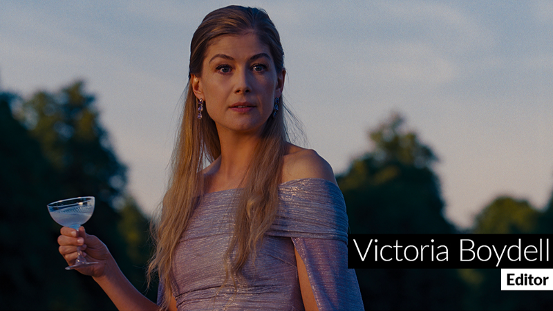
What we see, and the order in which we see it, always matters to a film, but the editing of “Saltburn” is an essential partner in the film’s dance between comedy, romance, thriller, and even a bit of horror. Luckily, by her own admission, editor Victoria Boydell never wants to do something so boring as being tonally even all the way through a film. Boydell’s challenge was to sculpt coverage and performance so that the audience feels Oliver’s world constantly shifting to accommodate Felix’s whims. A lot of the time, this meant avoiding the lushness of the Saltburn estate and emphasizing exactly what makes the characters pathetic or small — and therefore human.
“Both Emerald and I felt very keenly that you need to live Oliver’s experience in painful detail,” Boydell told IndieWire. “Even if the drone shots had been magnificent, it could have veered into ‘Downton Abbey’ territory. So you feel this slight awkwardness and hopefully, feel that he’s come to this house that could be quite terrible.”
When Oliver arrives at Saltburn, for example, Boydell says it was important to keep very close to his face and give us just enough of the estate to make his awe relatable and his awkwardness in such a grand place palpable. Likewise, Boydell never cuts away from the long tracking shot of Felix giving Oliver a tour of the house, because to Oliver the most attractive thing in Saltburn is Felix himself.
In the video above, watch how Boydell handled the film’s mercurial tone shifts in order to keep the audience laughing and feeling guilty about it.
The Directing of ‘Saltburn’

The world of wealthy English country homes isn’t a real one. They exist, of course, but as soon as Oliver arrives at Oxford (let alone Saltburn itself), he’s thrust into a swirling vortex of pomp and circumstance, where the in-crowd postures and gatekeeps as only rich people trying to internally justify the violence of empire can. In such a space, where everything is a little bit of a game that only the chosen few can win, Fennel found that both comedy and drama came from emphasizing just how human everyone is.
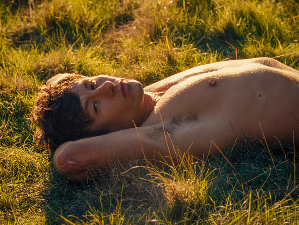
“The close-ups are so close,” Fennell said. “I kept saying, ‘Armpit hair!’ sort of shrieking it like a mad witch from the corners, but I really wanted stubble rash and pores and teeth. That’s important when you’re dealing with humans in a world that’s very artificial. We always felt that there had to be this incredibly sensual feel to this movie.”
Shooting on film itself contributes to the sensual feel of “Saltburn,” and Fennell embraced the chance to be expressionistic in scope while cutting in detail. It’s that combination of sensuous lighting with armpit hair that gives “Saltburn” its particular charge and created the visual framework for Fennell to shift between tones as Oliver rises and falls and rises again in favor with the Cattons. “It’s a constantly shifting power dynamic. The reason that [the 1:33 aspect ratio] made it so interesting to do that is you can physically do that. You will look at scenes often and when the power dynamic shifts, you’ll see that somebody is suddenly above another person. You’re looking at what’s happening between the two things. When it comes to power visually, it’s wonderful to be able to do that,” Fennell said.
In the video above, watch how Fennell created classic court intrigue using the language of privileged millennials and constructed frames that convey just how ardent — and embarrassing — the characters really are.
The Production Design of ‘Saltburn’
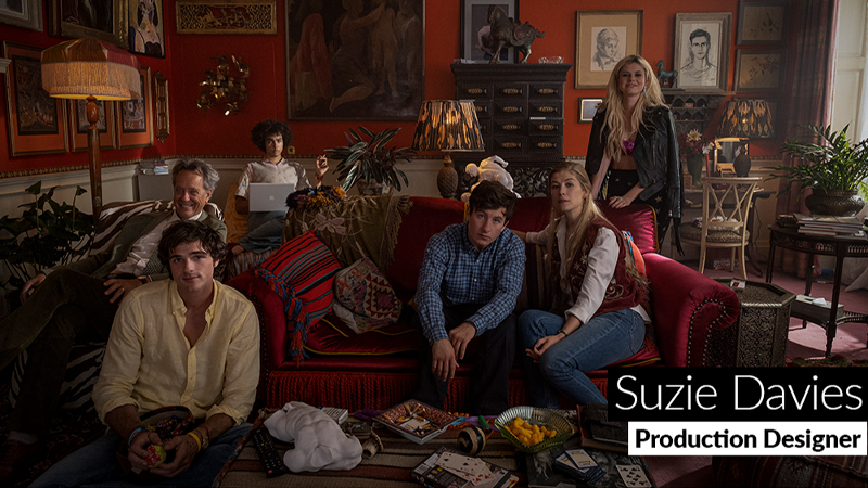
If there’s anything that simultaneously deglamorizes and romanticizes the characters of “Saltburn,” it is the production design. Suzie Davies needed to create an imposing splendor for the titular English country estate but sprinkle it with the material evidence that the family who lives there can never measure up to it. This involved thinking about the design of Saltburn (and Oxford) as needing the same kind of blemishes as Fennell and cinematographer Linus Sandgren were finding on the characters’ faces.
“We spoke a lot about smell and taste and texture. Sticky carpets, smelly boys’ rooms,” Davies told IndieWire. “We painted all the woodwork that high gloss. It looks like it’s wet.”
There’s perhaps no more vulnerable, human space in all of Saltburn than the bathroom shared between Felix and Oliver’s bedrooms; the way in which Davies lays out and decorates the space is a prime example of the ways in which she makes all the spaces in “Saltburn” come to wonderful, terrifying life. “The wallpaper [on the bathroom] looks like sinews of a body, and then [we have] our two bathroom cabinets that reflect, reflect, reflect. The floor, as well, is this amazing tiled geometric pattern so that you could see the liquid moving on the floor. And it feels so affluent to have just a bath in that size room to look out over the great expanse of this house that Oliver’s got his beady eyes on.”
In the video above, watch how Davies transformed a grand English country house into a series of sets that are almost alive with desire, as well as the sinister sense that something about them isn’t quite right.
READ MORE CRAFT CONSIDERATIONS
Craft Considerations
‘Loki’ Season 2 Was as Wild and Unpredictable as Its Title Character
Star Tom Hiddleston, directors / executive producers Justin Benson and Aaron Moorhead, and production designer Kasra Farahani seized new opportunities to bring fresh depth to the series.
By Jim Hemphill
May 7, 2024 2:00 pm

Craft Considerations
The Rocket Fuel of ‘Guardians of the Galaxy Vol. 3’ Visual Effects
The VFX Oscar nominee boasts expressive and detailed animation for Rocket and Groot, plus a two-minute, single-shot, climactic battle.
February 14, 2024 4:30 pm
Craft Considerations
‘I Feel Such a Responsibility’: Inside Making of ‘Killers of the Flower Moon’
Watch costume designer Jacqueline West, cinematographer Rodrigo Prieto, and production designer Jack Fisk explore the visual language of “Killers of the Flower Moon.”
By Jim Hemphill
January 9, 2024 3:30 pm
Craft Considerations
How ‘Maestro’ Hit the Notes of Leonard Bernstein’s Life
Watch cinematographer Matthew Libatique, costume designer Mark Bridges, and production designer Kevin Thompson break down the cinematic movements of “Maestro.”
December 27, 2023 12:00 pm
Craft Considerations
‘Risk Fuels Me’: Writer/Director Chloe Domont on Her Explosive ‘Fair Play’
The first-time filmmaker behind the Netflix thriller took some big swings — here’s how they paid off.
By Jim Hemphill
December 22, 2023 1:30 pm

Craft Considerations
‘Twisted Metal’ Recreated the Video Game’s Iconic Vehicles
Watch how production designer Victoria Paul and picture car coordinator Ty Guidroz crafted the deadly cars for the post-apocalyptic series.
By Daron James
November 27, 2023 2:30 pm
Armpit Hair & Wallpaper — the Pain & Glee of ‘Saltburn’ Is in Its Details
Watch how director Emerald Fennell, editor Victoria Boydell, and production designer Suzie Davies built the Gothic romance that millennials deserve.
November 20, 2023 2:00 pm

Craft Considerations
‘Daisy Jones and the Six’ Creates a ’70s Band — and Recreates the ’70s
Watch how the music, costume, and production design teams helped make it look like Daisy Jones and the Six were the best ’70s band you’ve never heard of.
November 13, 2023 2:00 pm

Craft Considerations
The ‘Deadliest Catch’ of All? Capturing Epic Footage on Dangerous Seas
The editor and cinematographer break down how they turn 25,000 hours of footage into a compelling, cohesive story.
By Chris O'Falt
August 18, 2023 3:00 pm
Best of IndieWire
Sign up for Indiewire's Newsletter. For the latest news, follow us on Facebook, Twitter, and Instagram.
Solve the daily Crossword

