Does the sci-fi classic Alien have the best movie marketing campaign ever?

There’s a case to be made that the Xenomorph is the greatest movie monster ever conceived. It’s certainly among the most iconic. H.R. Giger, the Swiss artist who designed the title creature of Alien, took inspiration from Francis Bacon and Rolls-Royce, and emerged with a biomechanical killing machine that’s instantly identifiable in silhouette. Cross a tapeworm with a shark, a cockroach, a dinosaur, and a motorcycle, and you’re close to describing the nightmare Giger and director Ridley Scott inflicted on unsuspecting moviegoers in 1979.
A monster so unforgettable sells itself. One look is all it would take to know that you had to see the cursed thing in action. And yet, there’s barely a glimpse of the alien in any of the original advertising for Alien. The beast is completely absent from the posters, and the trailer contains only a borderline-subliminal flash of its earliest larval stage, the face hugger. Unless you subscribed to a select few science fiction fan magazines — the ones boasting some enticing behind-the-scenes images, all part of a final “hard push” to get asses in seats — you were going into Alien blind, completely unprepared for the exact nature of the threat faced by its cast of unlucky galaxy-traversing characters.
Restraint isn’t unheard of in the modern age of movie marketing, but it’s certainly less common today. Studios don’t tend to leave much to the public imagination, at least not after the initial teasers. Look, for ruinous and recent example, at last week’s Abigail, whose trailer essentially gives away the whole trajectory of the movie, including a major plot twist that really should have been preserved. Too often, the logic is that if you don’t disclose everything attractive about a movie upfront, you might fail to draw in everyone.
The original amrketing campaign for Alien, which returns to theaters this weekend timed to Alien Day (an annual “holiday” that’s really just a way to indefinitely promote the franchise), represents the antithesis of that nervous, shortsighted strategy. It was a master class in building anticipation while ingeniously maintaining the film’s shocking secrets — leaving a prospective audience wanting more, and provoking questions only the movie itself could answer. Such trust in intriguing suggestion was very much in keeping with the minimalist spirit of Alien itself; to sell one of the greatest genre movies ever made, 20th Century Fox stayed true to the film’s values: its mystery and patience.
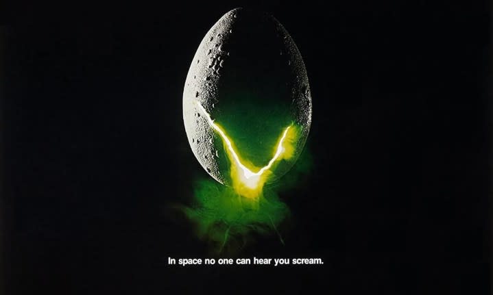
The brilliance begins with the tagline, which is arguably even better known than the movie that spawned it. A quick Google search reveals whole articles and random user queries about the origins of those immortal eight words, “In space no one can hear you scream.” It’s simple, evocative, and ambiguous.
Read or heard (via radio spots that paired it with notes of Jerry Goldsmith’s eerie score), that one line spoke volumes about the experience of Alien. It instantly conveyed tone, genre, and setting while conflating, with a well-chosen pronoun, the fear of the characters with that of the viewer. And how many taglines can be said to shape the public’s understanding of the universe and its physics? No wonder many still consider this the pinnacle of Hollywood ad copy.
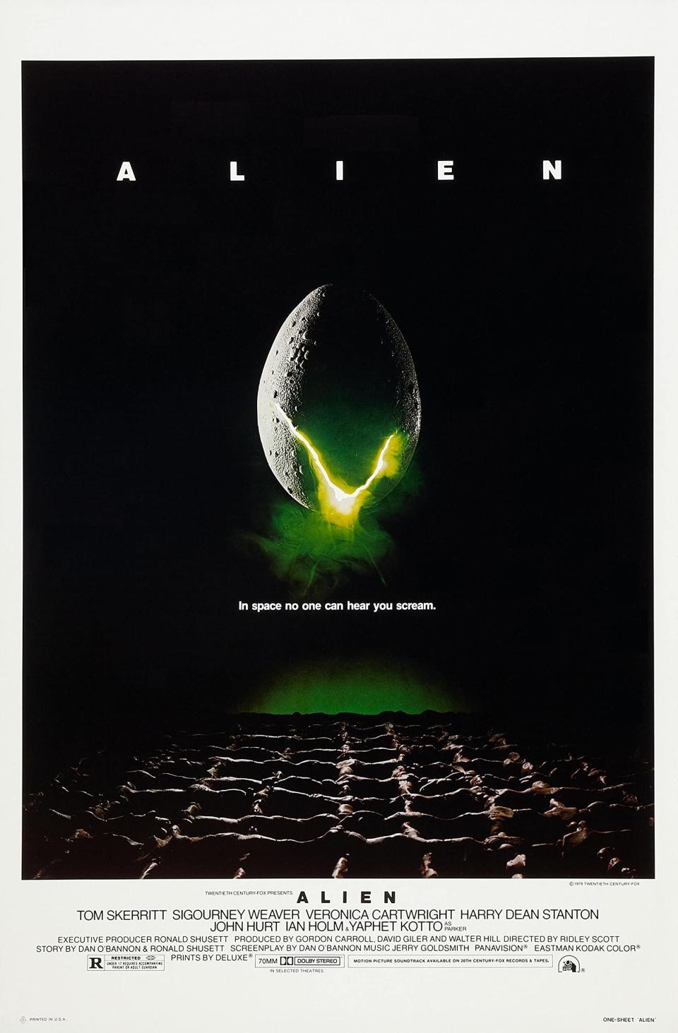
Naturally, Fox didn’t land on the perfect tagline immediately. It came after a period of trial and error, as the studio flirted with other options, some clunky (“Please listen mankind, you have so little time”), some generic (“A word of warning…”), some needlessly wordy (“No one should be allowed to even imagine that thing which is now headed our way”). It was a copywriter, Barbara Gips, who came up with the winning words. Her husband, Philip Gips, was one of the graphic designers behind what would become the official poster for Alien. That, too, arrived only after a series of proposed and rejected designs, including several by the man responsible for the posters for The Exorcist and Casablanca, Bill Gold.

Perhaps it was Barbara’s perfect tag that took Philip’s submitted image over the top. Certainly, the two complemented each other well, with words and visuals collectively conveying a stark sense of foreboding without revealing much at all. That poster, c0-created by Steve Frankfurt (with whom Gips had also joined forces for the astonishing promotional artwork of Rosemary’s Baby), is nearly as iconic. It depicts a chicken egg covered in plaster, floating in celestial darkness over some kind of craggy foreign landscape, with a V-shaped crack in the shell unleashing an eerie green fog. Again, the image tells the viewer next to nothing about Alien (the egg doesn’t even resemble the ones in the film), but it communicates a strong sense of otherworldly unease all the same.
In its spherical simplicity, that egg is more symbol than anything else: the terror of the unknown, the dark possibilities of space and life beyond our planet, conveyed with graphical clarity. If there’s a perfect intersection point of science fiction and horror, the egg is the warning sign that it lays ahead. It could be an exclamation point or Pandora’s box. It could also be a logo. In building its campaign around a veritable insignia of dread, Alien anticipated the branded marketing of later mega-hits like Batman, Ghostbusters, and Jurassic Park, all of which took a page from the way Fox drew our eyes to a single object pregnant — rather literally — with implied meaning and danger.
Few movies have inspired more fan-made poster artwork than Alien, but how many of these alternatives approach the pared-down effectiveness of the Gips and Frankfurt original? Remarkably, the film’s trailer would prove to be every bit as suggestive, mysterious, and influential. An early teaser, constructed around one of those tentative taglines and featuring still images from the film, is nothing to write home about. But it was followed by a two-minute spot so stylishly postmodern in its frantic audio-visual assault that it’s barely aged a day.
The first half is pure mood-setting, pushing through the starry void of space, across the barren surface of a planet, and over that done-up chicken egg from the poster. All the while, the soundtrack rumbles ominously, and the letters of the title eccentrically fill the top of the screen, coming together as deliberately and methodically as the plot does. Richard Greenberg, who designed the movie’s famous title sequence, claims that it grew straight out of the trailer’s opening minute; more than simply mirroring the movie it was selling, Alien’s campaign actually influenced it in the best way.
The second half of the trailer is distilled panic, a sizzle reel of context-free horror. Not a line of dialogue. Barely a hint of what the story will be and who the characters are. And again, no alien — they were saving that magnificent reveal for the film. This flush of alarming images builds in intensity, finally reaching a crescendo of terrified reaction shots (human and feline) and nightmarish flashes of stricken, convulsing bodies, before silence floods the frame like the vacuum of space as the tagline comes up. If we learn very little about what Alien is in terms of plot, we’re immediately hooked by its primal emotional power.
The spot looks way ahead of its time today. Every modern trailer that privileges effect and vibes over basic information probably owes it some debt. The tension-and-release rhythm has become standard operating procedure for horror movies looking to bait their line. But the ad’s slimy tendrils of influence reach into the advertising for other kinds of movies, too — for any film looking to grab a potential viewer via sensory overload or a powerful, abstract stream of shots pulled out of sequence. And you can hear echoes of that blaring alarm sound in the trailers for movies that lean on a similarly repetitive backbone of aural warning … though, of course, Texas Chain Saw Massacre got there first.
There’s a continuity to the ads for Alien, even a coherent vision expressed across pages, screens, and the walls of theaters alike. While so much Hollywood marketing lets the movies in question down — by making them look too formulaic, by spoiling their surprises far in advance — here was a campaign made in the image of what it was selling, and designed to drum up excitement through the express refusal to show too much.
The tagline, the poster, and the trailer all sparked curiosity, which is what the best advertising does. In the process, these ads helped popularize a guarded, intriguing new form of movie marketing. The puzzle box teases of J.J. Abrams, a true master of hiding monsters and protecting secrets, can be traced back to what those Alien preview materials cannily withheld.
The strategy paid off. Alien was a huge success (however much the accountants at Fox tried to suggest otherwise), drawing long lines and big crowds. Of course, the movie had something else going for it, something better than the smartest marketing campaign: It scared the living hell out of everyone. And that’s word of mouth you can’t buy. In space, no one can hear you scream. Here on Earth, the sound travels far and fast, attracting thrill seekers like a siren call.
Alien is now playing again in select theaters. For more of A.A. Dowd’s writing, visit his Authory page.
