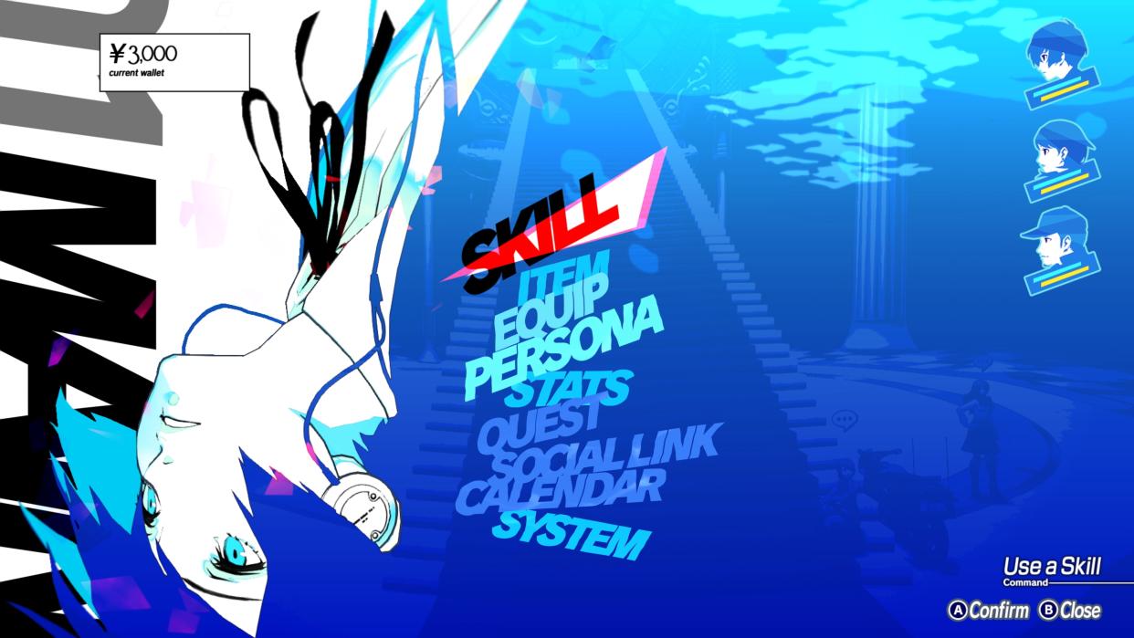
Persona 3 Reload's amazing UI might have the best menus in the history of JRPG menus, and shows the value of keeping devs around long-term

Persona 3 Reload's menu goes hard, and one game developer thinks he's figured out why.
Atlus just put out Persona 3 Reload, the long-awaited remake, last week on February 2, and UI elements like the game's pause menu are going down a storm. Senior UX designer Alex Tokmakchiev has looked to a past Persona interview (translated by Persona Central), to figure out why Persona 3 Reload's UI features look so good.
"In Japan, UI design is often handled by new employees," Persona 5 director Katsura Hashino said at the time. "Top level designers are usually in charge of characters and background graphics, with the UI being secondary. I think that’s a mistake. That’s why Atlus' UI designers are paid so well," the senior developer continued.
Hashino alludes to Atlus putting its UI designers in better positions than its Japanese counterparts, and so as a result, Atlus games have more stylized and impactful UI elements like menus. The Atlus developer also adds, elsewhere in the interview, that UI elements are very important in a game like Persona, where a lot of time is spent interacting with menus.
Tokmakchiev believes a lot of UI and UX designers in Western game development are "vastly underpaid compared to others," hinting at this being why Western-made games don't quite have the same standard of UI as games like the Persona series. In all fairness, comparing any game's UI elements to that of the Persona series is like fighting a losing battle.
Persona 3 Reload is Atlus's biggest-ever Steam game launch, which goes to show how well the wider game is going down with audiences both new and old, not just the UI features.
However, Persona 3 Reload has seemingly quashed a long-standing fan theory surrounding none other than Ryuji Sakamoto.
