Secrets in the Dark: The Visual Architecture of ‘I Saw the TV Glow’

In the opening image of “I Saw the TV Glow” the camera moves slowly down the middle of a suburban street. Dusk, it’s dark, but the sky has a hint of electric blue, as the camera passes over children’s chalk drawings that pop from the pavement like incandescent lights toward a neon-lit ice cream truck playing a slowed down children’s tune. This establishing shot embodies the magical, but slightly eery tone of the first half of the film and the childhood world of Owen (played by Ian Foreman, and as an older character by Justice Smith), who we cut to watching television in the dark.
While on the Toolkit podcast, writer/director Jane Schoenbrun told IndieWire they drew inspiration from the sense of “controlled chaos” they felt watching ‘90s Nickelodeon programming geared to older kids — remember SNICK? That line between feeling “scared, but not in danger” watching teen genre shows when you are a touch too young. While Schoenbrun and cinematographer Eric Yue didn’t adopt the cinematic language of those shows (except when recreating their fictional series “The Pink Opaque”), they did reach for the feeling they elicited.
More from IndieWire
“It’s that all of [the film should] feel like it felt like to watch ‘90s television,” said Schoenbrun. “So many of those TV shows on Nickelodeon were imbuing the suburbs with magic: ‘Pete and Pete,’ ‘Clarissa Explains It All,’ even ’Buffy [the Vampire Slayer]’ are shows about hidden mythologies, hidden darknesses, but not in a David Lynch way, not in a ‘Blue Velvet’ under the grass way. There’s danger and magic lurking outside your bedroom.”
Schoenbrun is not convinced their film should be labeled as horror, while Yue argued the film’s visual source of horror doesn’t come from the genre convention of darkness.
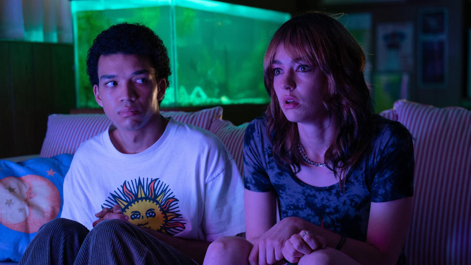
“There’ s intimacy when you turn off all the lights, there’s this glow of a fish tank, or a TV screen,’ said Yue. “There’s this balance between these things that are both horrific, but also kind of enchanting and mesmerizing.”
During their long conversations throughout prep, one thing that struck Yue was how much Schoenbrun thought in terms of architecture and the emotional use of space. The director even gave the cinematographer a copy of Gaston Bachelard’s “The Poetics of Space,” an influential book from 1958 that explored the intersection of architecture and psychoanalysis.
“When I think about darkness in the film, it’s also a place of comfort, in a way where I think Owen is comfortable in the basement,” said Yue of the cinematic space where Owen discovers “The Pink Opaque.” “We related the basement as a place of hiding secrets, it goes into this kind of Gothic territory. When you think about literature, you hide treasure, secrets become unlocked, and so I think in the film there’s a component where the basement is dark and it lends itself to this kind of subterranean secret that Owen has.”
Owen’s secret is his true self, which calls to him via watching “The Pink Opaque” with Maddy (Brigette Lundy-Paine) in the basement. The glow of the TV is more than a trans metaphor; in Schoenbrun’s cosmic world it is a potential portal to another reality. Throughout writing and preproduction, Schoenbrun kept watching “Blade Runner” and Spielberg’s “A.I.,” both of which captured the beauty the director was reaching for, specifically how vibrant colors sprung from dark spaces.

Yue, working with colorist Mikey Rossiter, experimented with colored lights during camera tests and decided to narrow the spectrum, working at times in an almost monochromatic-like way to lean into specific colors — a sharp contrast to the intentional muddying of colors in the second half of the film. It was important to Yue the sources of this color glow were grounded, organic to the locations — citing the fish tank in Maddy’s basement as a breakthrough. To capture the magic and beauty of that color popping from the darkness, Yue and Schoenbrun were adamant shooting on 35mm film stock was essential.
“Film has such fidelity of color, we really fought to shoot on film for this. I think we sacrificed a couple shooting days to shoot on film,” said Yue. Losing two shooting days on any film, let alone a condensed indie schedule, is significant. “But knowing how colorful [the film needed to be], for me on a technical level, you cannot push digital that hard without it feeling really artificial.”
To get increased contrast and saturation from the celluloid image, Yue had the film pushed one stop when being developed.
The Horror of Color
The color palette of the film stays largely the same throughout the film, but how we experience color evolves with Owen’s story and, according to Yue, becomes the visual source of the film’s horror. He feels it springs from the mundanity of Owen’s adult suburban world.
“This is a film about tracking a trans person through the first half of their life until that moment when that egg crack finally happens in childhood, and they may be their purest,” said Schoenbrun, describing the moment a person realizes they are trans. In the case of Owen, it’s a moment of realization that doesn’t bring change. “And by the middle of adulthood they are absolutely decayed. This is the emotional arc that [Owen’s] character goes through in the film, but it’s also mirrored in the aesthetic arc.”
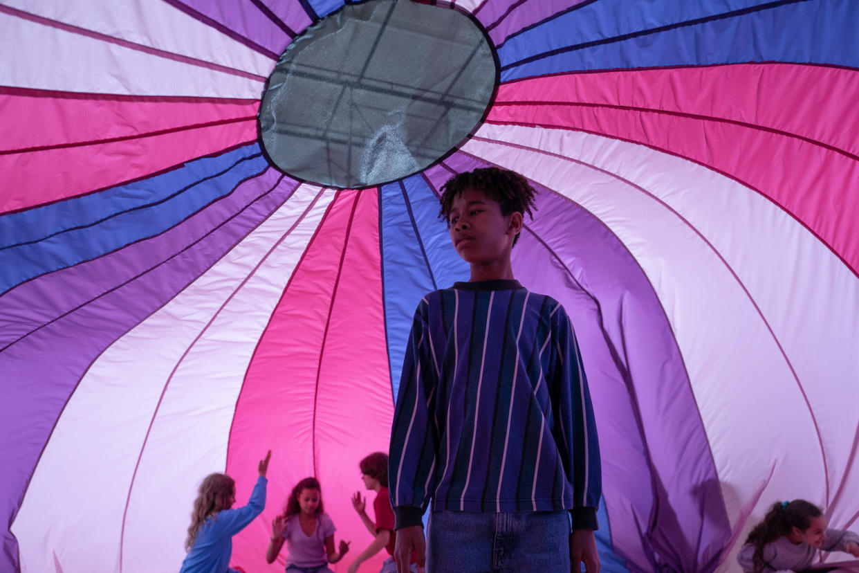
Schoenbrun points to the early images of a young Owen under the parachute in the grade school gymnasium as their Spielbergian moment of safety and comfort, but those same melange of colors in the parachute descend into a Dave and Buster’s hellscape at the Fun City arcade, where an adult Owen works. Yue recalled writing in their script that this later part of the film should feel like eating too much cotton candy — an apt analogy considering his approach to shooting these scenes.

“I remember just using every single light that we had to just put it on strobe mode, and I dialed the shutter to a very narrow angle, which creates this robotic effect,” said Yue, describing a technique common in war films to make action look more intense and choppy.
Yue shot a majority of the film with master prime lenses, but switched to Tribe7 lenses to create harsh flares during this section of the film.
“I wanted to assign this kind of panic feeling to a lens,” said Yue, who was looking to mirror the bombardment of modern amusement parks. “I wanted every light to muddy the frame, I think it’s sensory overload. In our world, [all] the distractions that we have, Maddy talks about this [in the character’s long monologue to Owen], these distractions cloud your sense of self and your sense to your environment.”
The key for Yue was to find the best ways to lean into the mosh of colors costume designer Rachel Dainer-Best and production designer Brandon Tonner-Connolly were putting in front of frame. The cinematographer recalled Dainer-Best wanting to test how to make the Fun City arcade.
“Rachel said, I’m trying to find the like most hideous looking things,” said Yue. “We brought in wardrobe during camera test, and [we discovered] under blue light the yellow-orange vests with neon paint splatter looked like it was glowing.”
Each tuning up of a color detail induced that too-much cotton candy-like sickness.
“To articulate all those things when we were [shooting at] the Fun Center, a lot of us had to leave and walk off set ,’ recalled Yue. “I was getting a migraine it was so intense.”
Best of IndieWire
The 13 Best Thrillers Streaming on Netflix in May, from 'Fair Play' to 'Emily the Criminal'
The Best Father and Son Films: 'The Tree of Life,' 'The Lion King,' and More
The 10 Best Teen Rebellion Films: 'Pump Up the Volume,' 'Heathers,' and More
Sign up for Indiewire's Newsletter. For the latest news, follow us on Facebook, Twitter, and Instagram.
