‘Star Wars’ Comparisons, Work Conditions, and Corey Stoll: Inside the ‘Ant-Man’ VFX of ‘Quantumania’


After exploring microscopic worlds in the first two “Ant-Man” movies, director Peyton Reed expanded into the massive Quantum Realm for the epic battle with Kang the Conqueror (Jonathan Majors) in “Quantumania.” What better way to kick off Phase 5 of the MCU?
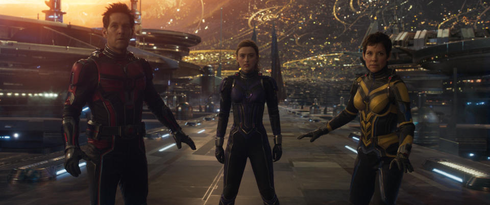
Much was made upon the film’s release of its similar look to that of “Star Wars,” but according to Marvel VFX production supervisor Jesse James Chisholm, Reed was more focused on the sci-fi visual influences of Heavy Metal Magazine and the abstract photography of Gerard van Smirren than the work of legendary “Star Wars” designer Ralph McQuarrie and his eye-popping, surreal landscapes and kitschy characters.
More from IndieWire
But Chisholm understands the comparison. “I don’t think we went in consciously making a ‘Star Wars’ movie,” he told IndieWire. “We all grew up on those films and it’s so steeped in our lexicon that it just becomes a part of our thinking. Yes, we have a restaurant scene with characters, so you can say that’s our cantina. It’s tough because we didn’t purposely go out doing that and comparing to ‘Star Wars.'”
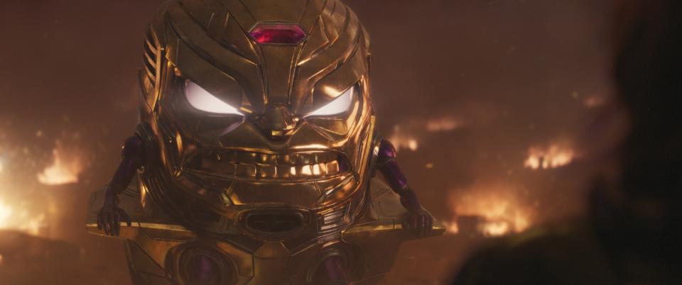
“Quantumania” was about going farther into the subatomic inner space than any previous “Ant-Man” movie, and the team delivered a moody look for trippy world-building (led by production designer Will Htay). The biggest character challenge, meanwhile, was creating M.O.D.O.K.(Corey Stoll), Kang’s killing machine, a giant floating head atop a tiny body. Although Jack Kirby’s comic book character looks very cartoony, the Digital Domain team went for as much photorealism as possible, based on the performance capture of Stoll, who fittingly has an oval-shaped face.
“I don’t want to give him the weight of Thanos, but this is a digital character that has to deliver his lines and he has to make people laugh,” the VFX supervisor said. “And if it doesn’t, he’s gonna fail. And so I think we just found ourselves constantly walking back to Corey. We used his eyes and the scale of the distance apart, but they’re scaled up, large. But we used his actual nose. We used as much of him, his skin, his pore detail as we could. Those aren’t baby arms and legs, but it just helped the animators to key in on him and keep his integrity. For me, I love where we landed.”

Courtesy of Marvel
The secret to keying into the worlds of “Quantumania,” meanwhile, was deciding when the characters were in a micro or massive universe, which determined when they could experiment with depth of field and tilt shift without confusing the audience. “I think it was really fun to play with those and pick our moments from the visual effects side with animation all of that,” added Chisholm. The former Digital Domain artist collaborated on more than 2,800 shots with the work divided between DD, ILM, Luma Pictures, MPC, Pixomondo, Rising Sun Pictures, Sony Pictures Imageworks, and Spin VFX, among others.
The big third-act rebellion against the formidable and seemingly unstoppable Kang — in which he’s ultimately taken down by an army of ants — is a tour de force of choreographed action, even for Marvel, one dominated by VFX and animation. Yet, as is often the case with Marvel tentpoles, it was difficult to iterate, render, and execute to the studio’s standards, particularly given a shortened schedule that was pushed up six months because of overlapping post-production on “Black Panther: Wakanda Forever.”
“Quantumania” also found itself in the crosshairs of the industry-wide conversation concerning unsustainable working conditions and a lack of health care for VFX artists, including a new IATSE survey used as leverage to help unionize the industry. But despite allegations of last-minute editorial changes to the third act that came too late to make a difference, Chisholm defended the quality of the work and suggested that the second unit was able to incrementally improve the fight scenes.
“Our third act didn’t change since photography to the end,” he said. “So it was always massive, all it did was get compacted. But there was no new storyline. We had a solid construct of the film. All that happened was it kept getting tighter and tighter. Marvel is always looking to make their films better. If I’ve made something that looks amazing and it just falls flat, they’re gonna ditch it and try and find [something] that works better.
“We had our days in long runs of it, just the strain of putting it together. I worked at Digital Domain, I knew what came with the job, and it’s challenging and it’s tough; I had the benefit of healthcare, I was taken really good care of by my company. You would hope that facilities can take on the work…without putting strain on the artists. They know that there’s gonna be a certain amount of change and we’re all gonna rally around to make it work. I think there’s a shift and I think vendors are saying no.”

Courtesy of Marvel Studios
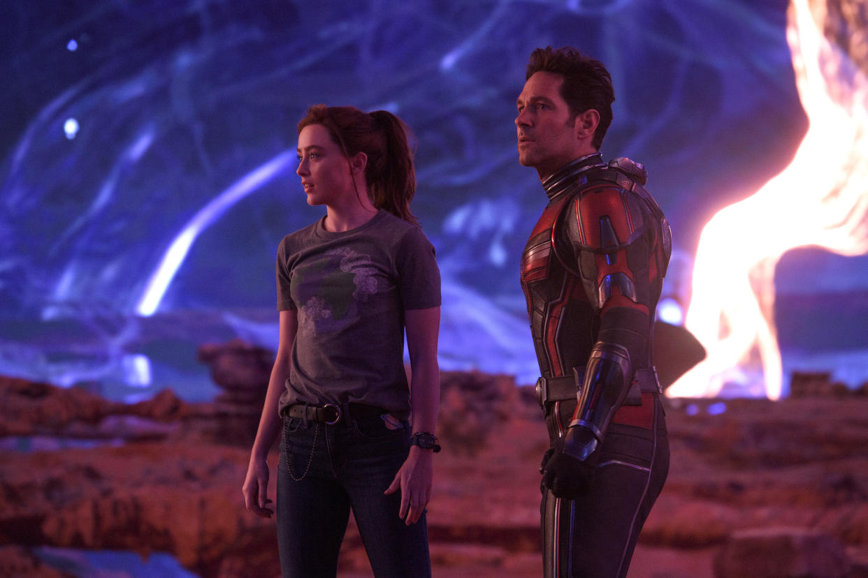
Aside from the size and scope of the whacked-out Quantum Realm (crammed with distinct cities, civilizations, and citizenry), Marvel went deeper into ILM’s StageCraft volume of LED screens for in-camera views and interactive lighting. But Reed was experienced enough with the virtual production tool from “The Mandalorian” to know how and when to use it within the great expanse of the Quantum Realm.
The volume was also beneficial for a scene in the jungle, in which Pope brought in lights to fill the volume and create lens flares to enhance the sculpted trees and plants on the set that were replicated and continued into the screens, which then moved in parallax as the camera swept through the set. This would not have been possible with traditional painted backing.
“StageCraft has been used by Marvel, but we finally got to use tools in London that had been advancing,” Chisholm said. “But Peyton wanted to be sparing with it. As filmmakers, we are spoiled by these massive stages or going outside and shooting expansive areas and you can put your lights far away and get the correct, fall off and the right shadows. And in the volume, it’s really small and contained, almost like a Faraday cage [enclosure].
“There’s this scene where Scott and Cassie [Kathryn Newton] crash land into these bluffs and this sun creature comes to attack them,” Chisholm continued. “And I got to use the sun creature on a control and move it to give them an actual eyeline. So they were not only in the environment but got to watch the sun as it moved. And then something else that was a lot of fun was we had the world scaled down around Scott. So it was as if he was growing and scaling up to go catch that sun at one point. So it helped [cinematographer] Bill Pope as far as knowing what to frame for. And I think we got really organic performances out of our actors being in that volume.”
Best of IndieWire
Sign up for Indiewire's Newsletter. For the latest news, follow us on Facebook, Twitter, and Instagram.