10 easy-to-fix mistakes designers always notice in homes with tips on how to remedy them
We all make mistakes in our homes that might not be noticeable to us, but a professional designer will always pick up on them. While they might seem like small things not to be pondered over for too long, they can actually affect how a space looks and functions overall, leading to the instinct that something isn't quite right, even though you can’t put your finger on what exactly it is.
Most of us will be guilty of at least one faux pas but they tend to be super easy to fix, and the change it could make to your overall space might surprise you. I spoke to interior designers who gave me a list of mistakes that they always notice, and the quick and easy fixes that you can apply immediately to achieve a more well-rounded modern interior.
1. Matchy-matchy furniture
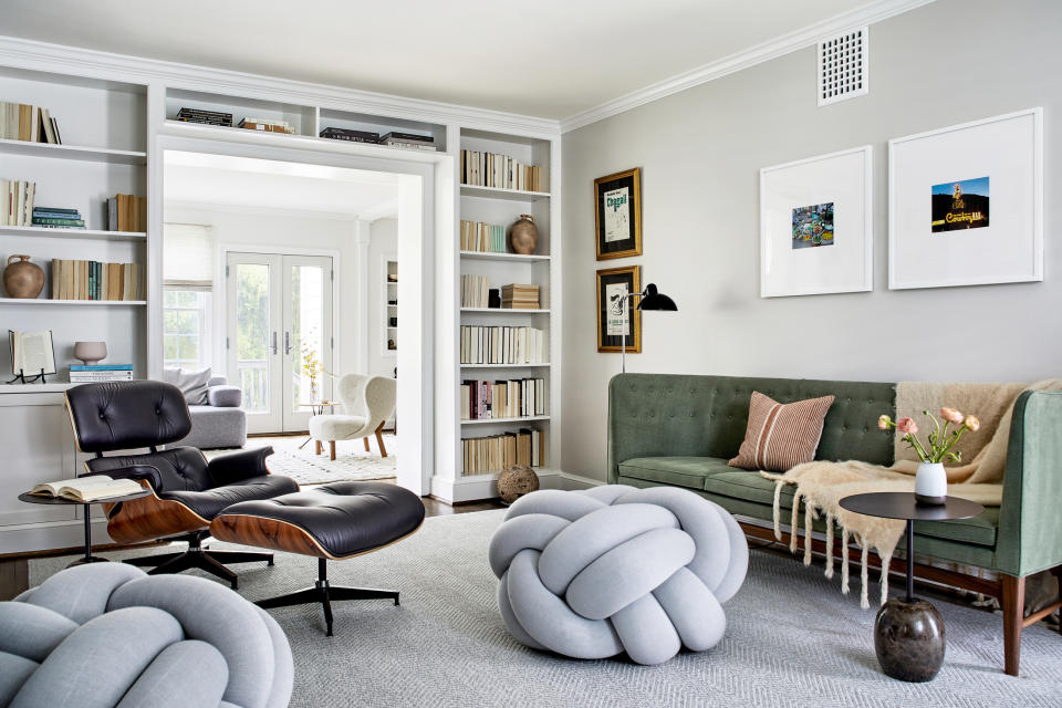
When buying modern furniture for your home, it's tempting to just get everything from the same place, whether that's the same shop or the same brand. Everyone’s busy, and this way of shopping just saves time, is easy to do, and often saves money, too. Getting everything from the same brand, or from the same collection, also means you don’t have to think about matching your furniture styles because they already go together.
However interior designer Alice Leigh warns that this is one of the biggest mistakes people make when decorating their homes. ‘You don’t want it to look like a showroom,’ she explains, and that is the risk you’re taking by purchasing all your furniture in a ‘set’ or from the same place.
‘I enjoy mixing old and new from different places,’ Alice adds. Although it might take a bit longer, it will definitely be worth the final result. Your home will be a collection of items you love that work together because they've been chosen to cater to your taste and needs but are different enough that they don't resemble a catalog page.
2. Getting caught up in trends
Trends are a wonderful way to ensure constant growth and innovation in interior design, but they change so quickly that it would be virtually impossible to follow them too closely. Be selective about which interior trends you choose to get inspired by, and make sure they match your own taste and needs, so you know you will love them for longer.
'Take inspiration for sure, but trends come and go so don’t get too wedded to them,' Alice agrees. 'Incorporate them in items that can be switched out rather than big investment pieces’. Take the expert’s advice and be creative with on-trend accessories that can easily be changed once the trend has passed, or you no longer like them. Do so responsibly though, and always think of ways to reuse, or donate those ‘trendy’ items you no longer want.
3. Rugs that are too small
‘Area rugs can really serve to make your space look larger, provided they stretch all the way under your furniture,’ interior designer Bethany Adams explains. Designers notice rug placement mistakes - like those that are too small or right in the center of the room - too often to count, and many of us make the pitfall. 'If you've got a postage-stamp-sized rug, your room will look tiny and awkward,' Bethany explains. 'Don't despair and toss your lovely rug though! Buy a large flat weave or sisal to layer underneath your showpiece and all will be well.'
‘Ideally, you want all the furniture to sit on the rug to frame the space,’ Alice adds. ‘This isn’t always possible (due to cost and space implications) so at least have the furniture partially sitting on it, but don’t have the rug floating in the room.' We love this rug from Target that you can get in different sizes to perfectly fit your space.
4. Not prioritizing a lighting scheme
Now this piece of advice is golden because almost everyone who doesn’t enlist the help of a professional in their project gets it wrong and then has to spend a lot of time, and budget, to rectify it. It’s all about planning your lighting scheme, and the elements that need to work within it, specifically lights, sockets, and switches, ahead of time.
Luckily, Alice has some lighting design tips. ‘It's important to think about your future layout early on so you can get light positions correct, and sockets in the right places, be it walls or in floors,' she says. 'You don’t want to be adding sockets when the decorations are complete and floors down. Lighting should be considered in layers; table, floor, pendant, wall, and accent lighting, not purely a grid of spots. Finally don’t forget to put all lighting circuits on dimmers so you can create moods.’
5. Curtains that are too short or too long
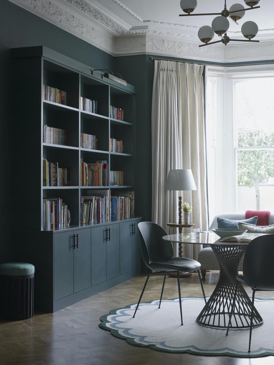
Especially if curtains are store-bought and not made to measure for the space, getting them the wrong size is an easy mistake to make. ‘Drapery really trips people up,’ Bethany tells me. ‘Unless you have electric baseboard heaters under your windows (fire hazard!), your drapery should hit the floor. Ideally, you'll hang your curtain rods halfway between the top of your window molding and the ceiling (or the bottom of your crown molding, if you have it), but if the math doesn't work out, just choose the tallest point you can. If you do have electric baseboard heat, skip drapery altogether and go for an elegant, soft Roman shade instead.'
Curtains that are too long won’t do the trick either, but interior designer Ashley Macuga has a quick and easy fix. ‘It's as easy as a trip to the dry cleaner,' she says. 'Ask the seamstress to hem up the curtains to 1/2” above the finished floor. Turns out you can hem curtains just like you can hem pants, and it's a lot less expensive than custom curtains.’
6. Having too much furniture or decor at the same height
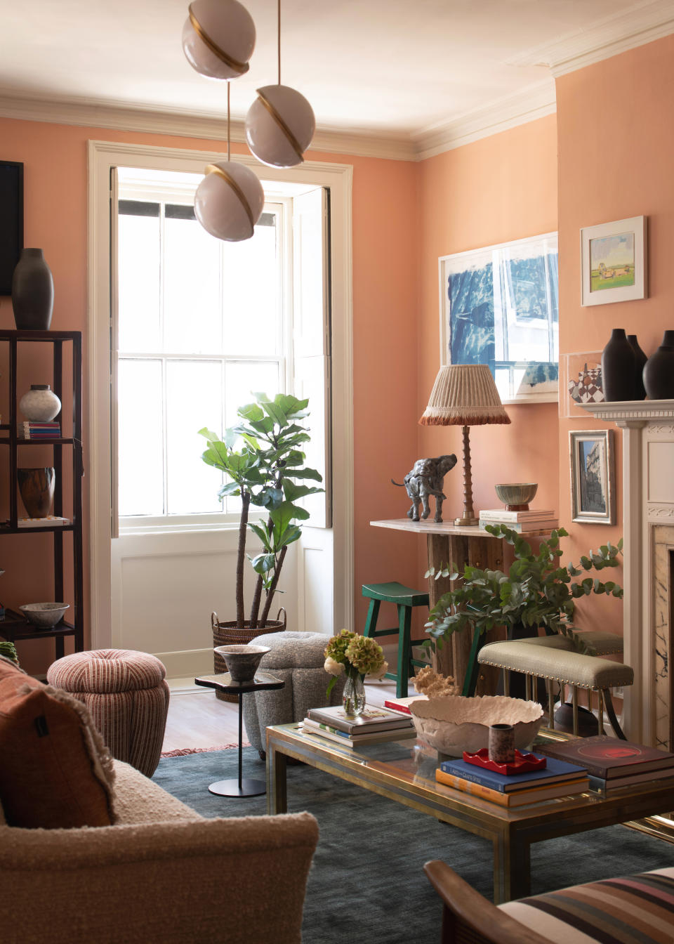
For an interior scheme to be successful and have a balanced look, there needs to be scope for the eye to travel. By making everything the same height, you sideline this completely. As Alice explains: ‘If it's all on the same visual plane there is nowhere for the eye to go.'
The trick is to play with different heights to create interest in your space. 'This could be achieved with lighting at different heights (floor/table/uplight) or using a taller cabinet in juxtaposition to lower level pieces of furniture, pictures at different heights and different groupings and incorporation of plants,’ Alice goes on to explain. This floor lamp from Anthropologie is great to help you add height variety to your living room.
7. Droopy throw pillows
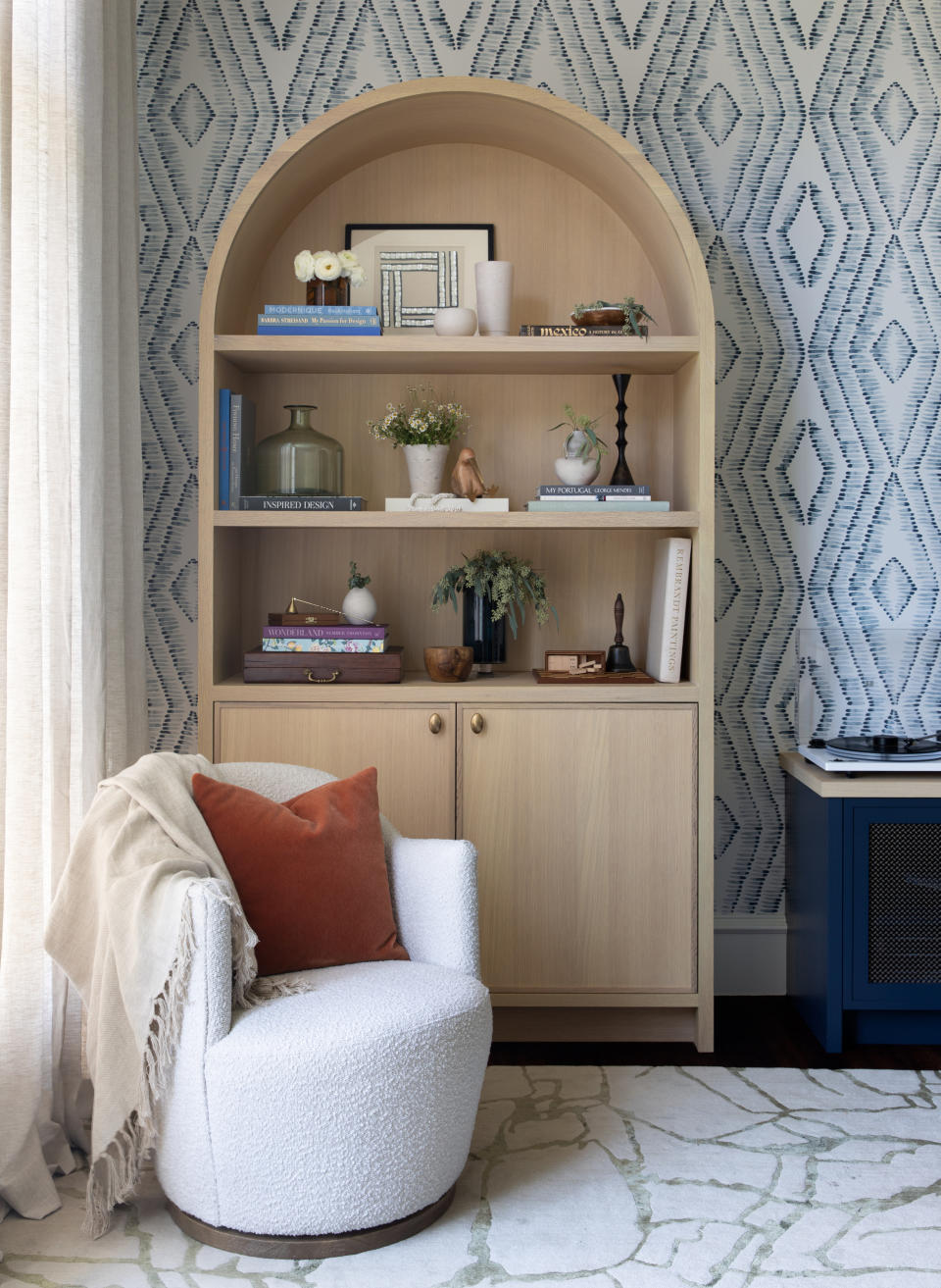
We all know that accessories and soft furnishings matter, and they're a great touch to tie a room together and create a cozy look. Throw blankets and pillows especially are such a great and easy way to bring color accents and personality into a space, as well as give a nod to your favourite trends. However, if you’re going to do this, you need to do it right, and sad droopy pillows won’t do.
The best throw pillows will always look full and bouncy. ‘Invest in pillows with enough fluff to fill out the pillow cover,' Ashley advises. 'We always size up when purchasing our inserts.' These pillow inserts available at McGee and Co. are a great investment and will last for a good while.
8. Pushing furniture against the walls
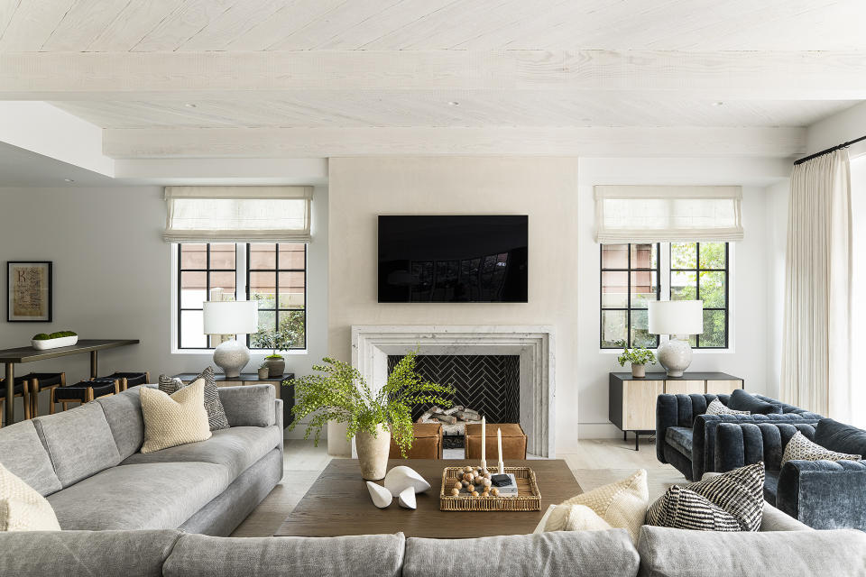
There might be a tendency to push furniture against the walls because we think it will create more space but in reality, it’s an inefficient use of floorplan. ‘I've noticed the tendency of people to push all of their furniture against the walls, which often results in a large, unused space at the center of the grouping,' says Bethany.
Instead, try floating your furniture so that there's always a gap between the walls and your pieces. ‘In a living room, center your coffee table to the fireplace or whatever your central focal point is, then place the sofa 18"' from the edge on one side, and the chairs 18" from the edge on the other side,' suggests Bethany. 'Fill in with side tables and if there's enough space to comfortably get from one room to another around this grouping, give it a try. Your space will look filled, but not crowded.’
9. Not enough contrast
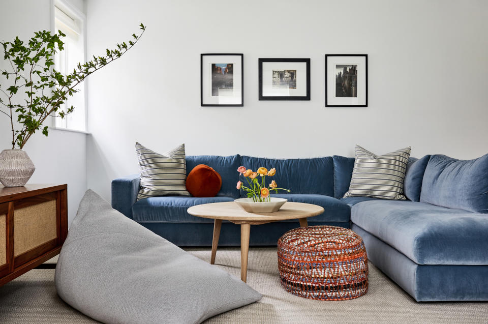
Sticking to a mostly monochromatic, light palette, and generally avoiding contrast is something that designers see a lot of. Maybe it’s because of our fear of trying to experiment, but Alice tells me that ‘contrast is often a key factor to a considered space and can stop it from looking dull or flat'.
There are ways to bring in contrast in more subtle ways that needn’t worry us too much about making mistakes. ‘This could be a dark vase against a light wall or contrasts found in textures, like shiny vs. matt, rough vs. smooth,' Alice adds. 'I love mixing fabrics, natural linen with more luxurious velvet is a favorite.'
10. Too much spacing on a gallery wall
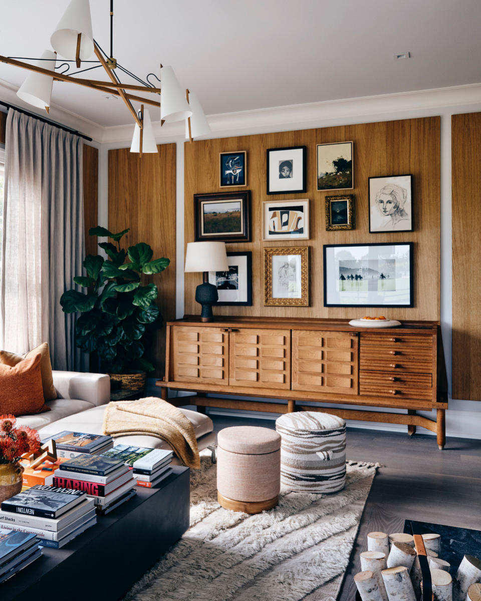
Gallery walls can be tricky to get right, especially when we overthink them, but there's one main point to make a conscious effort to avoid, and that's having too much space in between the picture frames.
The quick? We recommend using between 2" to 3" in between any frames hung side by side,' says Ashley. 'Ere on the side of 2" if they're smaller frames, and 3" if you have frames that are 24" x 36" or larger.’
If you’re anything like me, you've already made a mental checklist of all the mistakes you need to immediately go around the house and fix. Make these simple changes and your home is sure to feel so much more put together.
Fix the most common design mistakes with these buys

Premium Pillow Insert
Price: $22
Make sure your pillows look plump, and invest in a good quality insert that will prevent them from getting droopy.

Tulum Area Rug
Price: $226.99 (size9'x12)
Whatever the size of your room, make sure your rug is big enough to fit under your furniture and zone the area.

Floor Lamp
Price: $898
Make sure you bring in furniture at different levels to encourage the eye to travel. A tall floor lamp is great for this.