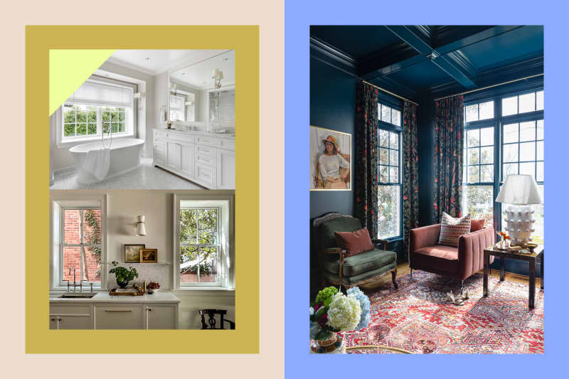
10 Paint Colors You Won’t Regret in 10 Years, According to Designers

Paint is an excellent tool for serial redecorators — after all, it’s not permanent. When you get tired of one color, you can grab a brush and try something different. However, many people aren’t looking to switch their wall colors regularly, and that’s where choosing a shade with staying power becomes extra important.
I polled a group of interior designers working across the country to ask them the shades they still won’t regret putting in their clients’ spaces — or even their own homes — 10 years from now. The result? An outstanding list of timeless, dependable paint color choices that won’t be going out of style anytime soon. You just might be surprised by how many white paint colors and off-whites are in this mix, proving neutral colors are here to stay. So get your paint supplies ready! You’re going to love these 10 tried-and-true shades.

1. Sherwin-Williams’ Pediment (SW 7634)
Designer Laura Umansky, the founder of Laura U Design Collective, has painted the kitchen of her own home in Sherwin-Williams’ Pediment (SW 7634), a bright white hue with hints of blue and violet. “It’s a sophisticated and light neutral with a warm undertone,” she says, noting how she appreciates that it’s a bit softer than other whites. “We’ve been here four years, and I’m not tired of it in the least!”

2. Sherwin-Williams’ Greek Villa (SW 7551)
Another white hue that will stand the test of time is Sherwin-Williams’ Greek Villa (SW 7551), which designer Amy Studebaker describes as “a cozy, versatile white.” She’s used the color on both the interior and exterior of her own home and thinks it’s truly the perfect modern white. “It’s creamy and warm but still bright enough that it doesn’t feel yellow,” she adds.

3. Sherwin-Williams’ Let it Rain (SW 9152)
Designer Shamika Lynch, the founder of Maximizing Tiny, describes Sherwin-Williams’ Let it Rain (SW 9152), a gray blue hue, as a “captivating color.” She finds it appeals to a number of rooms in a home — bedroom, den, living room, bathroom — especially if you appreciate a medium tone saturated blue. “This shade perfectly complements the current color-drenched room trend while also offering a cozy and timeless ambiance for those who will appreciate a moody vibe in the long term,” she adds.

4. Farrow & Ball’s Hague Blue (No.30)
Craving a deeper blue? Designer Alexis Warren says Farrow & Ball’s Hague Blue (No.30) will never go out of style, thanks to its versatility and depth. “Every time I use this color, it looks different and adapts to every space,” Warren says. “I have used this color in large sitting rooms to small primary bedrooms, and clients have never regretted it.”

5. Benjamin Moore’s Philipsburg Blue (HC-159)
Designer Audrey Curl finds herself drawn to Benjamin Moore’s Philipsburg Blue (HC-159), a shade from the brand’s Historical Color Collection. She calls this dusky, soothing mid-tone “a dependable choice for classic options that have stood the test of time.” Why? According to the designer, Philipsburg Blue pairs nicely with anything, including browns, neutrals, greens, reds, and corals. “We used this color in an office over 10 years ago, and it is still au courant,” she says, offering that it’s a great choice for libraries, sitting areas, and bedrooms, too.

6. Sherwin-Williams’ Creamy (SW 7102)
Curl considers Sherwin-Williams’ Creamy (SW 7102), an off-white shade, to be one of her tried-and-true favorites; she’s used it for over 15 years! “It is a crisp white with a subtle warmth to it and yet doesn’t go yellow,” she says. “It works in modern and traditional spaces.” It has just the right amount of contrast to work beautifully with white trim, too.

7. Benjamin Moore’s Revere Pewter (HC-172)
Designer Marianne Simon uses Benjamin Moore’s Revere Pewter (HC-172) at 50% strength. “It is our go-to for interiors when a client wants a touch of color,” she says. “It has a touch of depth and warmth without feeling harsh. It’s truly the perfect paint color for any space and will never feel dated.” Designer Diane Meyer of Interior Designs Atelier is just as big of a Revere Pewter fan. “It’s elegant and inviting with a hint of drama,” Meyer says. “It works well with cool and warm tones and is always an iconic color!”

8. Benjamin Moore’s White Dove (OC-17)
Designers are head over heels for Benjamin Moore’s White Dove (OC-17). “It’s usually our go-to white time and time again,” says designer Liz Mearns, the founder of Imagine Design. “With every project, we come armed with a variety of white samples, and White Dove is often the winner.” She considers the hue to be “the perfect timeless backdrop.” Designer Francie Winchester also sings White Dove’s praises. “It has a touch of yellow for warmth but is still very crisp and clean to modernize any interior,” she says.

9. ECOS Paints’ Prismatic Pearl (0025)
Designer Amber Gray of Grayson Interiors appreciates how ECOS Paints’ Prismatic Pearl (0025) complements a wide array of design styles. Plus, as she puts it, it’s a design chameleon in the best way. “It adapts to different lighting seamlessly, shifting from soft ivory tones to delicate hints of shimmer, ensuring a space feels dynamic and inviting,” she says.

10. Benjamin Moore’s Swiss Coffee (OC-45)
Benjamin Moore’s Swiss Coffee (OC-45) is another designer favorite that gets used time and time again. “This creamy white has significant staying power because it is relatively neutral but has creamy undertones,” designer Chrissie Haim explains. “You can experiment with furniture and accessory colors when the mood strikes — rest assured that Swiss Coffee can safely remain the same with whatever you choose.”
