49 Stylish Nursery Ideas for the Unique Baby Room of Your Dreams

Here at Cubby when you ask, your editors deliver. Nurseries are the top thing our Cubby readers are looking for, so we’ve gathered 49 stylish nurseries for one mega-article filled with design inspiration. Below you’ll find our favorite designer nurseries, the best nurseries from Cubby and Apartment Therapy tours, and best of all, dozens of new rooms. So whatever your style, budget, or space, we’ve got ideas for your baby’s room. Read on.
Animals
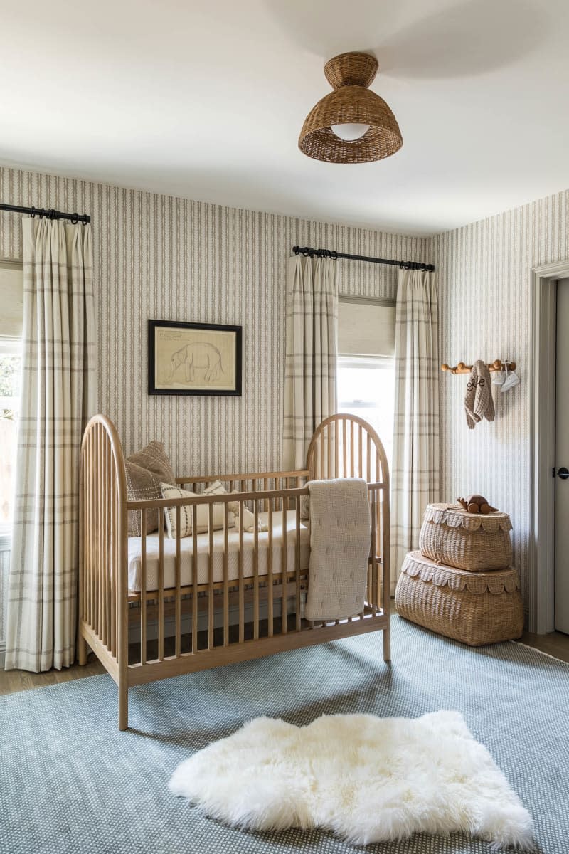
Refined Neutral
We’re filing this nursery by Mindy Gayer Design Co. under “rooms we want for ourselves.” The Orange County-based firm started with a taupe striped wallpaper and layered in textured details. While the palette is neutral, the room is anything but boring, thanks to tons of natural accents, including baskets, a woven lamp shade, and a sheepskin throw. Vintage artwork above the bed and throughout the room adds character.
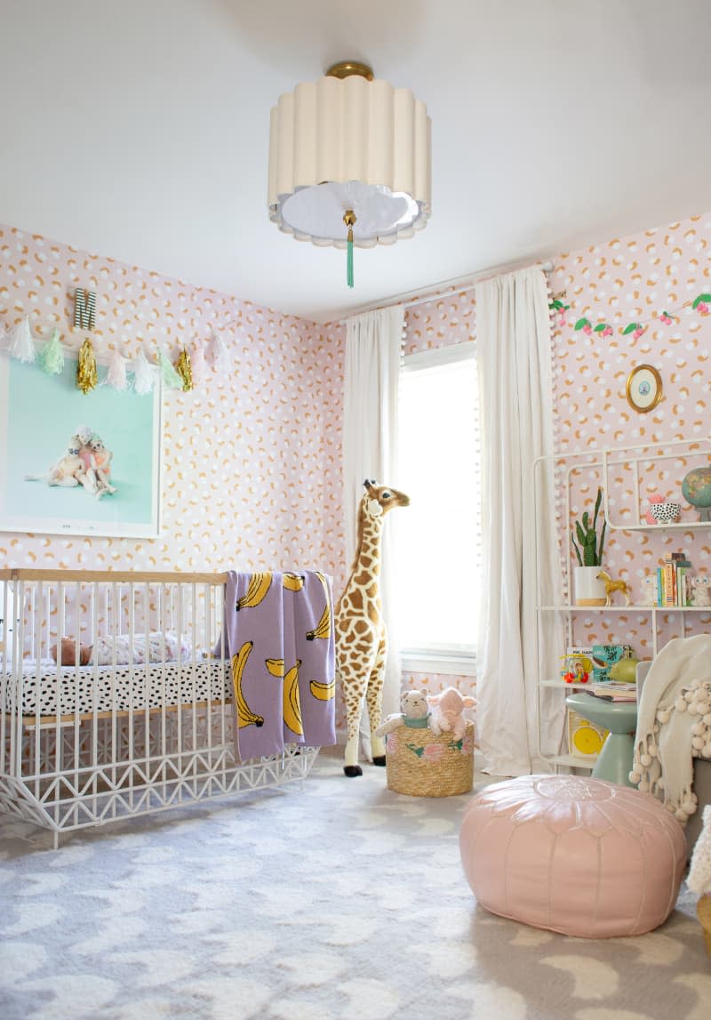
Pretty Pastels
While living in a rental house, designer Joni Lay couldn’t paint the walls, so she opted to use Chasing Paper’s temporary wallpaper to cover the butter-colored walls. “This gorgeous paper by Jen Peters instantly makes the space feel custom, and it’s such a pretty pattern that isn’t overwhelming,” says Lay of her daughter’s room.
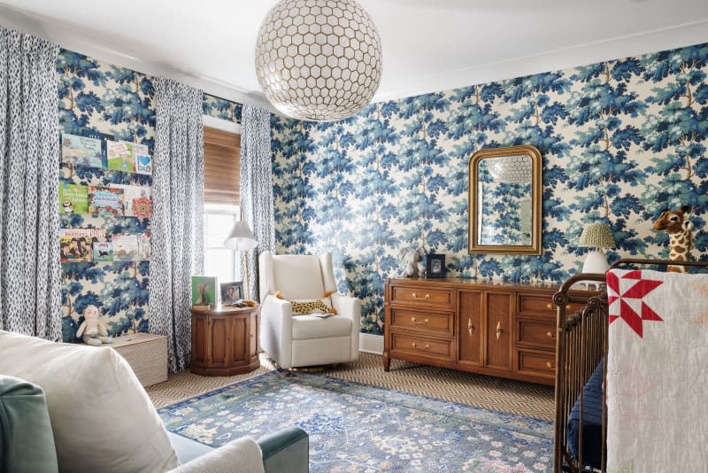
Sophisticated Treehouse
For this boy’s room, designer Hattie Collins, the founder of Hattie Sparks Interiors, wanted to create a sophisticated space, so she avoided traditional nursery items in favor of pieces that would grow with the child. For example, the dresser and side table are from Chairish. The standout design element is the wallpaper from Sandberg, which Collins paired with curtains made from Rebecca Atwood fabric and a light fixture from Serena & Lily.
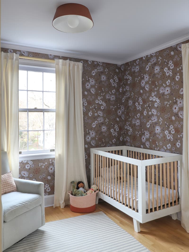
Bold Botanicals
Interior designer Jourdan Fairchild calls her youngest daughter, Dylan’s, room a “work in progress” (although it looks pretty perfect to us!). The retro-leaning Hygge & West wallpaper is one of many bold wallpapers that Fairchild has used throughout her 1946 Winston-Salem home.
A Little Boho, a Little Classic
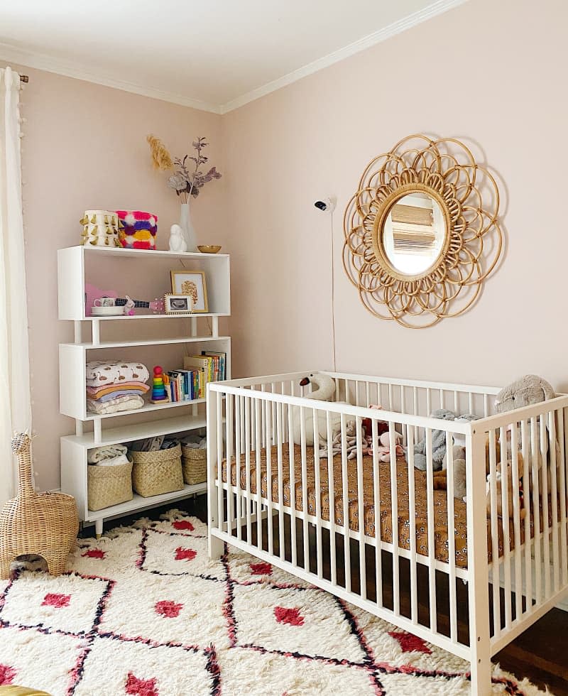
Take the classic baby girl room and give it a twist and you’d get something like this room by Kristen Fountain Wilson, the founder of Studio Louise in Atlanta. Wilson opted to paint her daughter’s room a subdued and unexpected shade of blush (Sherwin-Williams “Rose Tan”). A Moroccan-style rug with pink accents and a vintage-inspired crib sheet from Mebie Baby add to the boho vibes.
Vintage Modern
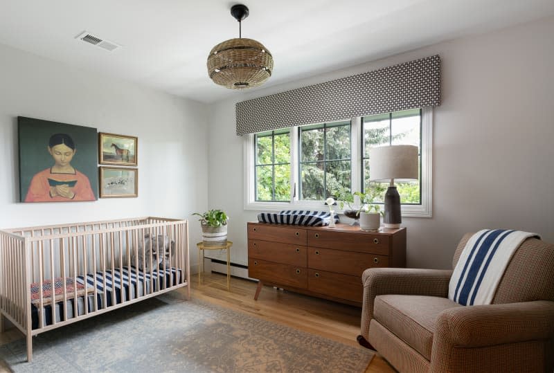
The team at Forge & Bow in Fort Collins, Colorado, went for a mix of modern and vintage elements in this neutral-toned nursery. The clean lines of the crib (similar to IKEA’s SNIGLAR) work well with the vintage art and mid-century-style dresser.
Modern Neutral
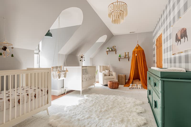
In a room for twin babies with twin dormer windows, Curated Nest Interiors, a design firm based in Greenwich, Connecticut, used pattern and color to strategic effect. The gray wall paint reduces the jogs in the architecture, while the buffalo check print on one wall becomes a focal point. Vibrant green and mustard accents, plus a swing(!) bring a playful spirit to the otherwise neutral space.
Mid-Century Mod
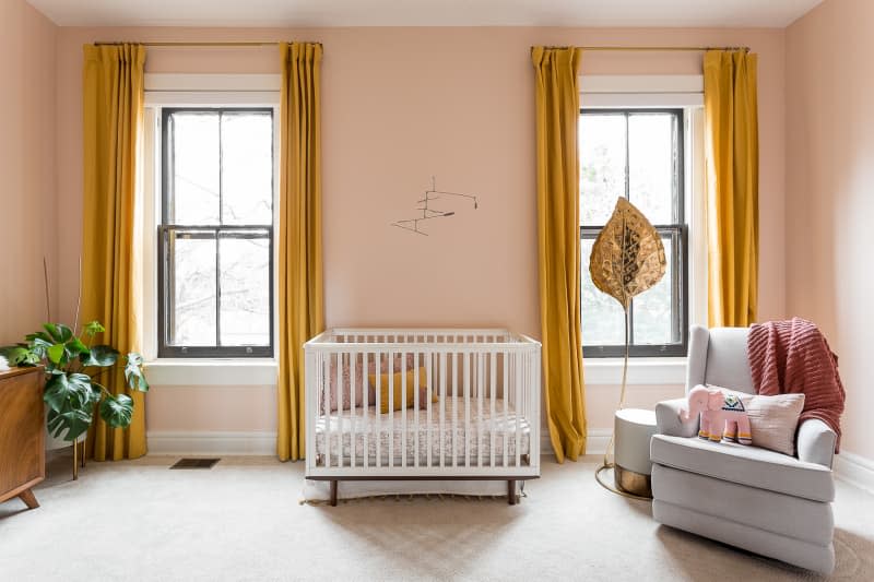
This pretty room by Bethany Adams of Bethany Adams Interiors in Louisville, Kentucky, proves the power of an unexpected color combination. Benjamin Moore’s “Queen Anne Pink” (HC-60) is a lively backdrop for the mustard curtain panels from CB2. Adams rounded out the room with a mid-century-style cabinet and the vintage Tommaso Barbi leaf lamp.
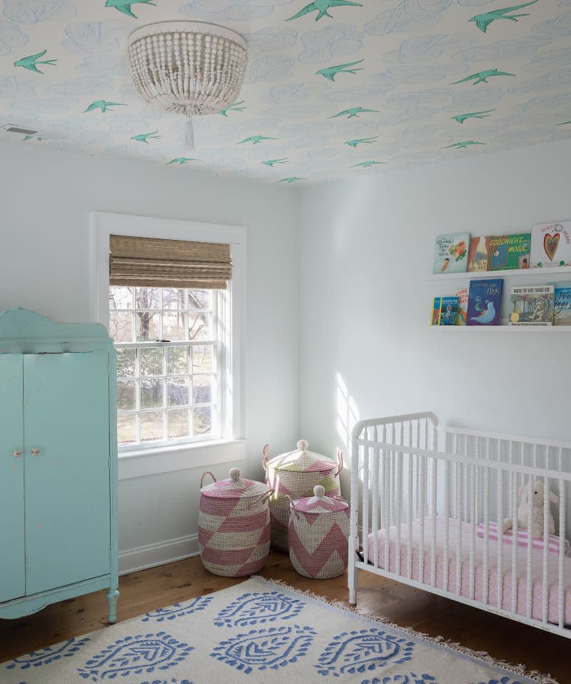
Soft and Tranquil
“I always want to create a tranquil, serene space for the baby and anyone else that enters the room,” says Gaelle Dudely, founder of Connecticut-based GLDESIGN. For Dudley, this means a palette of whites, neutrals, and soft colors. In this room, the Hygge & West wallpaper on the ceiling brings a hint of whimsy and charm to the soothing base.
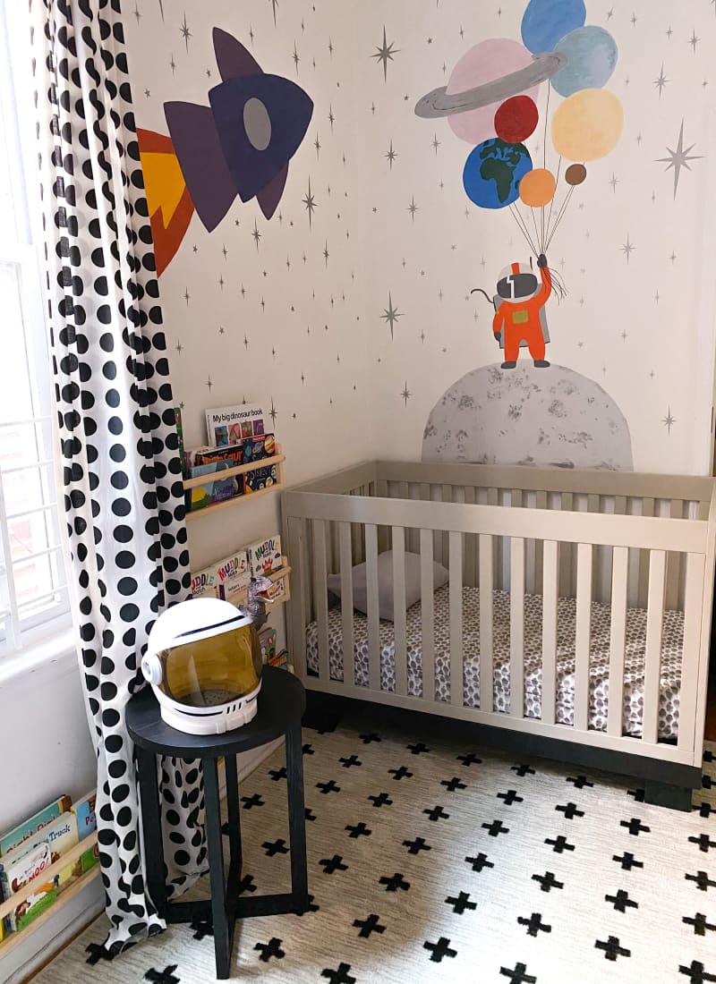
Space Theme
As the founder of Maximizing Tiny, a decorating business that focuses on small spaces, Shamika Lynch knows a thing or two about making the most of a tight spot. However, small does not mean plain. While her kids’ tiny room measures just 7 1/2′ x 11′, Lynch added a space-themed wall mural to make the room fun as well as functional.
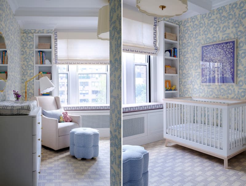
Pattern Mix
New York City-based interior designer Emily C. Butler is a master at mixing patterns, and this nursery is no exception. Here Butler layered a Greek key trim, a Bunny Williams Fabric footstool, and a geometric rug over the Peter Fasano Ardley wallpaper — and yet the room feels soft and serene, thanks to the restrained color palette.
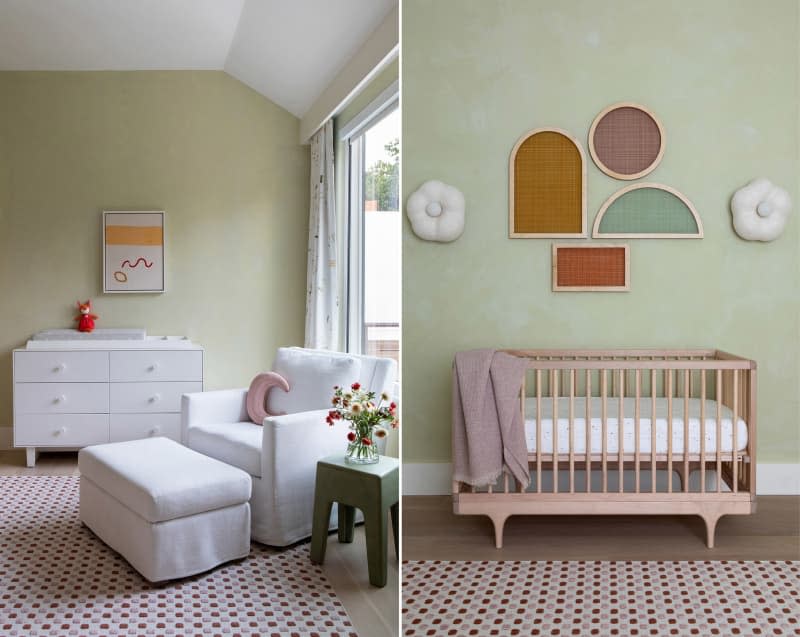
Subtle Sweetness
Brooklyn-based interiors and architecture firm Chango & Co. is known for their use of bright colors in children’s rooms, but this nursery features a more subtle scheme with Domingue Finishes’ Lime Wash on the wall and subtle pink accents. Creative Director Susana Simonpietri kept things understated with white furniture (an Ouef dresser and a chair from Restoration Hardware) and the playful Puff Daisy Sconces above the crib by Eny Lee Parker.
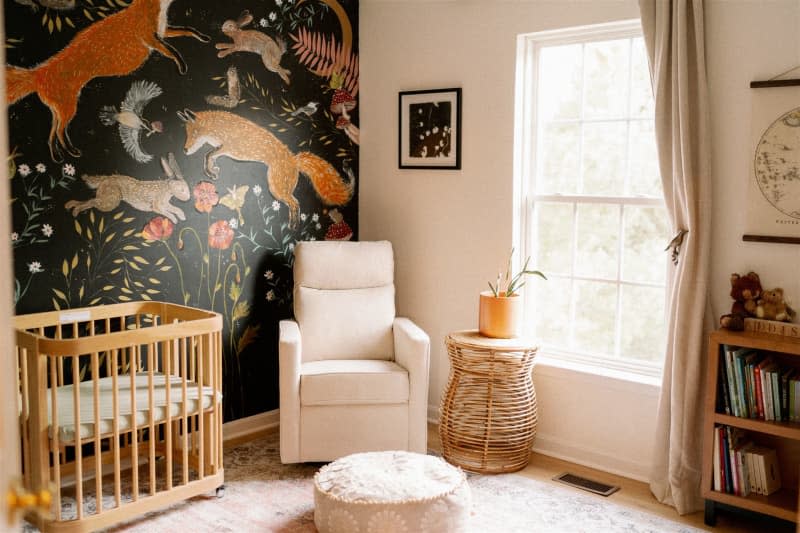
A Forest Fairytale
When Maryland photographer Leigh Anne Brader Poole set out to design her daughter’s nursery, Brader Poole knew how powerful a good backdrop could be to the overall visual effect of a space — so she called on artist Corrine Crone to create a gorgeous forest mural for her baby’s room. The results are nothing short of fairytale-worthy.
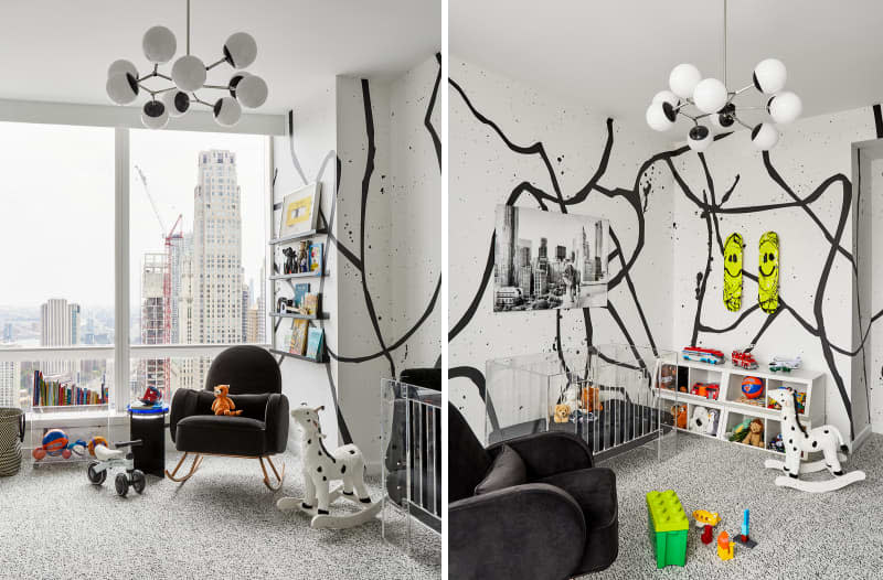
Freeform Black and White
Bold and graphic is how New York-based interior designer Hilary Matt describes this baby boy’s nursery, which features Drop It Modern’s spray paint-eque wall mural. Matt kept the palette minimalist with a black and white scheme, and “the books and toys bring in the pops of color,” says Matt.
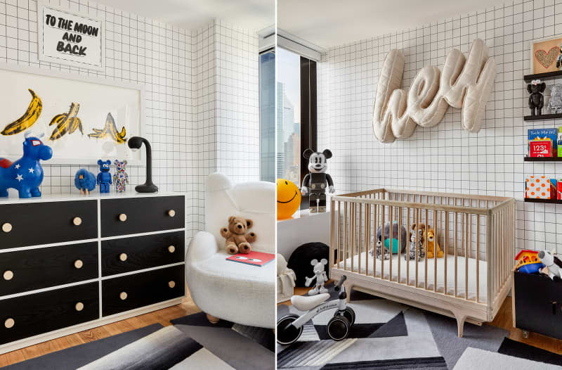
Graphic Black and White
In another black and white nursery by Hilary Matt (this one her own son’s nursery), Matt kept the base of the room monochromatic black and white. “I added in low-commitment touches and design elements that make the room more fun and young, but can be easily removed when they grow up,” says Matt.
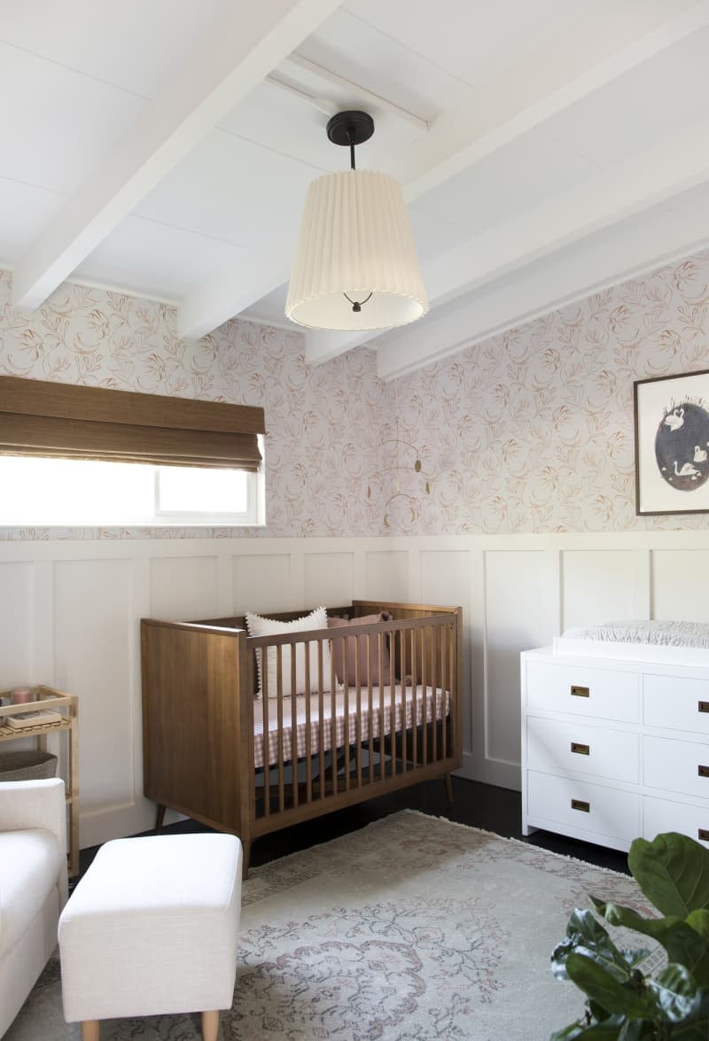
Traditional
When designing a nursery for her friends’ daughter, Sarah Gibson of Room for Tuesday opted to install wallpaper between the existing board and batten and ceiling beams. “I really love how the pattern bridges the gap,” says Gibson. “That negative space in the middle was begging for some sort of contrast, and the wallpaper works well.” Covering the window is a natural woven shade from Blindsgalore with a cordless lift, which Gibson chose so that it would be safe for the baby.
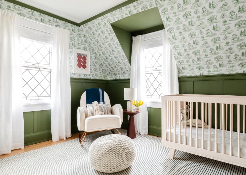
Tree Toile
For her daughter Marlow’s nursery, Chasing Paper founder Elizabeth Rees pulled inspiration from wallpaper, of course. Rees painted the room’s board and batten the same color as the design from her Tree Toile wallpaper, creating a forest-inspired space. The crib’s natural wood frame subtly reinforces the tree theme.
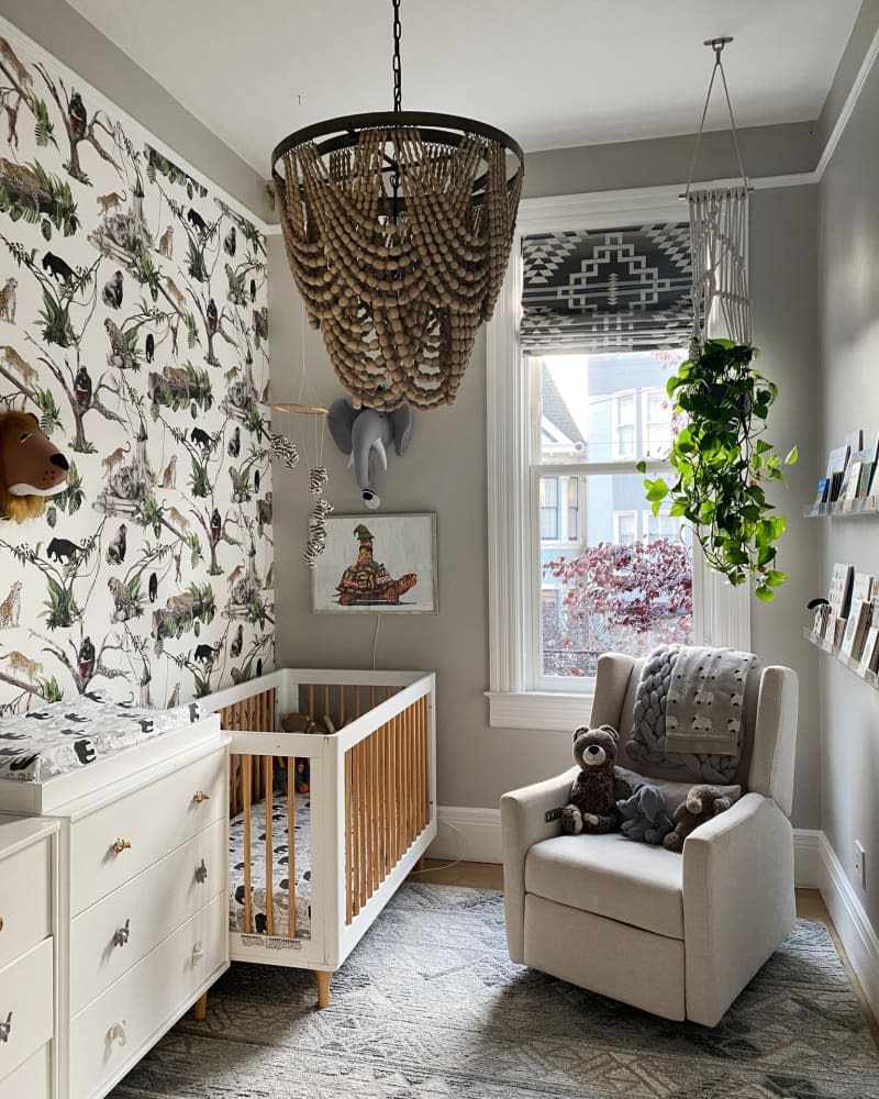
Jungle-Inspired
A small space was no challenge for Eva Bradley, principal designer at San Francisco’s Studio Heimat when designing a jungle-inspired nursery for a client. To make the most of the space, Bradley placed the crib and changing table side by side and positioned the glider where the most daylight enters the room; instead of a typical bookshelf, she opted for narrow acrylic book ledges.
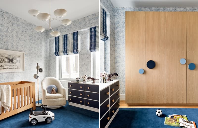
Cool and Comfy
“When you are designing New York City apartments, you really need to think about versatility. This nursery is practical, with ample open space on the floor for playing, while functional, allowing for the space to not feel too cluttered,” says interior designer Hilary Matt. Kids always need extra storage, so Matt designed custom closets — we love the mismatched knobs!
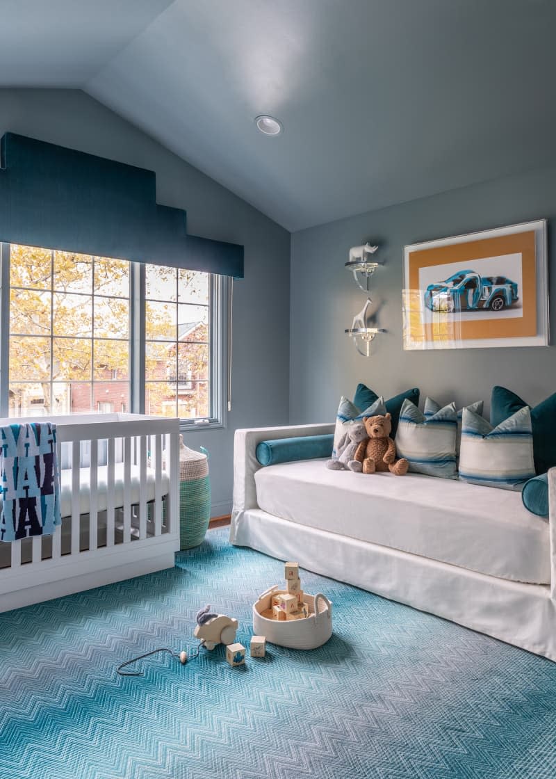
Shades of Blue
A self-described maximalist, Sissy Yellen went all in with blue in this nursery, including Benjamin Moore’s “Water’s Edge” on the walls. While Yellen now heads up a full-service interior design studio in Bloomfield Hills, Michigan, she started out as a bespoke nursery designer: This room is proof that nurseries can be just as chic as the rest of the house (and evidence of why Yellen’s scope expanded).
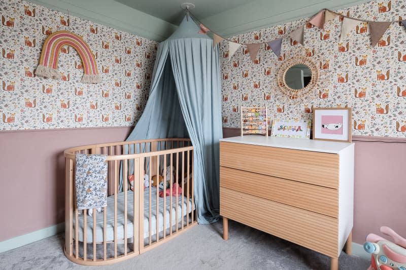
Whimsical
Artist Farwa Moledina went all in on color and pattern in her daughter Sofia’s nursery. The top half of the room is papered in Lust Home’s “Let’s Make a Den” wallpaper, while the lower half is painted in Farrow and Ball’s “Sulking Room Pink.” A sky blue ceiling paint (Lust Home’s “Elderflower”) completes the saturated scheme.
See more of this room: A Nursery’s Wallpaper Is Filled with Woodland Animals — And We Love It
In the Treehouse
Victoria Sass, founder of the interiors firm Prospect Refuge Studio, turned her clients’ nursery into a miniature forest by wrapping the wall is Sandberg’ “Raphael” wallpaper. The natural wood of the Caravan Crib by Kalon subtly picks up on the forest theme.
See more of this room: This Forest-Themed Nursery Makes You Feel Like You’re Standing in a Treehouse
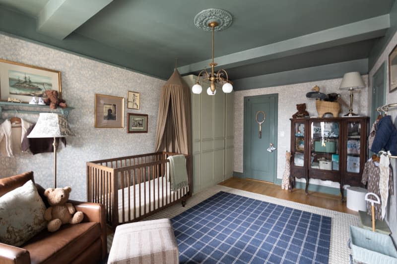
English Country
For her son’s nursery, Shelby Vanhoy from Pretty in the Pines wanted to create an oasis of calm in the bustling city. She did it with Farrow & Ball’s “Green Smoke” on the ceiling and trim and a quiet, nature-inspired wallpaper (Emrik in Misty Blue from Sandberg wallpaper). Vanhoy also created calm by providing ample storage in the form of an IKEA PAX Wardrobe System, which she gussied up with decorative molding and paint (Farrow & Ball “French Gray”).
See more of this room: A Gorgeous Traditional English-Style Nursery Mixes Antiques and IKEA
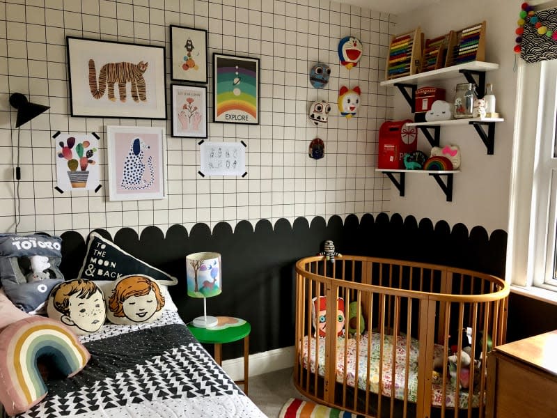
Joyful Monochrome
A black and white palette can feel cold in a nursery, but content creator Shona East found ways to bring a joyful vibe to a monochromatic scheme. East started with a white and black wallpaper (here’s a similar option from Ferm Living) in a grid pattern, then painted the lower half of the wall black with a scalloped edge. “Stripes and scallops are a simple and cost-effective way to add real interest and color to your home, and all you need is a tester pot,” East says.
See more of this room: We Are Totally into This Black and White Kids’ Room That Still Manages to Be Colorful and Quirky
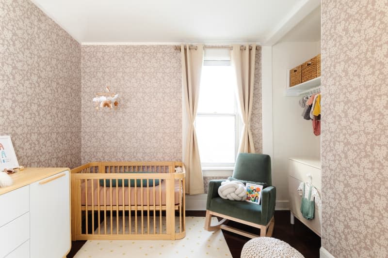
Sweet and Serene
Sweet and serene vibes abound in this nursery belonging to one of the co-founders of Chasing Paper. The company’s “Poppy” wallpaper lends the neutral furnishings charm. The parents have cleverly co-opted the large closet as a space for the bureau (the doors can be replaced at a later date).
See more of this room: Dreamy Floral Wallpaper Steals the Show in This Cozy and Sweet Nursery
Pops of Color
With gray walls and white-washed floors, this nursery is proof of the power of a pop of color. Just a few colorful knobs and a rainbow-hued garland bring the room to life. It’s no surprise, given mom Emma Paton is a fashion pro who knows how important a good accessory is.
See more of this room: A Fashion Buyer-Turned-Blogger’s Charming London Home
Moody Hues
A nursery doesn’t have to look babyish. Case in point: This industrial-meets-Scandi room designed by fashion stylist Claire Brennan for her daughter Lila. The toddler bed is the Stokke crib that is designed to grow with a child.
See more of this room: This Renovated London Home Is Your Inspiration for Industrial Meets Scandi-Inspired Style
Modern Color
An Australian family snuck storage into this small, shared kids’ room with a tall locker cabinet from Mustard Made. Rainbows are a theme throughout the house; the rainbow rug seen here is from The Slumber Co.
See more of this room: A Sunny Melbourne House Is Full of Light, Art, and Charm
Boho Color
Shelving is the star in this nursery in the home of Australian ceramicist Chela Edmunds of Takeawei. The triangular shelf was designed by Chela and Like Butter as a market display; Chela repurposed them as her baby, Ocean’s, toy and book shelf.
See more of this room: This Australian Ceramicist’s Style Is “Maximalist Wanting to Be a Minimalist“
Fresh Color
Here’s a fresh take on an animal-themed nursery. Illustrator Naomi Wilkinson designed the wallpaper herself, and wrote of it, “I designed it before my son was born and it’s made up of our daughter’s favorite things (at the time she was 2) including our dog, Lenny!” The papier-maché zebra head (purchased at Anthropologie) brings the theme into three dimensions.
See more of this room: Find Loads of Color and Pattern Inspiration in This Lovely U.K. Home
Bohemian Vibes
This bohemian-leaning room designed by Kate, a mom in Melbourne, Australia, shows that you can mix old and new in a nursery too. Note how an IKEA crib sits happily beside a vintage loveseat and a surfboard wrapped in crochet squares.
See more of this room: Vibrant Art and Rugs Add Color to This Rental House
Simple and Soothing
Custom window valances safely add pattern to nursery windows in the home of Rhiannon Bosse, the event planner and floral designer behind Rhiannon Bosse Celebrations. The walls in this room are coated in HGTV for Lowe’s, Sherwin-Williams “Privilege Green,” a soothing shade of green that will mature with the child.
See more of this room: A Floral Designer’s Once-Sterile Spec House Is Now Cheery
Modern Minimalist
Bliss Lau drew inspiration from New York City and the minimalist art movement when decorating her home, and that included her baby’s room. The convertible daybed is from Couchbed and the walls are Sherwin-Williams’ “Light French Gray.”
See more of this room: A Designer’s Minimal NYC Home Is Inspired by Donald Judd’s
Minimal Homey
The Brooklyn family who owns this home describes their style as “minimal,” but there’s a warmth in the way they accessorized the nursery. An Iranian rug, an elephant-shaped laundry hamper, quirky art, and toys displayed in simple wood crates found at The Home Depot all make the space feel simple but homey.
See more of this room: A Brooklyn Townhouse Is Organized and Incredibly Cute
Bright and Splashy
Stacey Blake, the creator behind DesignAddictMom, is known for her bright and colorful style, and her baby’s nursery nook is no exception. Blake wallpapered the space in “Arty” by Pierre Frey, but tempered the wild walls with Babyletto’s simple Hudson crib.
See more of this room: Tour DesignAddictMom’s Colorful, Personal Home
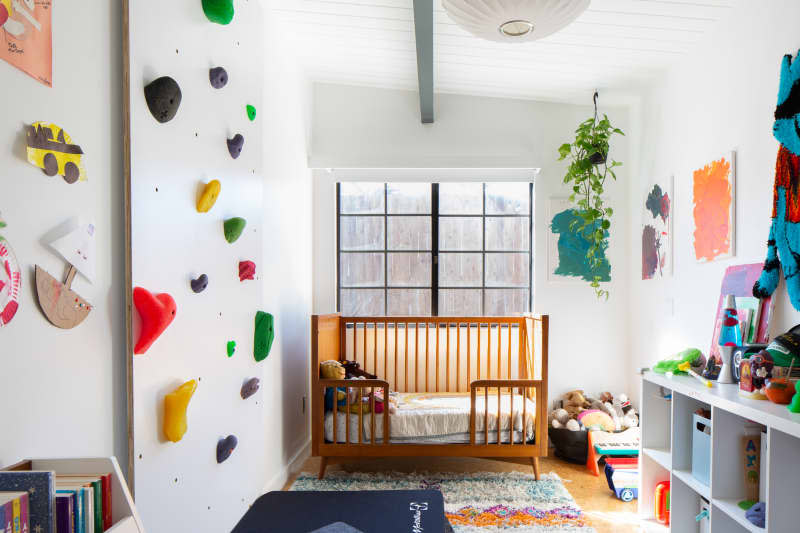
Mid-Century Style
A climbing wall made with Climbing Holds from Hangar 18 almost doubles as art in this toddler’s room, where a convertible West Elm crib picks up on the house’s mid-century architecture.
See more of this room: DIY Projects Saved This Mid-Century Modern House from Bad ’90s Updates
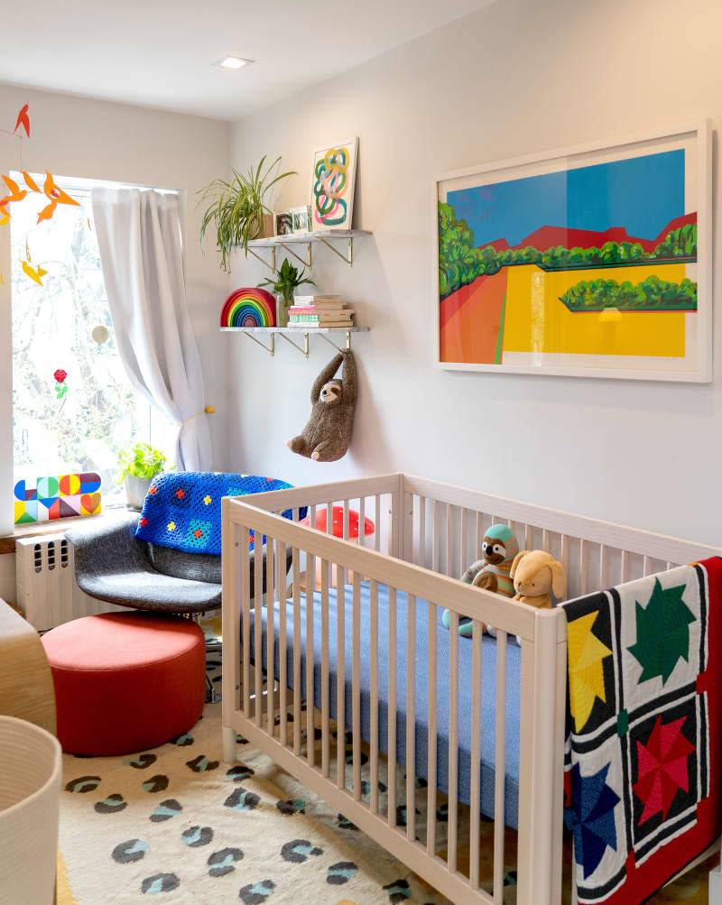
Primary Colors
A predominantly primary color palette makes this small nursery pop. Recreate the effect with white walls and accents of pure red, yellow, and blue and accessories like the MoMA mobile and rainbow stacker toy. The two blankets were made by baby’s mom and grandma!
See more of this room: Creative Directors Share a Brooklyn Rental with a Gorgeous Green Kitchen, Natural Light, and Open Layout
Serene and Imaginative
Set designer parents made this little girl’s room into a serene and imaginative place. The house-shaped play hut can double as an extra space for a child to sleep, and the mirrors are hung at the perfect height for their daughter who was not yet 2 at the time of the shoot. Wall-to-wall sisal carpet is a relatively affordable way to cover floors.
See more of this room: A Set Designer’s Playful, Parisian Apartment
Black and White
Black and white is a foolproof color combination, but it can often feel cold for a baby’s room. These Brooklyn parents warmed things up with natural materials (the wood IKEA crib and natural fiber stools) and a sheepskin throw. Triangle decals on the wall, plus gray accents give the room further depth without overwhelming the small space.
See more of this room: A Beautiful Brooklyn Home Designed on a Tight Budget
Colorblock
Hello, colorblock! This nursery’s wall mural was designed and painted by the homeowner Emily Wassall, a creative director for fashion and lifestyle. The Monstera Rug by Lorena Canals underfoot adds to the room’s playful vibes.
See more of this room: A Creative Director’s Colorful Tropical LA Home Has the Most Envy-Inducing Inside/Outside Living
Delightfully Graphic
Of course the nursery belonging to children’s book author Oliver Jeffers is a pure delight, with its graphic rug and just-right shade of gray. Book ledges display current favorite books in one corner (including some of Jeffers’ own!), while a two-tier shelf holds the rest of their son’s collection.
See more of this room: Suzanne and Oliver Jeffers’ Custom, Beautiful Brooklyn Home
Safari Sweetness
Multi-hyphenate content creator Marikah, who goes by MJ, added wallpaper on the wall behind her daughter’s crib. It helps define the nursery corner of the parent’s bedroom and is a little design surprise because it can’t be seen from outside the room when the door is open.
See more of this room: This Content Creator’s Brooklyn Apartment Features Lots of Cute Renter-Friendly Ideas
Retro
“Nothing is too precious or pristine in our apartment. Since having a kid, I feel like my style has shifted a bit,” says mom Becca Crawford of her Brooklyn home. An example of her relaxed style is her son Arlo’s room, where a vintage rug purchased in Istanbul sits happily beside a Little Tikes basketball hoop.
See more of this room: This Family-Friendly Brooklyn Brownstone Is a Dreamy Textile-Filled Home
Waves Wallpaper
All the bedrooms in the home of this Montreal family have a bold wall mural behind the bed, including the nursery where the wave wallpaper from Anewall.com goes up the angled wall beneath the eaves.
See more of this room: A Montreal Home for a Family of Five Is Fantastically Decorated
Soothing Blue
This nursery does double-duty as guest quarters, so the nursery elements are minimal. A wash of soft blue on the wall keeps things calm and neutral.
See more of this room: Danielle & Patrick’s Warm, Modern Home
Brightly Accented
A classic Jenny Lind crib looks fresh and modern in a bright shade of coral in this California rental, but it was a happy accident: The dad was adamant they paint the crib international orange (the color of the Golden Gate Bridge), but the painter got the Pantone wrong!
See more of this room: Kelsey and Mike’s Laid-Back and Cozy California Rental
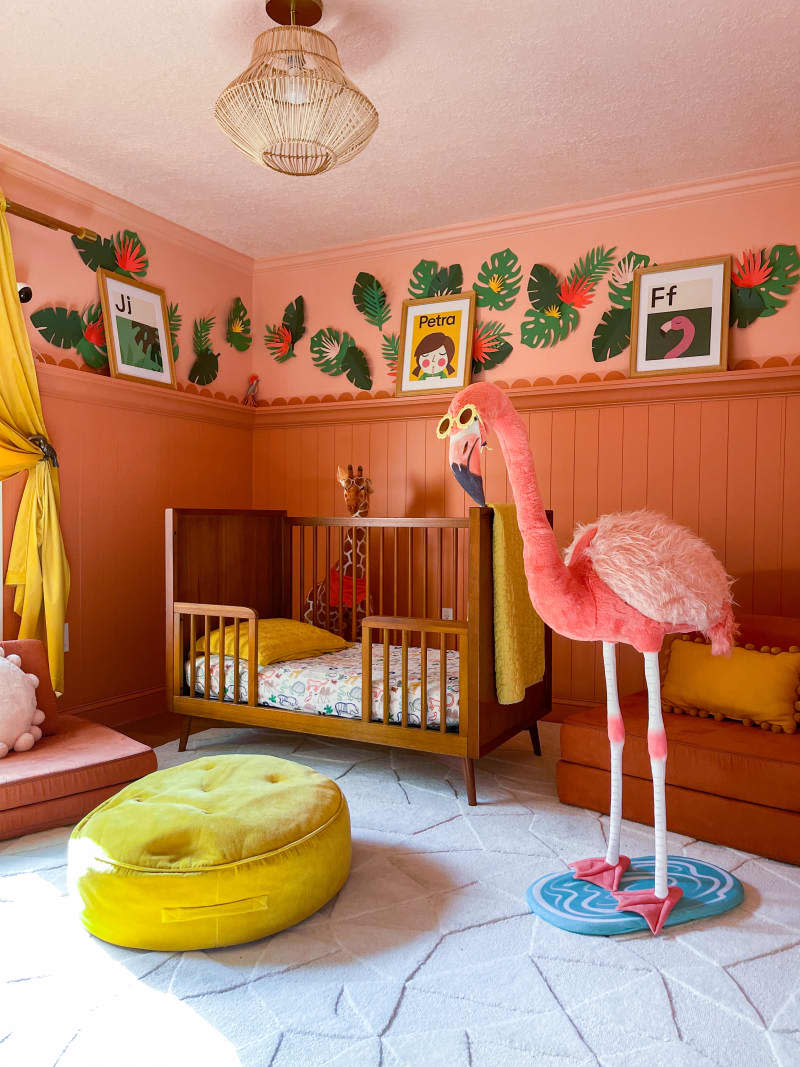
Tropical Heat
Mica, the content creator behind @mycolorfulfloridise, painted her daughter Petra’s room in Benjamin Moore’s “Adobe Dust” and “Peach Blossom” and used a stencil to trace and cut out the tropical leaves.
See more of this room: This Tampa House Is Like a Vibrant, Color-Drenched Oasis
Small and Sweet
Celia, who runs a YouTube channel and founded the decor shop Sticki Icki, created a nursery nook in the corner of her bedroom with a mini crib placed in front of a charming backdrop of wall decals from Fluke Decor and framed animal prints from The Crown Prints.
See more of this room: This Harlem Apartment Wows with Style and Renter-Friendly Small-Space Solutions
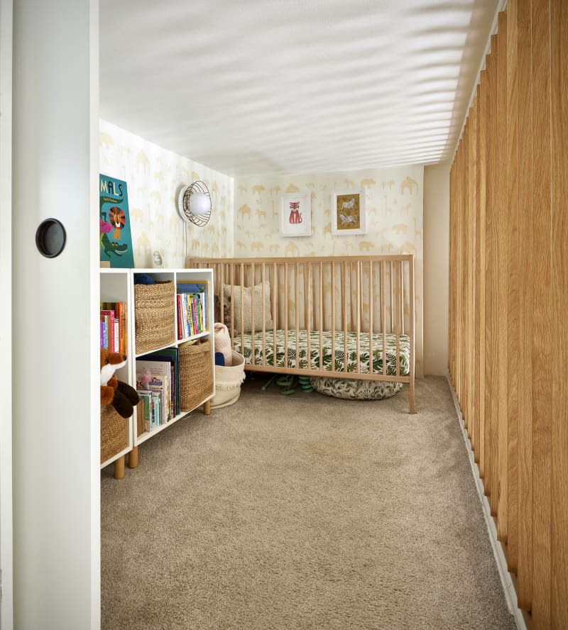
Subtle Jungle
Floor space was limited, but with 12- to 13-foot ceilings, this couple was able to turn a mostly unfinished storage loft in the apartment’s only bedroom into a nursery. To make the space safe and dark, they devised a wall of turn-able wooden slats that could be closed to block light and sound, or opened to let in air and natural light. A leaf-print crib sheet and animal wallpaper lend the room a subtle jungle theme.
See more of this room: A Small One-Bedroom Apartment’s Clever Reno Fits This Family of 3 Perfectly
