6 Paint Colors We're Loving For Kitchen Cabinets In 2023, According To Designers

From earth-inspired tones and cheery yellows to just-the-right neutral, we see a joyful kitchen in your future.

As one of (if not the) most important room in the home, the kitchen can be an overwhelming space to decorate. It’s a room that needs to be highly functional while also beautiful. With multiple purposes—from cooking and hosting to even eating within—kitchens must be simultaneously soothing, stylish, clean, and comforting, which leads many homeowners, by default, to the ubiquitous all-white kitchen. While the white kitchen may never completely go out of style, many designers are seeing homeowners who are more willing to branch out—especially when it comes to color. Many leading paint brands have already announced adventurous and playful tones as their 2023 color of the year. Designers are predicting (and already seeing) a shift towards homeowners opting to spice things up with everything from bold and earthy tones to new takes on neutrals. And where's the easiest place to bring a game-changing dose of color to the kitchen? The cabinets. Here are six paint trends we're currently crushing on that designers say are on the rise for kitchen cabinets in 2023.

Sherwin-Williams
Earthy Tones
Earthy hues started making their meteoric rise in the design world back in 2018 with Pinterest saves, specifically, skyrocketing for sage—and they haven’t slowed since. This year, three paint brands have already announced earthy tones as their color of the year for 2023—Sherwin-Williams Redend Point (SW 9081), PPG and Glidden’s Vining Ivy PPG1149-6, and many shades within Valspar’s 2023 color deck. Designers from Washington, D.C. to the Carolinas say earthier tones of different color families are making their way into the kitchen in 2023. “Think deep burgundy, mushroom white, oxblood red, dusty blue, deep fuschia and khaki green,” says interior decorator Rashida Banks who sees kitchen styles being influenced by the feel of the outdoors. Similarly, designer Cortney Bishop says, “We are pulling a lot of earthy reds and purple browns for our cabinetry right now, like Farrow & Ball’s Red Earth, No. 64 and Mahogany, No. 36.” And grassy green cabinets with black soapstone countertops are in Charlotte Lucas’s future.

Rosey Undertones
From warm whites with hints of pink to flirty pink tones, “it’s basically bringing in all the warmth,” says designer Monica Stewart of The Misfit House. A sophisticated and subtle hue can turn any room into an inviting space and pairs well with brighter whites. Hues like Benjamin Moore Bride To Be (1009), Featherstone (1002), and Early Sunset (2096-70) offer soft warmth like in this kitchen designed by Charlotte Lucas where she opted for Sherwin-Williams Corallite (SW 9698) in high gloss.
For a deeper shade try Farrow & Ball’s Templeton Pink, No. 303 or Farrow & Ball’s Peignoir, No. 286.

Golden Hues
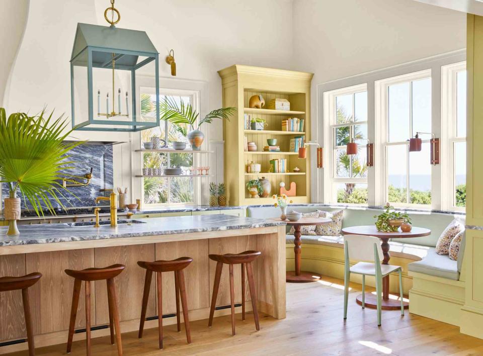
It might seem like a bold choice, but we love playful palettes entering the kitchen. Monica Stewart notes nothing says cheery kitchen (even when there is no sun) more than gold tones—from deep browns to sunny yellows! Lively hues can spark joy and bring positive energy into even one of the hardest-working rooms in the house. Pick a bright shade that's grounded in nature, and pair it with neutral accents—like interior designer Cortney Bishop did here with Farrow & Ball's Churlish Green, No. 251 in this Kiawah Island, South Carolina, kitchen. You can opt for a brighter yellow that still has a softness to it like Sherwin-Williams Fun Yellow (6908) or Benjamin Moore Hawthorne Yellow (HC-4) or choose a richer, more golden yellow like Farrow & Ball’s Babouche, No. 223 or Benjamin Moore Goldfield (292). We also like Farrow & Ball’s India Yellow, No. 66 with a stronger brown undertone.

Not-Too-Neutral
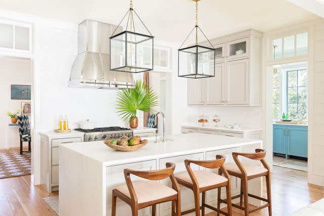
Traditionalists, this one's for you. While all-white kitchens are (mostly) on the way out, at the end of the day, it’s all about filling your home with colors you love. If a neutral kitchen is where you feel most comfortable—try adding a layer of depth when it comes to painting your kitchen cabinets. “The white kitchen will never completely go out of style, but for those clients willing to step out (a little) of the box, we have dreamt up some pretty exciting new schemes using classic colors in new ways,” says Charlotte Lucas. White paints with cool undertones can sometimes come off as stark and sterile, especially when paired with marble or quartz countertops for a monochromatic look. Instead, opt for a warm, creamy white that keeps the kitchen feeling like a welcoming gathering spot for all—like Benjamin Moore's Collingwood (OC-28) as seen above. Behr even named Blank Canvas (DC-003) their 2023 color of the year. For designer Laura Hodges, neutrals like Sherwin-Williams Meander (SW 9522) and Farrow & Ball’s Pavilion Gray, No. 242 are making their way into 2023. Bringing color into a space isn’t just about the paint—you have to consider what you’re pairing it with in the room. So, if you opt for a neutral paint color, bring in touches of color with your finishes, surfaces, fabrics, and artwork.

Warm Greens
Evergreen shades only increased in popularity during the pandemic, when homeowners sought to bring nature-inspired hues inside to help us exhale and the trend hasn’t let up. It's clear that subdued greens have solidified themselves as go-to neutrals for homeowners. Valspar included two shades, Flora 5004-2C and Green Trellis 5006-3C, in their 2023 colors of the year collection. In this kitchen (above), the cabinets painted in Sherwin-Williams Pewter Green (SW 6208) help to ground the lofty space while surrounding walls painted a soft gray-blue, Sherwin-Williams Oyster Bay (SW 6206), keep the darker shade from feeling too dramatic. Designer Laura Hodges sees warm green tones like Benjamin Moore Saybrook Sage (HC-114), and deep greens like Farrow & Ball’s Carriage Green, No. 94 continuing to be favored into the new year.

Buttery Yellow
Designer Charlotte Lucas says the kitchen deserves a little fun. “We just painted one a buttery yellow that has really warmed up the space with a butcher block countertop!” she says. This back kitchen (shown above) shows us how a fresh shade of soft yellow like Sherwin-Williams Fresh Zest (SW 9662) is the perfect way to add a hint of color to any room. Another soothing and elegant choice is Valspar’s Saffron Ivory (7003-21) or Behr Butter Yellow (ICC-90). The playful part about this shade is how its hue is often dependent on they way the light reflects within the room and time of day—lending itself to be nearly white or a creamy yellow.
Frequently Asked Questions
What kind of paint is best for kitchen cabinets?
Semi-gloss, gloss, or satin paints are best for kitchen cabinets. Before painting, always prepare the kitchen cabinets by removing grease and residue, then sanding them to a smooth surface.
Is it better to paint cabinets with a roller or brush?
Use a roller for ease and convenience when painting kitchen cabinets with a smooth surface. Touch up smaller spaces and hard-to-reach spots with a paintbrush.
For more Southern Living news, make sure to sign up for our newsletter!
Read the original article on Southern Living.