7 Incredible Design Ideas to Steal from the Most “Pinned” Kitchen of All Time

There are some homes on Pinterest that are so famously influential that you immediately recognize them when they pop up. And if you’re an avid Pinterest user, chances are you have them pinned multiple times … on multiple boards. One of those spaces is Julia Berolzheimer’s kitchen. As the founder of her namesake lifestyle site and co-founder of fashion and home brand Parterre, her aesthetic point of view is a source of inspiration for hundreds of thousands on a daily basis, all over social media. And that translates directly into her kitchen, which has all kinds of design ideas you’ll definitely want to steal for yourself.
1. Incorporate texture.
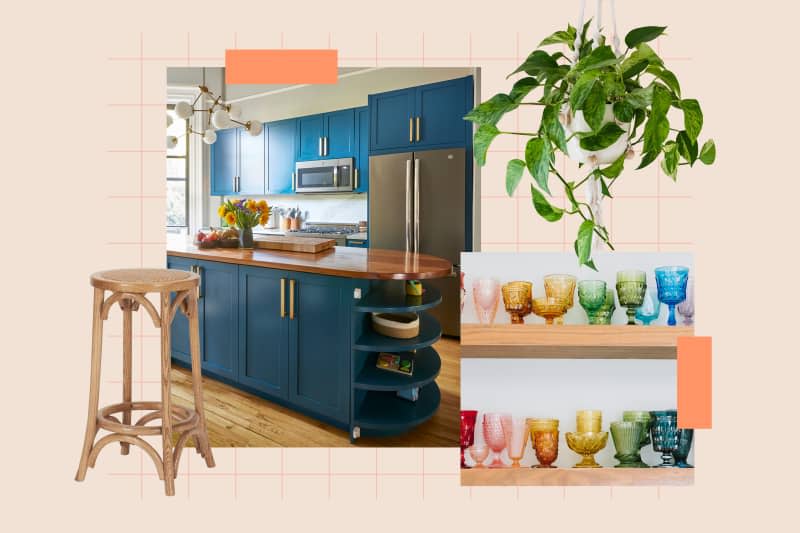
Kitchens are typically full of smooth, sleek surfaces. Adding some contrast via texture creates visual interest, making all the time you spend in yours that much more enjoyable. Rattan, as seen in Berolzheimer’s kitchen and on these stools, is a popular pick for its casual versatility.
2. Put colored glassware on display.
Your collections are meant to be seen, and making the space for them is easier if they have a functional purpose, too. A wall of colorful glassware makes a statement, incorporating a rainbow of hues without overwhelming the space. You can find this glassware at your local vintage store, or shop Julia’s very own designs at Pottery Barn.
3. Invest in aesthetically pleasing appliances.
Who doesn’t love a clean counter? With as much use as the kitchen gets, though, this isn’t necessarily realistic — not even for Berolzheimer. If you have to keep small appliances out, they might as well be attractive ones, like her Smeg toaster. It’s somewhat of an investment, but your senses will thank you.
4. Use pitchers as vases.
Kitchens are often full of different gadgets, so it’s helpful when functional decor can pull double-duty. Using a pitcher as a vase brings a rustic touch to the space — and guarantees it’ll get way more use than it would otherwise.
5. Add life to the space with greenery.
We’re all about fresh flowers, but there’s something about walking into a room with greenery that can be especially refreshing. It’s always available at your local grocery store or flower shop, but if you don’t have the budget to always buy fresh bundles when the old ones start to brown, consider going faux instead.
6. Collect unique dinnerware.
Similar to colored glassware, the eclectic nature of different dinnerware sets is worth showing off. These plates were designed by Berolzheimer, but look like a vintage set you unearthed in an estate sale. Bonus: By letting your dinnerware have its moment to shine, you may have room in your cabinets to store some of your less attractive kitchen gear!
7. Embrace blue and white.
There’s hardly a color scheme more classic than blue and white, and Berolzheimer’s kitchen is proof of how intuitive it is to execute. The cabinets are painted “Parma Gray” by Farrow & Ball, while the shiplap is “Simply White” by Benjamin Moore, but you can always incorporate the palette in smaller ways like with canisters or serveware.
What’s your favorite part of Berolzheimer’s kitchen? Let us know in the comments below!