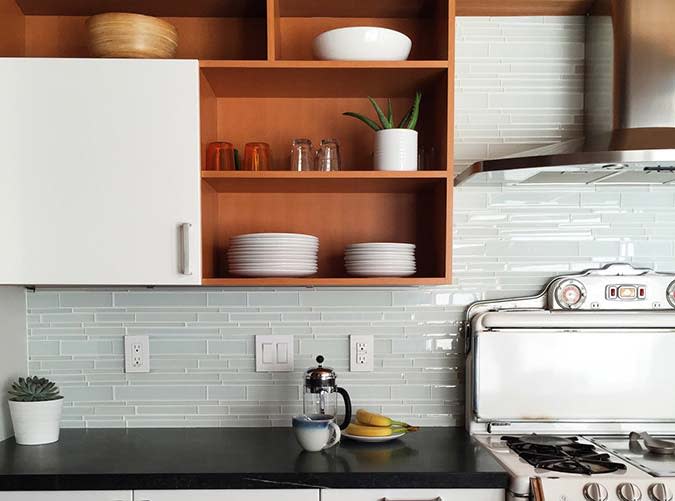
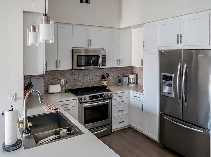
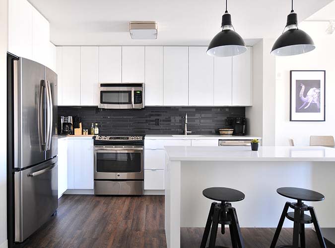
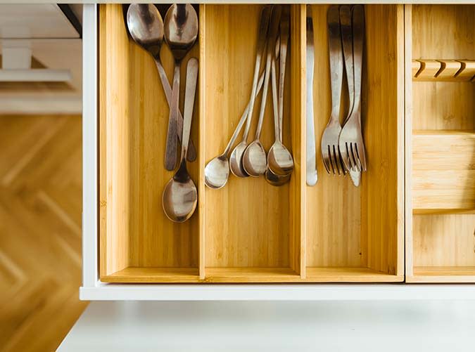
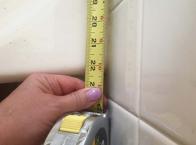
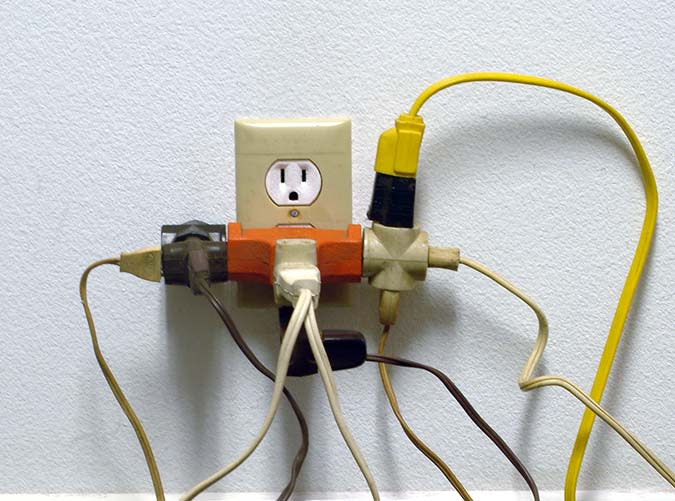
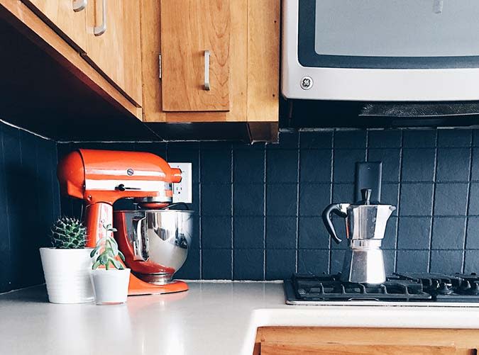
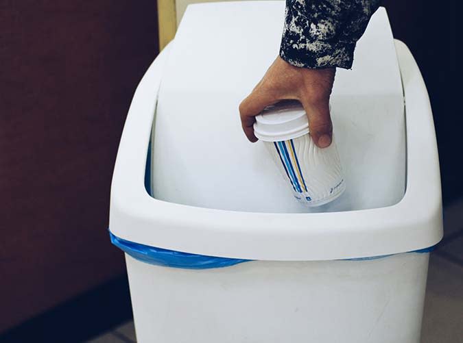
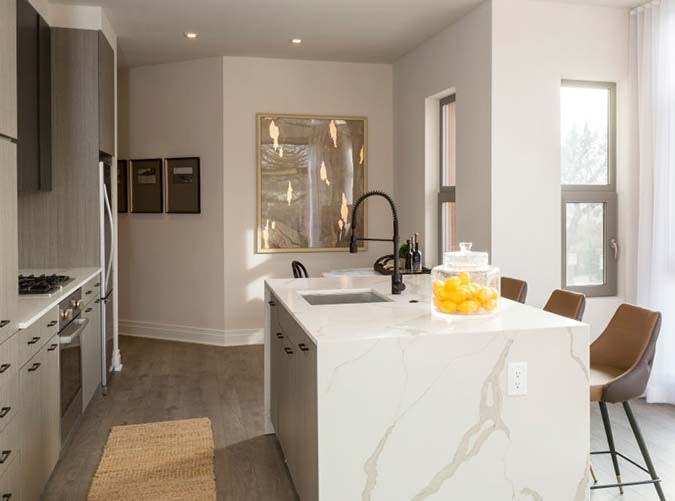
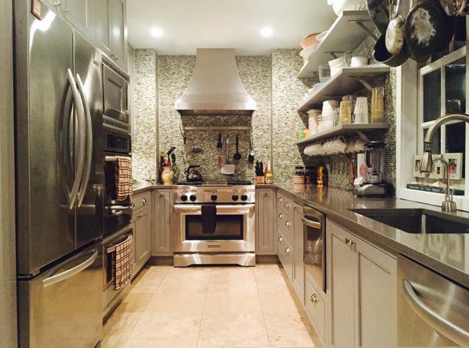
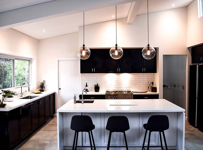
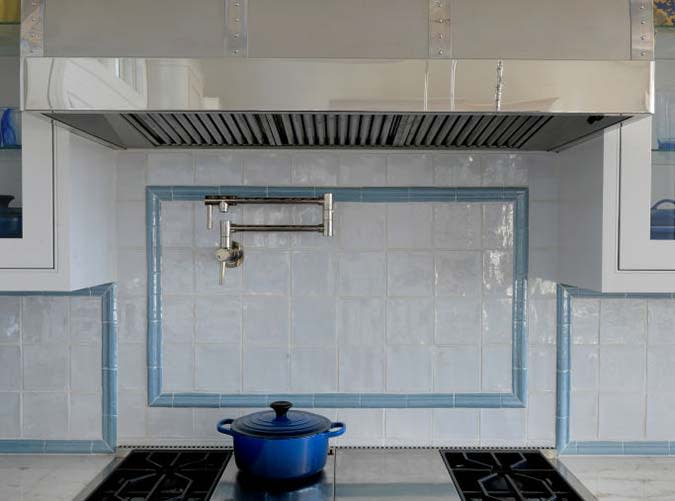
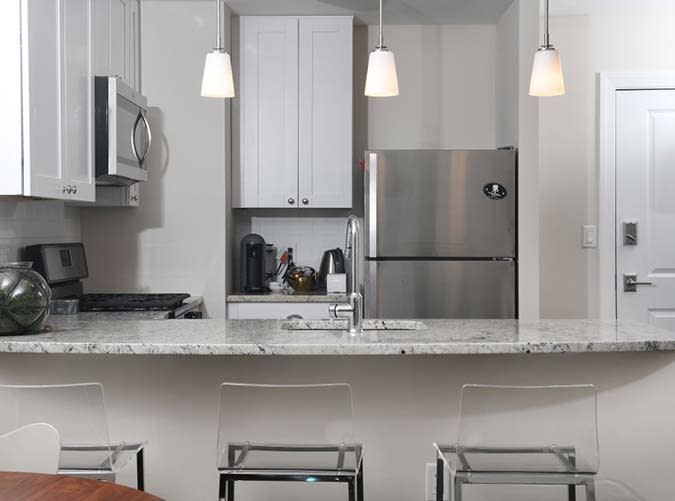
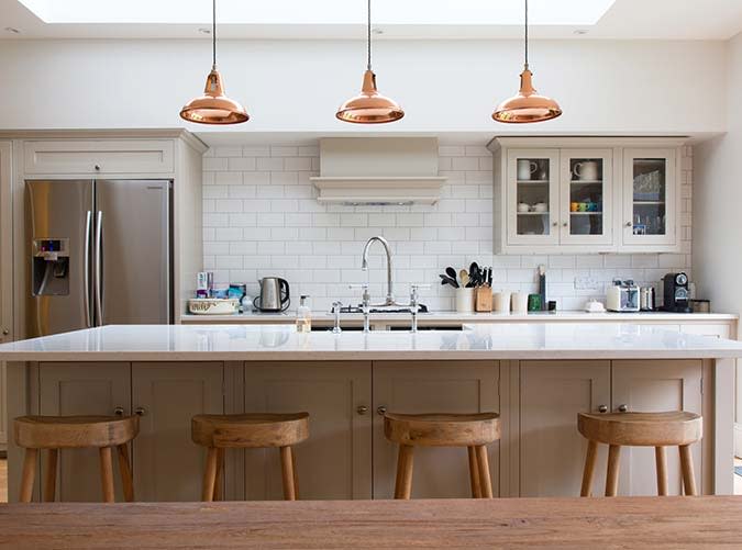
The 8 Most Common Kitchen Design MistakesPureWowSat, August 22, 2020 at 3:10 PM UTCMistake #1: Too much open shelving Open shelving is gorgeous. But be honest with yourself: Do you want every novelty mug and bottle of generic-brand ketchup on display?THE WASHINGTON POST /GETTY IMAGESSolution: Open shelving in moderation Think about items you’d be proud to display, and that you can realistically keep organized. Put these things (say, your wedding china or that funky bowl you got in Kenya) front and center—and hide your ugly stuff behind closed-door cabinetry.Twenty20Mistake #2: Too much stainless steel While it’s totally fine to choose fridges, ovens and dishwashers with a shiny chrome finish, keep in mind that once you add in stainless hardware, sinks and lighting fixtures, your cozy hearth might start to look a little like a morgue.Twenty20Solution: Mix in other materials Call us crazy, but we like a little variety. (How sleek is this kitchen with flat-front cabinets and matte black design details?)NAOMI HéBERT/UNSPLASHMistake #3: Things that open into other things (or the wrong way) If you’ve got two cabinets that can’t both be open at the same time… you’ve made a mistake. Same goes for a fridge that opens away from the heart of the kitchen.JAROS?AW CEBORSKI/UNSPLASHSolution: Measure twice When designing your kitchen, imagine opening every single door at the same time. Is there anything that might come into contact? If you’re not sure, break out the measuring tape.TWENTY20Mistake #4: Not including enough electrical outlets Hey, guess what? Everything you love in life—from your KitchenAid to your iPhone—plugs into the wall. You’re going to need more than two outlets, lady.TOM KELLEY/GETTY IMAGESSolution: Load up on sockets Strategic and ample placements are key.TWENTY20Mistake #5: Forgetting about the trash Compared to backsplashes and countertops, trash is so not sexy. Make sure you carefully consider its placement—or risk being the woman with a big, hulking eyesore in the middle of her French farmhouse kitchen.Twenty20Solution: Pull-out drawers (or stowed cans) Treat yourself to separate bins for regular, paper and plastic. Spring for soft-close cabinetry while you’re at it.THE WASHINGTON POST /GETTY IMAGESMistake #6: Not having enough types of lighting Psst: You’re technically supposed to have three types of lighting in your kitchen: overhead, spot and accent. (If you’re missing the latter two, chances are your kitchen looks sterile.)TWENTY20Solution: Vary your lighting types, sources and wattage In addition to overhead or high-hat bulbs, illuminate prep areas with pendant or track lighting. And can we talk about under-cabinet lighting for a minute? Yeah, you’re gonna want that to show off your sexy backsplash. (P.S. Go for LED bulbs. They last 15 years!)Twenty20Mistake #7: Not having proper ventilation Smell that? That’s the homemade marinara sauce you cooked two days ago.Twenty20Solution: Install a hood or ceiling fan Oven hoods don’t just look pretty (although: swoon), they also work crazy well to vent smoke, heat and smells to the outside world. Don’t have the space or budget for a hood? Even a ceiling fan or vented microwave can help with your smoke show.THE WASHINGTON POST/GETTY IMAGESMistake #8: Playing it too safe Yes, you have to think about resale. Yes, you need a kitchen that won’t look dated in ten years. But c’mon people: Live a little.THE WASHINGTON POST /GETTY IMAGESSolution: Add in subtle design elements and pops of color This is the room in which you will arguably spend most of your time—make it reflect your (non-boring) personality. Take a chance on interesting features, like rustic stools or glamorous lighting fixtures. Twenty20The 8 Most Common Kitchen Design Mistakes1 of 16Mistake #1: Too much open shelving Open shelving is gorgeous. But be honest with yourself: Do you want every novelty mug and bottle of generic-brand ketchup on display?THE WASHINGTON POST /GETTY IMAGESThe 8 Most Common Kitchen Design Mistakes1 of 16Mistake #1: Too much open shelving Open shelving is gorgeous. But be honest with yourself: Do you want every novelty mug and bottle of generic-brand ketchup on display?THE WASHINGTON POST /GETTY IMAGESThe 8 Most Common Kitchen Design Mistakes2 of 16Solution: Open shelving in moderation Think about items you’d be proud to display, and that you can realistically keep organized. Put these things (say, your wedding china or that funky bowl you got in Kenya) front and center—and hide your ugly stuff behind closed-door cabinetry.Twenty20The 8 Most Common Kitchen Design Mistakes3 of 16Mistake #2: Too much stainless steel While it’s totally fine to choose fridges, ovens and dishwashers with a shiny chrome finish, keep in mind that once you add in stainless hardware, sinks and lighting fixtures, your cozy hearth might start to look a little like a morgue.Twenty20The 8 Most Common Kitchen Design Mistakes4 of 16Solution: Mix in other materials Call us crazy, but we like a little variety. (How sleek is this kitchen with flat-front cabinets and matte black design details?)NAOMI HéBERT/UNSPLASHThe 8 Most Common Kitchen Design Mistakes5 of 16Mistake #3: Things that open into other things (or the wrong way) If you’ve got two cabinets that can’t both be open at the same time… you’ve made a mistake. Same goes for a fridge that opens away from the heart of the kitchen.JAROS?AW CEBORSKI/UNSPLASHThe 8 Most Common Kitchen Design Mistakes6 of 16Solution: Measure twice When designing your kitchen, imagine opening every single door at the same time. Is there anything that might come into contact? If you’re not sure, break out the measuring tape.TWENTY20The 8 Most Common Kitchen Design Mistakes7 of 16Mistake #4: Not including enough electrical outlets Hey, guess what? Everything you love in life—from your KitchenAid to your iPhone—plugs into the wall. You’re going to need more than two outlets, lady.TOM KELLEY/GETTY IMAGESThe 8 Most Common Kitchen Design Mistakes8 of 16Solution: Load up on sockets Strategic and ample placements are key.TWENTY20The 8 Most Common Kitchen Design Mistakes9 of 16Mistake #5: Forgetting about the trash Compared to backsplashes and countertops, trash is so not sexy. Make sure you carefully consider its placement—or risk being the woman with a big, hulking eyesore in the middle of her French farmhouse kitchen.Twenty20The 8 Most Common Kitchen Design Mistakes10 of 16Solution: Pull-out drawers (or stowed cans) Treat yourself to separate bins for regular, paper and plastic. Spring for soft-close cabinetry while you’re at it.THE WASHINGTON POST /GETTY IMAGESThe 8 Most Common Kitchen Design Mistakes11 of 16Mistake #6: Not having enough types of lighting Psst: You’re technically supposed to have three types of lighting in your kitchen: overhead, spot and accent. (If you’re missing the latter two, chances are your kitchen looks sterile.)TWENTY20The 8 Most Common Kitchen Design Mistakes12 of 16Solution: Vary your lighting types, sources and wattage In addition to overhead or high-hat bulbs, illuminate prep areas with pendant or track lighting. And can we talk about under-cabinet lighting for a minute? Yeah, you’re gonna want that to show off your sexy backsplash. (P.S. Go for LED bulbs. They last 15 years!)Twenty20The 8 Most Common Kitchen Design Mistakes13 of 16Mistake #7: Not having proper ventilation Smell that? That’s the homemade marinara sauce you cooked two days ago.Twenty20The 8 Most Common Kitchen Design Mistakes14 of 16Solution: Install a hood or ceiling fan Oven hoods don’t just look pretty (although: swoon), they also work crazy well to vent smoke, heat and smells to the outside world. Don’t have the space or budget for a hood? Even a ceiling fan or vented microwave can help with your smoke show.THE WASHINGTON POST/GETTY IMAGESThe 8 Most Common Kitchen Design Mistakes15 of 16Mistake #8: Playing it too safe Yes, you have to think about resale. Yes, you need a kitchen that won’t look dated in ten years. But c’mon people: Live a little.THE WASHINGTON POST /GETTY IMAGESThe 8 Most Common Kitchen Design Mistakes16 of 16Solution: Add in subtle design elements and pops of color This is the room in which you will arguably spend most of your time—make it reflect your (non-boring) personality. Take a chance on interesting features, like rustic stools or glamorous lighting fixtures. Twenty20About Our Ads