Architect Peter Marino on his new Chanel "townhouse" boutique
For a fashion label so associated with tailoring, it is fitting that every Chanel store is designed with its own, highly detailed, bespoke interior.
Three have opened in the past few weeks – major renovations of its flagship stores on Paris’s Rue Cambon and New York’s 57th Street, and a new boutique on Walton Street in London’s Brompton Cross district – all created by Peter Marino, the American architect so integral to the company’s image that he has himself become a face of the brand.
Marino’s relationship with Chanel began, he says, ‘when brontosauruses roamed the earth’–or specifically, in 1982 when, as a young architect in his early 30's, he worked on private homes for the Wertheimer family (the company’s owners).
As well as the Paris, London and New York stores, there are others about to open in Chicago and Seoul, all adding to a grand total of 198 worldwide.
"It’s a real wave," he says. "A whole lot of waves of Chanel at once." These days, his work is fairly evenly split between commissions for private homes, hotels and high-end retail, and, unusually for an architect with such a strong connection to a particular fashion label, he has designed stores for others too, including Dior, Fendi and Louis Vuitton.
What sets Marino apart is, to an extent, his own personal brand– he cuts a striking figure, rarely seen without his armour of custom-made leathers, cap, sunglasses and thick moustache (his ‘tattooed biker look’, as he has referred to it) – but also his innate understanding of what elevates a shopping experience into something meaningful.
His response to the rise of online purchasing is to create an atmosphere and sense of occasion that cannot be experienced virtually. "People say, 'Why would I go to a store when I can buy it online?'" he says.
"When people have this attitude, I tell them there’s an interesting statistic: only one out of every four people who walk into a luxury boutique purchases something. What is important is that all four of the people who went into that boutique, including the people who didn’t buy anything, leave with a positive impression of the brand.
You can’t do that on the internet – every brand looks the same. A handbag’s a handbag’s a hand-bag… one is £169, one is £1,690. Online, you can’t really see the difference. My job is to enhance the experience."

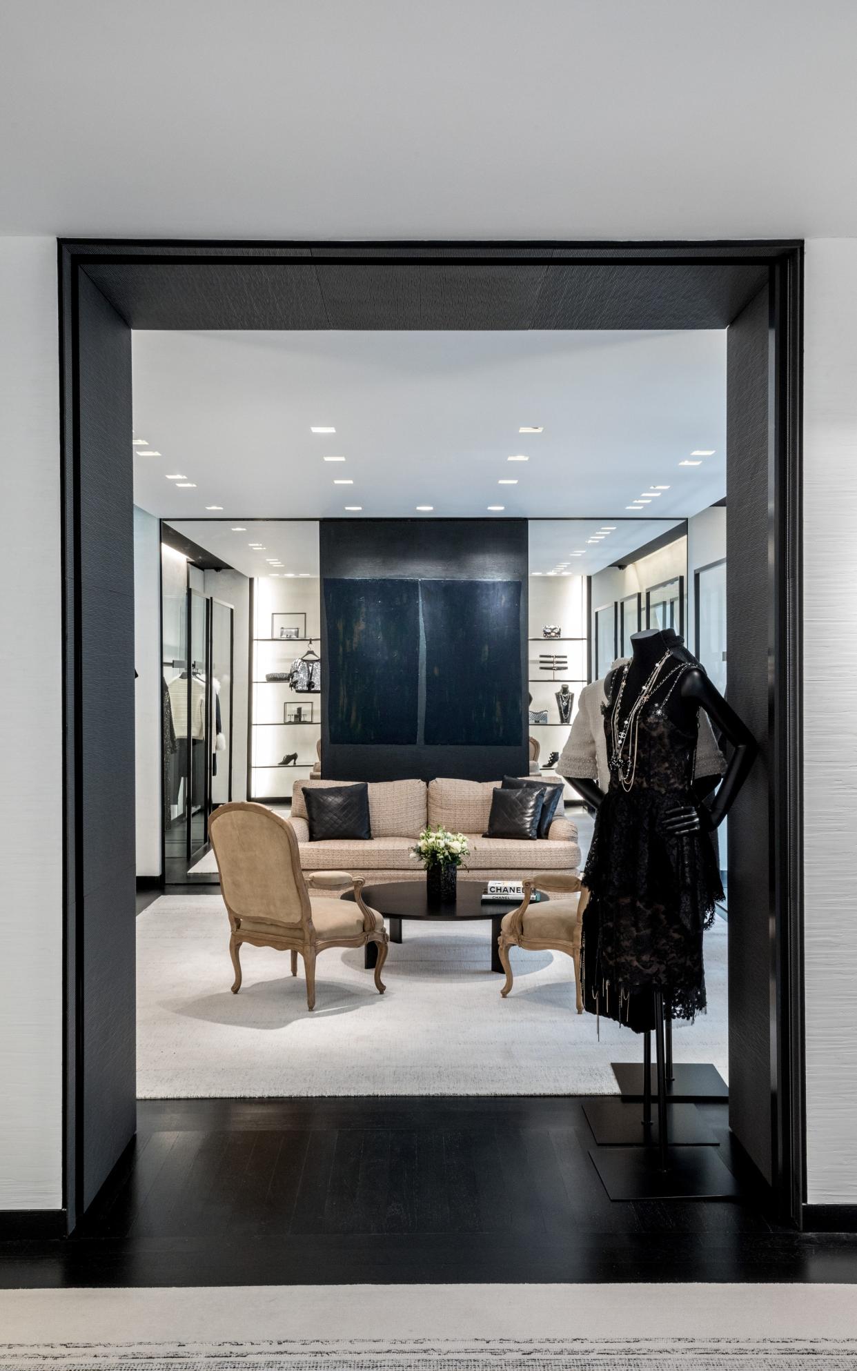
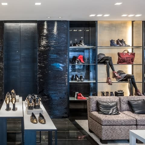
A Chanel customer walking into a store will instantly feel at home, thanks to certain design codes that are woven into the company’s DNA: a palette of black, white and beige; tweed and bouclé – whether used as fabrics and carpets, or within artworks and finishes; and what Marino calls ‘touches of the baroque’.
In the case of the London boutique, this comes in the form of a pair of Louis XV armchairs, a reference to Coco Chanel’s Rue Cambon apartment.
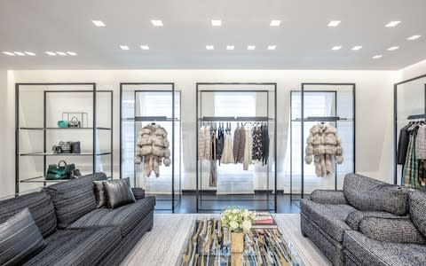
Yet each space has to be unique, and reflect its surroundings. The Walton Street store has the homely feel of a townhouse – albeit an extremely elegant one – rather than the grandiose drama of the larger flagships. "We wanted it to feel friendlier, more in keeping with the neighbourhood," says Marino.
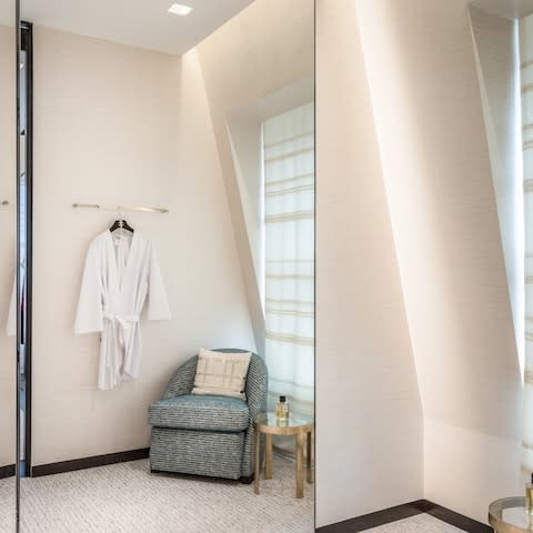
Cosy sitting areas and handmade window panels by embroiderers Lesage reinforce the residential feel, as does the scale of the artworks. For Marino, a serious collector and patron (he originally wanted to study art before taking a degree in architecture at Cornell University, and has produced his own works in bronze and glass), art is an essential tool to root a store within its surroundings.
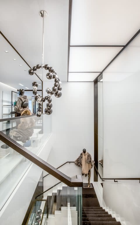
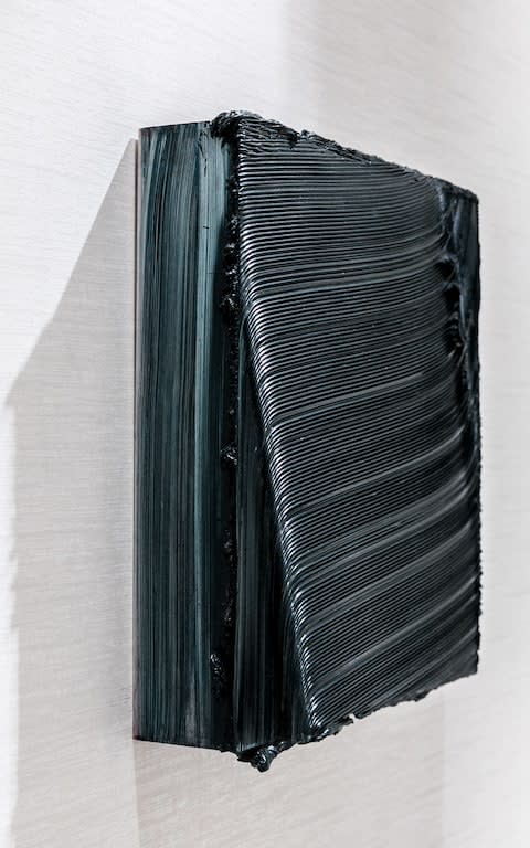
For Chanel, he will always include a piece by a female artist (here, a tweed-inspired photographic work by Michal Rovner), one by a French artist (Jean-Michel Othoniel’ s Murano-glass sculpture, which hangs in the stairwell), and one by somebody local to the store’s setting (the British painter Jason Martin, who produced the ‘beautiful little black square’ that hangs in a dressing room).
Contemporary art is also away to reflect the current cultural mood ; something key, for Marino, to the shopping experience: his stores are updated every three years, to ensure they feel relevant and fresh to customers.
"Fashion is one of the quickest reactors to the sociological and economic times in which we live," he says. "Not quite as quick as a painting, but it’s right up there. Keeping up with it is fun; I have to keep my ear to the ground so I don’t get stale, even though I’m 150 years old. It keeps you on your toes."
Sign up for the Telegraph Luxury newsletter for your weekly dose of exquisite taste and expert opinion.