The best movie monster designs: Godzilla, King Kong and more

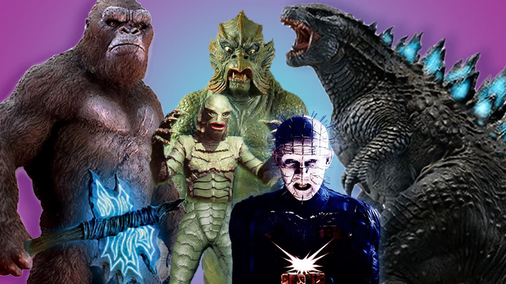
Godzilla x Kong: The New Empire sees two of the best movie monsters team up once more. So what better excuse for us to recap on the best monster designs we've seen on screen over the years? And there are plenty to choose from.
Almost since cinema existed it has been populated by monsters (Carl Boese y Paul Wegener's Der Golem from 1920 is often considered the first film with a monster). Many were designed to frighten, other to amuse, while some have changed their roles over time. And many of the most memorable have spawned franchises that have lasted years if not decades, becoming some of the most popular characters on screen.
Below we round up our favourite movie monster designs, from Godzilla x Kong to Alien to mythological beasts and horror icons, and explore where some of the inspiration came from. For more movie inspiration see our pick of the best Dune art and the history of the Ghostbusters logo.
01. Godzilla
Godzilla was the original kaiju, and this movie monster has undergone many changes over its 70 years, from the goggle-eyed suit of the original black-and-white classic from 1954 to Hollywood CGI. There are so many Godzilla films that the monster's temperament has inevitably changed several times. It became a fun comic character for a time and then became bad again, but generally Godzilla has got bigger and more powerful over the years, picking up new abilities on the way.
The original Godzilla was inspired by nuclear fears in the wake of the World War II. Today, the Hollywood Zilla can be read as an environmental message, but it's also a monster we can root for, restoring the planet's natural balance. Meanwhile, Toho's Japanese Godzilla remains bad, and downright weird if we include the rapidly evolving Shin Godzilla.
The Hollywood Godzilla for Gareth Edwards 2015 reboot was the work of MPC, with Guillaume Rocheron as VFX lead. Edwards was keen for Godzilla to look like a creation of nature rather than a fantasy character, but MPC also wanted to give the monster a presence and personality and to make his enormous scale feel believable. They studied footage of crocodiles and lizards and even bear fights to get the body mechanics right in the animation while adding enough humanised elements to make it possible for the audience to empathise with the monster.
For more on Godzilla's many incarnations, see our piece on the evolution of Godzilla.
02. King Kong
Godzilla x Kong: The New Empire is only the latest in a series of on-screen double acts we've seen from the two most famous movie monsters. Their collaborations and confrontations go all the way back to King Kong vs Godzilla in 1962, but Kong is older, dating way back to RKO Pictures' original from 1933.
The creator of the original Kong was the stop-motion artist Willis H. O'Brien, who was a huge influence on film effects, including on the legendary Ray Harryhausen. But for Peter Jackson's 2005 King Kong, Weta Digital, now Weta FX, made use of motion capture CGI. Kong's gestures and movements were acted by Andy Serkis, who was already familiar with the technique after his performance as Sméagol / Gollum in The Lord of the Rings.
03. The xenomorphs in Alien

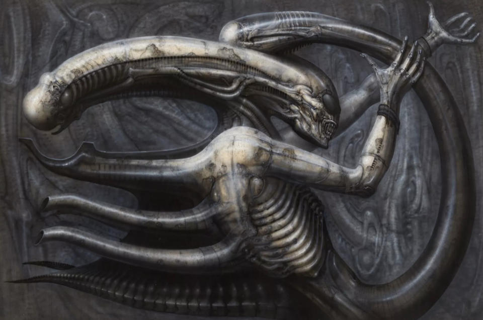
Moving from to space, designing aliens has always been a problem for the screen. Why would an alien species look human? On the other hand, a species that is too alien can be hard for filmgoers to relate to. Alien got the balance just right with the terrifying endoparasitoid xenomorphs (at least initially before the design and life cycle was transformed in successive expansions of the franchise).
Part of the success was undoubtedly thanks to the decision to bring in the Swiss artist H. R. Giger, who based the xenomorphs on his dark 1976 lithograph Necronom IV (he also designed the egg and chestburster forms of the alien as well as planetoid LV-426 and the Space Jockey vessel). Giger's design has a vaguely human form but it's different enough to feel genuinely alien, and terrifying enough to take Alien to the border between the sci-fi and horror genres. The alien has an inner set of pharyngeal jaws on a long proboscis, and it has no eyes, which Giger thought would make it more frightening since potential prey would be unable to tell if it was looking at them.
Giger took a biomechanical approach to his design, creating a mock-up using plasticine, parts of an old Rolls-Royce car, rib bones and the vertebrae from a snake, molded with plasticine. The practical effects for the Xenomorph's head in the movie were the work of the Italian special effects designer Carlo Rambaldi. The head apparently had 900 moving parts.
04. The Pale Man in Pan's Labyrinth
The Pale Man in Guillermo del Toro's Pan's Labyrinth may not have achieved the same mainstream fame as the movie monsters we've looked at so far, but it's the most deeply evocative of a long gothic tradition, incorporating elements from fairy tales.
The design of the humanoid Pale Man is quite horrifying, with folds of loose skin, a flat nose and eyeballs that fit in the palms of his hands. The monster was played by the contortionist and mime artist Doug Jones, who is no stranger to donning prosthetics or a monster suit: he played the zombie William "Billy" Butcherson in Disney's Hocus Pocus, the spy Morlock in The Time Machine and Abe Sapien in Del Toro's own Hellboy. The costume design was by Lala Huete.
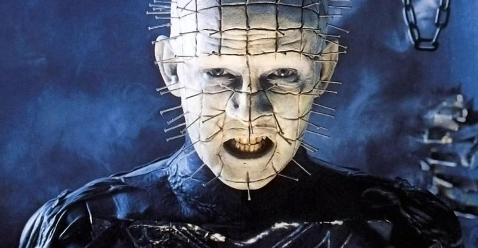
05. The cenobites from Hellraiser

Pan's Labyrinth certainly brings horror to movie monsters, but the Pale Man is Sulley from Monsters Inc in comparison with Pinhead and the other cenobites from Hellraiser. And while the cenobites may have once been human, they are very much monsters.
Clive Barker and producer Chris Figg brought in Bob Keen and Geoff Portass from Image Animation and costume designer Jane Wildgoose to bring his vision of sadistic extra-dimensional demons to life. Wildgoose said Barker asked her to design costumes for four to five 'super-butchers' who were to have "areas of revealed flesh where some kind of torture has, or is occurring" and a "repulsive glamour." Design influences ranged from punk and S&M fashion to the cassocks of Catholic priests.
06. The Kraken in Clash of the Titans
We can't talk about movie monsters without mentioning Ray Harryhausen. The legendary stop-motion visual effects artist was responsible for some of the biggest monsters seen on screen from the 1950s through to Clash of the Titans in 1981. And the climax of that final film was the confrontation with the kraken.
In this case, we are talking monsters from mythology, but ideas of how the kraken should look have varied dramatically. Harryhausen's stop-motion approach was already a little archaic by the time Clash of the Titans was released. I don't remember that bothering me as a kid, but it does look rather comical today.
The film was remade in 2010 with visual effects from MPC. VFX lead: Gary Brozenich went for a much more fearsome look that conveys the kraken's scale. Turning the original idea of the creature as squid or octopus-like, a big focus was put on the corkscrewing tentacles, which would resemble a rollercoaster as Hercules and Pegasus flew through them.
07. The Thing
John Carpenter's 1982 version of The Thing is up there with Alien when it comes to imagining a terrifyingly plausible new life form. John W. Campbell's novella Who Goes There? had been interpreted for the screen before in The Thing from Another World, but that 1951 film only showed the creature in a humanoid form. Carpenter's interpretation was much more faithful to the concept of the shape-shifting parasite in the original story, something made possible by advances in animatronics and less stringent censors.
It's incredible to think this was just a year after the original Clash of the Titans because the practical effects here are still terrifying today, and they're actually more convincing than the CGI used in the 2011 remake. There are animatronics that crawl like crabs or wriggle like worms, all moving in the right way for The Thing's particular form. Most of them were designed by Rob Bottin, while the Thing's dog form was the work of Stan Winston. Not everything that was originally envisioned was possible: storyboard artist Mike Ploog had sketched even more grotesque forms, including bodies with multiple heads.
08. Sulley
He might not be the most fearsome movie monster, but Pixar's Sulley is a memorable screen character. Voiced by John Goodman, the design of James P. Sullivan for Monsters Inc was said to have been based on the look of the prehistoric giant ground sloth, but he also has a very human face, little devil horns, feline fangs and an almost reptilian tail.
Sulley became a challenge for Pixar's technology and research technical director Christophe Hery in the 2013 prequel Monsters University. The bright blue and purple monster has 2,320,413 hair strands, 25,336 of which are key that guide the motion and shape of the others. Hery told us: "I was strong in my opinion that they should move to importance sampling. But there was one issue: I had no idea how to do hair with raytracing using importance sampling and physical models. When they hired me, they put me on Monsters University. Hair became a major research project for me."
The results are easily seen in the improved realism and softer shadows of the Sulley of Monsters University compared to the Sulley of Monsters Inc.
09. Frankenstein's monster
We can't close a roundup of the best movie monsters without mentioning one of the most enduring of all. Inspired by Mary Shelley's novel, Frankenstein's monster, often mistakenly called Frankenstein himself, first appeared on screen in a 1910 short silent film directed by J. Searle Dawley for Edison Studios. However, the defining image of the monster would be that created for James Whale's 1931 film for Universal, which spawned a clutch of sequels.
Boris Karloff played the monster, and the design was based on sketches that Whale made himself and which exaggerated Karloff's own features. The idea was to retain enough of the actor's features to give the creation a "pitiful humanity”. Makeup artist Jack Pierce built up the iconic eyebrow ridge and square head with spirit gum and a layer of cotton painted with collodion, a liquid plastic. It may seem like an almost comic interpretation today, but it became iconic, inspired copycats like Herman Munster and remains a Halloween favourite. Meanwhile, the concept of Mary Shelley's Frankenstein remains as intriguing as ever, most recently being revamped in Poor Things.
10. The Creature from the Black Lagoon
We'll finish with another iconic movie monster from the past. The Gill-Man (Ben Chapman in a suit) may not have dated well, but it's easy to see why this jungle adventure-turned-creature feature inspired such terror back in 1954. Our first glimpse of the monster is a clawed hand reaching up under the water. When Millicent Patrick's creature is fully revealed, it turns out to be a gem of a monster design: the body of a man with fins, the head of a fish and a frighteningly vacant look.
