A Boutique Hotel Inspired the Transformation of This Philadelphia Area Dining Room
"Hearst Magazines and Yahoo may earn commission or revenue on some items through these links."
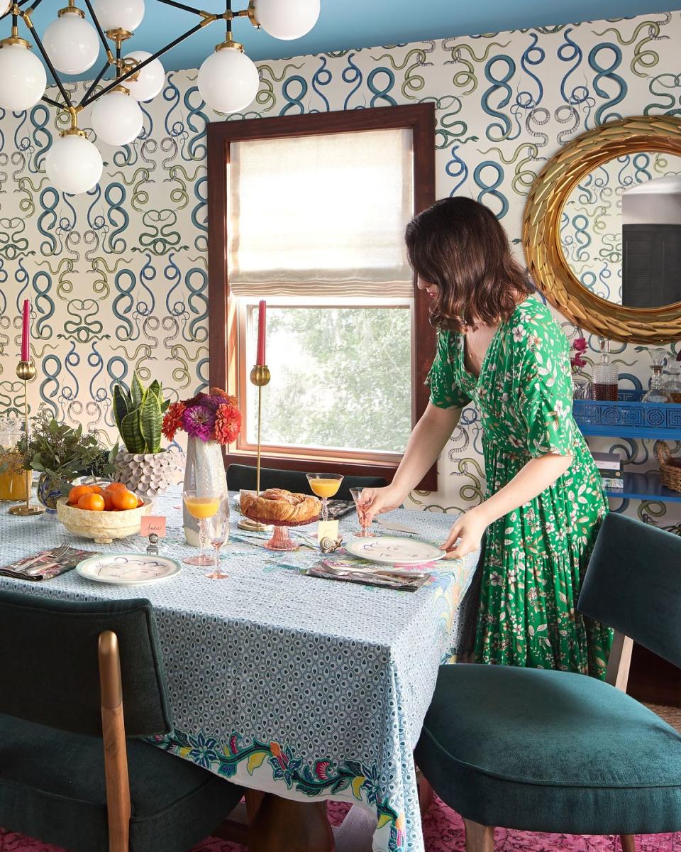
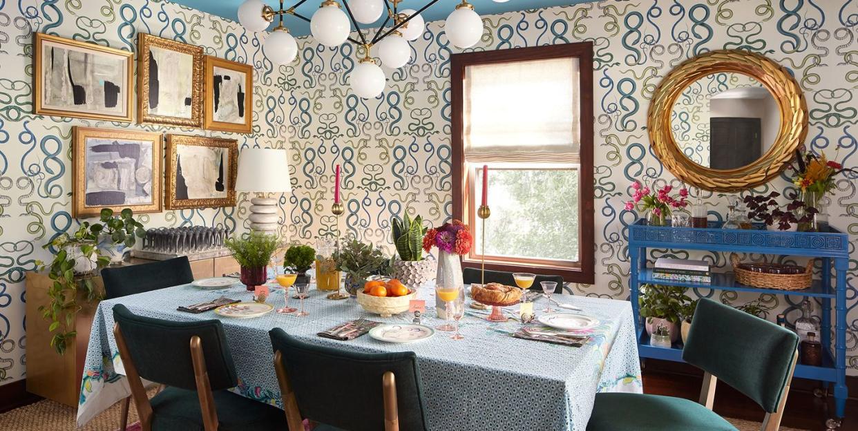
The clients were full of personality—but their dining room was not. “Before, the room was dark and decorated in a more transitional style, even though the homeowners have funky, quirky taste,” says designer Michelle Gage of the space, located Philadelphia-area home she was hired to transform. “We needed to put that on display.”
Gage did just that. The once bland, brown dining room in the 1923 Craftsman outside Philadelphia is now a lively showpiece. The inspiration? The lobby of a boutique hotel that the clients stayed in while traveling abroad, which the designer describes as “chic, cool, and full of curiosity."
Since the lobby is a gathering place for lounging rather than a room for sit-down dining, Gage didn’t borrow specific pieces of furniture. “We translated the inspiration into a brand new design better suited to a dining room,” Gage says. “We pulled out some of the delightful colors, textures, and materials, but added our own twist, like, snakes!”
Indeed, the designer covered all four walls with Schumacher “Giove” wallpaper featuring vertical cascades of snakes. From afar, the reptile renderings read as curlicues of lime green and sapphire sea life or stylized garden vines. Up close, the finely drawn creatures are delightful. "It’s a room they no longer shun,” Gage reports.
Tour the Dining Room
“Their style leans more eclectic; the ‘before’ version of this room had none of that,” Gage says. The “after” is all that and more. “We brought in snake wallpaper, a hot pink rug, emerald green velvet chairs, and a statement light fixture,” the designer says. Gage re-used the family’s existing dining table and took subtle cues from the chinoiserie pattern on the prior roman shade, which pictures peacocks among flowering branches.
Wallpaper: Schumacher.
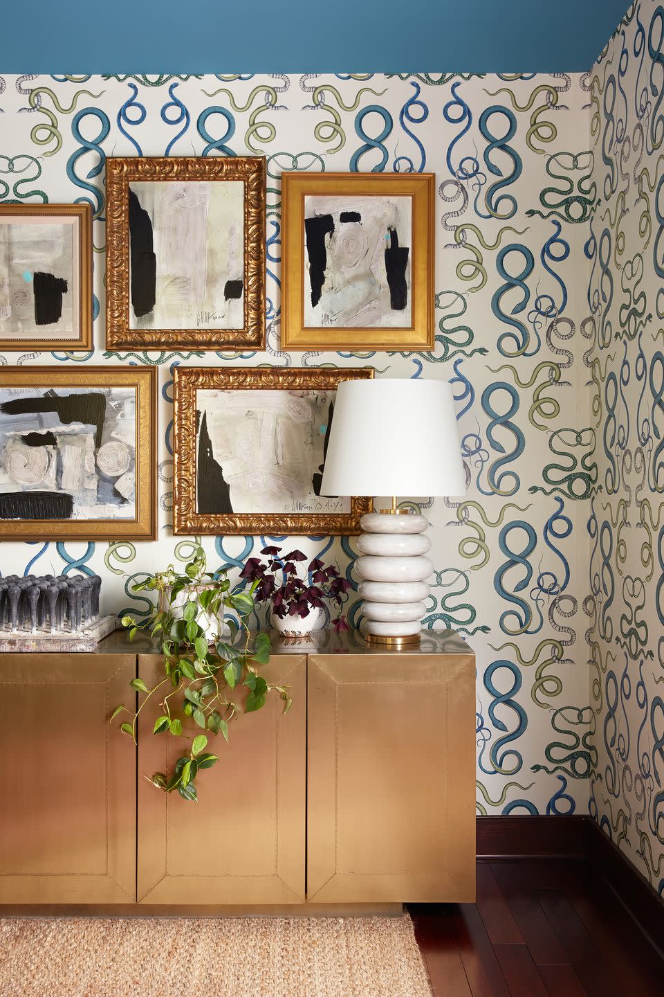
A series of custom reproductions of Graham Harmon’s abstract expressionist paintings make a bold statement over a brass-clad sideboard that provides storage for serveware and such. The organic shapes of the stacked ceramic-glazed lamp by Kelly Wearstler plays off the free-form shapes in the artwork while the white linen drum shade echoes the fields of white in the compositions.
Artwork: Soicher Marin. Credenza: Burke Decor. Lamp: Circa Lighting.
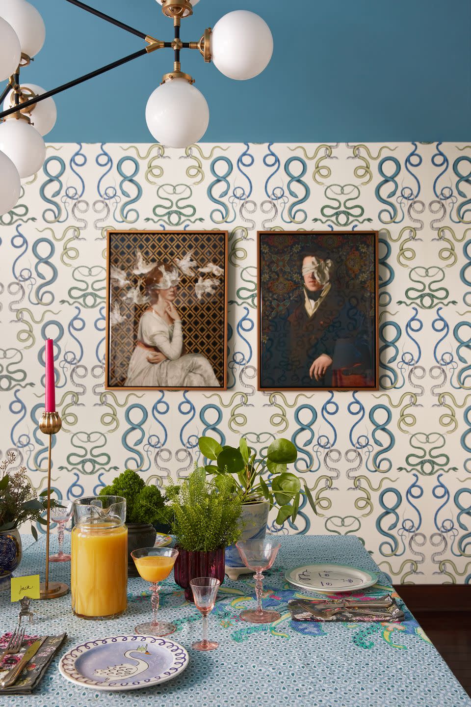
A pair of cheeky portraits, Love is Blind and See No Evil by Jackie Von Tobel, inject a sort of dignified humor into the room. The golden finish of the float frames around the giclée on canvas works are consistent with the other pieces that adorn the walls. A tall, skinny candlestick holder brings gold to the table and mimics the chandelier’s orbs.
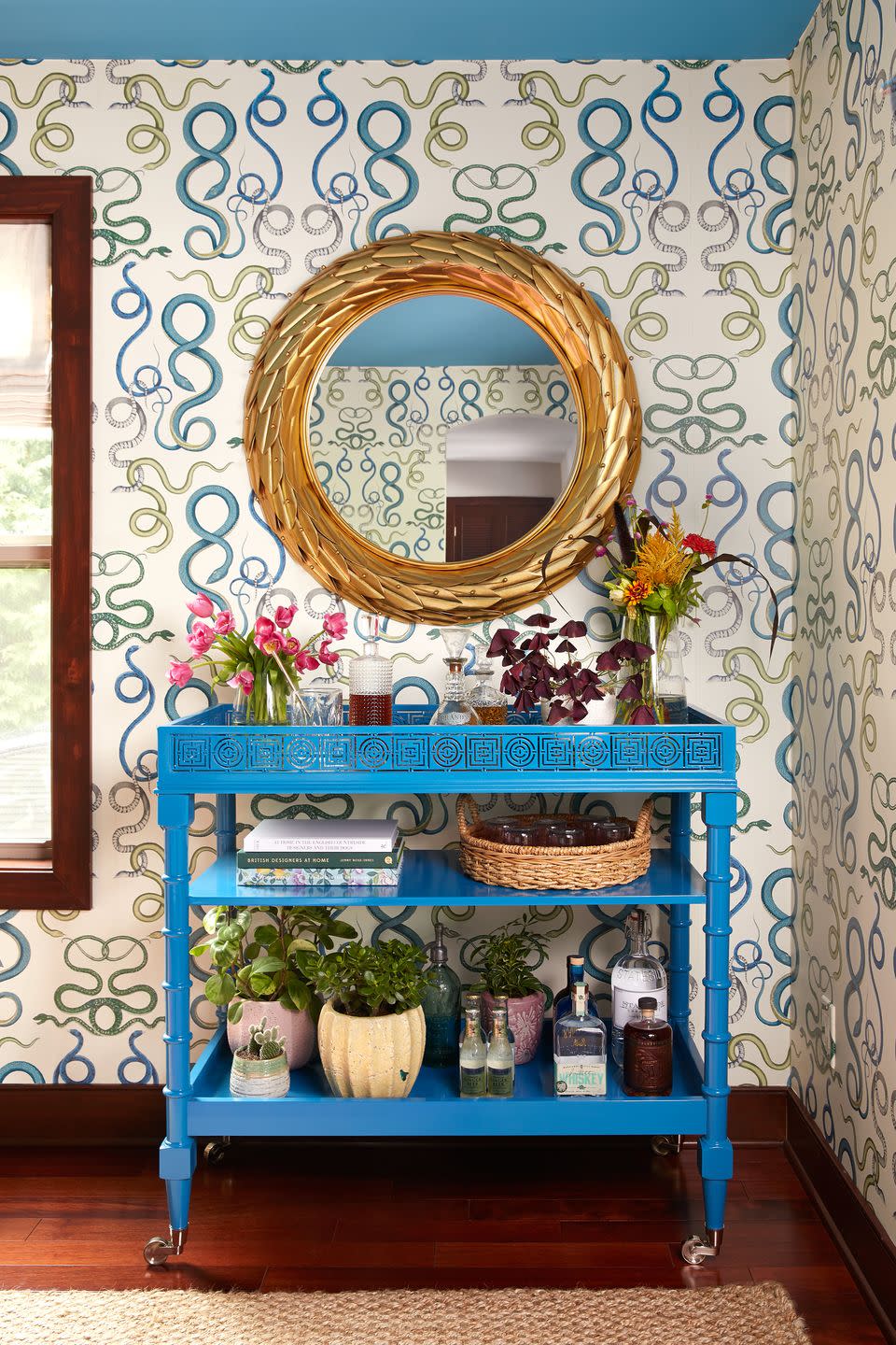
A gilded metal laurel leaf mirror adds texture and old-world glam above a rolling bar cart with faux bamboo legs and laser-cut geometric detailing with an Asian-style aesthetic. The iconic Florence Broadhurst design helps lend a sense of well-traveled history to the space.
Console: Florence Broadhurst. Mirror: Burke Decor.
Tour the Bathroom
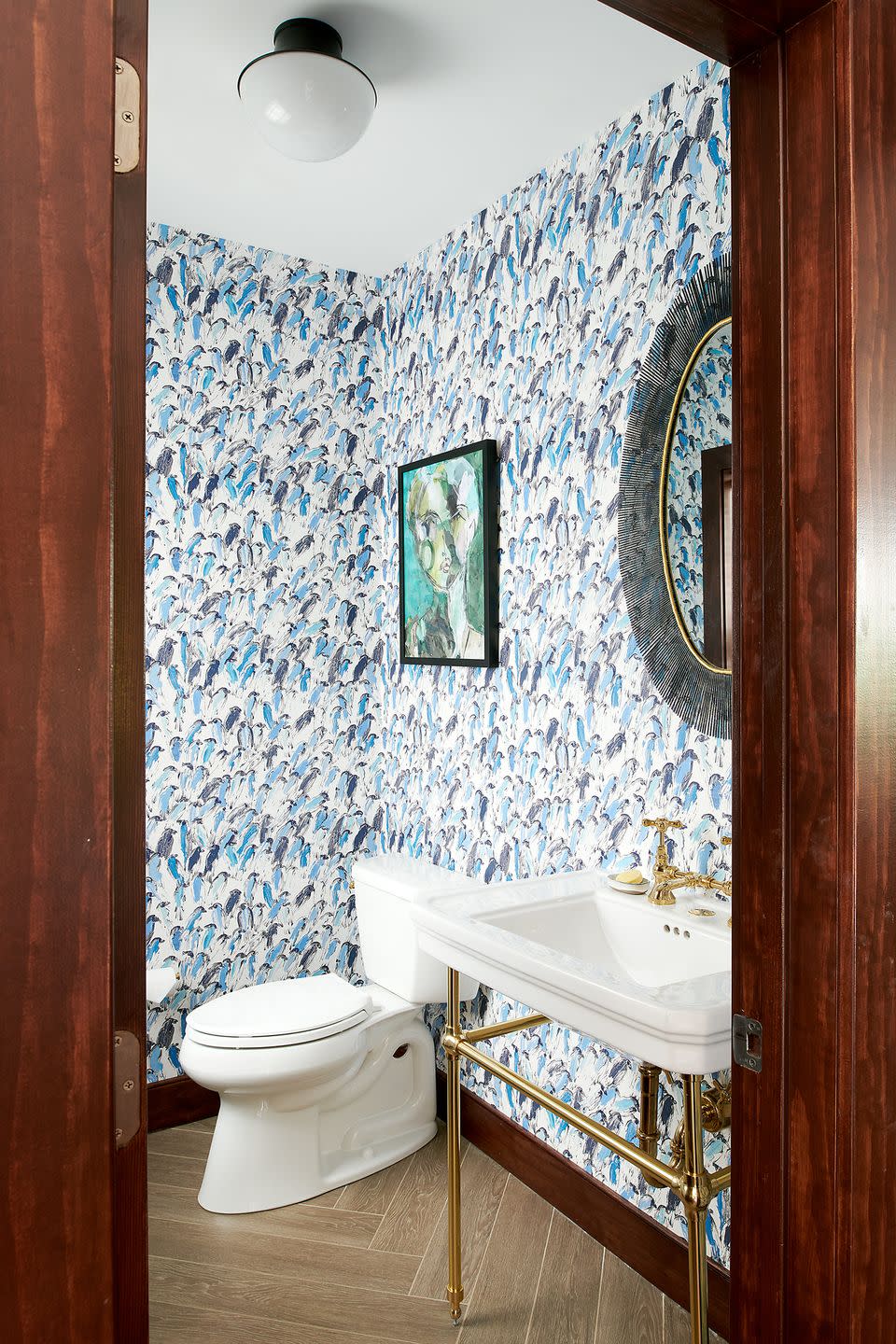
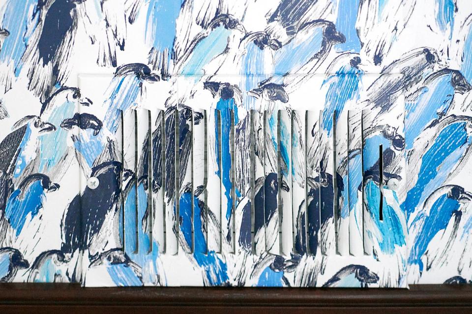
Gage took on the powder room too, wrapping it in another animal-themed favorite paper: Lee Jofa’s “Finches” designed by Hunt Slonem. An art print by Leslie Weaver adds to the fun.
Artwork: Chairish. Wallpaper: Kravet.
Q & A
House Beautiful: How extensive was the project?
Michelle Gage: We painted the ceiling, added wallpaper, installed a chandelier, ordered custom window treatments, hung new art, and sourced all new furniture, except the dining table which they already owned.
HB: Describe any distinct “zones” within the space, and how they function.
MG: We’ve obviously got the center table for meals with guests. We also have a bright blue bar cart for the host to play mixologist. For storage, we have the brass credenza, which helps to anchor the gallery wall of art above and acts as a serving station for platters.
HB: Did you encounter any memorable hiccups, challenges, or surprises during the project? How did you pivot?
MG: The pandemic dropped in our lap right after the design presentation, which gave us some headaches on furniture lead times.
HB: Where did the majority of the budget go?
MG: We really spread it around the room. We put it in places that would lend great impact: the wallpaper, the art, and the chandelier.
HB: How did you save money?
MG: We reused their existing dining table. It would have been easier to start fresh with a blank slate, but I actually really like the piece and they were game to keep it. It fit the room well so we worked around it.
HB: What’s your favorite part of the space?
MG: The snake wallpaper 100 percent—I didn’t even show them another style. They were all in and we totally went for it!
Follow House Beautiful on Instagram.
You Might Also Like