A Breakup Inspired This Designer's New York Apartment Makeover

After going through a major breakup, you might be inspired to get a major haircut. Perhaps you change up your wardrobe. Or, if you're Alexander Reid, you decide to embark on a top-to-bottom apartment makeover.
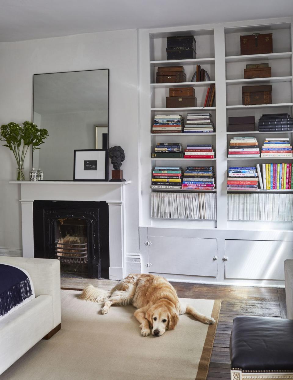
"My ex actually found the apartment originally, but I kept it!" the New York-based designer laughs. And, to be fair, the one-bedroom space in a 1750s Greenwich Village townhouse is one of those once-in-a-lifetime finds that Manhattanites dream about—oversized windows, two fireplaces, a bathroom with built-in storage, and it was pet-friendly for his 11-year-old Golden Retriever, Stanley. "It was so great that I didn’t want to give it up," Reid says.
But at the same time, he knew he needed a fresh start. "It was the first time I'd lived alone in a long time, and I wanted to have a space that really reflected me," he says. So last winter—"after saging the apartment, of course"—he decided it was time to hit the refresh button.
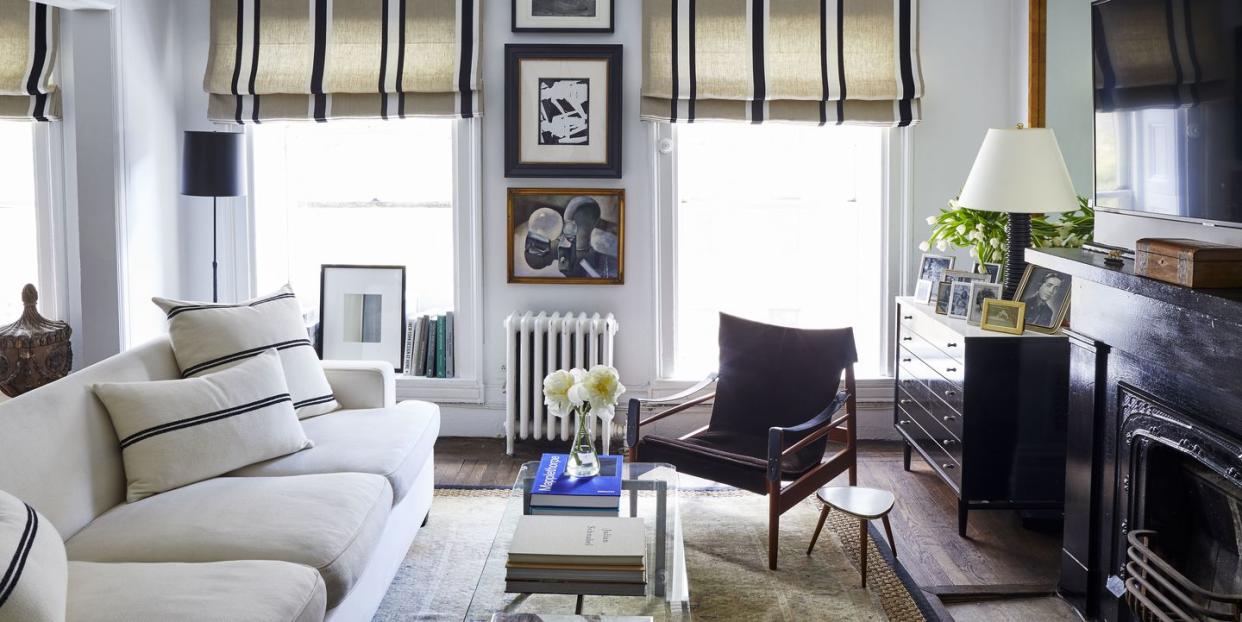
His starting point: a tan-, white- and black-striped Pierre Frey fabric he found while helping a client, which he ended up using for Roman shades in his own living room. While a paint color change-up wasn't in the plans ("I do like the aesthetic of a big, white box with dark wood floors," he says), he let the fabric inspire a shift from a mostly gray-and-white palette to a warmer mix of camels, warm woods and leather, alongside the existing black and white.

After painting the fireplace surround a glossy black, Reid hung a television above—a bold move for him, he says. "I generally hate a TV over a fireplace," he admits, "but in the living room, it feels so comfortable and cozy." Plus, he adds, "we never had a TV before—my ex thought they were gauche!"
Since launching his own firm, Reid had been working out of his apartment, which meant that the dining room was essentially his de facto office. But he'd recently leased a separate office space, giving him the opportunity to reclaim the dining room for its intended purpose. (He's a frequent entertainer, he says, but in more of a "Mrs. Doubtfire, order some takeout and plate it on nice china" sort of way.)

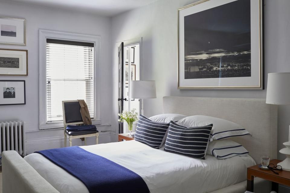
Every piece in the bedroom was replaced, starting with the bed. "I'd always had high, traditional beds, so I decided to design a sexy, low, modern bed for myself," Reid says. An oversized Ansel Adams photograph above took the place of several smaller pieces, and the black chests he had used as nightstands were moved into the living room to make way for a pair of sleek, Italian leather tables.
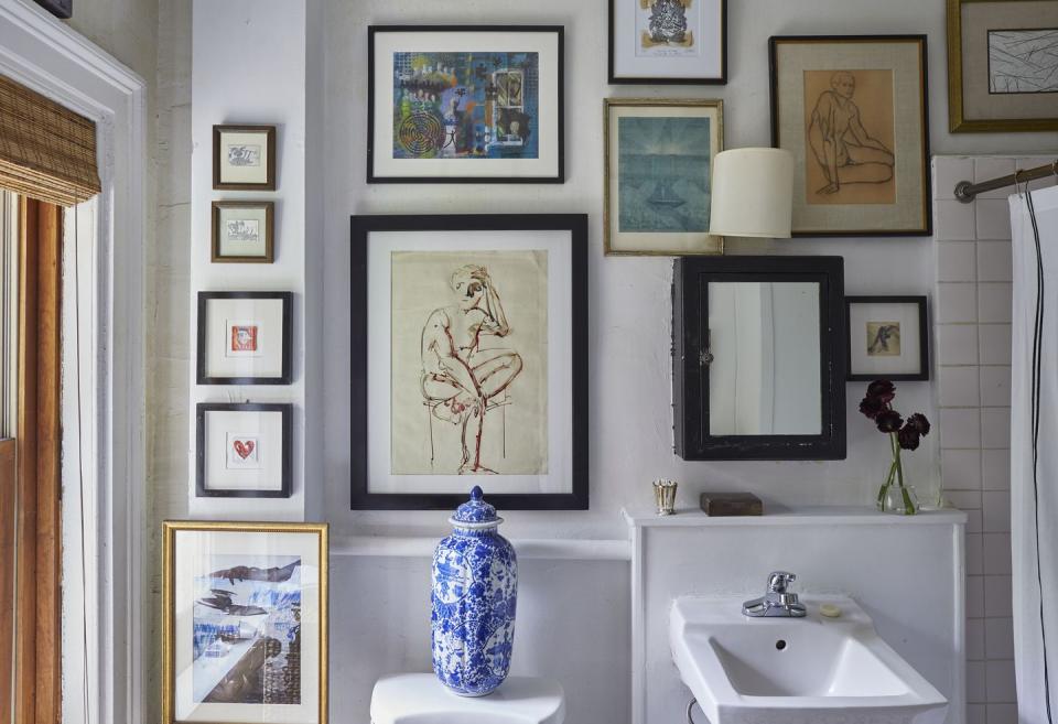
Reid had considered wallpapering the bathroom, but didn't want to make the investment in what was, at the end of the day, a rental—"I draw the line at doing major renovations to someone else's property," he says—so instead, he turned to his art collection for a solution. "Gallery walls are great, but I wore myself out on them, so I moved the bigger pieces to the main rooms and used the smaller ones to 'wallpaper' the bathroom," he explains. "And I painted the medicine cabinet black, so it even looks like it's a frame."
His new "bachelor pad," Reid says, "is much more me. When you go to the office all day, you just want a nice place to come home to and relax; now, I feel even more at home here."

Follow House Beautiful on Instagram.
('You Might Also Like',)