Burger King Is Rolling Out A Whole New Logo And It’s A Total Throwback

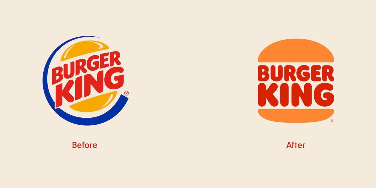
It's a new year, so maybe you're considering trying out a new look. Oh, that's so funny, because Burger King totally had the same idea! The brand announced today that it would be rolling out not only a whole new logo, but also a new brand identity that will make every part of picking up your next Whopper look totally different.
The new look marks the brand's first complete rebrand in over 20 years. And though they called it a "more modern look" in a release, we can't help but get total throwback vibes from its new designs. But I guess when new styles are throwbacks to old styles that makes them new again? Not sure, but we know we like it! First up is the minimalist logo that will look sharp and crisp on digital signs and on its app and website, since more and more of us are choosing to get our food that way now.

Next up is the brand's new packaging (which you can see at the top of the article!), which features bold colors and illustrations of ingredients that are giving us totally groovy vibes. Like, honestly, put that "Cheesy Bacon" design on a t-shirt and I would wear it!! Finally, you can see the BK crew's new uniforms in the photo below. Oh, and those are real Burger King employees rocking the looks, by the way!

This combined with new digital-first designed restaurants make a whole new look for our beloved BK! You can expect to see the new logo and packaging designs rolling out in the coming weeks, while restaurant redesigns will roll out over the coming years.
You Might Also Like