Colors that go with green – 11 expert-recommended combinations to try
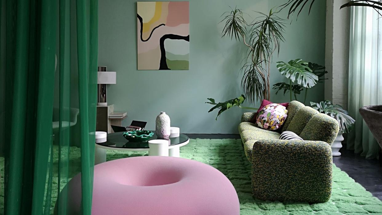
Many colors go with green - and it makes complete sense if you think about it. Green is the defining color of nature, and most other colors also exist in natural spaces, so we're used to seeing them working alongside each other.
'Since we are all accustomed to seeing green in all types of warm and cool tones in the natural world, replicating those indoors feels right,' agrees Amy Krane, architectural color consultant and founder of Amy Krane Color.
However, not all combinations are as favored as others, and the best choice of color to go with green depends on what you want to achieve. It can be a great companion to other hues; sometimes uplifting, sometimes dramatically clashing with them.
Take a look at these 11 suggestions by top experts to find out how to use this hue effectively at home.
1. Terracotta
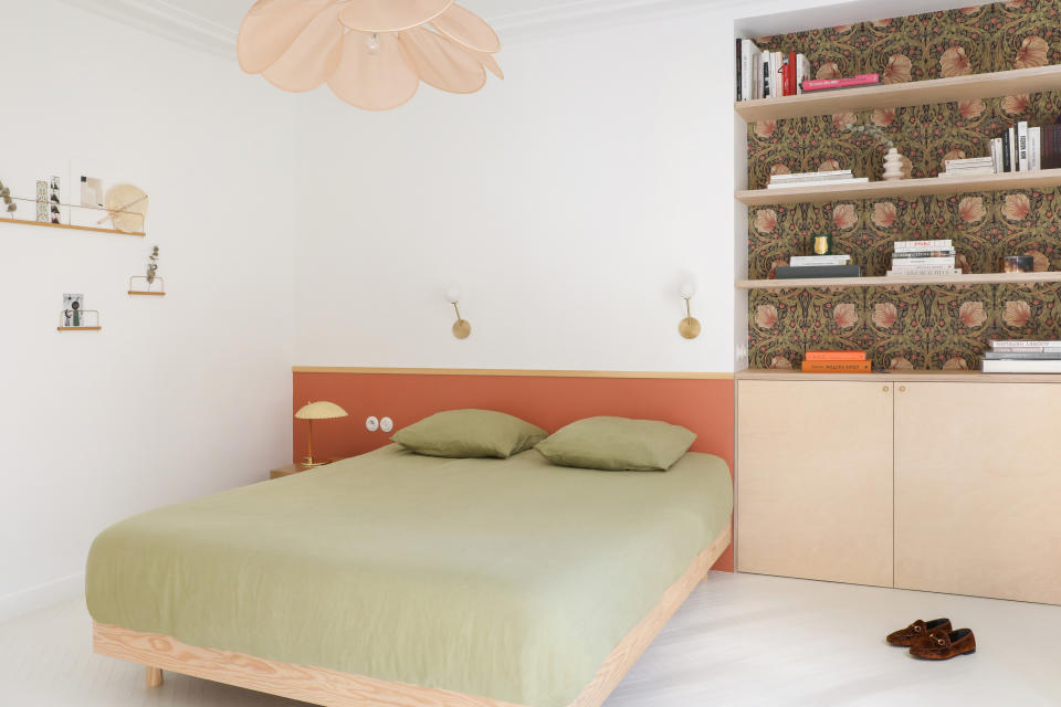
Among the colors that complement terracotta. you'll find easy, breezy sage green is a great fit. In fact, the two tones work well together across materials, paint colors, fabrics, wall coverings, and metals.
In this bedroom designed by French studio Heju, terracotta and sage create a beautifully restful space when used in combination. 'The niche in the master bedroom is adorned with wallpaper designed by William Morris and a birch bookcase, all enhanced by a terracotta headboard, with a clashing green bedspread, all created for an impactful space,' says Hélène Pinaud, founder of Heju.
2. Pink
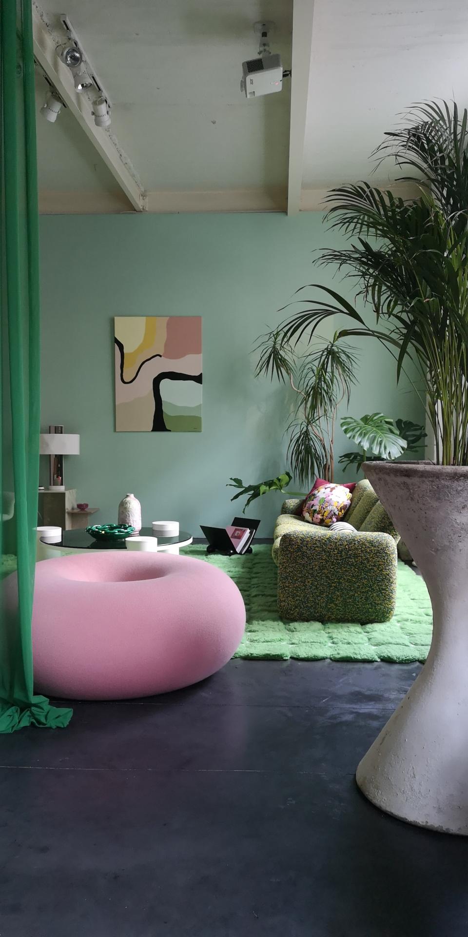
Green is a go-to color that goes with pink, and it's a combination that we are seeing gain popularity yet again, after its surge a few years ago.
'I wanted to create a cheerful green bubble for a cocoon winter garden feel in a retro-futuristic style with pops of pink,' says Hélène Rebelo, founder of Cool Machine. 'I grew up in the countryside and now that I live in the city, I miss nature enormously. Surrounding myself in green is a way of keeping a link with my childhood, which was marked by forests, plains, and fields of flowers.'
'It doesn't take much skill to pair pink with green successfully as they exist together in nature in so many flowers,' says Amy. 'Both warmer yellow-pinks and cooler blue-pinks work with greens well. Pinks work well with olive, sage, mint, and hunter.'
3. Other greens
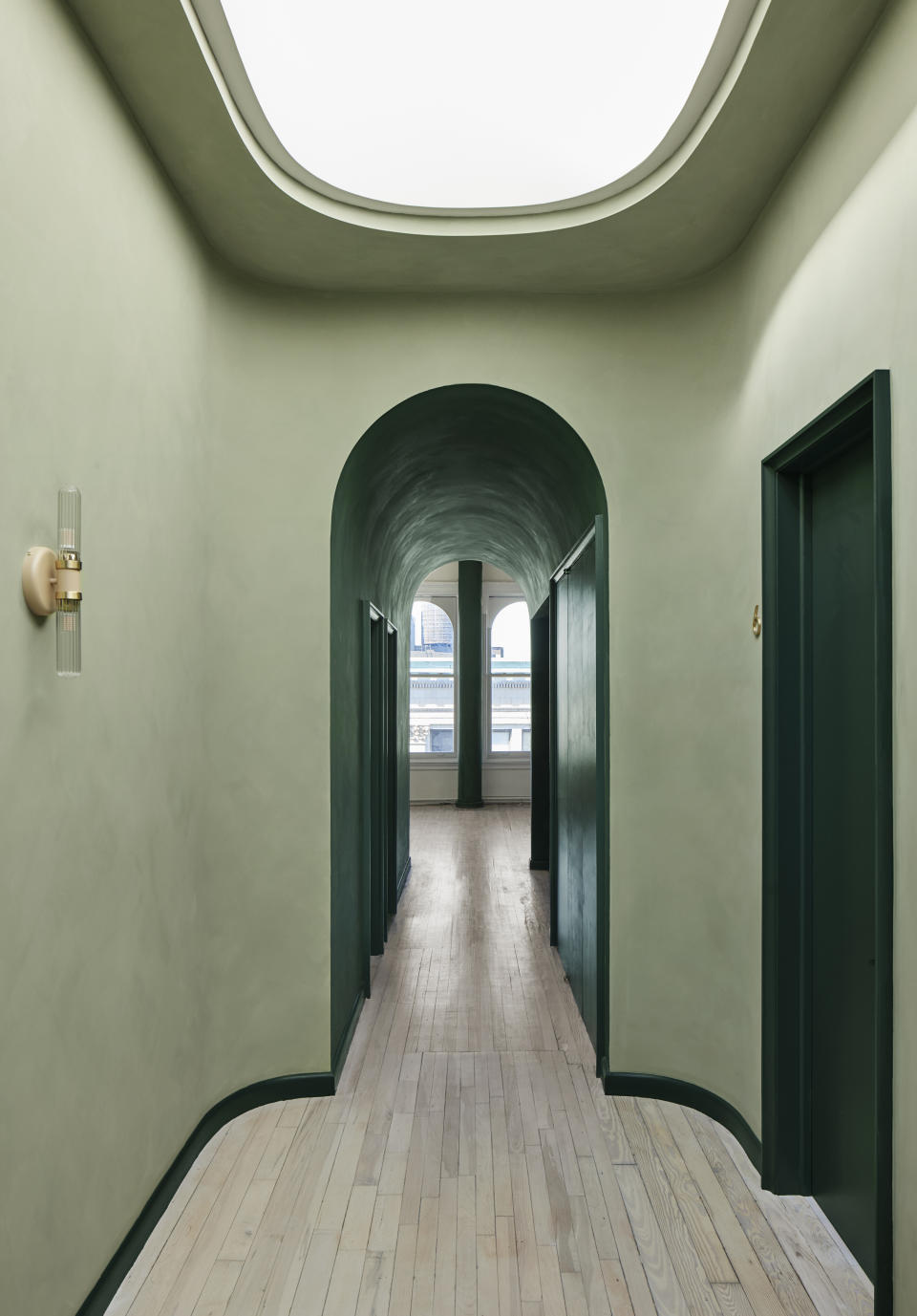
It might seem like an obvious place to start, but combining green with its other shades makes for an easy color palette. Think of colors that go with sage green or other lighter shades that could be paired with darker ones. This will give the room a sense of layering, along with depth.
'Wellness can be created through design,' says Barbara Reyes, director of design at Frederick Tang Architecture. 'We wanted the dweller to 'experience the space' through color symbolism and strategic use of light, making it feel like a treatment; a transition from darkness to lightness.'
'Color can impact a mood,' says Barbara. 'The predominant color we used was green (lime washed in a cypress and deep forest), chosen for its property to heal, critical at the front where the dweller first experiences the space. It continues to another 'light-filled area', the atrium which is the core of the space with its pill-shaped skylight, it is 'heavenly'. A rich forest green offsets the pale green in the barrel-vaulted hallways to cradle a user before heading into treatment.'
4. Yellow
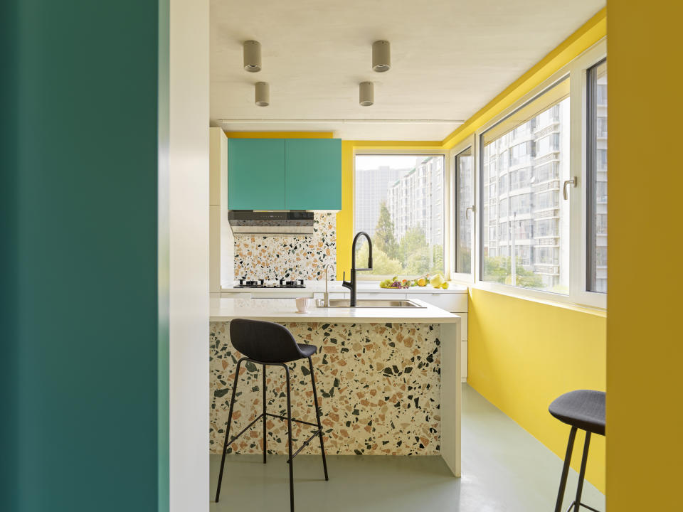
this bold scheme above showcases that if you're not afraid of going bold, a dark green can be a color that goes with yellow perfectly. These two clashing shades can truly uplift the look of the room, fill it with personality and also add a cheerful vibe to the space. Plus, both bright colors reflect light, making the interior feel more open and breezy.
'The color palette of the house reflects the energy of the young family living there,' say Margret Domko and Momo Andrea Destro, founders of MDDM Studio. 'The floor and the ceiling are two parallel, horizontal surfaces in cement in between which different colorful elements are inset: the yellow walls give an energetic environment to the house while the cabinet of green echoes the color sparkles of the terrazzo.'
5. Black
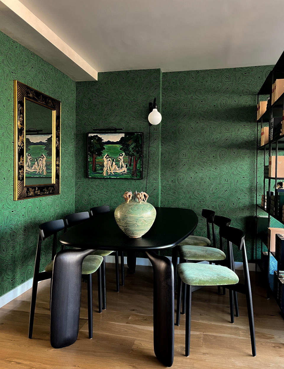
Much like cream or white, there's a whole spectrum of colors that go with black. An enticing neutral that has a timeless quality to it, this shade can truly induce sophistication in a space.
Understandably though, black is also one of those colors people feel a little hesitant to use liberally. But even when used as an accent color on furniture, lighting, or curios, this tone when paired with green can spell elegance.
'Drawing inspiration from the surrounding landscape, we designed an atmospheric dining room that exudes a sense of drama,' says Jean Parker, founder and principal designer at Le Jean Design. 'The space is angled towards a row of floor-to-ceiling windows that provides a panoramic view of the lush treetops. We selected a rich set of patterns and textures, along with black-toned shades to showcase the dynamic range and depth of greens. One of our favorite details is the seamless harmony between the engravings on the vintage vase by the late José-Antonio Sarmiento and the malachite wallpaper by Cole & Son.'
6. Red
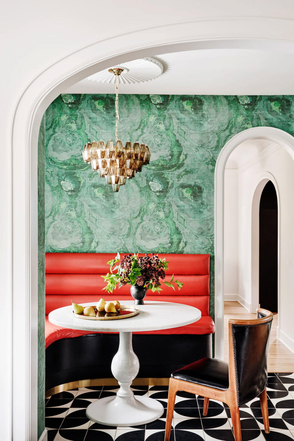
You might be surprised to see the red feature on this list – after all, isn't red and green the preserve of Christmas? 'When using colors like red and green you're approaching the design with the intent to make a statement,' says interior designer Katie Paulsen from Maestri Studio.
However, you're not bound to use the most basic red and green shades together, and the real joy in this combo is often found in the more interesting combinations of shades from each color family, as in this dining room by Maestri Studio where an emerald green is chosen as a color that goes with red.
'In this case, the space needed to be exciting but also needed to have a soothing quality that the family could always enjoy,' says Katie. 'We did this by softening the brighter values of the red and green by pulling in wood tones and by adding warmth with the metal finishes. We knew that our best approach to using these bold colors was in knowing they will stand out but also keeping in mind that they need to feel like they belong.'
7. Blue
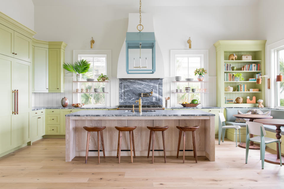
There's an adage that 'blue and green should never be seen', but give a good interior designer a rule and they'll show you the exception to it, and how best to break it.
Blue and green has become a designer favorite in recent times, for the very reason that it's a color pairing that feels new and exciting, and not overplayed. Much like green and yellow, green is a color that goes with blue as a neighbor on the color wheel, making a tonal scheme again a great way to approach this palette.
While rich, jewel-like greens and blues work together, more vibrant, primary, and pastel tones can also work in the right scheme. 'The color scheme for this kitchen is fresh, bold, bright, and fun,' says interior designer Cortney Bishop. The key to making this combination work? 'Grounding the pastel palette,' Cortney suggests. 'Be thoughtful to pick colors you can thread through the home in fabrics and other home accents - cabinetry, trim work - for this.'
8. White
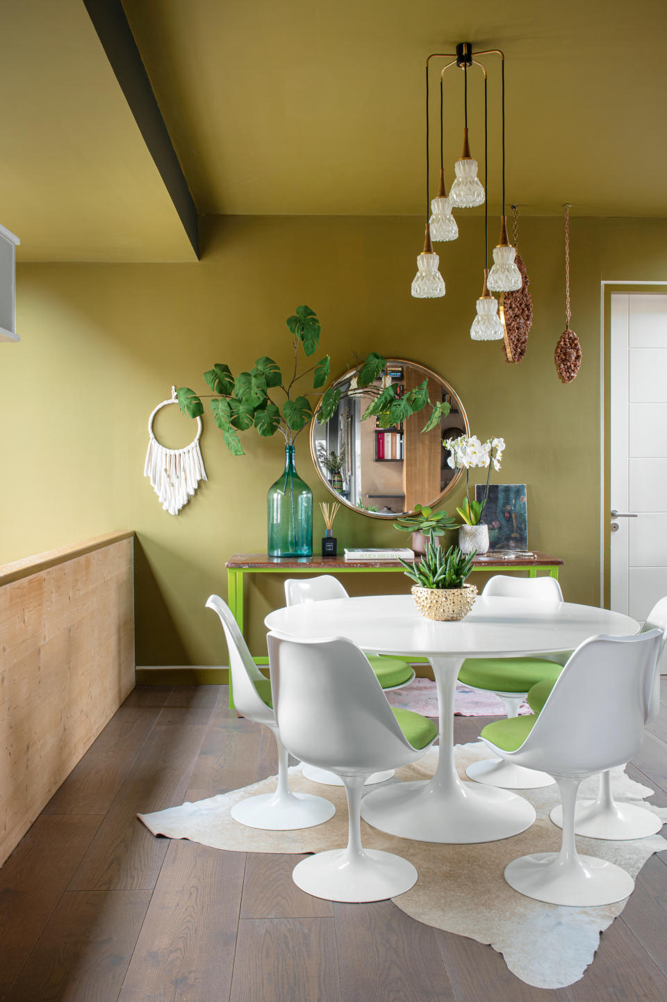
Decorating with neutrals is one of the easiest things to do in design. From deep forest greens to vivid limes, any shade of green will instantly add contrast to a white or cream, and add freshness to the scheme.
As a rule of thumb cooler-leaning greens and yellow-toned greens like lime, fern greens, jade greens, and emerald greens work best with crisp true whites. You have more choices with more muted, dusky greens like sage and pistachio. They will usually work both with a bright white to add freshness to these more muted tones or an off-white for a more warm, cocooning feel.
'Cream or white makes for a great base color to lift other tones in a room,' says Noorein Kapoor, interior designer and founder of Noorein Kapoor Design. 'Along with varied colors such as green, you can also build on various materials and finishes, and add textures to a neutral room. Use a white or cream as a backdrop and lift the secondary color with confidence.'
9. Orange
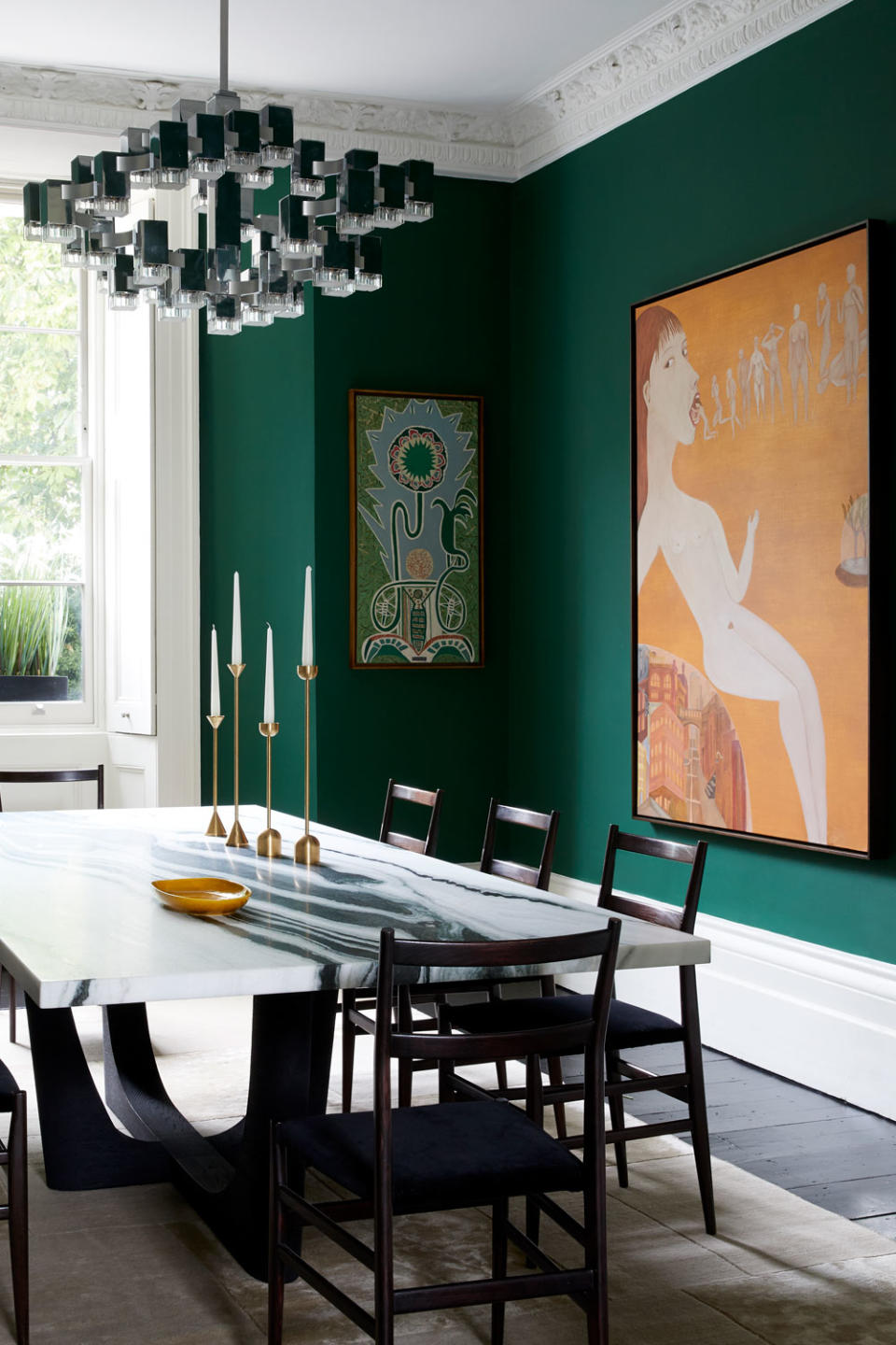
If you like warmer tones in your home but want a color combo that still feels fresh and interesting, try pairing a dark green or a dark olive shade with a muted orange. Many colors go with orange and you can be sure that green can be a great companion to this zesty hue. You have that clear contrast here, so it still feels daring and has an impact but it's not too overwhelming.
'Green and orange will create a dynamic balance in the room,' says Amy. 'The brighter the combination, the more sizzle. But if it's a warm interior you wish, then consider a burnt orange or ochre with a deep-toned green like a forest green,' says color consultant, Amy Krane.
There are of course more punchy variants of this combination if you want to go bold – tangerine hues with chartreuse, emerald with bold terracotta, and more. We would just always recommend adding a touch to these bolder schemes to break up the colors.
10. Grey
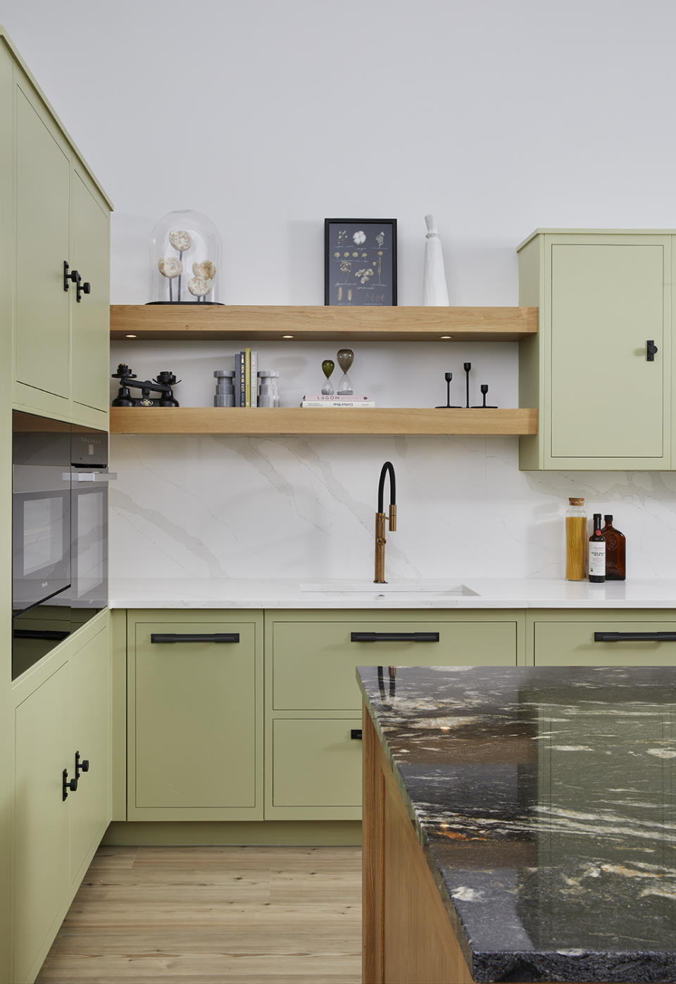
Neutral lovers that want to inject just a hint of color, this is the combination for you. Grey is a color that goes with green in a lot of different tones (just look out for shades that have a more cool grey undertone) but a very on-trend scheme is grey and sage green.
Modern interiors tend to skew cool in tone. 'Cool greys show hints of their blue, green or purple beginnings,' says Amy. 'Grey with green is a modern pairing that can skew a little towards neutral but still look and feel warm.'
Pair a cool light sage green with a really pale, cloudy grey for a contemporary combination that works particularly well in kitchens and bathrooms, or any room that might lack natural light. Then ground all those light, airy colors by adding just a hint of black, or as you can see in this gorgeous sage green kitchen.
11. Purple
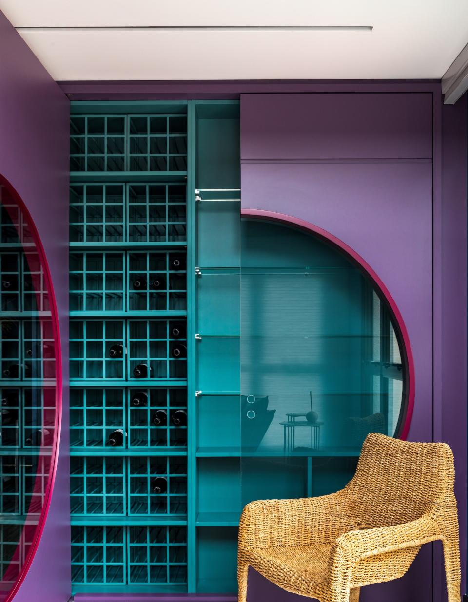
Colors that go with purple may seem hard to find but green makes a great option. This can be a very charming combo, particularly in smaller rooms where you want to make an impact and embrace coziness. Botanical greens and jewel-toned emeralds look amazing with purple – these colors are a wonderful foil for each other.
Purple is known for its invigorating and calming abilities, embracing the power of both warm and cool colors. 'Choose natural shades like green for a more grounded effect, especially for those who fear overly saturated spaces while looking for the positive feelings of joy and calm purple can offer,' says interior designer Sarah Barnard.
If you want to slightly tone down the combination bring in some neutral tones like soft greys and whites to make sure purple is a color that goes with green, without reading like a Halloween decorating scheme.
What colors don't go with green?
As this expert advice hopefully proves, there's a right tone and shade of almost every color that will work with versatile green. However, some shades can be challenging to put with green, just for the connotations these color combinations have. This tends to particularly apply to a green shade mixed with primary yellow and blues.
With orange and purple, in the wrong combination, you can create a color scheme that's best suited to Halloween decorations, while primary red and green can struggle to escape the trappings of Christmas decor.
What is the opposite color of green?
The opposite color on the color wheel from green sometimes called a complementary color, is red. In theory, this color combination goes together effortlessly, but the combination has connotations to Christmas that are hard to ignore. However, by changing up the tone of the red and green, you can still achieve a sophisticated scheme that proves red and green go together.
3 paint colors that go with green

Studio Green
Type: Water-based paint
Price: $40 for 3 liters

Porsche Speed Yellow
Type: Acrylic paint
Price: $75 for 3.7 liters

Grey 04 Matt
Type: Water-based paint
Price: $70 for 3.7 liters