This D.C. Home Was Designed to Accommodate a Growing Family—And We Don’t Just Mean Kids
When a couple who had recently bought a townhouse in Washington, D.C.’s Georgetown neighborhood told their designer, Zoe Feldman, they wanted their space to better accommodate their growing family, they weren’t just talking about making room for their impending third baby. The wife’s parents were also going to be moving in, making them a multigenerational household that spanned ages 1 to 80. “The neighbors were friendly and [the home] was flanked by this alley where kids could ride bikes, draw with chalk, and run around,” shares the homeowner, “but the inside lacked any personality, color, or reflection of ourselves.”
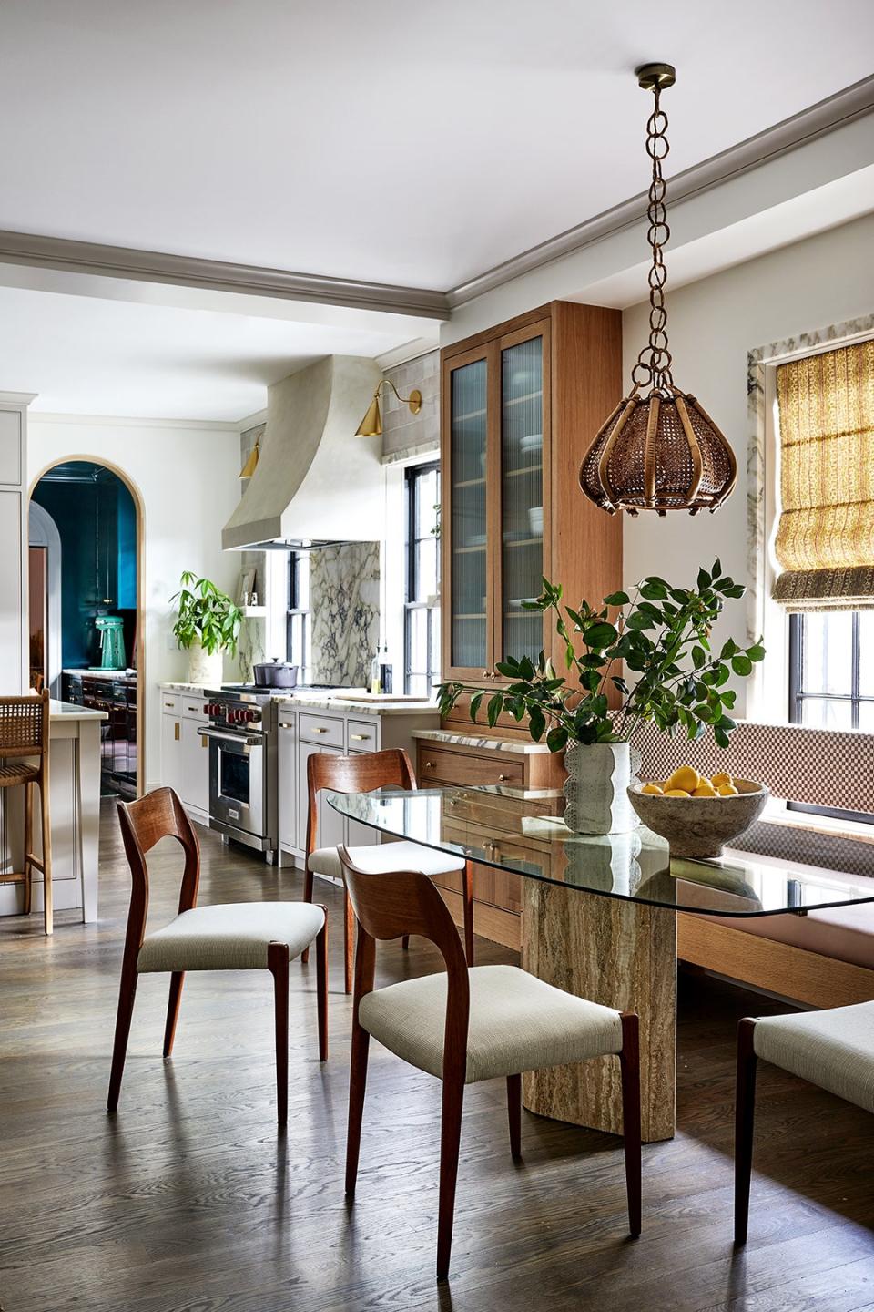
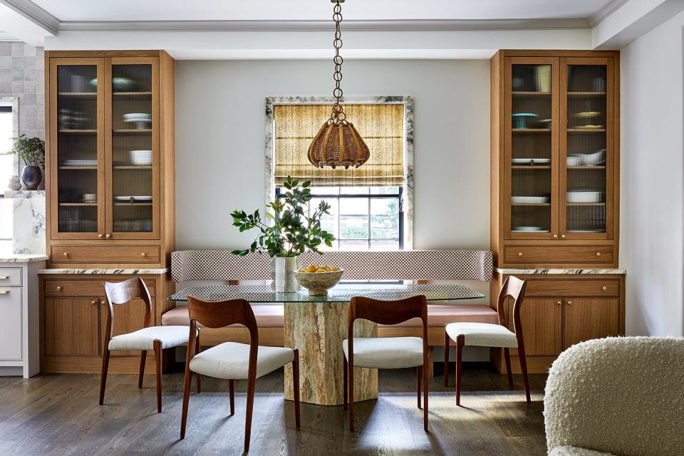
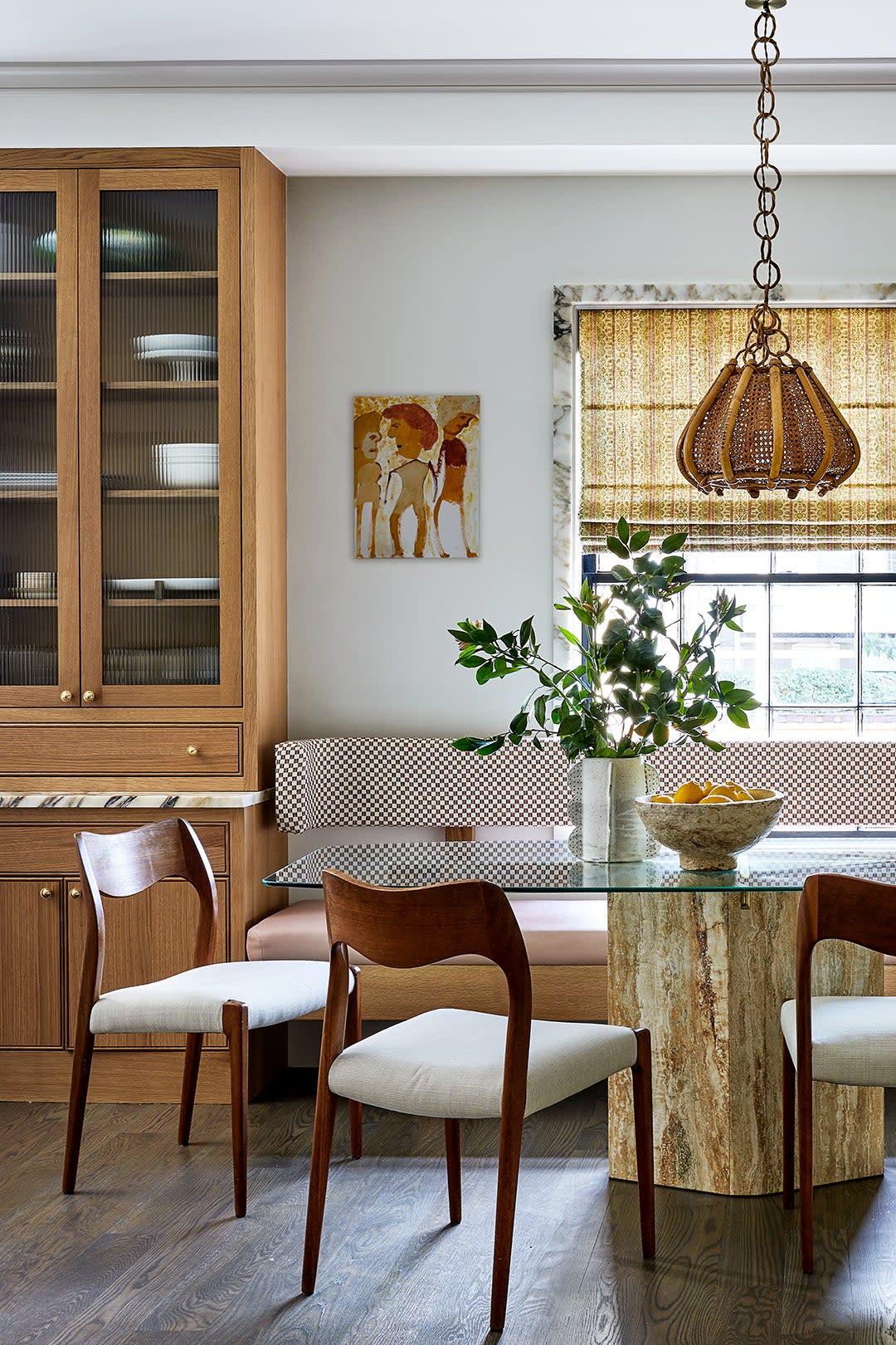
The original floor plan consisted of a formal dining area that didn’t fit their lifestyle or personalities at all. With their family being in the restaurant business, they needed a hardworking kitchen (complete with two dishwashers and a beverage fridge) with an open dining area that felt casual but could still fit large gatherings. Feldman delineated a banquette with floor-to-ceiling white oak cabinets. Swathed in a subtle checkerboard fabric and featuring a curved, winged backrest, the banquette is one of the freshest Feldman says she’s ever been a part of creating. “The devil is in the details,” says the designer.
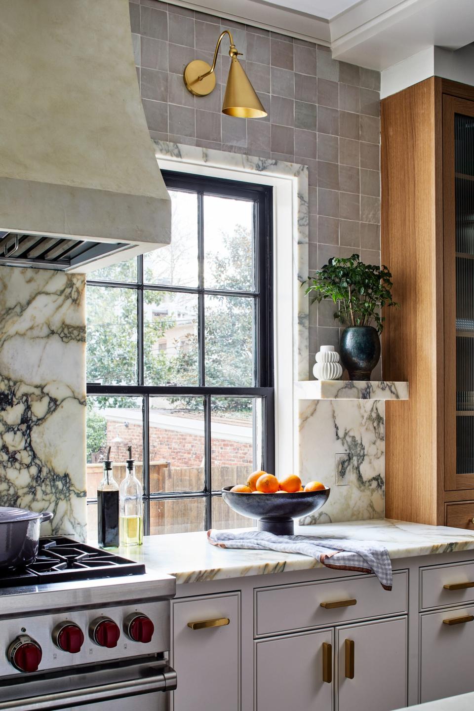

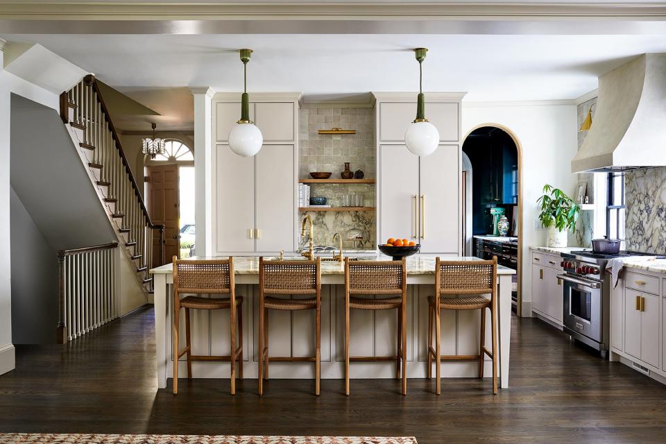
Specifically, the devil is also in the Trufig outlets. The company, which makes bespoke receptacles to match other surfaces, hand-painted the covers to match the Calacatta Monet marble backsplash. It was just one way Feldman made the most of a little moment. She went heavy on texture elsewhere, facing some of the cabinets in ribbed glass, swathing the vent hood in plaster, and jamming out the kitchen windows in stone. “The marble casing around the windows…I didn't quite understand why it would be so cool until it was up and I saw how it elevated a plain wall,” says the homeowner.
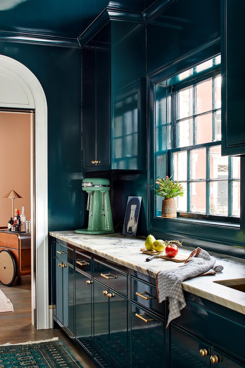
Jutting off from the putty-colored kitchen are a series of hangout zones that serve different purposes. Beyond the high-gloss pantry is a peachy pink space that mostly gets used by the adults.
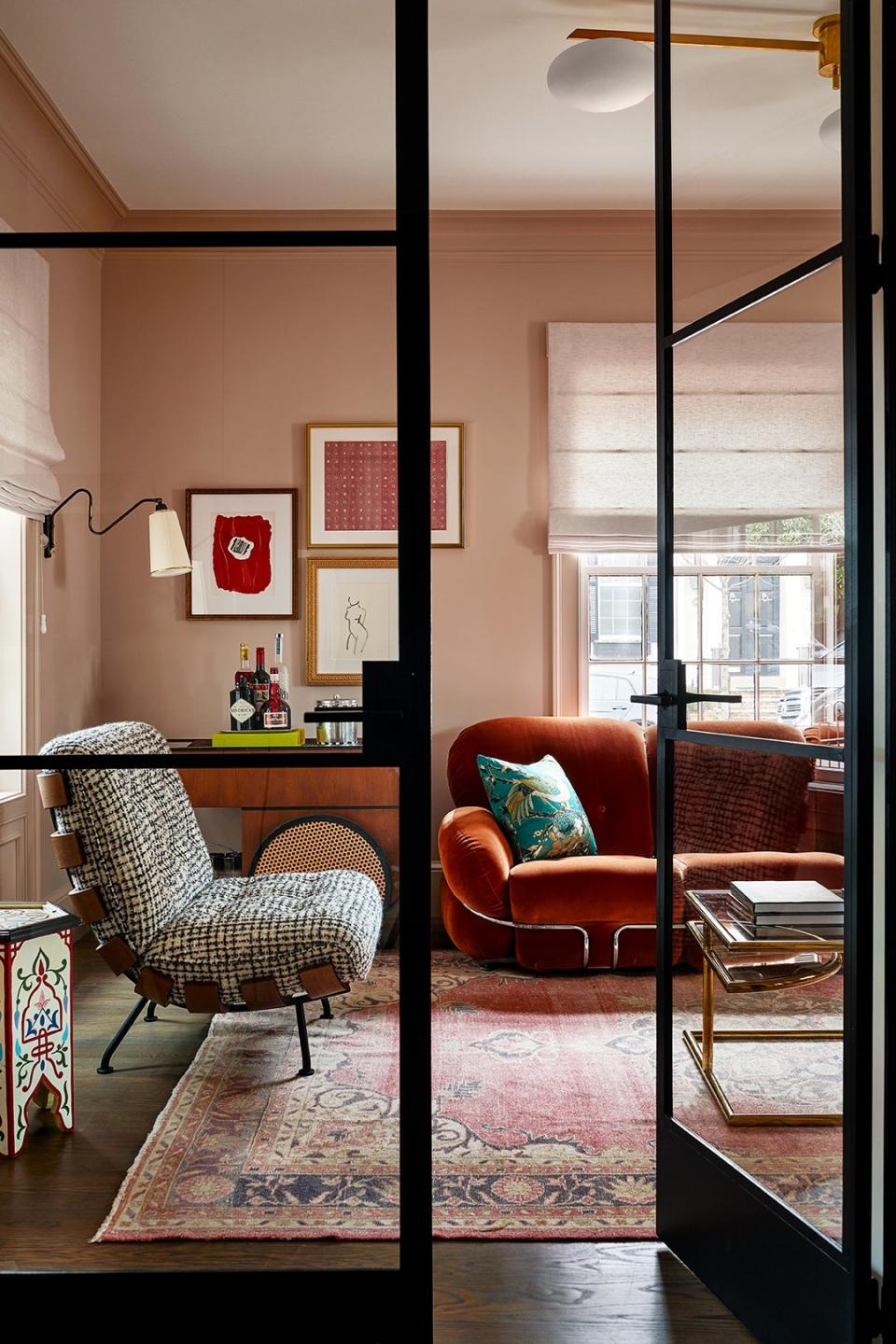
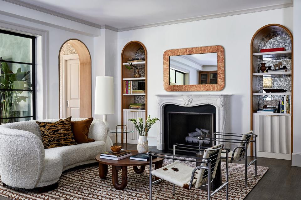
The sitting area that is open to the kitchen is what Feldman calls a “big chat area,” a place for guests to chill and gather before dinner. To ensure her parents felt truly at home, the owner peppered in sentimental Chinese heirlooms. “Since they were coming to live with us, it was important to me to incorporate some items that would honor them and make this as much their home as it is ours,” she shares.
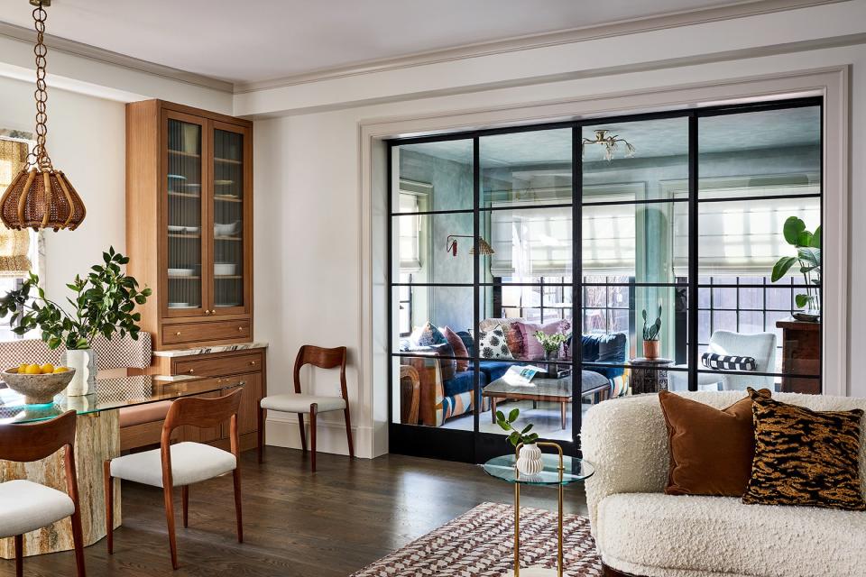
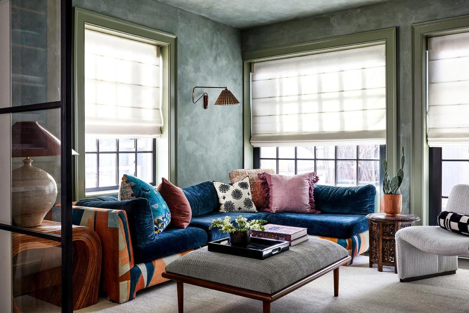
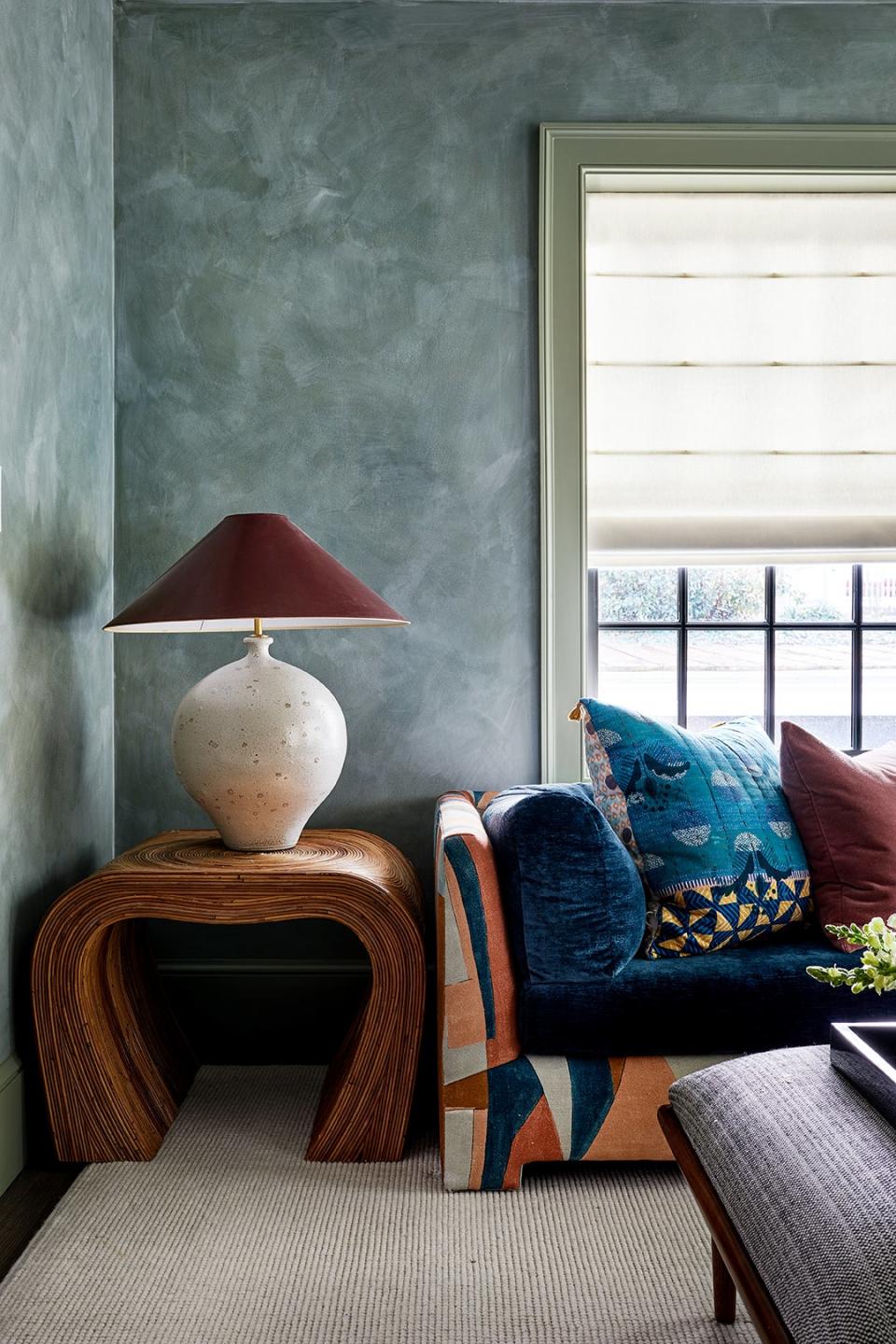
Separated by another set of steel-framed doors (but still in clear view of the kitchen) is the TV room. Feldman coated the walls in a blue-green limewash and opted for a richer green paint along the trim for a slight contrast. “For adults, it gives off a cool, loungy vibe, yet for my kids, it's the best place to bounce and build forts,” says the homeowner.
While less obvious, Feldman embraced a tonal palette in the mudroom, too. The large cabinets that feature loads of hanging space for coats and drawers for hiding shoes are painted fire-engine red; the floor is clad in terracotta tile; and the floral wallpaper has tinges of chocolate brown in it. “It’s red used in different ways,” notes Feldman.
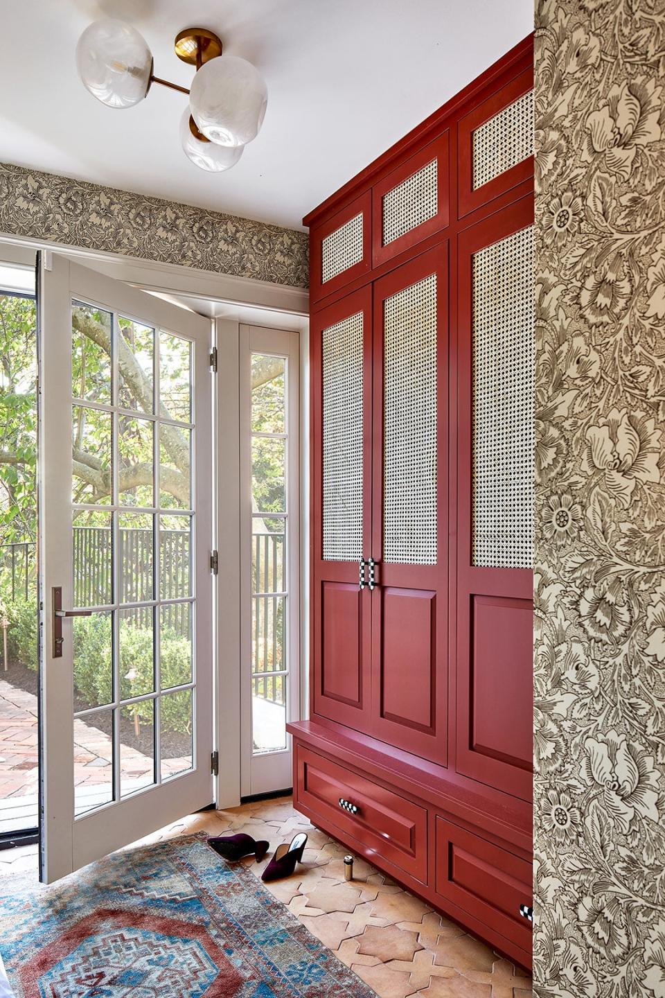
With so many people coming in and out of the house now, every high-touch surface (like those checkered handles) not only had to look cool but be up to the job. “My kids' sticky fingers will eventually make it onto every surface, so everything needs to be family-friendly and durable,” says the owner.