This Designer Wanted a Loftlike Feel So Much, She Put Her Bed in the Living Room

Jana Kubischik, interior designer and founder of Amazing Crocodile, didn’t bother to hire painters for the striped columns in her Berlin flat. Between the angles, varying widths, and alternating color scheme, she knew it would be easier to do it herself. Plus she had already mastered the pattern in her first brick-and-mortar shop and again for a client’s office. What started out as an ode to the work of Irish graffiti artist Maser (and a bit of Memphis design influence) is now an eye-catching divider in the three-bedroom apartment she shares with her husband and three children in the Prenzlauer Berg area.


Kubischik knew she needed a place that could accommodate her family when they started their house hunt. “Our dream was a loft with a completely open space where only the bedrooms would be separate,” she says. “And this comes very close.” Though it's not exactly what they were looking for, they turned their new reality into the next best thing. By adding a half-height wall bordered with columns to create what’s now the primary bedroom, this section of the apartment is almost like a studio, while the kids’ rooms are completely tucked off the hallway.


On the perimeter of the open-floor plan, a U-shaped corridor winds around from the front door to the living area and then back to the bedrooms. Along the route, Kubischik and her husband decided to replace a former doorway with glass. By chance, they found an old framed window from a salvage yard that fit perfectly in the opening—arch and all—lending an industrial element to the space. The nod was definitely intentional.

On the living room side of the partition, cubbies and paper storage boxes hide things like matches and batteries; the couple’s headboard is on the other side. A series of IKEA Pax units, slightly tweaked by their carpenter to fit just so into the corner, lines the wall for their wardrobe. “[The setup] works quite well,” Kubischik says. “The only problem is that when the kids come home late and want to eat something, we’re basically in the same room as the kitchen” she adds with a laugh.

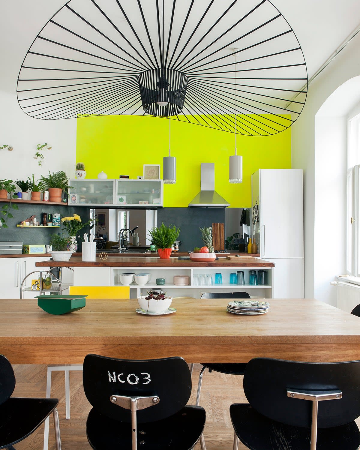
Previously, the kitchen was on the other side of the wall, but in order to make space for another bedroom, they brought it over to the main living space. Now a focal point, Kubischik leaned into making it stand out. She swathed the upper wall in neon yellow paint (a purely aesthetic decision) and the lower backsplash in a black floor-grade product with smoky gray glass panels interspersed throughout (a more practical choice). “We just didn’t want tile,” she says. “When you get oil or tomato sauce on the wall, this is so easy to clean.” To give those surfaces more opportunity to shine, she opted for a series of open shelves and small cabinets in lieu of traditional uppers and used the island cubbies as storage for plates and glassware.

Fluorescents make one more appearance in the couple’s bathroom. A concrete sink in chartreuse adds an injection of energy to the otherwise serene space where the couple enjoys taking long soaks in the tub and unwinding in the custom-built sauna. The spalike addition initially came in a prefab kit, but they once again enlisted the help of their carpenter to wrap it in plywood for a 5-star-hotel feel. Had the plan been to cover it in stripes, though, Kubischik would have been fine all on her own.
