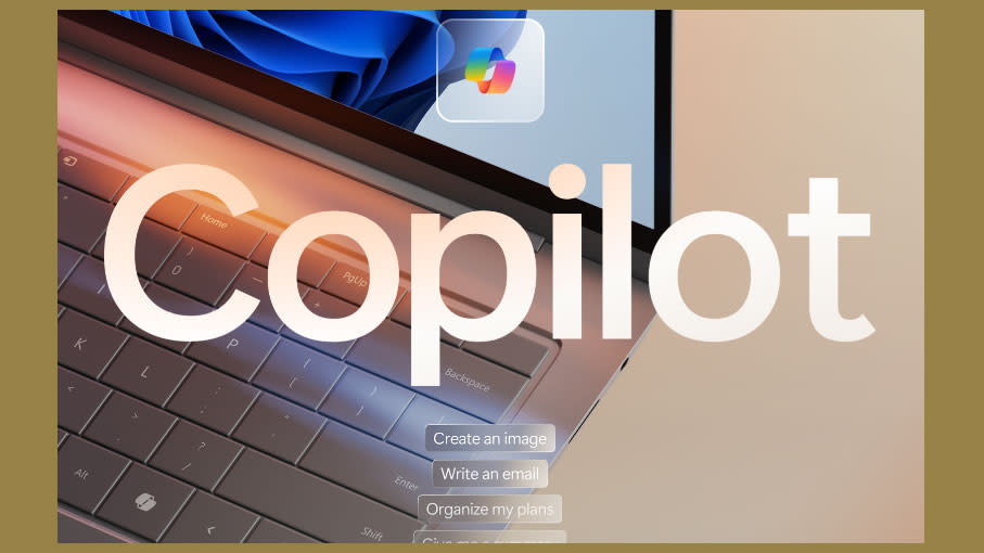
Does Microsoft's Copilot logo deserve a place on the keyboard?

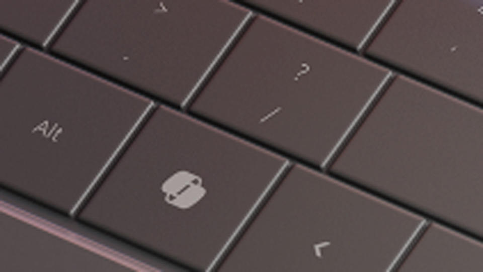
In the biggest change to its keyboards in three decades, Microsoft has announced that new Windows 11 PCs will include an AI key, giving access to its AI tool, Copilot at the press of a button.
This means that that colourful logo that some of you will be familiar with is going to put to the ultimate test – it'll be distilled into black and white and appear without any words next to it. But is the logo, which was only announced last year, really so good as all that? Can it stand up to other famous textless logos and become a part of everyday workflows?
In a blog post, Microsoft executive vice president Yusuk Mehdi said he believes the adoption of this logo into the keyboard will "empower people to participate in the AI transformation more easily". He compared the introduction of Copilot of the keyboard to adding the Windows key almost 30 years ago.
AI transformation aside, the thing is, the Windows key is a core part of the Microsoft brand, and was designed by graphic design legend Paula Scher. It's not clear who designed the Copilot logo, but I'd argue that it doesn't have the same gravitas as the Windows logo. First of all, the brand itself hasn't been around that long. It was announced at the tail end of last year, as the new Bing Chat and Bing Chat Enterprise.
Of course, AI itself is fairly new to most of us, so it's not surprising that the logo is new. In a reveal for Copilot three months ago (below), a video sees the colours from various Microsoft icons such as Outlook incorporated into ribbons to form the logo. So far, so logical, but I'm not sure the result is that impressive. It's more saying 'recycle logo at a party' than anything else. And the party vibes don't really translate that well when it's in black and white.
Will Copilot be distinct enough to be scannable and recognisable on the keyboard? Only time will tell. Perhaps I'll be eating my words in a couple of decades time when Copilot has taken my job and become the most iconic logo of the decade. Perhaps I'm just resistant to change. Or perhaps I know good design when I see it, and Copilot just isn't doing it for me. It might also just be me, but if you squint slightly, it looks a little like a hot dog...
