Don't Call It Sage—This D.C. Kitchen's Seafoam Cabinets Bring the Drama
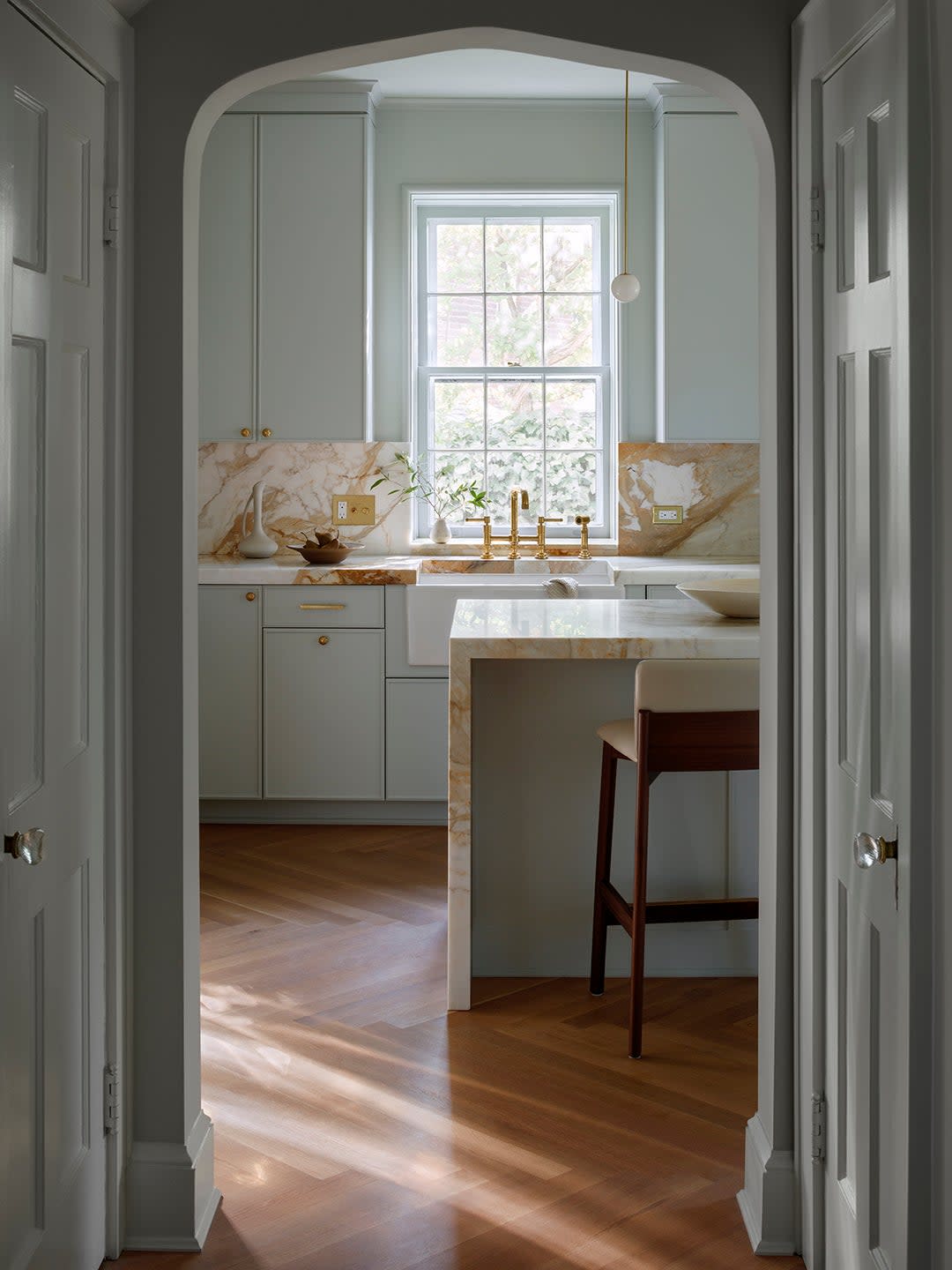
Nicholas Potts wants to get something straight: History, at least as far as design is concerned, is far from boring. “There’s a popular misconception that anything having to do with history is somehow ‘safe’ and ‘proper,’ and that color was either muted or nonexistent,” he says.
When the architect and designer met a young couple who had recently bought a 1930s home in Washington, D.C., he was pleased to find they thought the same way. “The house is very much of the 20th century, with everything from Tudor to Colonial Revival to Arts and Crafts elements throughout,” Potts says. The owners, who work in the tech industry and now have two children, sought to lean into the space’s history with crisp detailing and colors that would have been considered modern when the house was originally built.
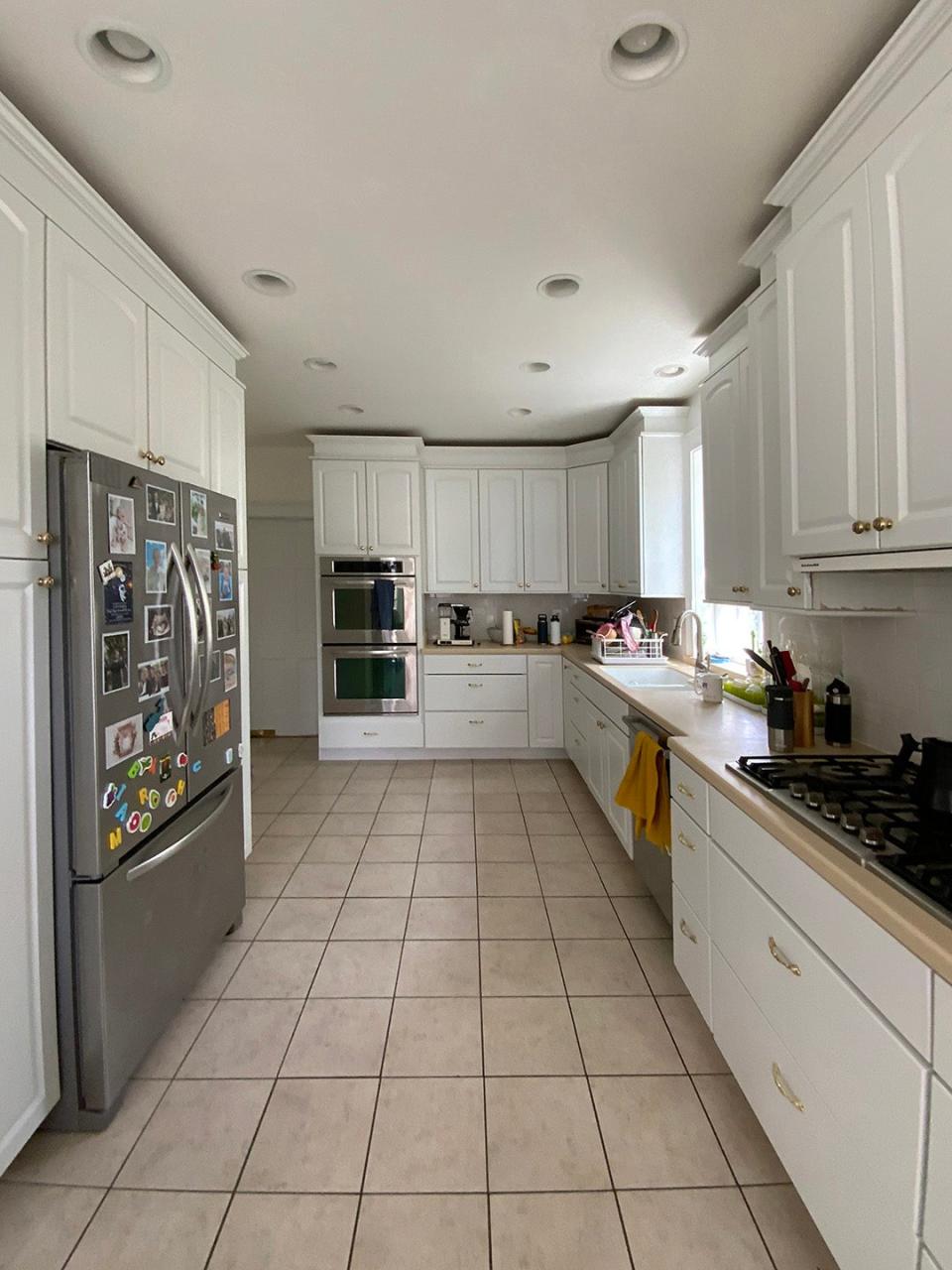
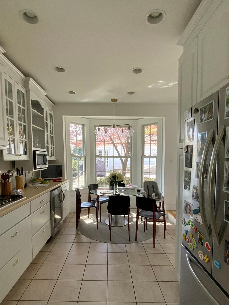
That sentiment is particularly clear in the kitchen. And while Potts revamped the layout to be fit for everyday life in 2024, he pulled material references from the past to ensure that the home gladly felt its age. After all, if everything old is new again, then how can any of it be boring?
Make Pasta Night Part of the Plan
Although this house was first built sometime during the Great Depression, the kitchen got an overhaul around the year 2000—and everyone agreed that the builder-grade renovation was far from ideal. “It was as if it were done only to expand the square footage, without putting any thought into how that [space] was actually going to be used,” says Potts.
There were no sight lines into the kitchen from the rest of the house, and for some reason it was a step down from the back door. The floor plan was too narrow for an island but too overloaded with cabinetry. Potts simplified the layout by working from the outside in, moving a nearby powder room and adding a central hallway so that the newly elongated kitchen had a generous spot for an island. “It was crucial that whatever my team and I did prioritized function, but the main reason behind the island was that the owners requested an unbroken surface for their tradition of rolling out pasta,” Potts says.
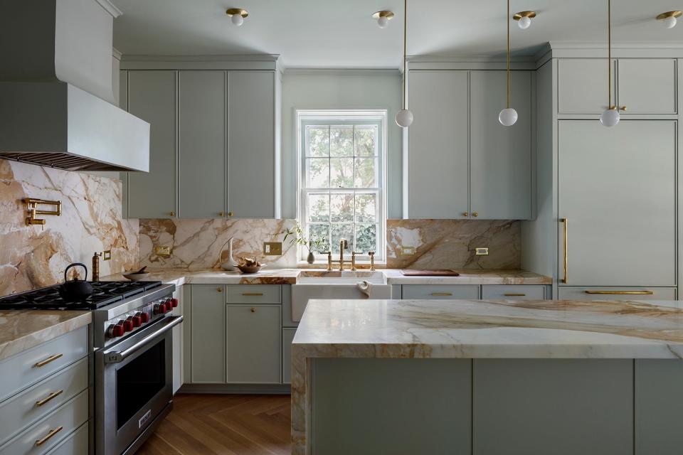
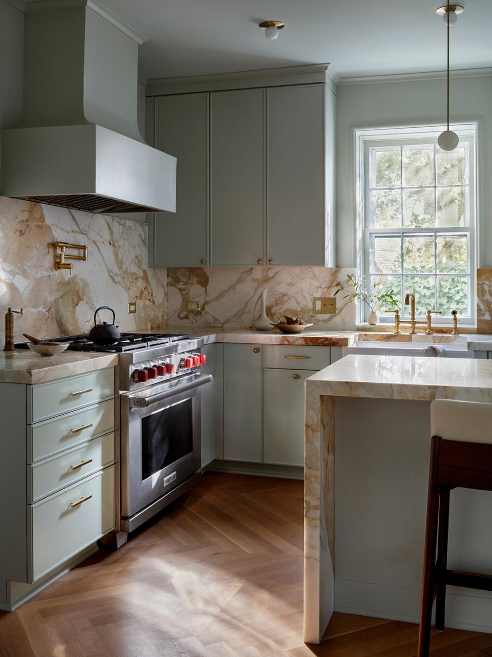
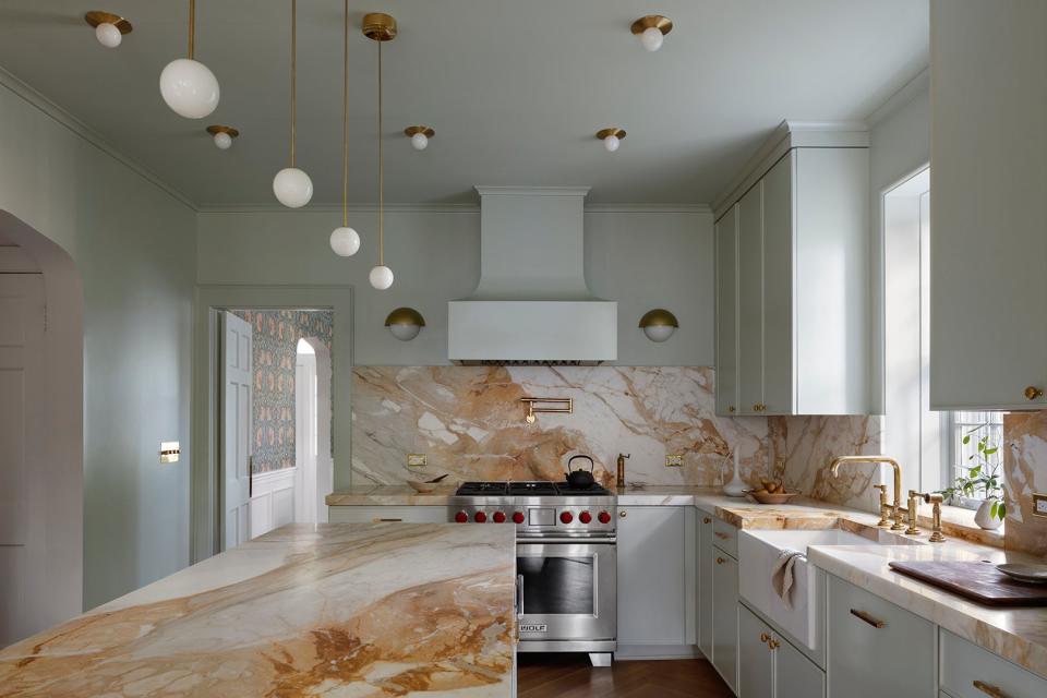
Calacatta Macchia Vecchia, a marble with strong gold-pink markings, would best underscore their pasta-making station as well as the rest of the countertops and backsplash. Going with a herringbone pattern for the wood floor brings some much-needed structure to the fluid-looking stone.
Use a Color That’s as Fresh Today as It Was Yesterday
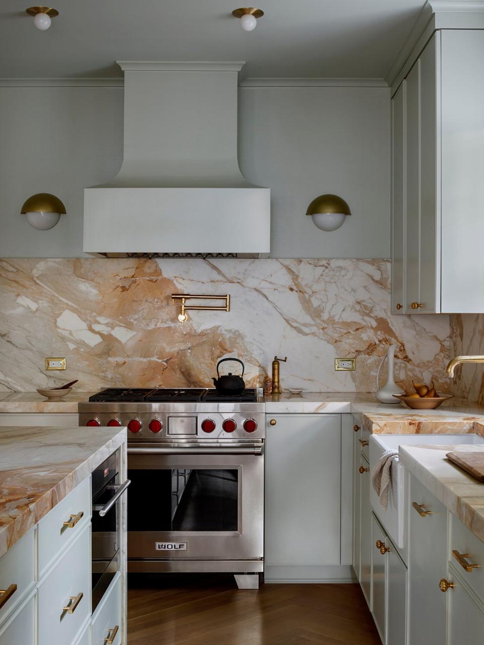
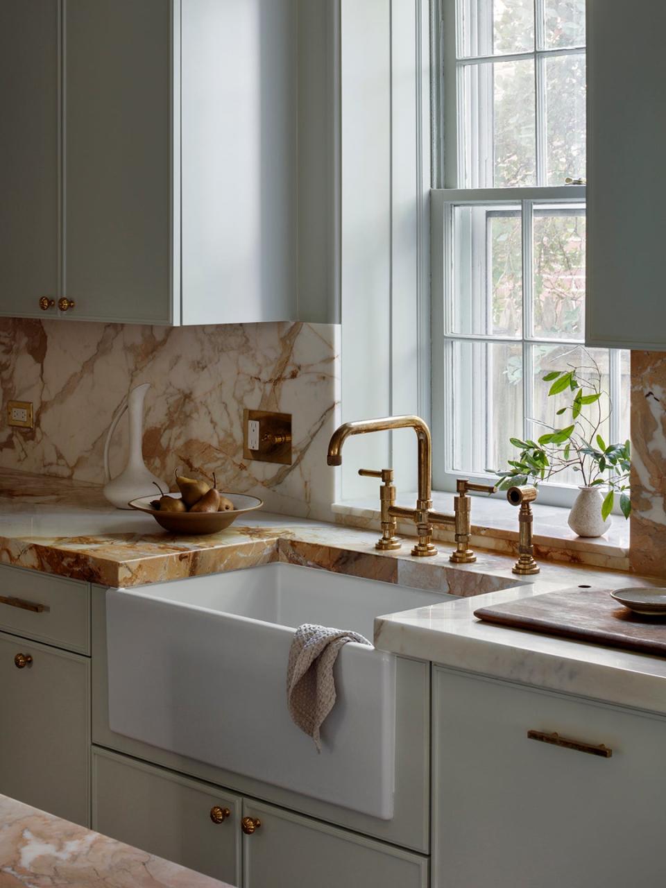
Back in the 1930s, cleanliness in the kitchen was top of mind for people, but that doesn’t mean they proved it to guests with an all-white palette. They still embraced color. “Bright, fresh pigments were popular at the time, so we embraced this period-appropriate coloring,” Potts says.
They chose Farrow & Ball’s Cromarty, a “nearly pure” seafoam shade, which is simple at its core but can be applied in a dramatic way. How exactly? Potts drenched the room in the hue, using it from the ceiling down to the lower cabinets. Even the range hood got a splash. The designer paired it with similarly crisp cabinets that have a hairline-thin edge frame. “This detail would be at home in the 1930s but seems just as cool today,” he says.
Be Hyper-Strategic About Storage
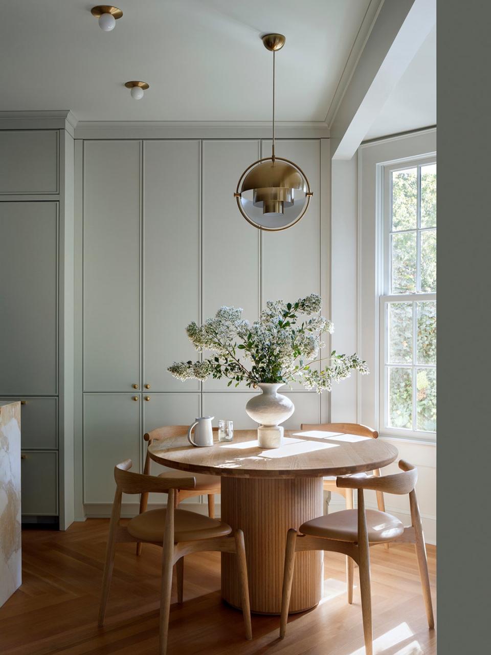
It’s not that Potts thought the owners didn’t have enough cabinetry in the original kitchen, it’s just that the layout was all wrong. It's easier to stay organized when things aren’t so spread out. “If there’s any opportunity to add a full wall of shelving, I’ll take it,” Potts says. “Over the years, my team and I have discovered that full-height storage is an incredible bargain in a small footprint.”
The extra-tall cupboards were the perfect addition to the dining area by the bay window. “That corner was too wide when it was empty, so full-length cabinetry activates that wasted space,” Potts says. Finally, the family’s stand mixer and grilling tools have a cabinet to call home.