This Drab NYC Apartment Got a Serious Upgrade—Without a Gut Reno

“Hearst Magazines and Verizon Media may earn commission or revenue on some items through the links below.”
Crisp, clean white-on-white rooms certainly have their proponents. New York designer Camila Pavone isn't one of them. "I think the world is tired of all-white everything," says the founder of Effortless Style Interiors, whose Instagram feed reveals a kaleidoscope of bold wall coverings, feisty statement pillows, and audacious paint choices. Sometimes that kind of fearlessness can be a tough sell, but for one recent project—a co-op apartment in Manhattan's Washington Heights neighborhood—Pavone got to flex her colorful muscles for one very special client: her sister, Danielle.

Danielle had been on the lookout for a unit in her eldest sister's apartment building for years. When one finally became available, she scooped it up, then tapped Camila to help turn the tired, dated space into one that fully reflected her personality. "This is my first time owning a home and, not having a partner, I really wanted it to be super me," says Danielle. Or, in her words, "very feminine and glam." Luckily, her sister speaks the same design language: "Camila taught me that pink can be a neutral," she laughs.
Although Danielle owns the apartment, getting major construction through co-op building red tape usually makes gut renovations a hassle, so Pavone stuck to mainly cosmetic changes with dramatic effects (and a few clever reno-avoiding hacks). She incorporated a combination of revived vintage pieces (some scored on the cheap through Facebook Marketplace and others found for free) and splurged on larger furniture, lighting, and art. The balance helped keep costs down and also result in a more lived-in end result.
Before
Kitchen
The kitchen got the most extreme structural overhaul, with Pavone electing to remove a wall to create a more open concept with an eat-in island. It was also where Danielle was enthusiastic about splurging the most, earmarking bigger-ticket items like the floor tile from Cemento, rosy-pink pendants from Hudson Valley Lighting, and a honeycomb backsplash inlaid with brass.
"My style tends to be pretty traditional but with a twist," says Pavone. That mix is exemplified in the kitchen lights, a traditional shape recast in a fun color. "But Danielle is a little more boho." To incorporate that, Pavone layered a vintage rug on the floor—a choice that took a bit of convincing. "I was like, why would I have a rug in my kitchen? I don't understand this," laughs Danielle. "But now I love it; it's one of my favorite things!"
Living Room

In the living room, Pavone designed around an Interior Define sofa that Danielle had brought over from her last apartment. "It's this unique blue color, and we had to work with it," says Pavone. "So picking out the rug was crucial." The pink hues tie into what's probably the room's most special element: the series of art prints, Warrior Girls by Maren Devine, that surround the television.

"What I love is that those prints have been in several of Danielle's apartments—we keep moving them around," says Pavone, who sees parallels between the strong female subjects and Danielle's work with Planned Parenthood. Plus, she says, "they're really helpful because they had so many different colors that I could pull from."
Dining Room

The midcentury table came from Pavone's husband's grandmother: "It was sitting in her basement, covered in plastic, and she always said, 'Oh if you ever want anything let me know,'" recalls the designer. "And I was like, 'Actually I've had my eye on that dining room table!" Here, it gets a jolt from a painting by Amanda Petro.
The raffia bar cart—a $40 (!!) find on Facebook Marketplace—adds texture to the space. And the Dance It Out print reflects both sisters' love for dancing around the house.
Bedroom

In the bedroom, Pavone opted for wallpaper by Lauren Haskell. "We used a lot of women-owned businesses," she says. The blue chair, meanwhile, was a trash rescue, reupholstered to add the perfect jewel tone. Pavone DIYed the headboard in a deeper blue.
Home Office

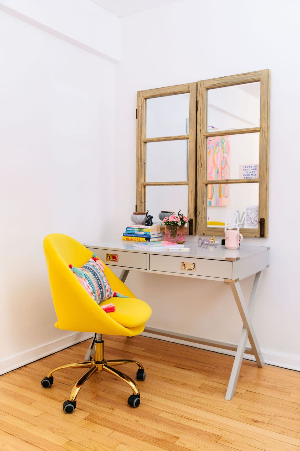
The office area features another element from one of Danielle's former homes: "At some point I had a basement room with no windows, so Camila came up with the creative idea to have two mirrors that looked like a window," she recalls. Now, the panes hang above the desk where she's been working for the last year and a half.
Bathroom
Pavone gave the bathroom an entirely new look—with surprisingly little demo. Since removing pipes would have been a headache to navigate under the building regulations, and custom tubs and showers are expensive, Pavone spray glazed the existing bathtub white for a fresh look. Cement floor tiles found on Etsy and a wallpaper by Laura Park give the small space just as much color and pattern as the rest of the joyful apartment.
Follow House Beautiful on Instagram.
You Might Also Like