A Happy Paint Accident Made This London Home’s Staircase Circus-Cool
We may earn revenue from the products available on this page and participate in affiliate programs.

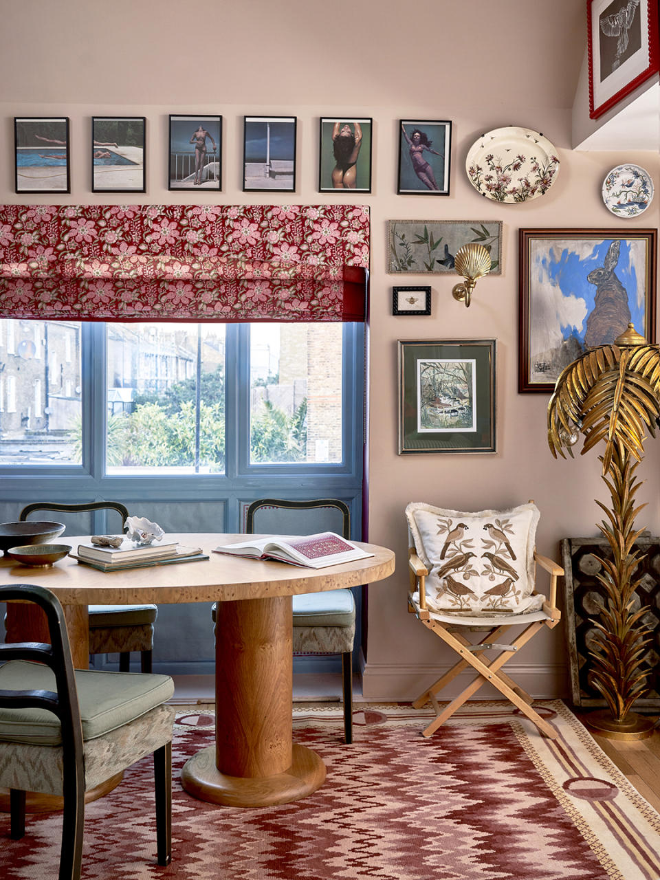
India Holmes is the sort of person who relishes a DIY project. As the creative director of Pelican House, a London-based design studio specializing in rugs, and the former design director of de Gournay, the luxury British brand renowned for hand-painted wall coverings, Holmes happens to be a pro with a paintbrush. The terrace, before. When house hunting four years ago, she considered historic properties and lofty warehouse conversions, but, surprisingly, she landed on a much squarer and more modern 1980s build devoid of character. “I could see that it had potential, and that there was scope to make changes,” she explains. Actually, the blankness of the space meant she could flex her creative muscles. “Working in this industry, I see so many interiors that I love and want to replicate parts of, but it’s not always within my budget. There’s something so satisfying in re-creating it yourself,” she says. Over the years, she has transformed almost every surface. Here, she talks through the most impactful additions and DIY wins: “Just don’t look too closely!” she says, laughing. Make an Entrance (Literally) The staircase, before. Holmes has made countless visits to India for work (Pelican House’s rugs are made by artisans there) and was taken with a rich, bold blue she saw on the public buses when driving to and from the company’s studio in Kolkata. She realized it was the perfect hue to amp up the nondescript hallway. “Initially it was just going to be the walls, but then I got so much paint on the floor, I was like, ‘The floor is going blue as well!’” she says. The ceiling was a different story. With red and white paint and a serious amount of Frog Tape, she created a tentlike illusion. Holmes hung a vintage suzani she bought from her now business partner, Bella Valenzia, as a curtain to conceal the washing machines underneath the staircase. Give Each Room Its Own Moment The primary bedroom, before. It wasn’t Holmes’s intention to use a bold color in each room, it just sort of happened from her tackling one room at a time. “And it’s actually more fun, because there’s a new, exciting thing always on the horizon,” she reasons. But from the start, she had her sights firmly set on yellow for her bedroom and chose a textured painted wallpaper with a silk overlay to accomplish the job. “It feels so cozy at night, and bright and fresh and sunny in the day,” she shares. The horse-themed wallpaper below was a design she created for her old employer and features pops of red and green, which tie in with the upholstery and art dotted around the room. Don’t Shy Away From a Shape Just Because It’s Trending The bathroom, before. Following decor trends to a T is looked down on by industry insiders, but Holmes doesn’t regret the sweet fish-scale tile for her en suite’s walls. “It almost felt like a hospital in there,” she says of the old clinical design. “I was definitely subject to the scallop fad, which on reflection is maybe gone, but I still love it because it’s not an in-your-face scallop.” She spent “ages” searching for quality, well-priced marble tile, landing on Intmarble, and then chose a deep teal for a strong contrast with the sunny bedroom. She has since added another shell-shaped shelf to her collection: “I thought I may as well stay on the scallop theme,” she notes. Play the Long Game The large architect’s chest was a $400 find, discovered on an auction site, and houses all of her arts and craft supplies in one neatly labeled place. “One thing I’ve learned is to be very patient. If you wait long enough, something will come up and it will be more perfect than the thing that you might have bought too quickly,” she says. But it pays to do your due diligence, especially with pieces that might be susceptible to having woodworms. “The first butcher block [island] I got for the kitchen, the legs actually just disintegrated in front of my eyes,” Holmes recalls. She ended up buying a new (to her, anyway) sturdy island from a regional auction house via the Saleroom. Mine the Wallpaper Archives The kitchen, before. Holmes knew the house wouldn’t suit “a really fancy kitchen,” so she set about configuring a more modest one as if it were an extra-large pantry. She chose a ceramic sink and open shelving. A more recent addition is the impactful wall treatment, which looks like Portuguese Azulejos tile but is in fact trompe l’oeil wallpaper she created at de Gournay. “I put a really heavy-duty lacquer on top, which makes it wipeable but also makes it look even more like tile because it adds a sheen,” she explains. A patterned rug from Pelican House made from recycled plastics saved her from having to update the wood floor. Mix With Conviction The living room, before. Holmes’s affection for antique objects, modern trinkets, and art creates a layered feel and gives the impression she has lived in the house for decades, not a few years. “I think if you like something enough, you can look past it slightly clashing. In my case, everything ends up working together because there are so many different things,” she says. Her best find? “I’d seen gold palm floor lamps on trips to Paris, but they were always a little out of reach. Then a pair came up at auction from an old Hollywood hotel. I kept one and sold the other for what I bought them for, so it ended up being free!”