Here's How to Get the Coastal Look Right

"The symmetry in the space was not architecturally great," confesses Ashley Gilbreath of a recent project she completed in Florida. Indeed, Gilbreath, a Louisiana-born creative who is now based in Montgomery, Alabama, and does nearly a third of her work on the coast of the Sunshine State, was faced with a challenge familiar to many new homeowners and renters: An open floor plan with an awkwardly lopsided layout. "We had a lot of design challenges,"she confesses. Luckily, Gilbreath had some tricks up her sleeve, and with a clever design, she managed to conjure a space that's both elegant and relaxed.

"The client's style is very tailored, sophisticated-pressed oxfords, white pants," Gilbreath says of the homeowner, who not only uses the space as a getaway for herself and her husband, but for her three children and several young granddaughters. As such, she wanted a space that was elegant, sure, but also comfortable enough for fun family gatherings.
"Her sense of interiors is very tailored, but she wants it to be very fun and relaxed," Gilbreath summarizes. "She’s a big proponent of living on your stuff: She has dogs in the house, babies in the house, she just likes to live. So she wanted it to look like her, but a more relaxed version."
The good news, as Gilbreath points out: "She is fairly monochromatic." As the designer explains, "the challenge with super-open spaces is that they all have to play together." So, Gilbreath and her team could stick with the client's preferred palette of ocean-appropriate blues and teals. The one challenge? "You can only repeat the same color so many times before it gets old."
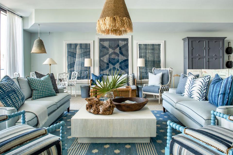
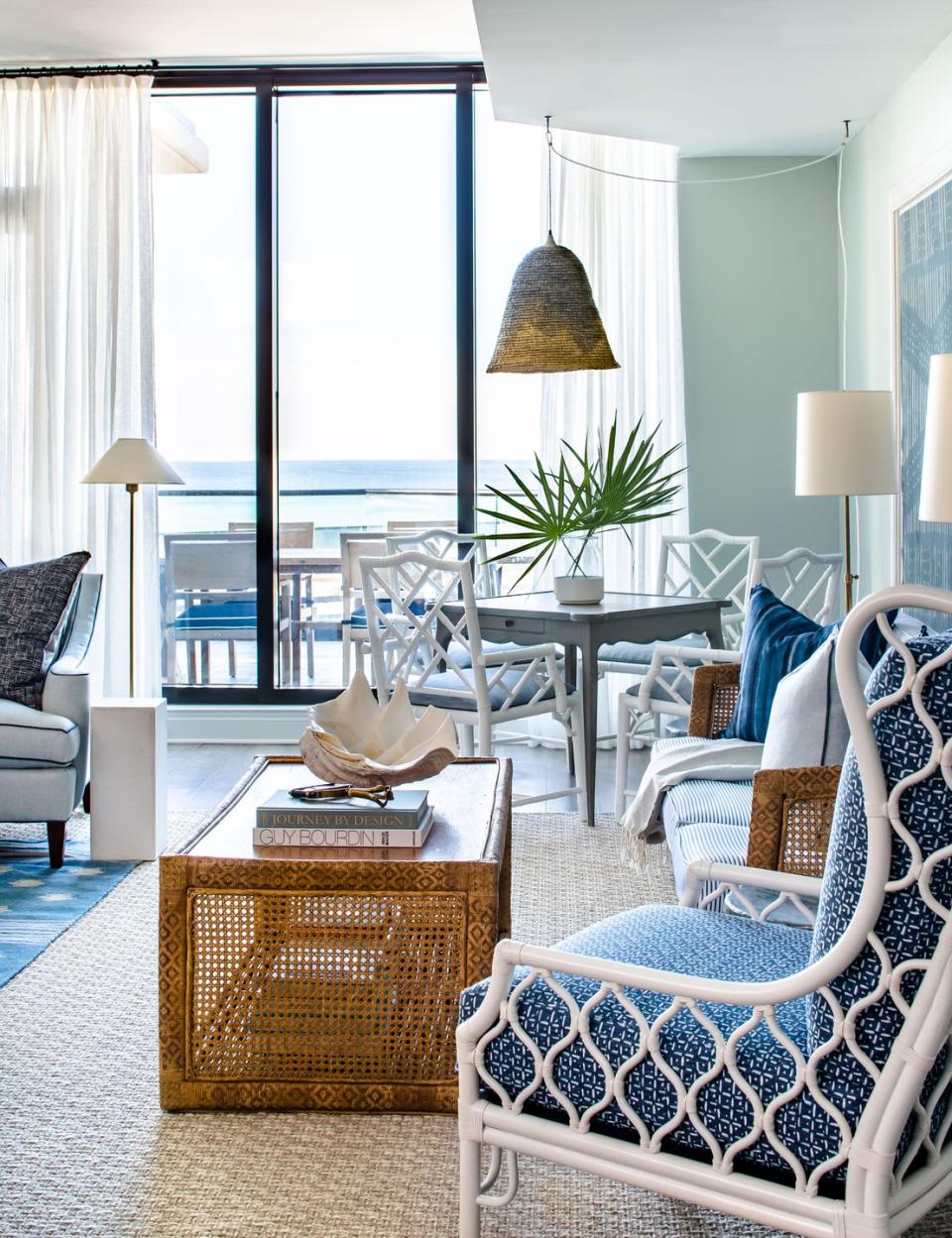
To make up for the all-blue scheme, Gilbreath looked to interesting textures to add interest and patina: a wicker bench and table found at Scott's in Atlanta nod to traditional coastal style, while antiques (many from Gilbreath's own Parish Shoppe) and unconventional art bring history into the space.

On the "crazy long wall" that runs "literally from the beach all the way to the entry," Gilbreath hung a vintage African textile that she's held in storage for years-waiting for the perfect place. "We thought, how do you break up the monotony of this big huge space?"
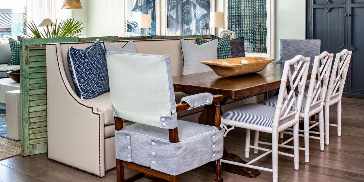
In the center of the room, Gilbreath delineated living and dining spaces with an unexpected item: a vintage shutter. "When we were shopping in France two or three years ago we ran across this salvage guy, and literally he had a pile of these that looked like he was about to strike a match on," the designer recalls. "He said, you really want this? Well yeah, actually, I do!" The teal color and antiqued texture seemed the perfect addition to the room.

"We needed a room divider, and we’ve done so many fabric screens I was just kind of over them," Gilbreath says. So, she enlisted her cabinetmaker ("who has by now stopped rolling his eyes at my crazy ideas," she laughs) to cut the 8-foot shutters in half and connect them into "a great screen."
In the room, it pairs as well with the vintage game table and wall hanging as it does with contemporary pieces-like the sofa it sits behind-adding just enough visual interest without disrupting the open space's overall scheme.
In the bedrooms, Gilbreath followed the same general strategy, opting for ocean-informed colors with dashes of texture and thoughtful pattern. As she sums up: "It was really just about texture, texture, texture, and a little bit of pattern in just the right places."
Follow House Beautiful on Instagram.
('You Might Also Like',)