Kitchen paint colors going out of style in 2024 – and the 5 colors that will reign supreme
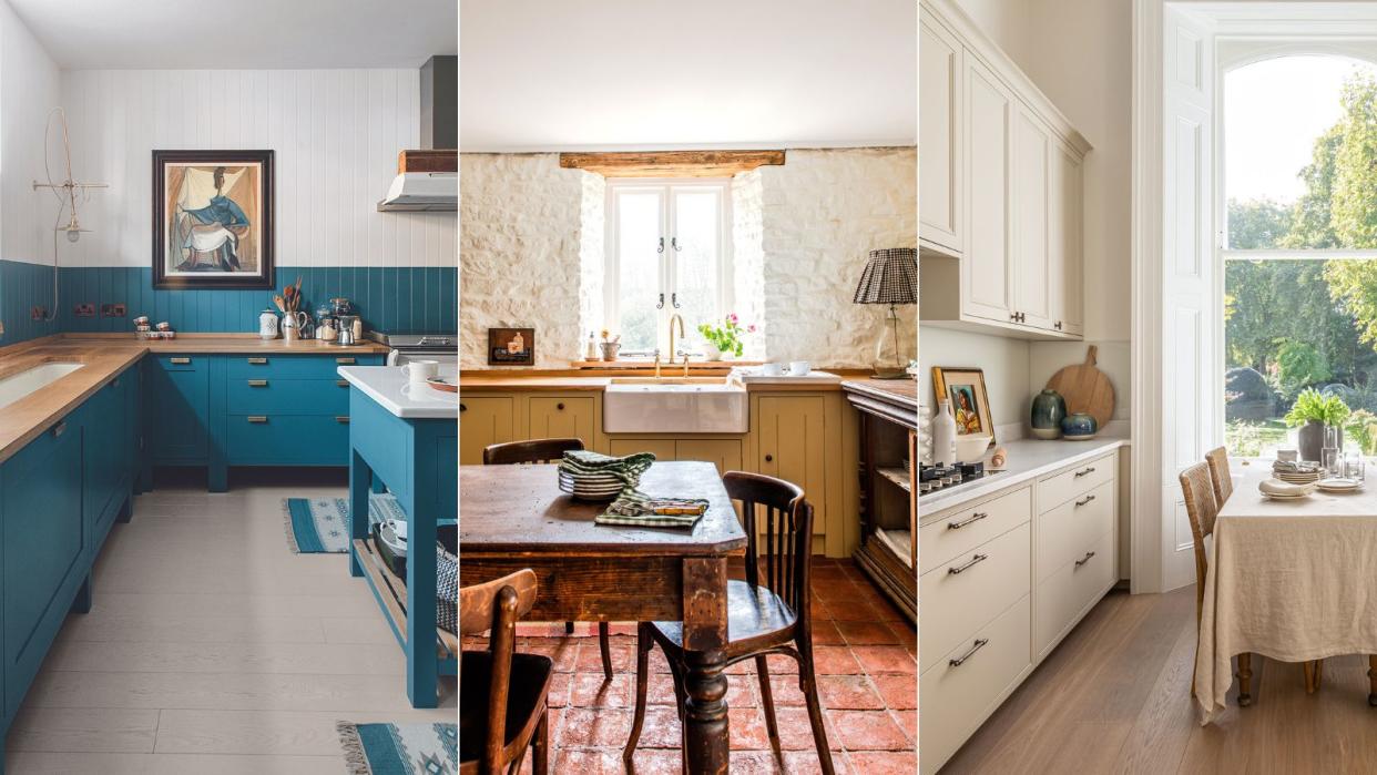
Adding color with paint is a quick and easy way to add style and personality to a kitchen, but get it wrong, and you could risk ruining the heart of your home.
Kitchen color (even if you’re using neutrals) should be the first thing to consider when you are looking for kitchen ideas. One of the most appealing finishes for kitchen cabinetry and walls, paint lends itself to both the classic looks of the traditional kitchen and crisply linear designs. The advantage is in its almost limitless choice of colors, allowing you free rein to express yourself, whether your home is period or contemporary, country or urban – and you can always repaint if you decide to update.
If you’re not confident in choosing a room color scheme, go with a pre-selected kitchen paint palette already picked out by the paint brand you’re using, or follow our advice later on working with tonal, harmonizing and contrasting colors.
Kitchen paint colors to leave behind in 2024
Much like with any outdated decorating trend, one of the biggest mistakes is to eschew painted kitchen ideas and room color altogether for fear that your space will age badly.
Here interior designers reveal what kitchen paint colors are going out of style for 2024, and how to approach choosing paint ideas for kitchens that truly sing, from using the color wheel to help you avoid making disastrous color mistakes to finding paint colors that will make you feel happier at home.
The Perfect Kitchen, Barbara Sallick | From $21.87/£30.45 at Amazon
Learn more about the fundamentals of kitchen design in this bestselling book. Find practical advice as well as hundreds of images to inspire your own remodelView Deal
1. Go for subtle pink instead of harsh red
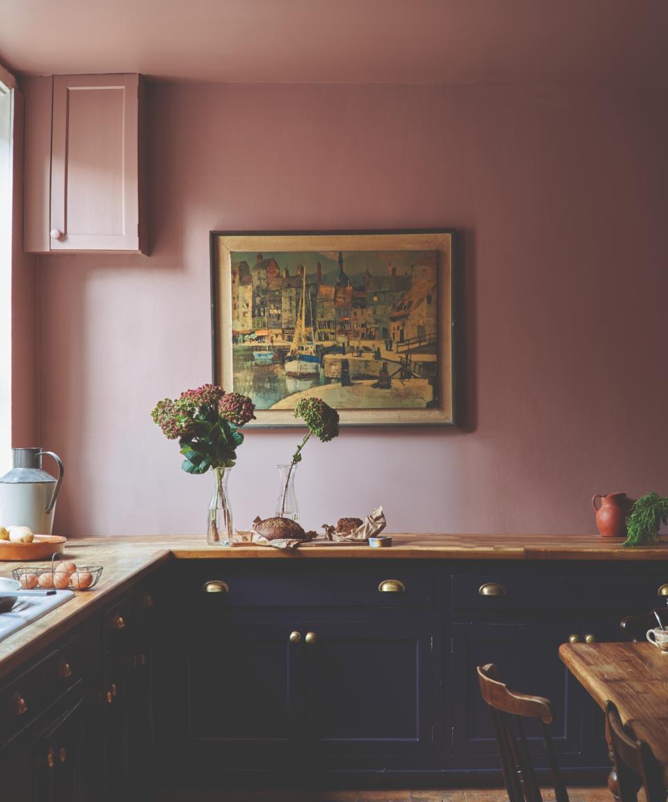
Red is a strong and bold color for the kitchen – the workhorse of the home – but lately we've been witnessing a color shift to a softer, subtle hue – enter pink.
Rich, elegant, and nuanced pink is undisputedly the color trend of the moment. A warm pink, like the one above, lends sophistication to a scheme. A versatile hue, it can veer into a playful pastel or brighten into deep coral.
‘This tone works perfectly in a small kitchen that is rather dark, or which suffers from a lack of natural light,' says Elizabeth Hay, founder, of Elizabeth Hay Design. 'Not only does it inject a space with brightness and cheer, but it will also bring out and highlight any accent colors in the room.’
With its clear ties to the natural world, warm pink is used for painting accent walls and brightening a kitchen or dining area with splashes of color that symbolize and promote health and vitality.
‘Due to its close relationship with pink and orange shades, the color is mood-boosting and energy-stimulating without becoming overwhelming like many red kitchen shades. On the other hand, with more muted and subtle tones, pastel pink can become a good choice to enhance quiet confidence and serenity,’ enthuses Sarah Lloyd, senior brand manager at Valspar.
2. Replace gray with beige and taupe
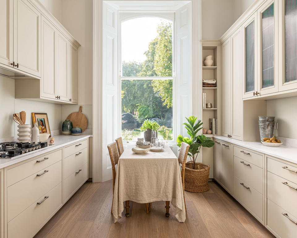
Once a tried-and-trusted neutral, gray has since fallen out of favor when it comes to kitchen cabinet colors. Instead, more designers and decorators are reaching for beige – the new neutral in interior design.
The power of a beige kitchen color palette to add warmth and elegance to the heart of our home should not be underestimated. A soft scheme of harmonious neutrals creates a reflective backdrop to the ever-changing light of the seasons.
The broad spectrum of neutral, earthy shades they conjure up offers rich inspiration for creating a soothing scheme. From creamy limestone shades and the oaty tones of untreated linen to the grayish-browns of weathered oak and warm earthenware ochres, neutral shades can be as captivating as color.
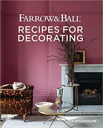
Farrow and Ball: Recipes for Decorating | $43.16 at Amazon
Farrow & Ball is a leading producer of high-end paint and luxury wallpaper, and their design experts share their wisdom for creating harmonious interiors and beautify home décor in this inspirational book.View Deal
3. Switch out white for a mood-boosting yellow
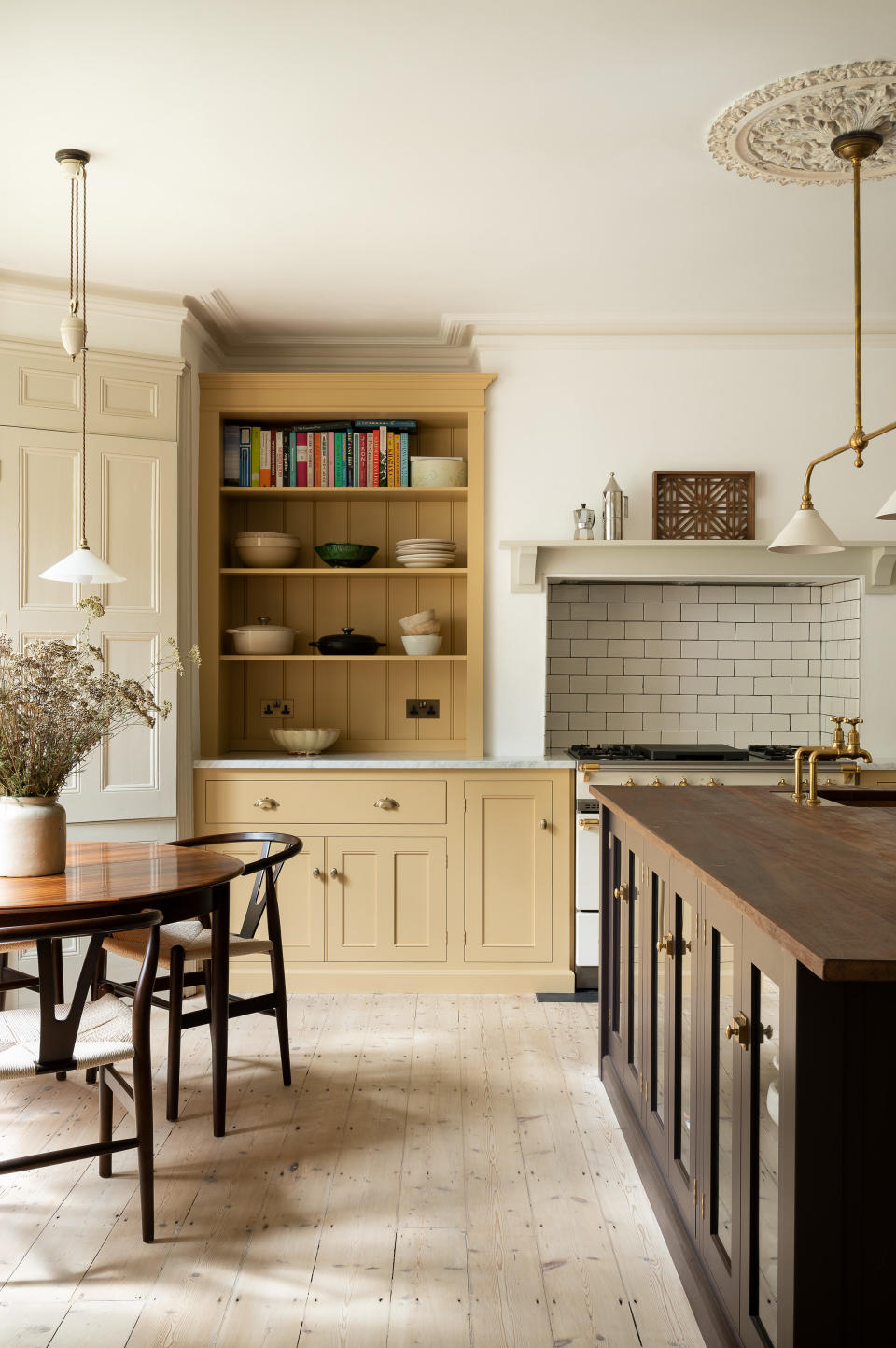
Another former favorite, white kitchens are no longer the desirable kitchen trend they once were. These days, designers and clients are reaching for mood-boosting hues to add a touch of joie de vivre to their kitchens. Unsurprisingly, yellow is shining a spotlight on our kitchen color schemes for 2024. As one of the most uplifting colors, it is not surprising that it is having a renaissance.
From pretty primrose to zesty lemon, yellow paint brings warmth and sunshine to every surface it touches in a light-filled kitchen. ‘This cheery paint color imbues the room with optimism and is perfect for bringing a sense of positivity into the home,’ says Justyna Korczynska, senior designer at Crown. ‘Yellow kitchens are also very soothing, particularly when paired with cool, calming tones such as greys and pale, muted blues. The color creates a sense of calm with a feeling of well-being and restfulness.’
As well as considering the style of the kitchen you wish to decorate, you should also think about how you use the space and the energy you wish to evoke. Paler, gentler hues will create a calming atmosphere while stronger sunnier hues offer more high-octane energy, especially important in a family kitchen. Tweak that energy further by opting for alternative finishes like chalk or glossy lacquer.
4. Swap a dated navy blue for cobalt, lapis and cerulean
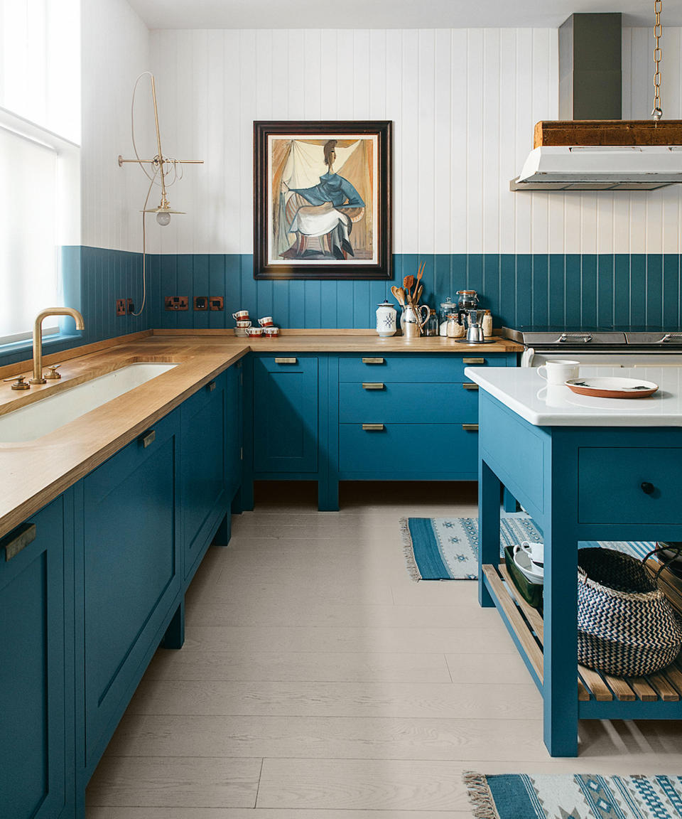
Navy blue will always be popular, but lately, designers have been considering softer, subtler, serene variations in the modern kitchen. A shade that's always been popular in the world of interiors, ocean blue is set to be 2024's kitchen paint color du jour.
From the alluring aquamarine hues of sandy Caribbean shores and the glistening teal tones of pebbled Mediterranean beaches to the inky blues and midnight notes of deep Atlantic waters, the colors of the ocean are as serene as they are striking and offer a versatile spectrum for decorating a contemporary and country kitchen alike.
‘Ocean blues, like lapis and cerulean, are the most wonderfully gender-neutral paint colors,' says Nicole Salvesen, co-founder, of Salvesen Graham. However, avoid using cold blues in north-facing rooms. Instead, find those that have some warm tones in them and they will be a brilliant backdrop for artwork, texture and timber.’
5. Choose pastels in favor of dark, unforgiving colors
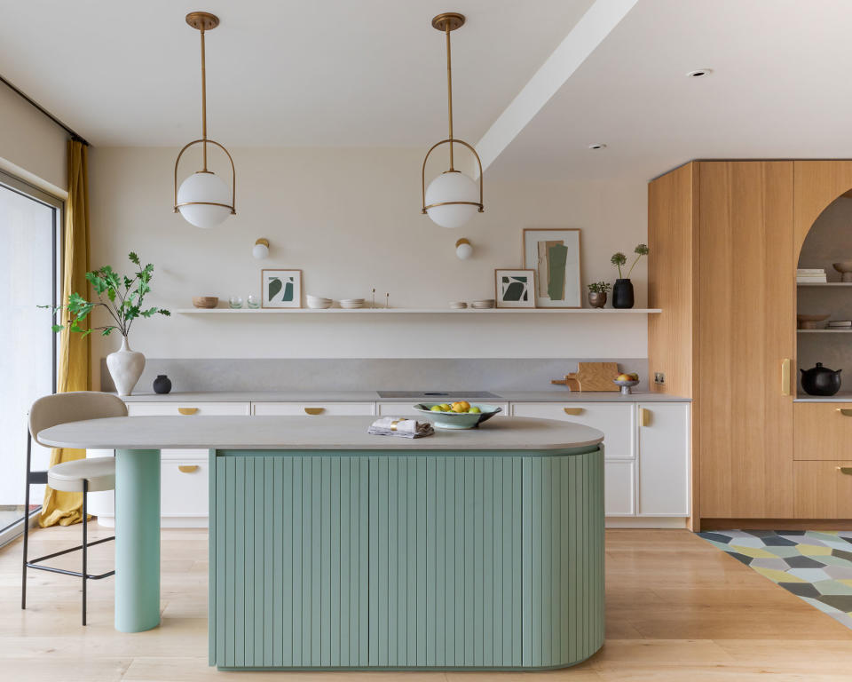
Dark kitchen cabinet colors were once considered the best paint palettes for kitchens. They were bold, strong and hid a multitude of decorating sins. However, we've gone full circle, like most trends, and are now welcoming back the pastel hues that previously graced 1950s kitchens up and down the country.
From peaceful pinks to blissful blues, pale sugary shades will give the illusion of space and create a restful atmosphere in the home.
'Pastel colors offer a charming alternative to neutrals or dark shades; they are calm but embracing, soothing but uplifting, and can give added life to a room without being overpowering', says David Mottershead of Little Greene.