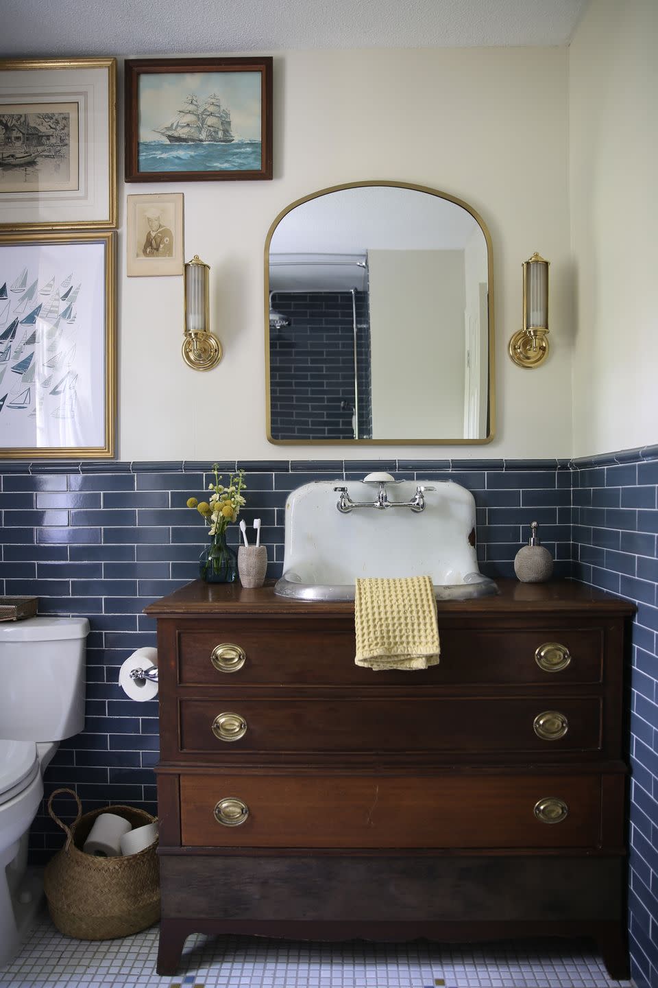
This Once-Kitschy Bathroom Was Transformed Into a Refined Refuge in Only Eight Weeks

Designing a room to a specific theme is a balancing act. With careful design choices, a theme will more closely translate to a single cohesive style—but lean in too heavily and the space becomes kitschy. In the case of blogger and designer Victoria Ford’s North Carolina guest bath, the previous owners had veered to the latter.
With lighthouse wallpaper trim and sponge-painted walls, her blue and white nautical-themed bathroom looked like something left over from the '90s. But as a participant in the One Room Challenge—a biannual design event in which creatives transform one space in a limited time period—Ford successfully translated her existing lackluster bathroom into a refined refuge while still managing to maintain a nautical feel. "I must have seen the previous wallpaper border in this space as a personal challenge and an inspiration all rolled into one," laughs Ford. No matter how she saw it, judging by its handsome outcome, the challenge was a success! Here’s how she pulled it off—without totally throwing out the original inspo.
Before
True to the seafaring-inspired scheme, Ford settled on an inky blue subway tile from Fireclay—fittingly named Nautical—to line the lower half of the walls. But despite being a main focal point of the room, it was actually the floor tiles that were the room's primary inspiration. "Marcus has very few opinions as I’m designing," Ford says of her husband. "So when he has one, I do whatever I can to make his dreams come true." Based on an image of a mosaic tile design her husband had spotted online, Ford once again turned to Fireclay. "Marcus and I played around with the colors on the site, mixing and matching and pairing arbitrary sets of four until we landed on this color combo," she says.
The dusty blue hue at the center of the mosaic was a non-negotiable for Ford, as it matches the wall tile in her en-suite bathroom. "I firmly believe in the concept of having bathrooms in the same house be cousins (not twins) and calling back to other areas in your home either in theme or color," says Ford. "For this bathroom, we chose color and theme since we have nautical touches in other places."
To create more of a lived-in look, Ford installed a trough sink she sourced from Facebook Marketplace. "This sink is rough but that is what we love about it," she says. "That’s a lot of polished in one space. The sink keeps the space gritty and loved." With the help of her contractors, Ford installed the sink into vintage vanity—another Facebook Marketplace find.

The room's signature half-wall tile extends into the shower, where Ford installed a shower niche she uses partially for storage and partially as an impromptu technology stand. "The niche is so important to me," she says. "I use it to prop up my iPad for Netflix when I detangle." She clarifies: "always with the water off," of course!
For Ford, this room is so much more than just a guest bathroom. "[It's] such an example of so many of the things that we hoped for and thought about when we were young and first got together,” she says. “A life together, a home of our own, the ability to be creative and have that creativity and our gifts make room for us. It’s just a bathroom but I never want to lose sight of how grateful I am."
Follow House Beautiful on Instagram.
You Might Also Like