Palmetto Bluff Idea House Photo Tour
Palmetto Bluff Idea House Photo Tour
Welcome to the Palmetto Bluff Idea House
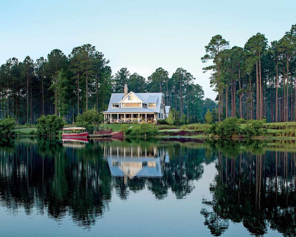
Welcome to the 2014 Palmetto Bluff Idea House in Bluffton, South Carolina! Here you'll find a room-by-room tour of our coastal showcase that's designed to inspire you and your home.Surrounded by pine trees and nestled beside a lake, the east-facing back porch offers unrivaled views of the sunrise. Take an overview video tour of the Palmetto Bluff Idea House
Entry: The Decorating
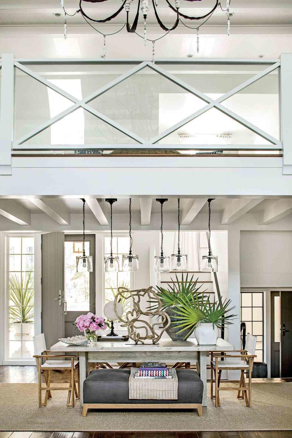
Like Ken, Suzanne encourages people to explore and use every part of a home. a€?In a house like this, most of the eating happens outdoors,a€? Suzanne says. She laid the proper foundation for a dining room: a rug to anchor the space, a trestle-style table, and a variety of seating options. But then she took a thoroughly modern approach, pulling an ottoman (which is more useful than a bench) right up to the table and using the dining area more like a library table. This homea€?s dining room, like every other one in the South, shouldna€?t be relegated to occasional-use-only status. Enjoy it every day. a€?This is todaya€?s way of living,a€? says Suzanne.
Entry: The Stairs
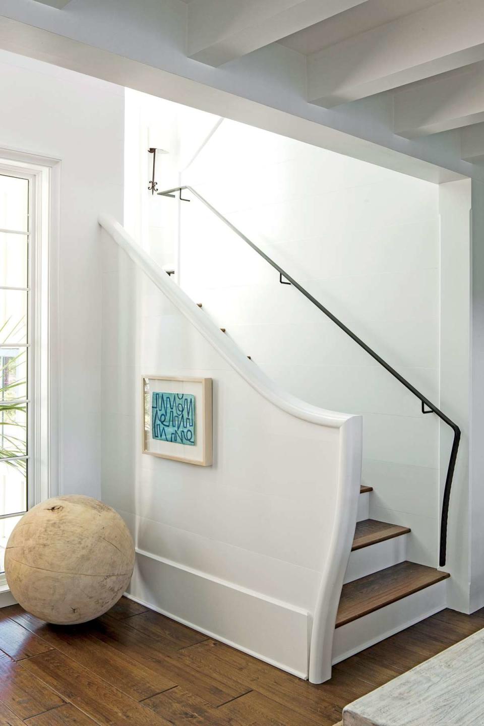
To encourage people to flow forward through the house, Ken de-emphasized the stairs, tucking them off to the side.

Entry: The Details
The six pendants have the feel of an art installation and further accentuate the lowered, beamed ceiling. Combining these lights with the tabletopa€?s driftwood and globe accessories, Suzanne established an entry point for her layered, sculptural look. a€?I wanted to show a casually elegant side of living,a€? she says. Suzanne set a wooden ball beside the stairs to call attention to the gentle curve of the railing, which references the flowing lines used on the exterior.
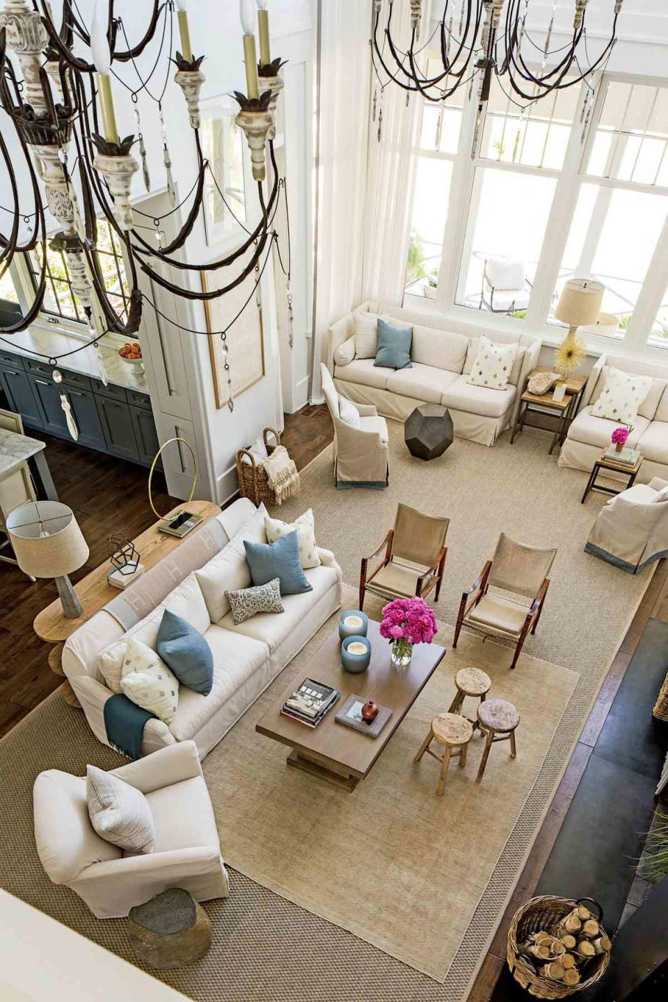
Living Room: The Space
a€?The stunning views of the marshland drove the living room design,a€? says Ken. He also wanted the room to be large enough for a family to be simultaneously connected and separate in two seating areas. The floor-to-ceiling clerestory bay window is more than just Kena€?s grand gesture to the landscape; it also ensures that the wraparound porch wona€?t steal a sliver of light from this ethereal space. To balance the white walls, Ken created a a€?super-heartha€? (shown on next slide) opposite the kitchen. a€?Ita€?s like the one at historic Biltmore,a€? he says. Made of blackened steel, it inconspicuously houses the tv, a bookshelf, and the primary bedroom door.Take a video tour of the Palmetto Bluff living room
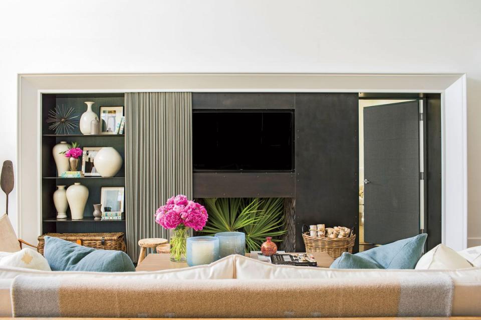
Living Room: The Decorating
To ground the 30-by 16 1/2-foot space, Suzanne used large sofas to carve out two separate seating areas: one in front of the windows and another around the hearth. Lightweight chairs and tables add a kinetic energy to the room. The pieces are easily interchangeable between spaces, so the seating combinations are flexible. Bringing the exterior color inside, Suzanne swathed the room in shades of white and added ribbons of blue. a€?Ita€?s a sophisticated French blue with gray and green undertones,a€? she says.
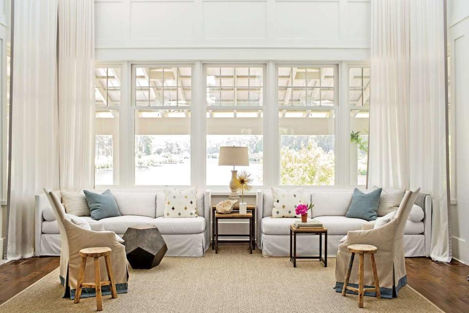
Living Room: The Details
Keeping the room a€?undecorated,a€? Suzanne focused on a few embellishments: Floor-to-ceiling curtain sheers (Mist Snow; sunbrella.com) frame the windows, layered rugs add texture to the space, and dressy chandeliers offset the minimalism.

Kitchen: The Space
Keeping traffic flow in mind, Ken designed a square, U-shaped kitchen that opens off the living area and then leads out to the porch on one end and to the clutter room on the other end. When stationed at the large island, which has a stove-top, the cook in the family can still interface with others. a€?Ita€?s like being at a Japanese steak house,a€? says Ken. The windowless wall was a natural place to house the rest of the appliances.Take a tour of the Palmetto Bluff kitchen
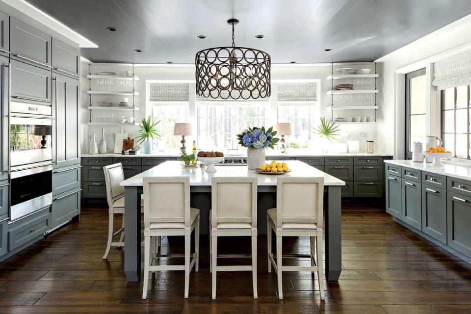
Kitchen: The Decorating
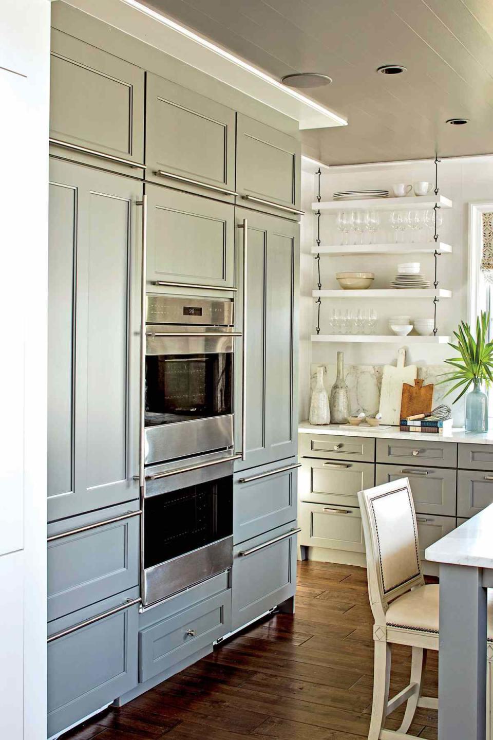
Simple Shaker-style cabinets in a gray-blue shade (Winslow in Willow; wellborn.com) mirror the heartha€?s colors. Suzanne says, a€?In open layouts, make all the spaces relate.a€? Free of top cabinets, the upper half of the kitchen looks especially expansive with white walls and a Calacatta gold marble backsplash that extends the countertops up the walls.
Kitchen: The Details
Noting that todaya€?s appliances are so well designed, Suzanne didna€?t bother hiding the double oven. And she stocked the open shelving with a mix of clear glasses and white pottery (Alexa and Potterswheel dinnerware from the Southern Living collection; dillards.com). a€?Put everyday things in reach so you can stow and go,a€? Suzanne says. Ken agrees, saying, a€?There is beauty in the functionality.a€?
Side Rooms: The Clutter Room
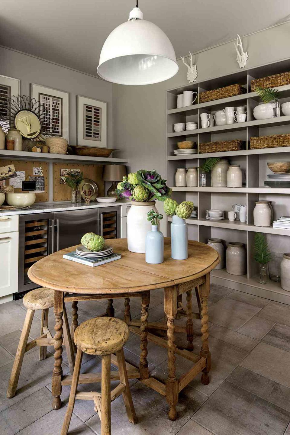
a€?In an open floor plan, you need to make sure there is a backstage area to hide things you dona€?t want the public to see,a€? says Ken. This multipurpose room, located between the mudroom and the kitchen, houses a dishwasher, a sink, two walls of lower cabinets, and a full wall of open shelves to help with kitchen storage. An antique French table and stools can be used as a desk or another spot to eat.Take a video tour of the Palmetto Bluff clutter room
Side Rooms: The Powder Room
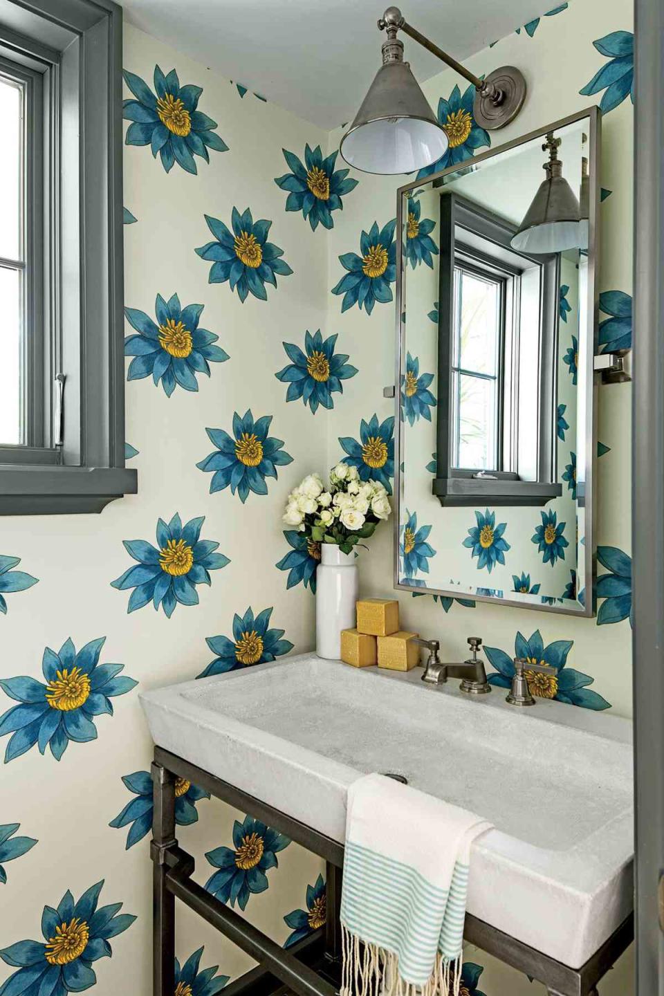
Suzanne broke from the rest of the homea€?s muted scheme and papered these walls with an exuberant pattern. a€?Try to make a small space extra special,a€? she says. Window trim painted Westchester Gray by Sherwin-Williams picks up on the deep blues in the paper and the steel legs of the Bradley sink, which is the only stand-alone sink in the home. A sliver of a mirror is topped with a library sconce to round out the furnishings.Take a video tour of the Palmetto Bluff powder room
Side Rooms: The Mudroom
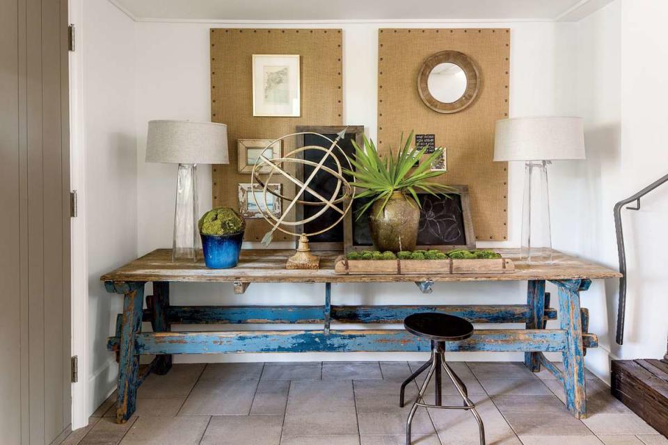
Those who park in the carport enter the home through here. Designed as a passthrough space that leads to either the clutter room or the dining room, it is sparsely furnished with an aged, blue farm table thata€?s convenient for holding handbags and keys. Two bulletin boards for posting schedules and other items keep a busy family organized. Tucked beneath the main stairwell of the home, the mudroom rests at a slightly lower level. Ken retrofitted antique timbers to make the stair treads. a€?I like using creative materials to help make our lives more interesting,a€? he says.Take a video tour of the Palmetto Bluff mudroom
Primary Suite: The Bedroom
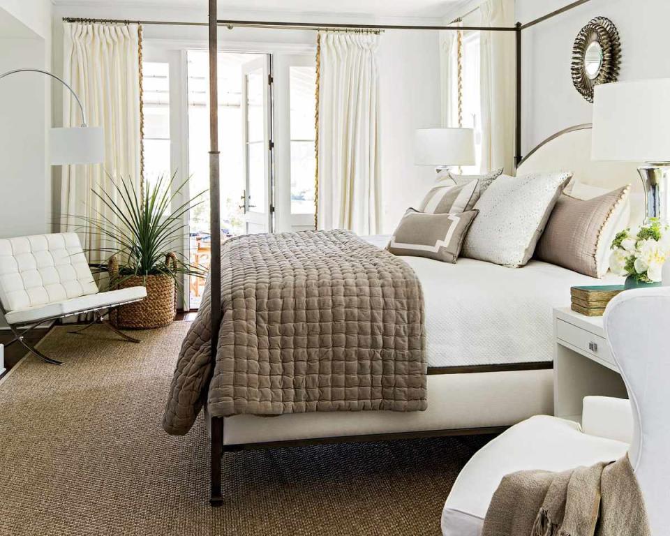
To get to the primary suite, you walk through the hidden upholstered door in the super-hearth. To give the room a water view, Ken placed it at the back of the house with a door leading off to the porch. Suzanne positioned the bed between the windows so the water is always in sight. White walls and breezy drapery (Linen Blanc fabric; ballarddesigns.com) on the windows and doors give the room an ethereal vibe and provide continuity with the nearby living room. To help soften the space, Suzanne layered in a sisal rug and rich bedding textures including velvet, pom-pom fringe, and metallic linen. Shiny lacquered nightstands add a mod punch to the subdued mix.Take a video tour of the Palmetto Bluff primary bedroom
Primary Suite: The Bath
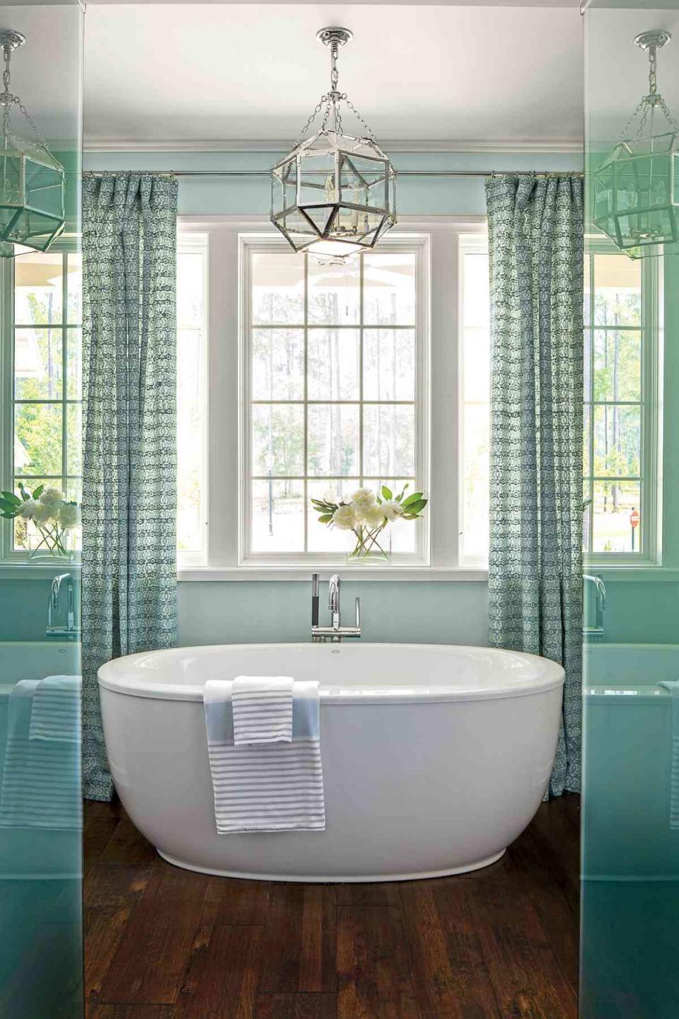
A small hallway with two walk-in closets leads into the serene bath, painted a soft blue (Rainwashed; sherwin-williams.com). Suzanne created dramatic focal point using curtains to frame a freestanding tub. The rest of the space is completely symmetrical: Twin vanities are opposite each other, and two frosted-glass compartments flank the entrance. The opaque glass adds spa-like feel and lends a sense of privacy to the generous shower and water closet.Take a video tour of the Palmetto Bluff primary bath
Bunks & Bridge: The Bunk Room
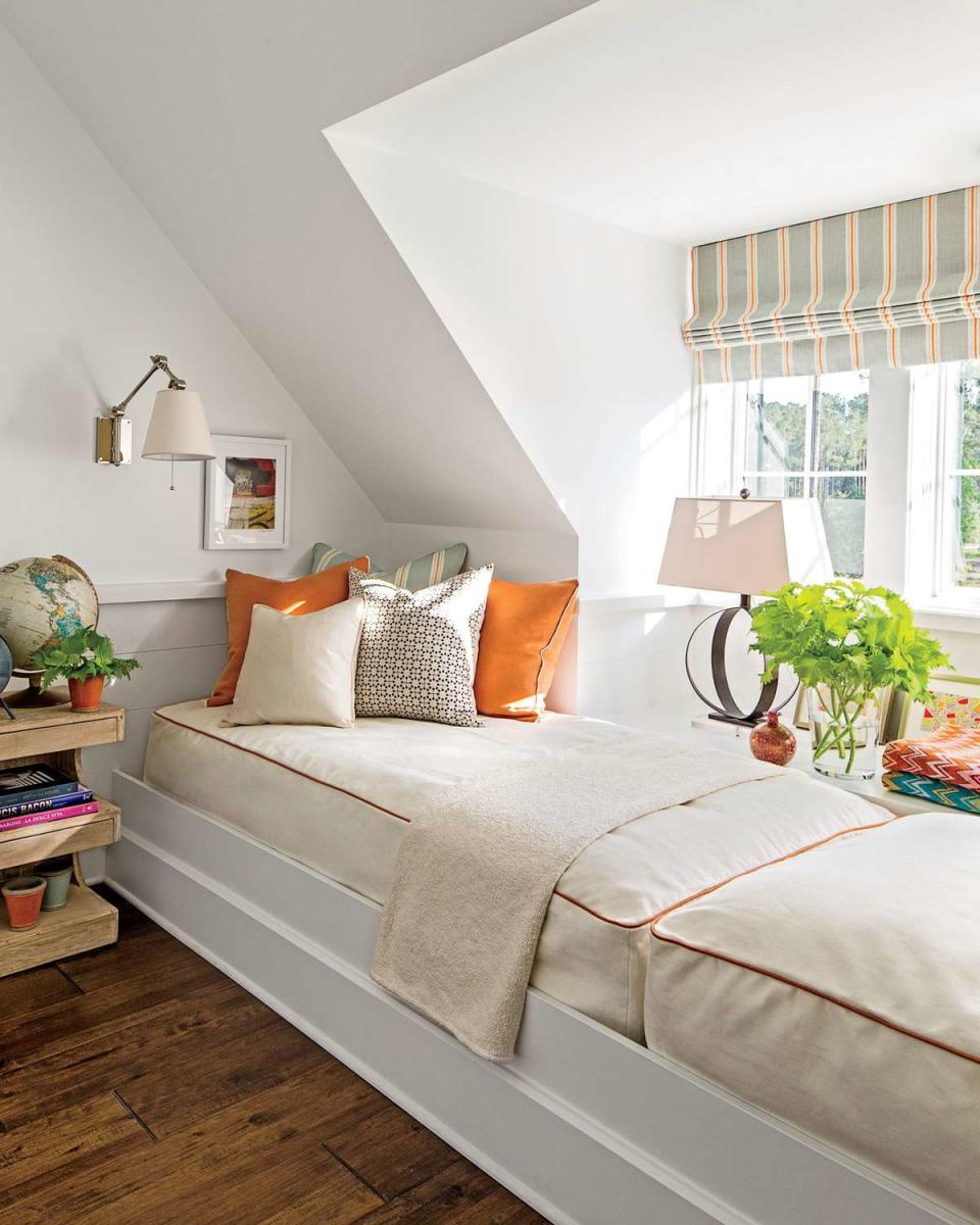
During a construction walk-through, Suzanne discovered a sizable portion of unused space off the bridge above the primary bath. A quick measure revealed that the oddly shaped room was around 13 feet wide by 8 feet deep. Coincidentally, the combined length of two twin beds is about the same distance. a€?We all know that the best houses are all about friends and family,a€? says Suzanne, who crafted the space into an accommodating hangout and extra sleeping spot. Two twin mattresses rest on a tiered wooden platform covered with custom, tightly fitting, orange-piped bed coversa€"similar in design to fitted sheets. A window ledge (tucked between the eaves of the roof and built up to bed level) serves as a nightstand. Space-saving library sconces mounted at each end provide reading light. A cheerful blue-and-orange-striped (Stockholm Stripe by Vanessa Arbuthnott) Roman shade is a smart option for compact spaces and injects youthful energy into this area.Take a video tour of the Palmetto Bluff bunk room

Bunks & Bridge: The Bridge
In keeping with the homea€?s open-air vibe, Ken elected to go wall-less in the space that connects the two upstairs wings. He affectionately calls the area a€?the bridge,a€? a play on the homea€?s waterside location. Like an observation deck, the area provides the best views in the home and makes a great place to perch. a€?You can sit and read up here away from everyone but still be in the know about downstairs happenings,a€? notes Ken.Take a video tour of the Palmetto Bluff Idea House bridge
Bunks & Bridge: The Bridge
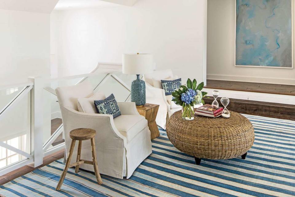
Sticking with the blue-and-white palette that runs throughout the living room, Suzanne shook things up a bit, giving the bridge a California-cool vibe infused with deeper indigo hues. a€?We planned the room around this striped dhurrie rug found on a trip to Los Angeles. The tones are a bit stronger, but it shows the power of using a single pop of color,a€? she says. To crank up the rooma€?s Southern sensibility, gracious armchairs, a wicker ottoman, and a lamp made from blue-and-white pottery round out the mix.
Guest Suite: The Bedroom
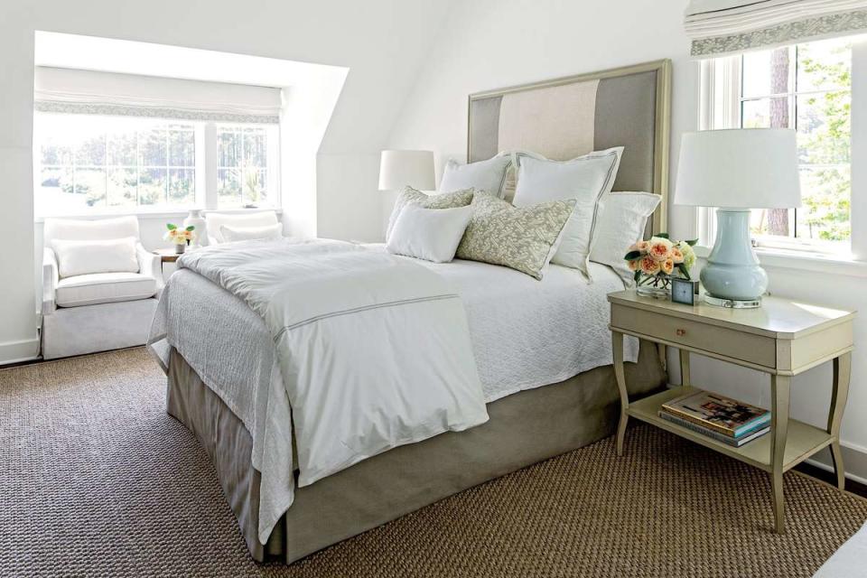
Upstairs, Ken created a guest suite that loosely mirrors the layout of the primary suite below. a€?Ita€?s nice to have a retreat-like space for guests that is away from the hustle and bustle of the house,a€? he says. Relying on a mature, gender-neutral palette of deep taupes, soft grays, and crisp whites, Suzanne grounded the space with Hickory Chaira€?s Candler Bed and shapely West Paces Side Tables in matching birch finishes. The wooden frame around the striped greige-and-white headboard dresses it up for special visitors. A bed skirt in the same fabric as the headboard and timeless white bedding ensure that this occasional use room wona€?t go out of style.Take a video tour of the Palmetto Bluff Idea House guest bedroom

Guest Suite: The Bedroom
a€?Always place a comfortable seat near a window that looks out on the water so you can savor the view,a€? says Ken. Heeding this advice, Suzanne placed a pair of upholstered armchairs in the windowed niche.
Guest Suite: The Bath
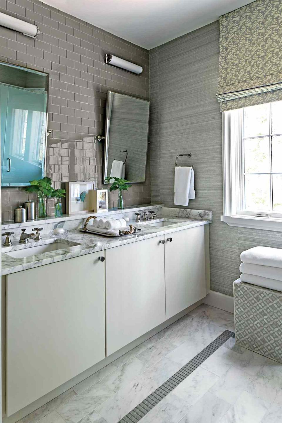
This space boasts a double vanity, miles of tile, lots of luxe marble, and other high-end touches. a€?We created this bath to be smaller in size but still on par with the primary bath,a€? says Ken. Suzanne continued the restrained styling of other rooms and layered in plenty of muted colors and patterns for interest. a€?I like to design baths that are timeless,a€? she says. a€?In here, the bluish gray colors and the combinations of glass, grass cloth, and marble create a very chic feel.a€? Simple, plain-front cabinetry; minimal twin mirrors (23030128, rh.com); and picture-light-inspired sconces (Calliope Bath Light, circalighting.com) take a backseat to the rest of the rooma€?s details.Take a video tour of the Palmetto Bluff Idea House guest bath
Kids' Bedrooms: The Girl's Room
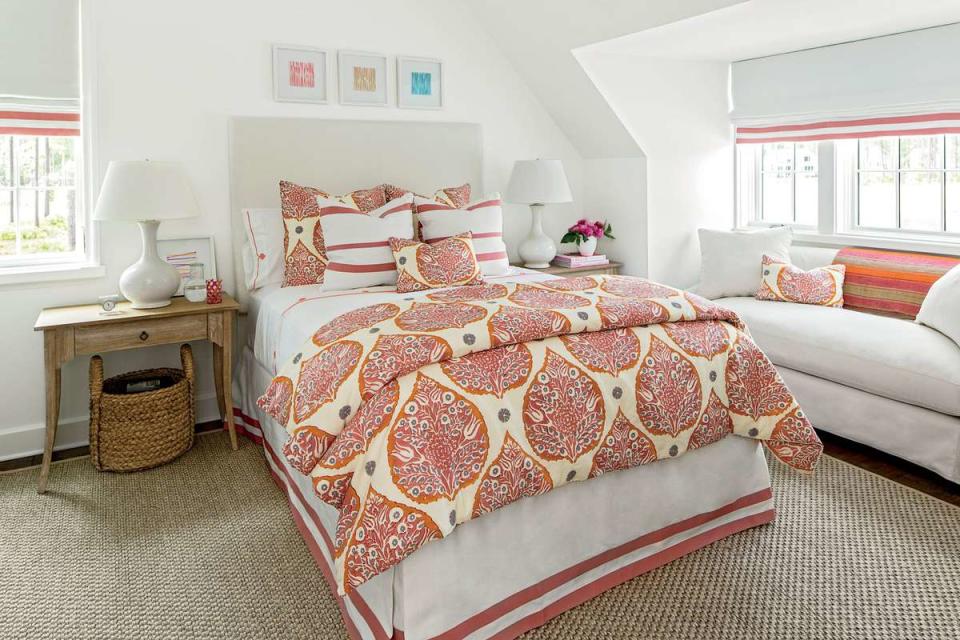
Citrusy splashes of pink and orange adorn this room, courtesy of Galbraith & Paula€?s Lotus fabric in Rhubarb. a€?It is sophisticated but will appeal to any age,a€? Suzanne says. a€?In kidsa€? rooms, ita€?s key to pick a fabric that allows whoever will be in the space to add their own personal touches. It needs to evolve with them over time.a€? Although this pattern has several hues to pull from, Suzanne practiced her signature restrained use of color and simply ribboned pink accents throughout the room: on the sheets, bed skirt, and windows. A simple, square-shaped headboard, directed by the rooma€?s angular architecture, and a matching pair of natural wood bedside tables complement the space. Above the bed, Suzanne hung a row of artwork for a final burst of color.Take a video tour of the Palmetto Bluff Idea House Girl's Room
Kids' Bedrooms: Boy's Room
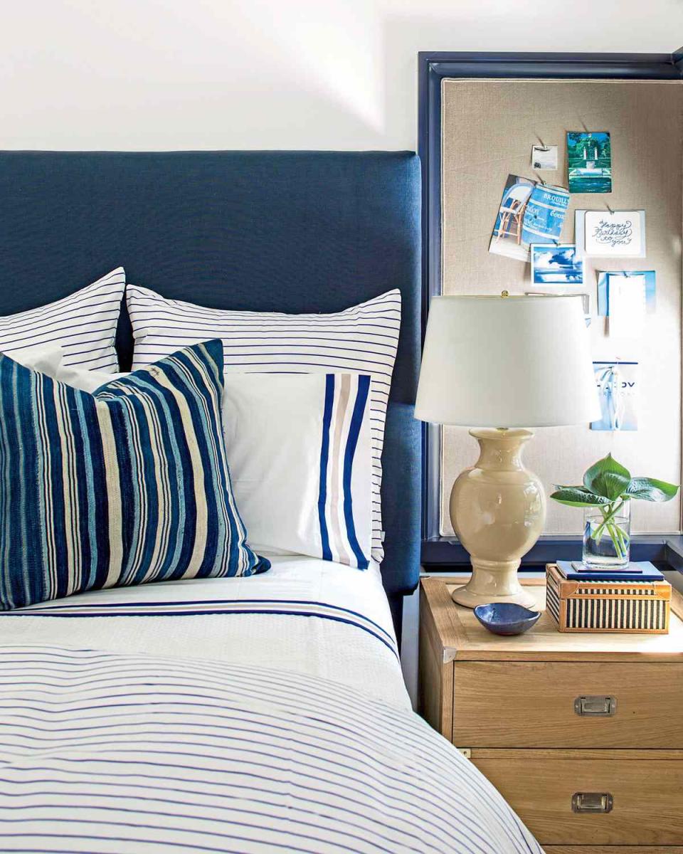
Next door in the boya€?s room, Suzanne took a slightly nautical direction that is particularly apropos for a home on the water. She anchored the room with a navy headboard and bed skirt. Then, she layered on striped navy-and-white bedding (Percy Stripe Duvet Cover and Euro Shams in Cobalt and the Beach Stripe Sheet Set; serenaandlily.com). a€?You need to create a tasteful foundation that gives the child the freedom to accessorize the room however he wants,a€? she says. To temper the stark contrast between navy and white, Suzanne worked in natural wood and khaki accents. a€?A warm, limewashed wood finish goes well with navy,a€? she says. A campaign chest from Ballard Designs (ballarddesigns.com) serves as a bedside table and packs extra storage in the room.Take a video tour of the Palmetto Bluff Idea House boy's bedroom
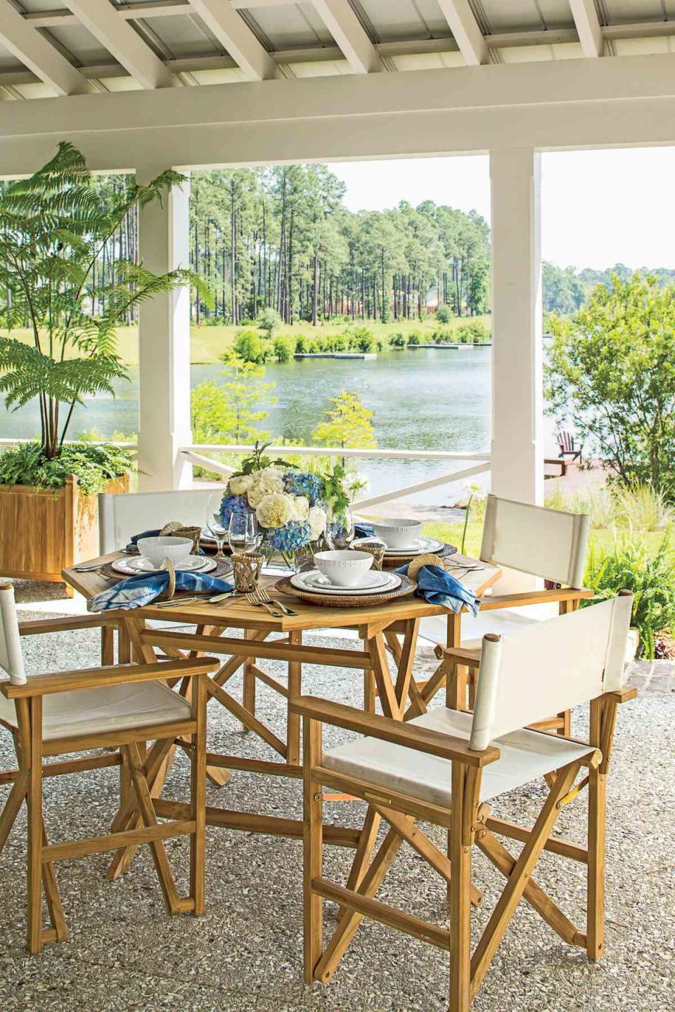
Porch: The Space
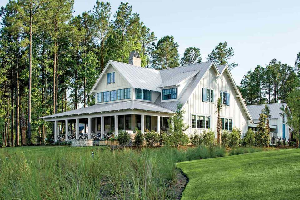
At 49 feet long and 12 feet deep, the wraparound back porch was conceived as a series of three rooms, not a narrow hallway. a€?The porch wraps the living rooma€?s bay window,a€? says Ken. a€?To keep the outdoor furniture out of the windowa€?s sight lines, I dropped the rear porch 2 feet lower than the main-floor rooms.a€? Entry points placed on the sides echo Kena€?s interior floor plans but dona€?t disrupt the central seating area. Ceiling fans help keep the open porch well ventilated on hot and humid South Carolina days.Take a video tour of the Palmetto Bluff Idea House outdoor living spaces
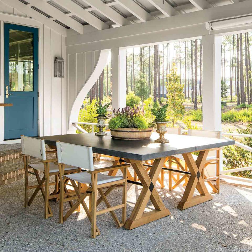
Porch: The Decorating
Wanting to create a comfortable but stylish outdoor area, Suzanne approached the space the same way she approached the living rooma€"with a blue-and-white palette, flexible seating arrangements, and an edited mix of styles and materials. a€?Off the kitchen, two tables are pushed together to make one big square surrounded by the same chairs that flank the dining table inside,a€? she says. In the central lounging area, she placed two sectionals together to create a u-shaped seating area that looks out to the water. She anchored the space with a blue-and-white-striped rug and an elegant teak coffee table. Beyond the seating area is a second, smaller dining table that can double as a card table. a€?Ita€?s important that this outdoor space accommodate a lot of people,a€? says Suzanne.
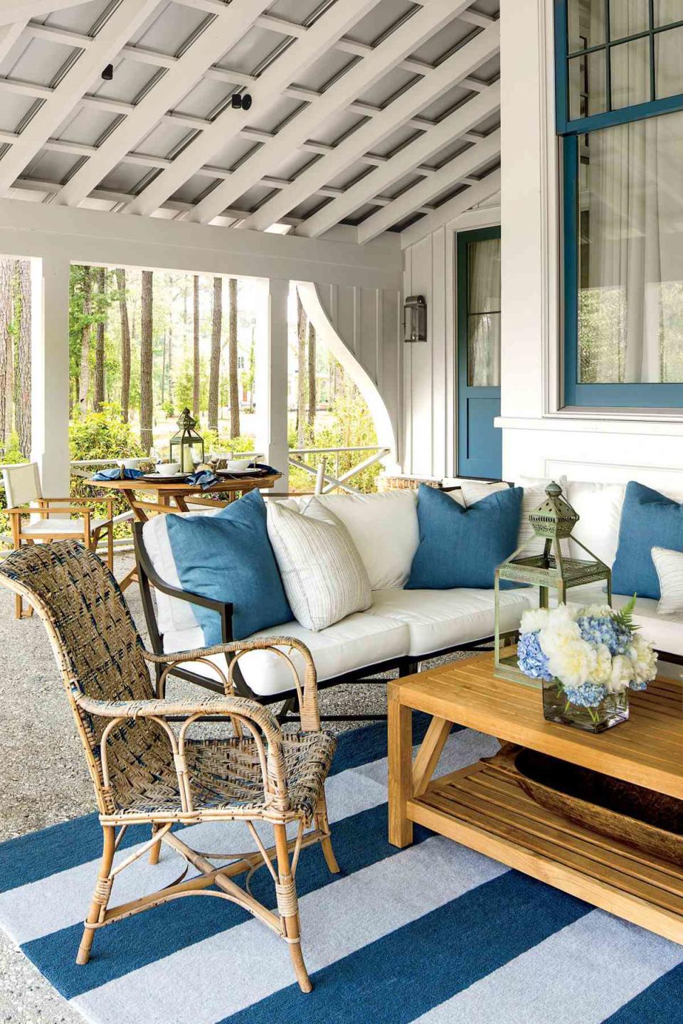
Porch: The Details
Treat the furniture arrangements like you would insidea€"but not the materials. The porch is exposed to the elements, so outfit it accordingly with outdoor fabrics and rugs, such as these Sunbrella cushions and pillows. Dona€?t be afraid to bring out a few older pieces to lend the space some patina. An antique rattan chair is light enough that it can be moved inside quickly and easily. Accessorize tabletops with lanterns for light and floral arrangements in weighty, windproof containers.
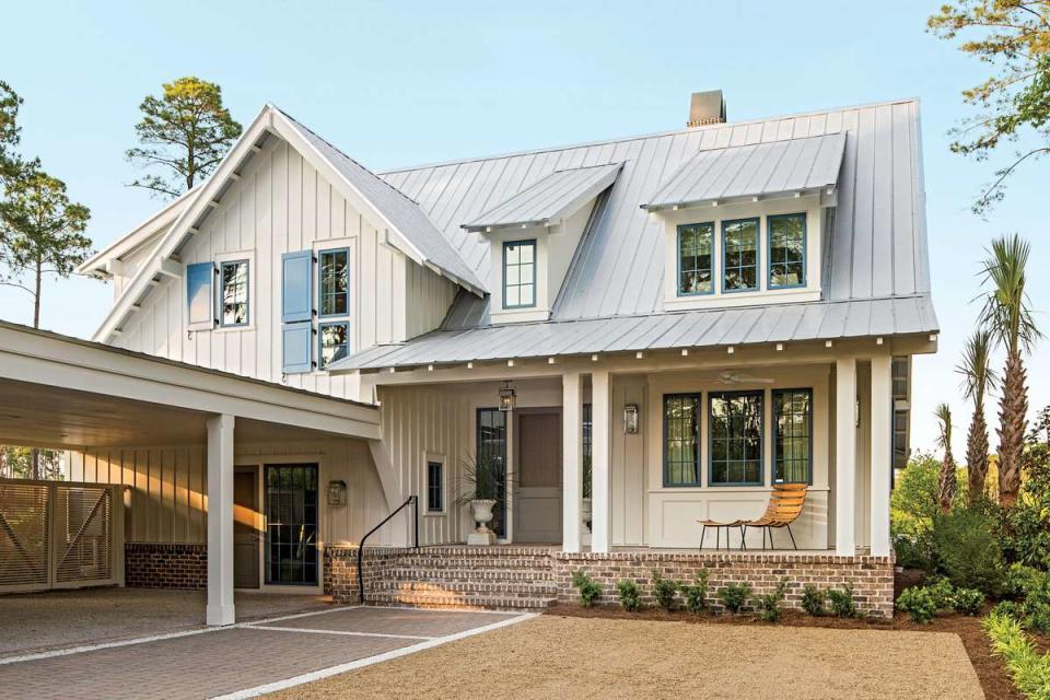
Exterior: The Front
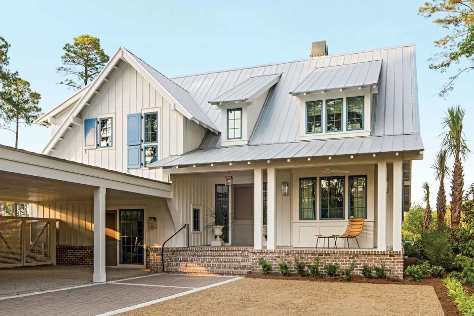
a€?I wanted to design a house that feels fresh right now but will still be relevant in 100 years,a€? says Ken. Using time-tested, durable materials with crisp lines, such as James Hardie board-and-batten siding, plank-style shutters, and a standing-seam metal roof, creates a simple silhouette that wona€?t tire over time. The location of this home in Palmetto Bluff is both suburban and waterfront, giving Ken the opportunity to create almost two homes in one. Street side, he designed a more humble facade with a covered storage area and parking pad running perpendicular to the main mass. a€?I imagined it like an arm reaching out to visitors,a€? says Ken.
Exterior: The Sides & Back
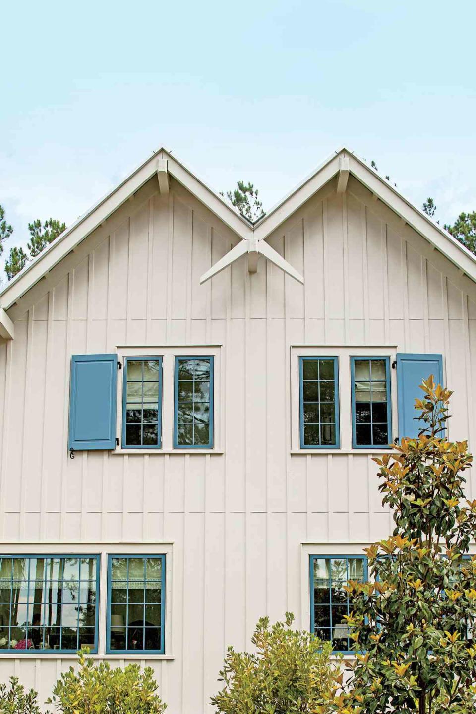
a€?I wanted to show that a modest house can still be dramatic,a€? says Ken. So on the water side, he created a headturning look with a sharply symmetrical facade centered on a steep gable roof that houses the double-height clerestory bay window. To balance the soaring shape, he flanked the gable with shed dormers and hugged it with the wraparound porch. On the sides, Ken takes your eye on a fun zigzaggy ride with a double-gable roofline outlined with exaggerated overhangs. The cheerful colors, familiar barn forms, and classic materials balance the homea€?s impressive back side. a€?For every elegant gesture in the architecture, I tried to include an equally humble one,a€? Ken says.
Exterior: The Swoop
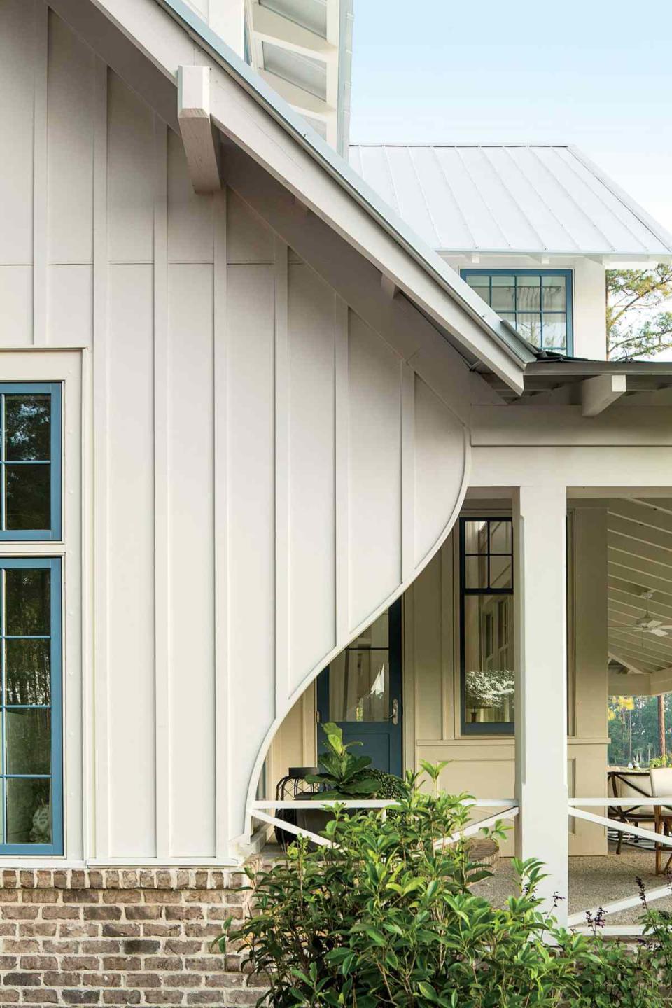
Because 90-degree angles and straight lines are less often found in nature, Kena€?s hand-drawn curves lend an organic, artistic touch to his homes.
Exterior: The Double Gable
Ken highlighted the exteriora€?s razorsharp silhouette with an X shape by extending and crossing the roofa€?s rafter tails.
Exterior: The Garage
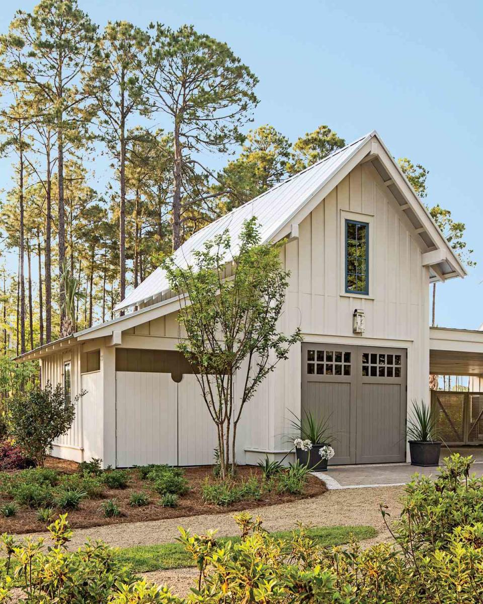
Intended to double as an entertaining space, this structure has a steep two-story profile to up the buildinga€?s drama and balance the main house. In lieu of hardware, Ken notched the doors to make handles.
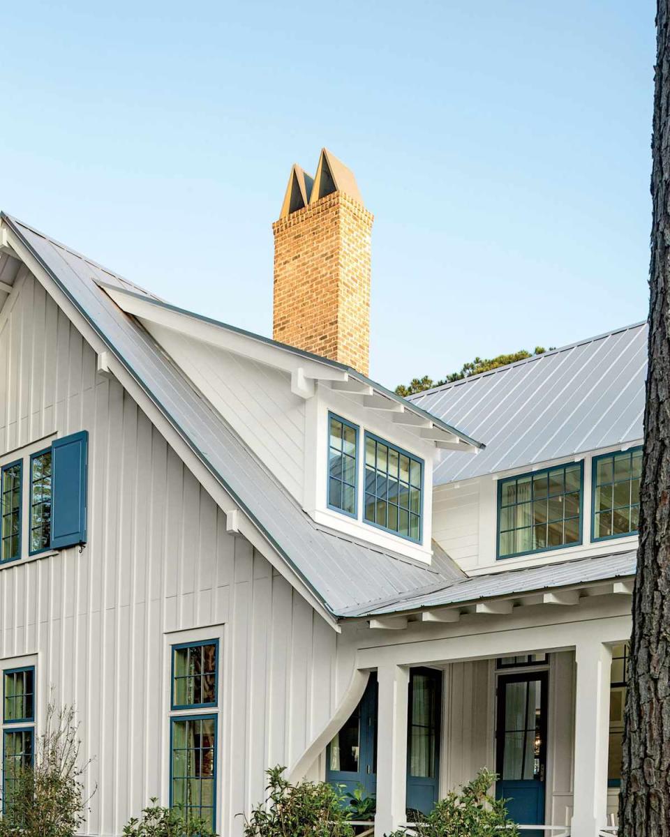
Exterior: The Roof
Extended overhangs show off simple rafters around the house. The M-shaped chimney flue keeps water out of the fireplace and was inspired by the work of architect A. Hays Town.
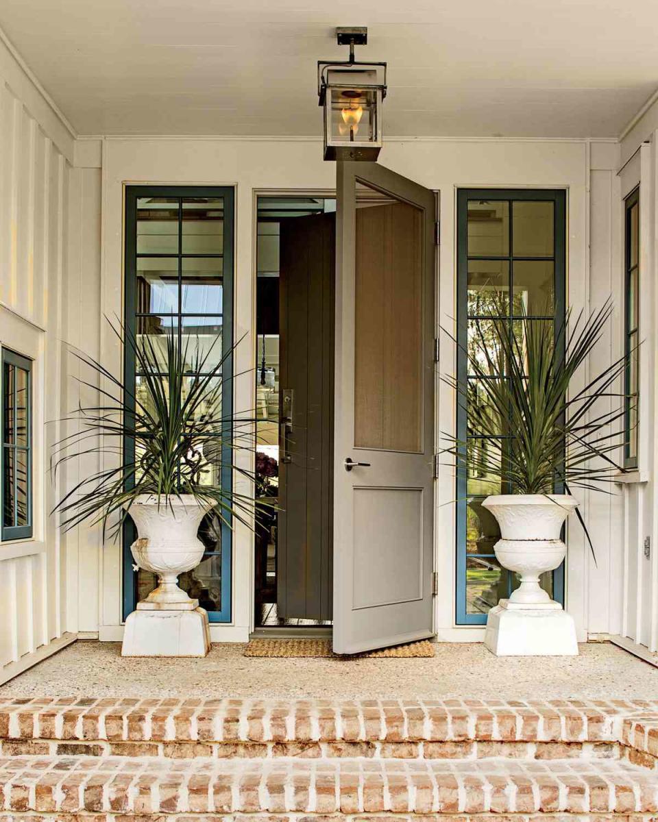
Exterior: The Front Door
Ken hung a classic screened door over the front door to lessen the entrya€?s formality and set a relaxing tone. Gas lanterns in a stainless steel finish from Bevolo (bevolo.com) complement the housea€?s cool color palette.
In perfect tandem, Architect Ken Pursley and Interior Designer Suzanne Kasler work together to write the next chapter of Southern style with our 2014 Idea House. It's lighter, fresher, and more livable than ever before. | Story by Zoe Gowen