This Perfectly Preserved Victorian Brownstone Got a Midcentury-Inspired Transformation

Finding an affordable pre-war brownstone a stone's throw from Manhattan is, in itself, a near-impossible task; finding one that also happens to be in immaculate shape requires nothing short of a miracle. So when a pair of prospective homebuyers struck out in their search for the ideal Brooklyn townhouse, she decided to broaden their parameters—and ended up with a dream house on the opposite side of Manhattan.
Located in Jersey City, the 1837 building was in excellent shape. Owned by the same family for generations, its 12-foot tall ceilings, original parquet oak flooring, and impressive crown moldings were still fully intact. “It's rare to see townhouses like that that are so well-preserved and with that much light. We were sold as soon as we walked through the entryway,” says the homeowner.
As beautiful as the details were, though, the house was in need of some updates to make it more accessible for its new inhabitants, including two young children, now aged 3 and 6. To guide the process, the owners hired Ana Claudia Schultz, a designer based in New York's Hudson Valley. Read on to see how she turned the living room of this historic home into an eclectic, family-friendly space.
Splurge on Custom Built-Ins
While the architectural elements were intact, the furniture was less so. "The living room had cabinets that looked like they were going to fall on you," says Schultz of the uber-traditional space. So she removed them entirely, replacing them with custom floor-to-ceiling walnut built-ins, which were carefully installed by Jamie Ladd of JTL Woodworks in Red Hook. The wall-spanning height accentuates the room's tall ceilings and adds structure; bespoke touches like slatted wood panels hide a stereo system.
Soften Angles With Curved Furniture
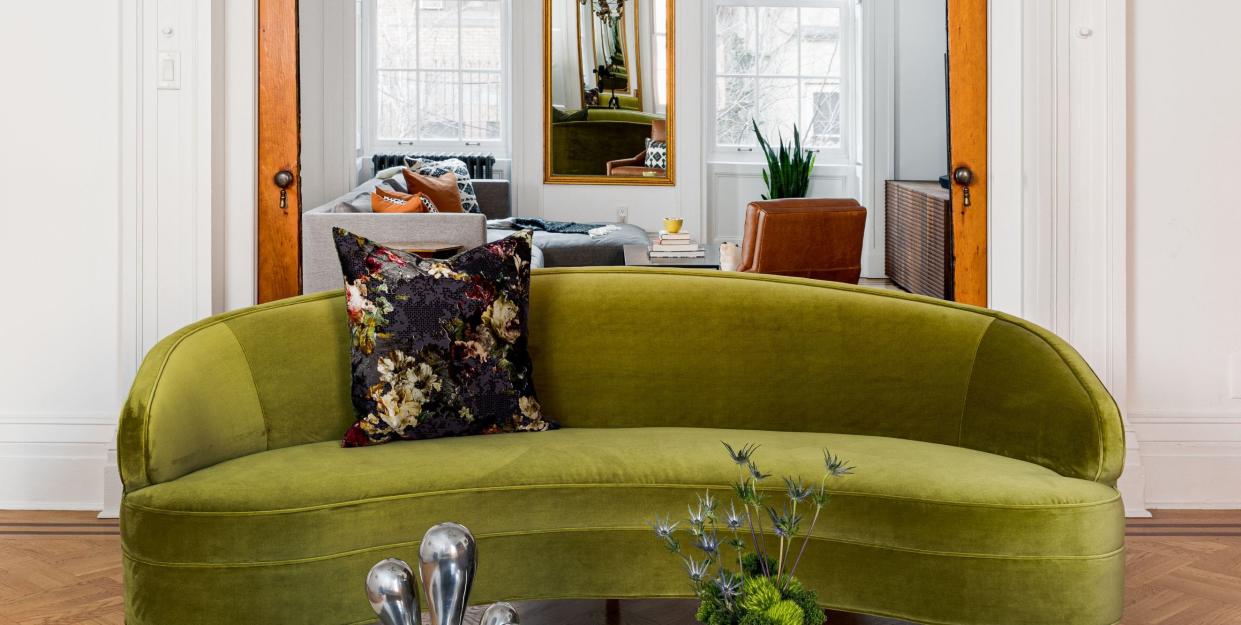
With the mid-century-inspired built-ins in place, Schultz added a pair of curved sofas in a lush green velvet. “Even though the space had beautiful architectural detail, the room was rectangular, the mantle was rectangular, and there needed to be some balance," she explains. "Curved furniture softens the space." The shape also allowed the designer to fit in a bit of extra seating without taking up as much visual space as an L-shaped sectional would require.
Embrace Juxtaposition
With its dark millwork and rich gem tones, the formal living room strikes a decidedly moodier tone than the adjacent family room, which is separated by a pair of Victorian pocket doors that are often left open. While Schultz embraced the differentiation, she also used recurring elements and colors to tie them together: Matching glass Roll and Hill chandeliers and black marble fireplaces create visual symmetry, while an eclectic collection of global goods—a sculpture from China, a rug and painting purchased in Pakistan—is scattered throughout both spaces.
Follow House Beautiful on Instagram.
You Might Also Like