Renault's new Ampere logo is radically different
Renault has officially launched its planned electric vehicle spinoff Ampere, and it's unveiled the brand's logo for the first time. The design for a business that aims to "democratise EVs in Europe" references the shape of the Renault logo that we know, but it's also very different from other car logos, especially in terms of colour.
It might not immediately look like a car logo (see our article on the best car logos), but such a distinctive design could help Renault's new EV brand stand out as the EV market starts to get more competitive.

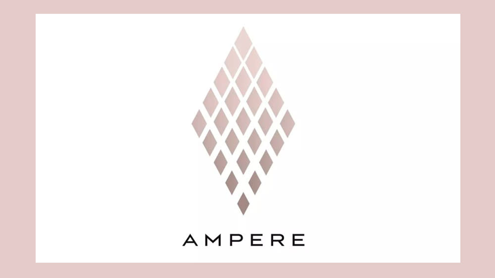
Renault's logo for Ampere might initially make you think more of a cosmetics or skincare company with those shades of pink and brown. Although several car brands have been toning down their colours to an extent (think the new Citroen logo), I can't think of another car logo that has such muted skin-like hues.
The new logo eschews the typical masculinity and sometimes even aggression of many car logos for a understated design that takes the Renault diamond logo and turns it into a bank of many small diamonds. These change hue through top to bottom as the amount of white space between them shrinks.
The French car manufacturer says the geometry of the Ampere logo is arranged in a way to convey the idea of “perpetual motion and ascending upwards to a shared goal.” It also cleverly conveys an idea of electrical charging as well, with the colour gradient seeming to show power being charged to the larger diamond's smaller diamond cells.
The type for the brand's name is more like what we would expect for an EV brand: clean, elongated letters that feel slightly futuristic. It feels quite classy for a brand that aims to cut EV prices.

Ampere aims to be “the first European EV and software pure player," taking the lead in the development of electric vehicles and software-defined vehicles on the continent. But, with access to Renault’s industrial resources, it also aims to reduce the cost of EVs to make them much more affordable. For now, Ampere remains wholly owned by Renault, but its shares will trade separately from spring 2024.
There have been a lot of car logo rebrands in recent years, including some, like the new Ford logo, that were so subtle that people barely noticed them (also see our round up of subtle logo changes that made a big difference). The general trend has been towards flatter, simplified designs.
The Ampere logo aligns with that tendency to extent, although it also goes against it by including a large number of small elements and incorporating a sense of depth in the colour gradient. The result is an identity that looks quite unique in the car market.
