The Shower in This Brooklyn Brownstone Leads to a Secret Patio
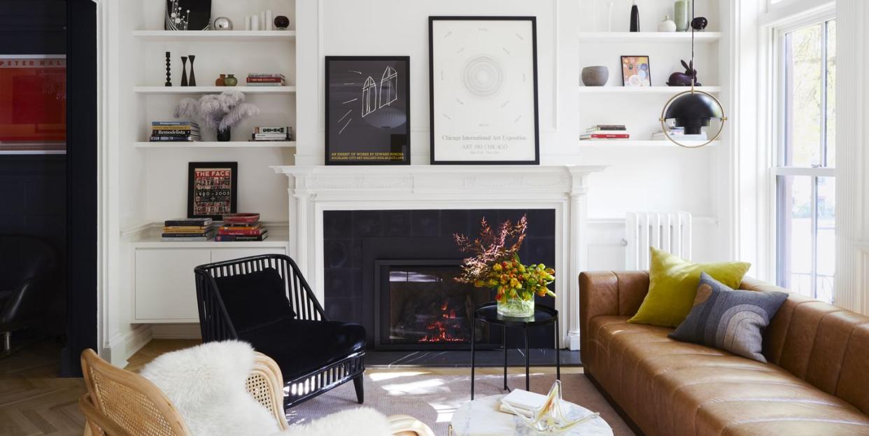
“It is about focusing your eye onto something worth focusing on,” says designer Sarah Hill of her use of black paint throughout this townhouse in the Clinton Hill neighborhood of Brooklyn. “It's the front door. It's the fireplace. It's this great paneling in this one section of the room.” And the kitchen cabinets, and Corinthian columns, and the master bath’s marble countertop and tiled floor. When the bones of a home are this fantastic, there sure is a lot to draw attention to.
For Hill, cofounder of the sustainable firm Urban Pioneering Architecture in New York City, it was a dream project. First up were the clients: The wife is a design writer who’s covered the industry for years, while the husband is a lawyer whose side hustle is restoring antique lighting (note the amazing fixtures in every room). “It's great to have that client who knows what she wants,” Hill says. “And she really liked the idea of something very modern that worked as a contrast to all of that classic architecture. That mash-up, I think, works really well in these older homes.”
Old indeed—the house dates back to 1860 but was gut-renovated in the 1920s or ‘30s, according to Hill’s detective skills, and is now under landmark protection. Her edict for the renovation and subsequent design? “Don't strip the house out of all its great character. Celebrate that character,” she says, “but then also make sure that it doesn't compromise their modern aesthetic.”
Both goals were accomplished with the black-and-white color scheme. “I have a soft spot for the Farrow & Ball Pitch Black. I think it's just a really great, rich, deep, interesting black,” Hill says of the paint color on the front door and central staircase (a very unorthodox feature from the 1920s renovation, as brownstone stairwells are usually along the farthest wall). “And then the client really liked [Benjamin Moore] Witching Hour,” she says of the staircase’s wall and trim color, which appears in two finishes. “That was definitely her favorite black, because it's black that goes a little cool, a little blue, which she thought had a nice play off of the Pitch Black.”
Kitchen
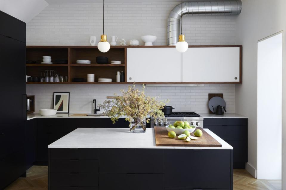
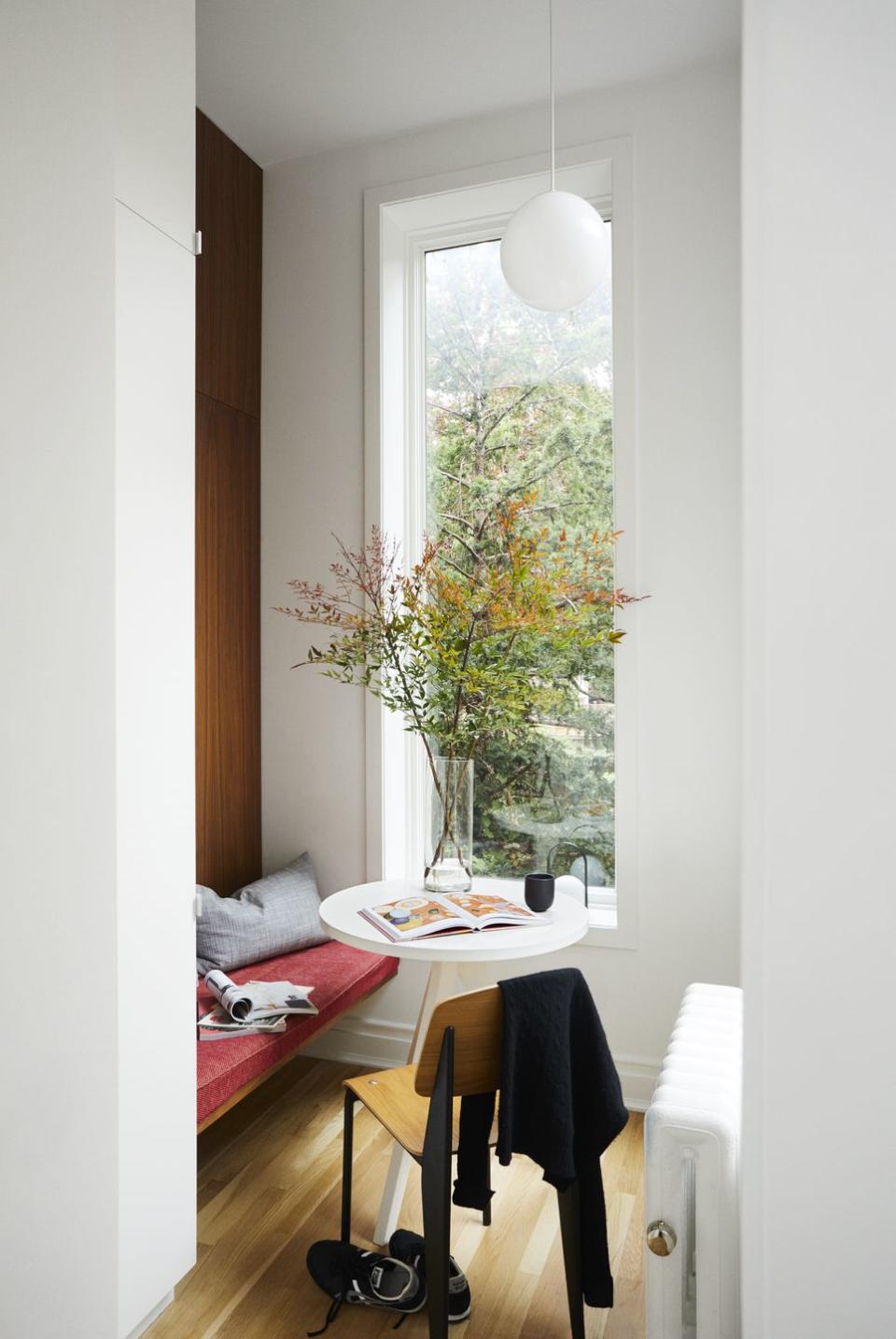
The renovated space, which used to be the home’s formal dining room, is flooded with light from the giant windows opening to the yard, and thus could handle (you guessed it) a lot of black paint. The Ikea cabinets have custom-made fronts painted in Benjamin Moore Midnight Dream.
“[The owner] always had this vision of a matte black kitchen, and that's what we did,” Hill says. “She would talk about wanting her kitchen to be very functional, even slightly industrial—this machine that she could cook amazing meals in. Leaving the duct exposed was a nod to that feeling.”
A backsplash of thin, white glazed tiles from Chelsea Arts Tile + Stone mirrors the rectangular molding on the opposing wall, while the walnut cabinet and shelving keeps it all from feeling too stark (a trick that’s used repeatedly throughout the home).
Master Bedroom
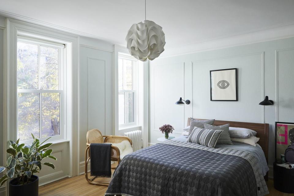
The palette switches up only here, where an evil eye floats over the bed and the walls are coated in a custom version of Benjamin Moore’s Alaskan Husky, a gray with blue-green undertones to which Hill added 50% more white. “It does morph throughout the whole day, and with the seasons, as the light changes, which is just so beautiful,” she says, “and that really gives it a tranquil glow.”
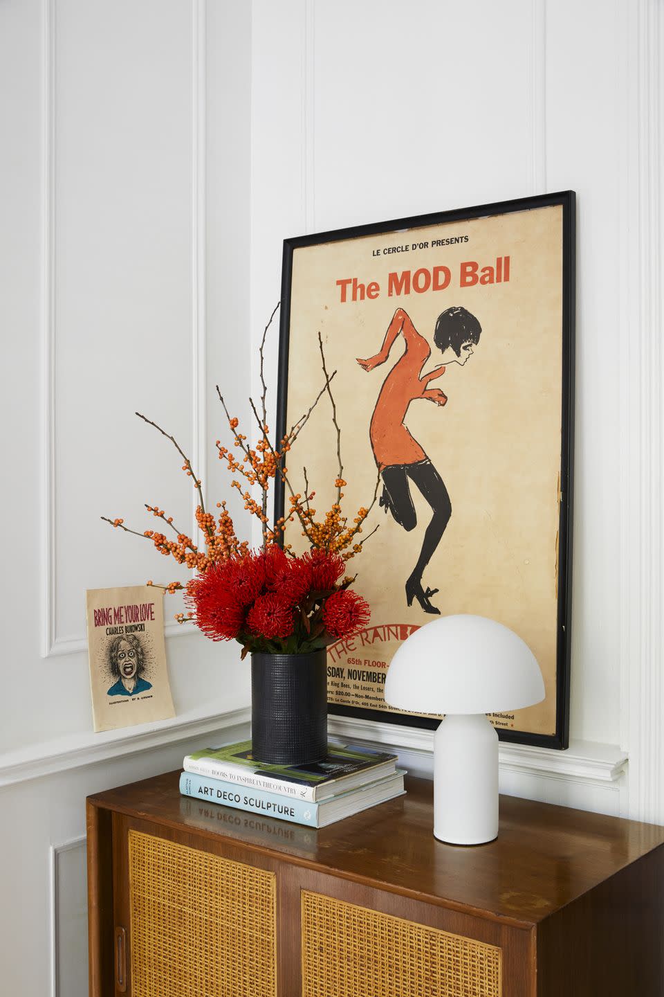
Those jazzy light fixtures and art posters add funk, but the home is absent of almost any window treatments or drawer pulls. “If you had really fussy window treatments, it would really be distracting from all these great, clean lines,” Hill says. “It goes back to just letting the house speak for itself, and not trying to overdress it too much. Just letting it do its thing.”
Tour the Rest of the House
You Might Also Like