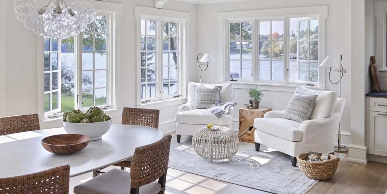
A Single Shade of White Paint Transformed This Family's Lake House

A smorgasbord of styles. That’s the (rather diplomatic) term Chicago designer Andrea Goldman uses to describe the original state of a rambling lake house in Wisconsin that her new clients, a large family, had recently purchased. Originally built in the 1920s, the 10,000-plus-square-foot house had been added onto over the years without much regard for architectural or decorative continuity.
“You could literally see the transitions from decade to decade as you walked through,” says Goldman. “The trim and hardware didn’t match; you’d have a brass lever handle straight out of the ’80s with ’90s oil-rubbed bronze.” And every room was themed: The Western room was clad in limestone and Aztec tile, an Asian-inspired bar featured pagoda-shaped millwork, and the Colonial parlor was decked out in swags and tassels. “The clients actually asked me, ‘Are you sure you want to do this?’ ” laughs the designer. “At first, I really didn’t know if we could pull it off.”
With the family eager to start using the house as soon as possible, Goldman knew she couldn’t do a major reno. So she went back to basics: “It’s amazing what a coat of white paint can do!” Benjamin Moore’s White Dove unified the spaces, helping to camouflage some of the more interesting architectural choices (like a Swedish-inspired railing that overlooks the dining room). Comfy, easy-care furniture like extra-deep sofas and wipeable chairs—much of it in quick-ship fabrics or purchased from retailers like DWR for expediency’s sake—replaced fussy upholstery. The existing wood floors, a mishmash of painted patterns and colors, were sanded down and stained to match. “We tried to value engineer as much as we could since it’s such a large house,” explains Goldman. “Whatever we could leave intact and just update with paint and decor, we did!”
The only room to undergo a full renovation was the Proven?al-inspired kitchen. “The owners weren’t sure about gutting it, but finally, they realized that it would give them the most bang for their buck,” she says. The team worked around the existing plumbing lines and layout to make the process easier, troubleshooting a low ceiling height by opting for open shelving instead of upper cabinets.
The finishing touch: painting the house’s Scandinavian-red exterior a serene charcoal gray. “People in the area who had seen the old house were blown away!” Goldman laughs. “They couldn’t believe it was the same one.”
Dining Room

The ideal dining room setup for a vacation house? “A casual table that doesn’t require a cloth or lots of care, and chairs that you can sit in with wet bathing suits,” says Goldman. Chandelier: Cisco Brothers. Table: AGD. Armchairs: Palecek with a Cowtan & Tout fabric. Side chairs: DWR. Rug: AFW Studio. Art: Amos Ferguson.
Kitchen

Faced with low ceilings and limited storage, Goldman opted for open shelving. “It makes the space feel more airy, and items are easy to grab.” Pendant: Simon Pearce. Stools: DWR. Runner: Dash & Albert. Cabinetry: Stonewood Construction. Island paint: Hale Navy, Benjamin Moore. Tile: Fine Line. Faucet: Dornbracht. Countertop: soapstone (perimeter) and quartz (island).
Butler's Pantry

The butler’s pantry practically doubles as a speakeasy. The open design of the shelves makes for easier grab-and-go access. A tucked-away wine fridge keeps chilled rosé at the ready. Sconces, flush mounts, and table lamps create a layered glow. An antique table with bar seating is the perfect serving spot.
Wallcovering: Phillip Jeffries. Sconces: Troy Lighting. Lamps and ceiling fixture: Circa Lighting. Stools: Made Goods. Rug: Merida.
Study

Goldman removed the existing dentil crown molding to streamline the space. Chandelier and lamp: Circa Lighting. Chair: DWR. Desk and stool: AGD. Rug: Oscar Isberian.
Master Bedroom

Textures mix up the neutral palette of the master bedroom. Bed: Bernhardt. Euro sham fabric: Victoria Hagan. Bench: AGD. Bedside tables: Worlds Away. Lamps: Arteriors. Chandelier: Noir. Wallcovering: Phillip Jeffries.
Gallery

“The right white paint can change everything,” says designer Andrea Goldman, who used White Dove by Benjamin Moore to turn an upstairs sitting area into a tranquil spot for reading. Chairs: Lee Industries, in custom fabric through John Rosselli. Cocktail table: Noir. Rug: Stark.
Bunk Room

Four queen beds equal the ultimate sleepover space. Beds and bedding: Room & Board and Brooklinen. Curtain fabric: Holland & Sherry. Ceiling light: Rejuvenation. Sconce: Palecek. Rug: AFW Studio
Dock

For a low-maintenance outdoor space, Goldman chose furniture that doesn’t require cushioned seats. Table and dining chairs: RH, with pillows in Raoul Textiles fabric. Lounge chairs: DWR, with Herme?s pillows. Side table: Made Goods.
Tour the Rest of the House
Follow House Beautiful on Instagram.
You Might Also Like