Tales From a Basement Reno: “All I Knew Was I Wanted a Concrete Floor With Plywood Millwork”
When Robin Heller and her husband, Noni, discovered that they were expecting their third child, Harry (now 1), they knew their four-bedroom home wouldn’t be able to fit them; their two other sons, Liam (9) and Lev (7); and any guests who came to visit. Having recently moved from Los Angeles to Baltimore, hosting friends and family from the West Coast was inevitable. Plus their house is also Heller’s HQ: She recently launched a design studio aptly dubbed Surrounded by Color with business partner Jen Levy. Heller was determined to make everything fit: her family, faraway guests, and further proof of her talent.

“The two older boys didn’t want to share a room, so we came up with this idea to build out the basement,” she says so matter-of-factly that it’s clear bunk beds were never a potential alternative. “When we were brainstorming about what to do, it just seemed like the perfect way to go.”
Give Guests a Good View
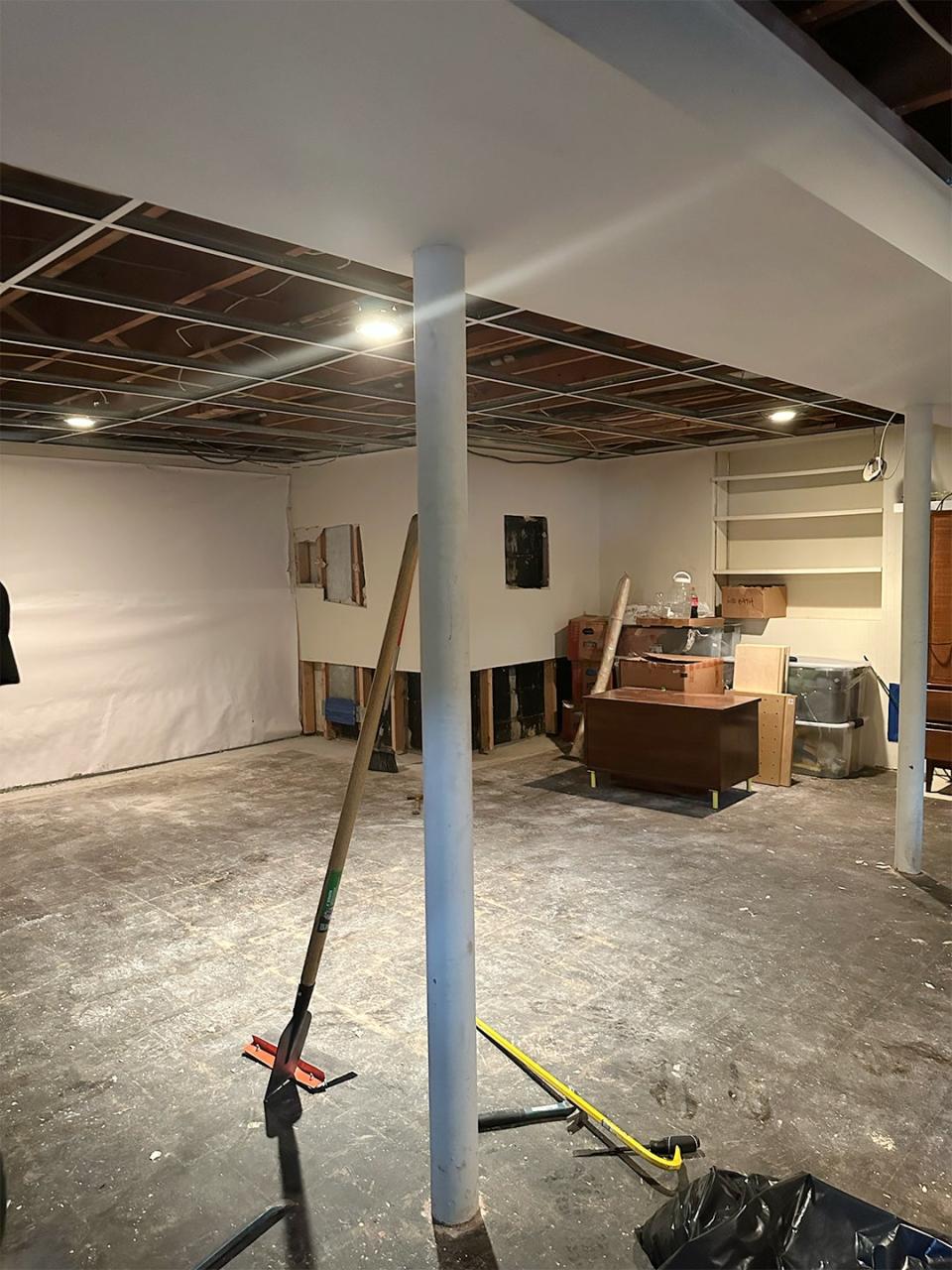
Heller laughs as she describes the existing basement as “disgusting and scary,” where cobwebs commanded corners between utilities. “We could only access it from a narrow stairwell outside, through a single door covered in bugs,” she says. She partnered with architects at PI.KL Studio and contractors at Robbins Custom Builders on the project, and everyone was on hand to lend creative solutions.
They toyed with the idea of connecting this basement with another in a separate area of the home and making it one large space, but that ended up not being possible. Then a landscape architect from From Garden Design proposed excavating a 10-by-20-foot patio off the side of the house, ensuring that a guest suite below would have plenty of light. “We live on three acres that are mostly set on the back of the house, so visitors would be able to take that in every morning,” says Heller.
There were no issues with the construction once it got under way, except for a small snafu in the beginning. “My husband accidentally dropped his wedding ring in the grass the day before the excavation, so we had to quickly go out and get metal detectors to find it,” she says.
Put Your Best Mood Board Ideas to the Test
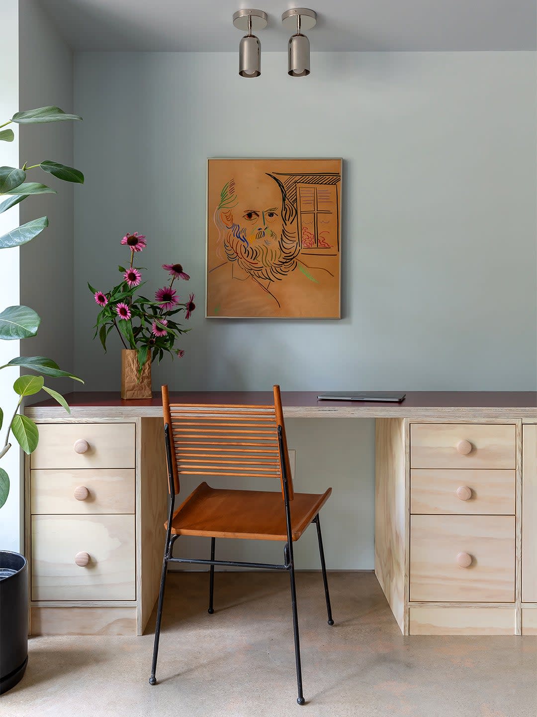
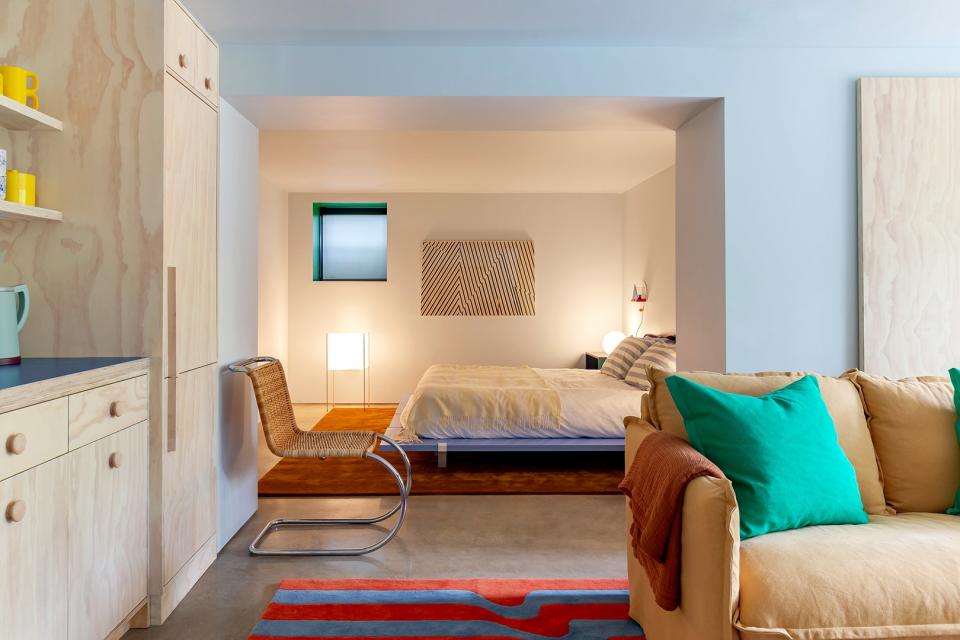
The design Heller came up with includes an open living area with a corner office set into one nook, plus a concealed refrigerator for when anyone is feeling a little too lazy to go upstairs to grab a soda. The bedroom and bathroom are tucked away on the far end of the suite. And while it took some time to finalize the layout, there was one detail Heller knew she wanted to include from the very beginning: plywood. “Years before I ever became a designer, I would create Pinterest boards that were full of plywood interiors,” she says. “All I knew was that I wanted a polished concrete floor with plywood millwork.”
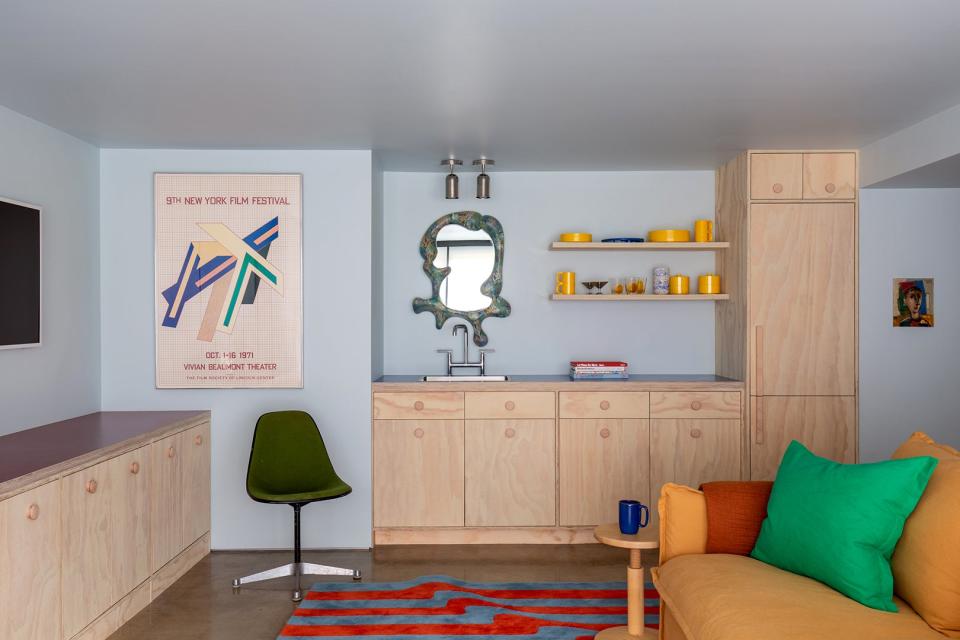
The sealed plywood has a pronounced grain, and it runs on the lower half of the living room’s main wall and across to the custom kitchenette. The oversize unfinished knobs are a smooth contrast to this surface, while complementing the overall “vibrant utilitarian” vibe of the project.
Let the Rainbow Take Over
The polished concrete and unpainted plywood might lean industrial, but the other details are all about having a cozy good time. “My style is playful and unusual,” says Heller. “I like the juxtaposition of having the cold concrete meet the many soft materials surrounding it. Plus we have a basket of slippers, so everyone is sure to keep their feet warm!”
For the countertops, she ordered the brightest colors Formica has to offer. The purple surface along the media wall in the living space coordinates with the striped blue and red rug underfoot, while the blue in the kitchen brings out the aqua shades in the Concrete Cat mirror above the sink. “I originally bought that mirror for a wall upstairs, but no one would hang it because it’s so heavy,” Heller notes. “So we framed the kitchen to make sure it could support it.”
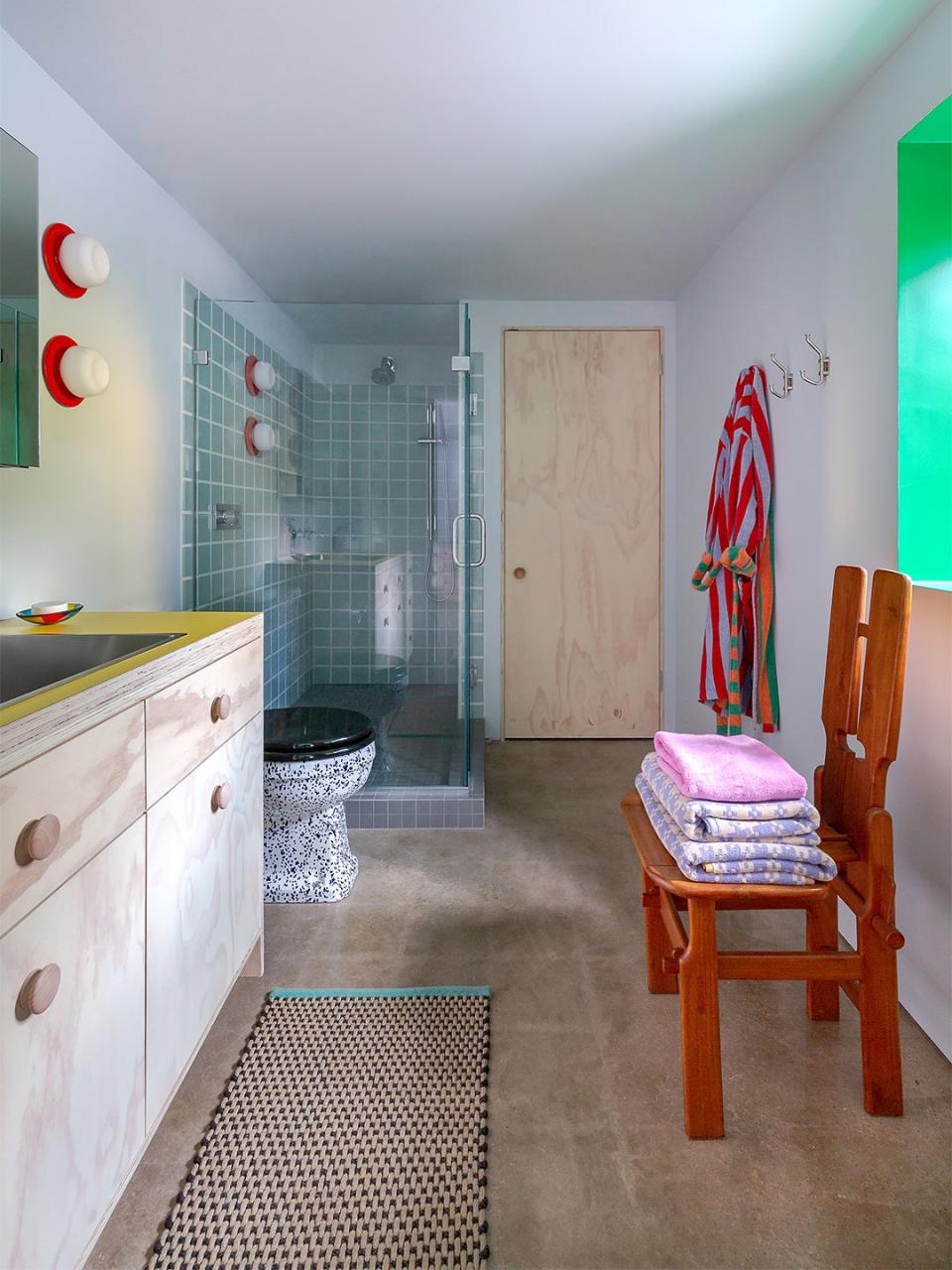
Even the neon yellow on the bathroom vanity fits in, thanks to other retro details in the space, like the small-scale square shower tile and the splatter-painted toilet Heller had shipped from the U.K. Because the concrete and plywood act as neutral anchors, every whimsical flourish seems to work. “I picked a palette that would make people happy, because that’s how I wanted people to feel when they went down there,” Heller says. “Transforming a space that was so dark and dreary with color proves that it really can change everything.”