A Toronto Fixer Upper with Ridiculously Beautiful Natural Light
I've always believed that the best characteristic a home can have is natural light. Sure, paint, lighting and good design are all necessary (and very present in this home), but that natural light is key. And it's absolutely pouring into Andrea McQueen's stunning abode that we're touring today. Her fresh and crisp style is right up my alley and I can't wait to see what this budding designer is going to do next. If you need me, I'll be pinning every single snap from Nicole Lewis to my home board. Join me for the full tour!
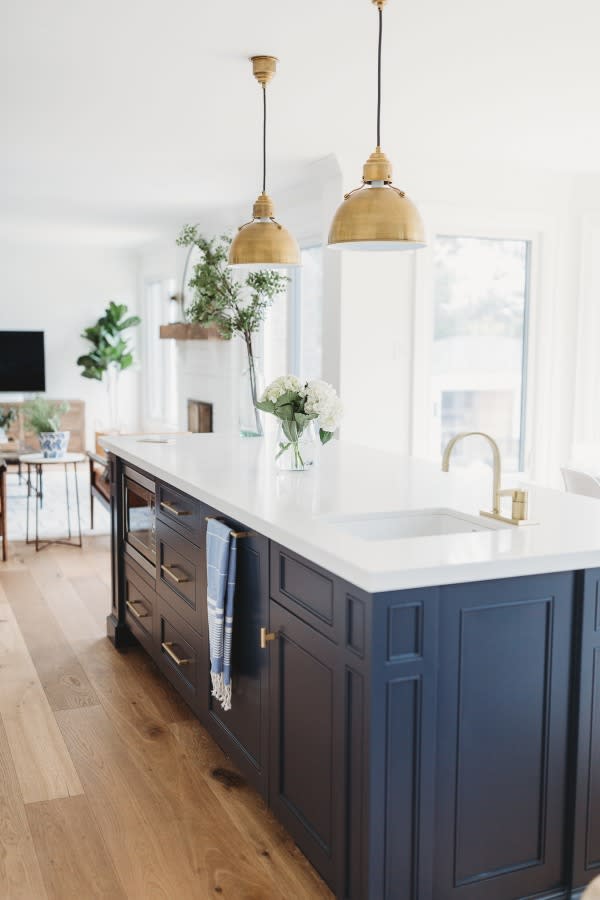
From Andrea McQueen... My home is located in Burlington Ontario, a suburb of Toronto. It was built in 1986, and was in original condition when we found it (dusty rose carpet all over the master bath, linoleum floors, and a white melamine kitchen). We'd been searching for a fixer upper for over a year, and our rock star realtor found this property before it came on the market, so we were able to snatch it up quickly. Although it was dated, it had great bones, was on a huge lot, and had tons of natural light. We camped out in the basement during the 10 week renovation (not something I recommend to clients!), which enabled me to oversee all of the construction.

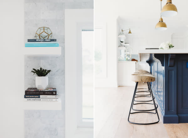

When it comes to design, I love to create spaces that improve the way we live. Life can be hectic when you're juggling a career, kids, activities, and social commitments. It's so important that your home is your haven, where you can relax and unwind surrounded by the people and objects that bring you joy. My style is pretty classic, and I tend to incorporate trends with things like lighting and accessories.
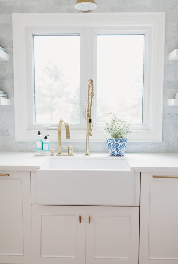
Now that the construction phase is finally complete, I'm focussing on decorating the rest of my house. I'm a big believer in buying what you love, so I'm saving to invest in things like window coverings and am currently planning my Formal Dining and Living Room. My kids also want new bedrooms so that's also on the list (it never ends!).
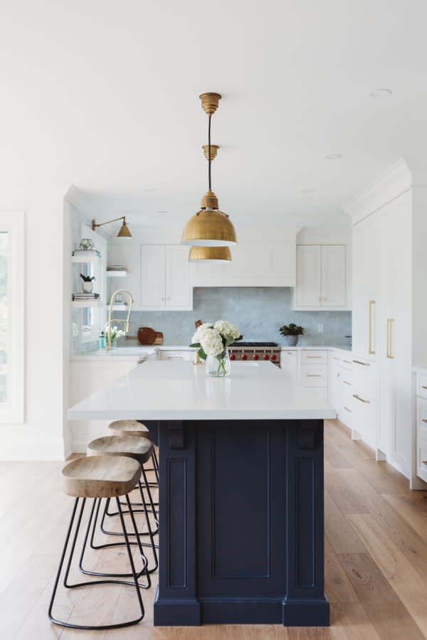

The kitchen and family room are where we spend the majority of our time. We love to entertain so I designed the 9 foot island to accommodate seating for guests while we cook. (The island may also be the scene of a few late night karaoke parties). The island is painted BM Hale Navy. It took a little time to convince my husband to commit to the blue but we're so glad we did. The island includes a prep sink & second dishwasher (which was a total game changer and the best decision). I love how the soft gold hardware contrasts with the navy and white cabinets, and how the backsplash creates subtle movement and texture.
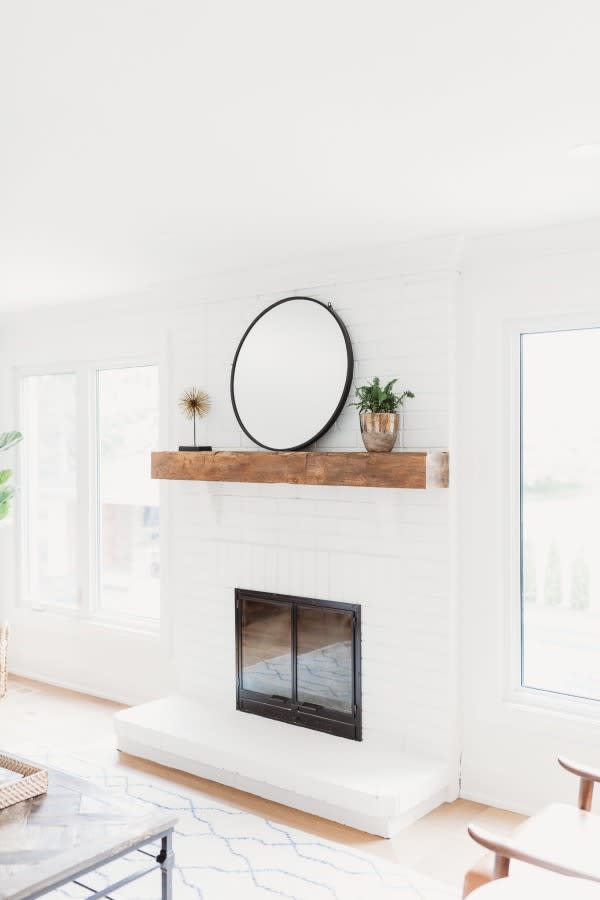
The Family Room is a relaxed, casual and cozy. I think its pretty classic but with a mid-century vibe, and nothing is too precious as we have two kids and a dog. We painted the original brick fireplace to match the clean white walls (BM Oxford White) and replaced the original mantle with a beautiful rustic reclaimed piece. I don't love the look of a big television but we found one that has a super slim profile and I did my best to decorate around it. Fun fact- my two boys (ages 6 and 9) are currently obsessed with cooking shows, and they love to watch them on TV while they are in the kitchen whipping up their own "recipes" and pretending they are contestants on whatever show they're watching.

The sofa is Mitchel Gold Bob Williams in a custom gray fabric, the throw pillows are all from Tonic Living, the chairs are West Elm Mid-Century Show Chairs, the rug is from Dash and Albert, the console is the Print Maker's Console from Restoration Hardware, the art is from Canvas Gallery in Toronto, the faux fiddle leaf fig and basket are from Pottery Barn, the coffee table is from Pottery Barn, the drinks table is from Elte, the reclaimed mantle is from Loft Doors in Burlington.
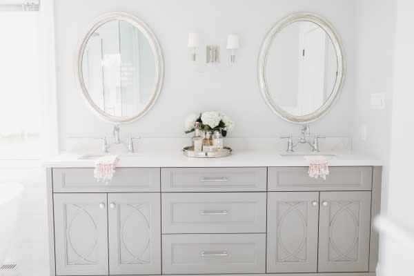
The Master Bathroom is calm, serene, monochromatic (a big departure from what it was originally- see before pic). I really wanted to use marble on the floors but it wasn't in the budget, so I went with a Mayfair Porcelain tile that has subtle veining and texture, and a "marble like" appearance. I laid it in a herringbone pattern to add interest. I used a basket weave marble on shower floor and in the niches, and designed a 7 x 8 foot double glass shower with dual rain heads and a hand held shower. The new bathroom has a ton of storage and is super functional.
The tub is from Costco, faucets are Brizo in Polished Nickel, Mirrors are from Restoration Hardware, Vivian Dual Sconce is Visual Comfort, George Mini Chandelier is Visual Comfort, Vanity is custom in BM Vintage Pewter, walls are BM Gray Owl, Styling Accessories are from Pottery Barn, Turkish Towels are from Tonic Living.


The kids bathroom was designed with my two little boys in mind. I went with a cheap and cheerful white hex tile and dark grout for contrast, and tiled the walls in subway tile (because... boys). The navy vanity and brushed gold hardware are consistent with the colour story in the rest of the house. There's a ton of storage in the vanity and I love the character that the lighting adds. I also went with single lever faucets because they are easy to clean.The Bistro 4-light Bathroom Sconce is by Visual Comfort. The custom double vanity in Hale Navy is by Top Notch Cabinets. The plumbing fixtures are Kohler, the Julia Rothman Dream Shower Curtain is from Hygge and West, the stool is from Loft Doors in Burlington, the art is from Etsy.

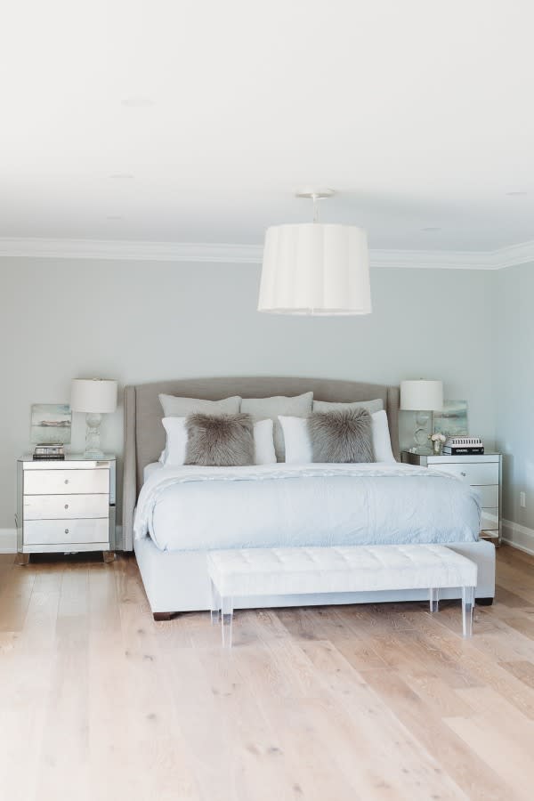
The Master Bedroom is a still a work in progress, but we're getting there. I love a calm, serene vibe in a Master and tend to keep things minimal. I'm still in the process of layering in textiles for softness, and still need to find the perfect rug... I have white linen draperies on order from Q Design- I think the draperies will add so much softness to this space. And I've designed a sitting area (again- waiting to find the perfect pieces!). The mirrored side table and Upholstered bed are from Elte, the bench is Mitchell Gold Bob Williams, lamps are Pottery Barn Carlotta Lamps, Dresser is Vintage, light is Barbara Barry Simple Scallop Chandelier from Visual Comfort, Bedding is all Pottery Barn, Mirror is from Cocoon Furnishings, Canadian Art is all from Canvas Gallery in TorontoAs you can see, our home is still a bit of a work in progress. But its where we come together to connect, unwind, and enjoy each other's company, and we are so happy here.

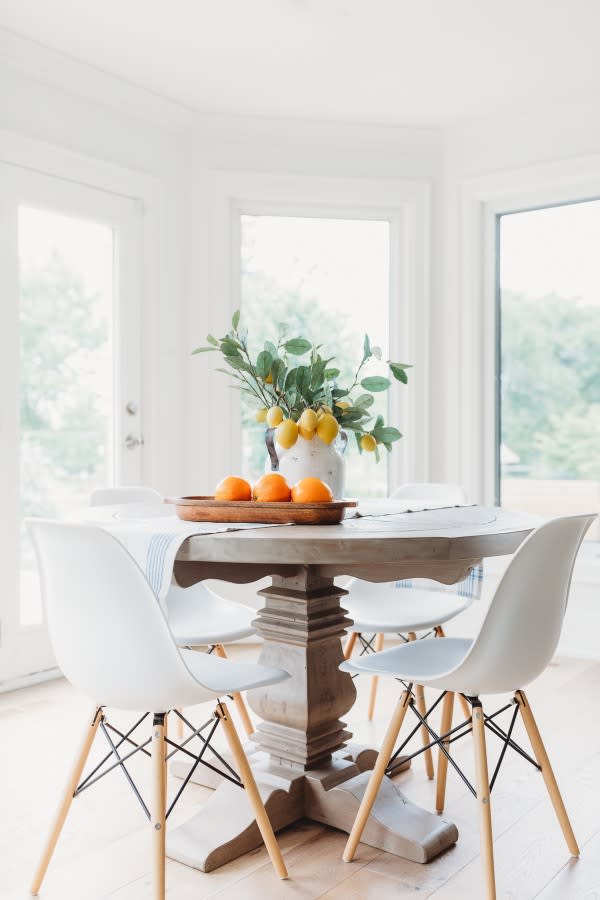
Photography: Nicole Lewis | Lighting: Eugene Pendants by Visual Comfort | Backsplash: 3 x 6 Carrara Marble | Boston Swing Arm Library Light: Visual Comfort | Cabinets: Carson Door Profile by Top Notch Cabinets (in Oxford White) | Counters: Frosty Carrina by Cesarstone | Faucets: Rubinet | Greenery: Pottery Barn | Hardware: Emtek | Interior Design: Andrea McQueen | Kitchen Chairs: Structube | Kitchen Table: Restoration Hardware | Rug: Kismet Rug in Navy by Caitlin Wilson | Sinks: Blanco Siligranite | Tractor Stools: Restoration Hardware | Turkish Towels: Tonic Living
SaveSave SaveSave