The VFX behind Teenage Mutant Ninja Turtles: Mutant Mayhem
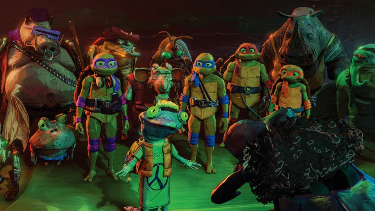
With an origin in the comic book series created by Kevin Eastman and Peter Laird in the early 1980s, the Teenage Mutant Ninja Turtles have become an enduring set of characters across comics, toys, animated TV series and feature film versions and variations.
Teenage Mutant Ninja Turtles: Mutant Mayhem has reinvigorated the on-screen adventures of the pizza-loving heroes in their half shells. 3D World speaks with Eric Cheung, Cinesite’s animation supervisor, and VFX supervisor Chris Kazmier about the studio’s part on the new, visually stunning film. For Mutant Mayhem, Cinesite’s artists worked in collaboration with Mikros Animation, taking on particular sequences and scenes.
(If you're interested in learning more about animation check out our collection of the best animation books, or create you own with our collection of the best 3D modelling software).
Character design: capturing the aesthetic
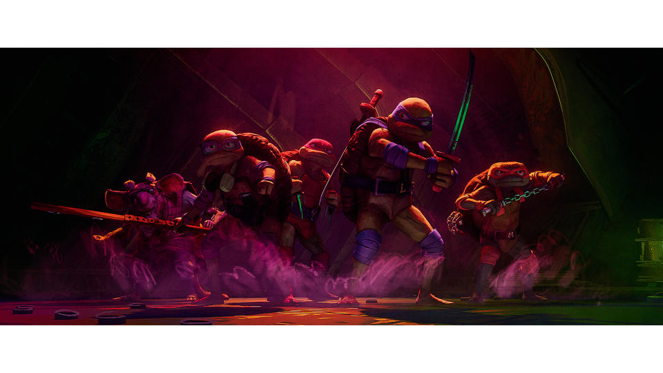
Our conversation begins with Cheung addressing the degree to which the character designs from the original comics informed the character design and animation undertaken for the movie. “Mutant Mayhem seeks to stand out by emphasising the youthful adolescence of the turtles, not just by casting teenage actors to play the heroes, but in the very visuals themselves,” he says.
“The character design we were working with was more youthful; because the designs were slightly skinnier versions of the Turtles than audiences had seen to date. It was a kind of more teenage build. “When it came to the animation, we needed to embrace the overall feeling of adolescence that the filmmakers wanted to get across. This meant the action choices were more naturalistic, keeping hand gestures and cliche acting to the minimum.
One of the live-action movies that Jeff Rowe (director) referenced was Attack the Block, a sci-fi movie in which a group of armed teens fight an alien invasion. For the action and fighting style, it was all Jackie Chan-focused: utilising props around which to gain advantage in a situation, and showing real effort in the moves and choreography.”
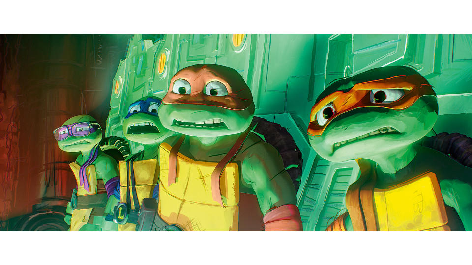
Cheung then goes on to describe the kind of scope available to Cinesite to both stay ‘true’ to the Teenage Mutant Ninja Turtles aesthetic, and also where they were able to elaborate and iterate on it. “Mikros (the lead animation studio for the film) developed the visual style for Mutant Mayhem and provided textures and models for all of our shared assets,” he says. “Cinesite then used that information to recreate shaders and the final look of the characters to match the filmmaker’s pre-defined visual style and language."
"As an animation supervisor, it’s very rewarding to help create something that others can enjoy, and especially rewarding to see animators grow and succeed in their craft."
“There were some characters, props and locations only featured in our sequences and we created those assets ourselves, guided by the Nickelodeon art team, to match the established style. Additionally, we received a couple of animation sequences from Mikros early on. We also did animation tests internally to ensure that we matched the amazing work coming from Mikros. We then showed Jeff Rowe and (co-director) Kyler Spears some iterations to get some feedback. It went generally well.”
Stylistic approach through animation
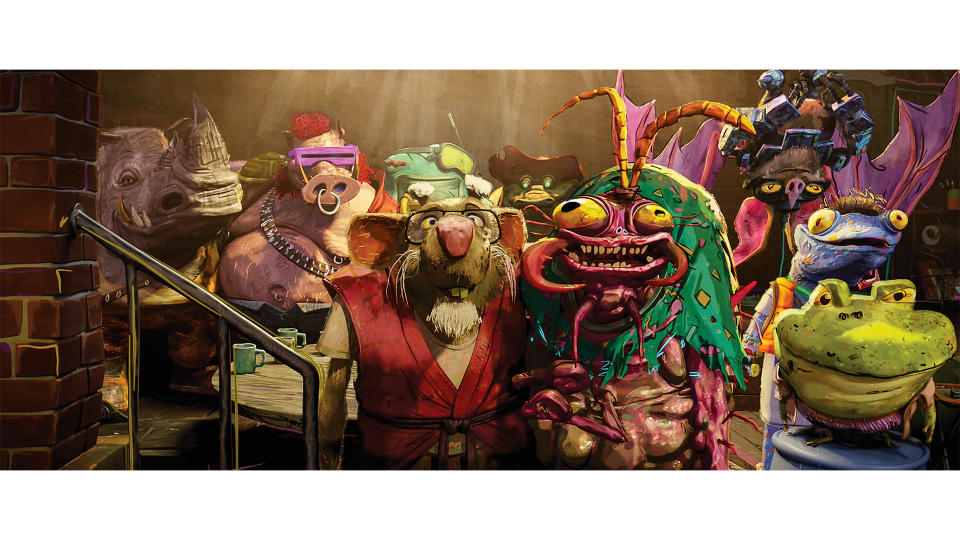
Kazmier augments Cheung’s insights on the overarching stylistic approach. He notes: “There was amazing attention paid to the colour palette of the toys, and also the chunkiness of those toys. Even the colour palette of the original cartoon series was very influential on the film itself. In the TCRI [Techno Cosmic Research Institute] lab sequence, the original toy Technodrome was an influence on the set and acted as a reference for the surfacing.”
Cheung also adds: “As an animation supervisor, it’s very rewarding to help create something that others can enjoy, and especially rewarding to see animators grow and succeed in their craft. Cinesite had completed an NPR sequence with another Paramount Pictures film Paws of Fury: The Legend of Hank. TMNT allowed us to be a creative ally to Mikros and explore this style much further. An example of this would be our Cynthia Utrom, the head of the TCRI who’s trying to milk all the turtles. The character design of Cynthia came from Nickelodeon creative and we then created the model to final.”
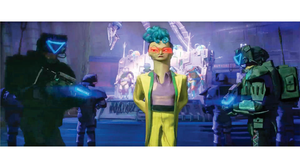
Cheung and Kazmier then proceed to delineate how the film has provided an opportunity for Cinesite to continue refining its workflow and pipeline. Cheung explains: “TMNT was animated on 2s mostly, where every pose is held for an extra frame, with some exceptions."
"Animation on 2s has a very appealing and traditional feel to it, you can focus a little more on spacing and really think about your breakdowns. This style was chosen to give a more traditional cartoon look to the film, but it was the first time we adopted this workflow. Also, all the 2D line work was new to us, so Cinesite’s pipeline team had to develop a tool in-house to meet this new way of working.”
For their work on Mutant Mayhem, Cinesite’s team worked in Gaffer, Maya, Houdini and ATrack. Additionally, because the 2D line work was new to Cinesite, the team developed that tool in-house so as to be consistent with the style of the project.
Kazmier then adds: “We had to bring some new ways into the pipeline that were being worked on earlier than was expected by the development team. Some of the tools were a version that ultimately became the next release, but I’m sure that the development team expedited what they could in order to help the show stay on track. Some of the tools were of course the curve/line animation tools that have been mentioned, but some were under the hood of how to manage data more effectively."
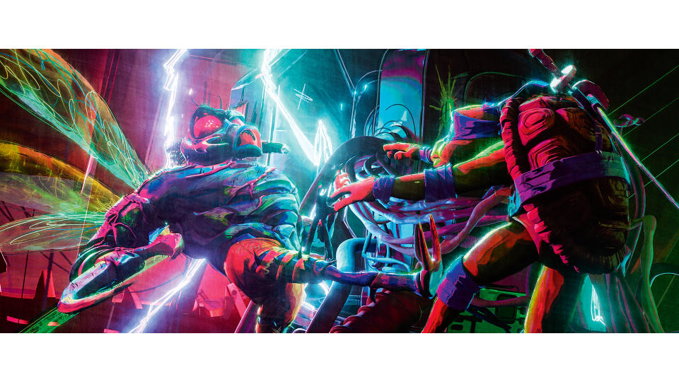
Also, we introduced a full 2D FX team, which meant bringing the software, Toon Boom, into the pipeline in our Linux environment. This started off more of a manual process but eventually became more automated as compositing artists received all of the correct FX layers in the final comp automatically.”
Another important dynamic of the pipeline management process that Kazmier is keen to identify relates to managing asset ingestion from another vendor. He explains: “We use different software to Mikros Animation for grooming, so along with our CG supervisor
"The idea was they wanted to make it cinematic and widescope, but the detail and colours are off and imperfect."
they were able to bring in guide curves from one grooming software and replicate the final groom from within Houdini in order for it to work within Gaffer. They could also sim the grooms within this process. Mikros had developed a very ‘show look’ way of rendering hair that our dev team had to create on our side to match.”
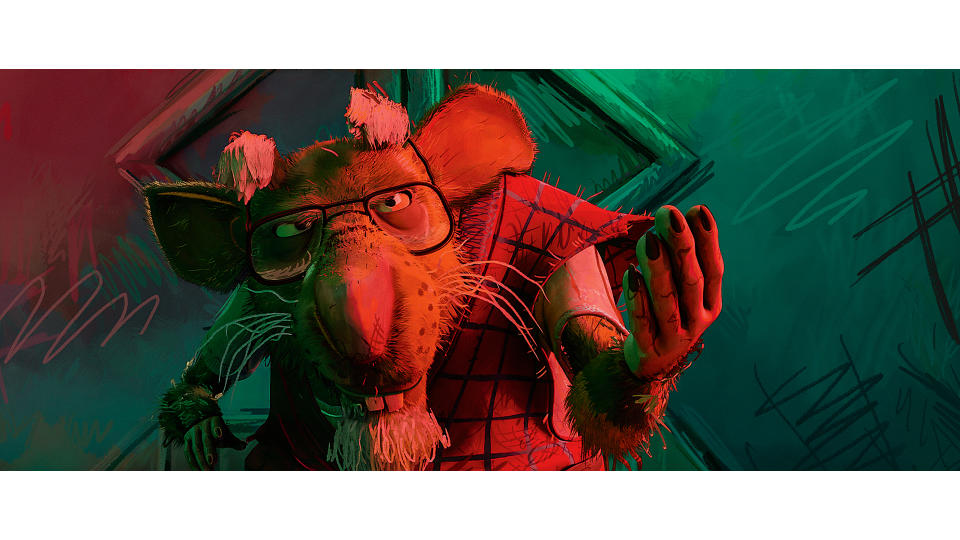
Visual palette: texture and movement
Animation has the capacity to energetically combine the photorealistic and a range of more abstract approaches, and our conversation with Cheung and Kazmier turns to how the visual palette of the film accommodates that spectrum of choices.
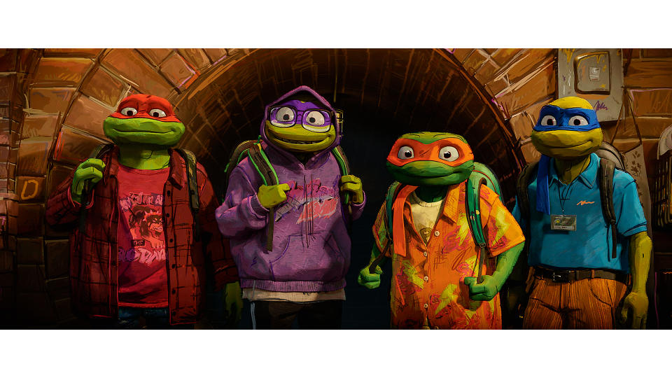
“Trying to apply so many of these ideas,” Cheung says, “such as the live-action camera language, the teenage sketchbook look and feel, and the point of view of a much younger take on the Turtles, proved to be quite a challenge. Or, at least, a different challenge."
“We came up with the description, ‘The look is like you took some school notebook drawings and shot them with a high-end film camera using an anamorphic lens and a full lighting crew’. The idea was they wanted to make it cinematic and widescope, but the detail and colours are off and imperfect. Imperfect meaning that there are no perfect profiles and sketchy lines on everything."
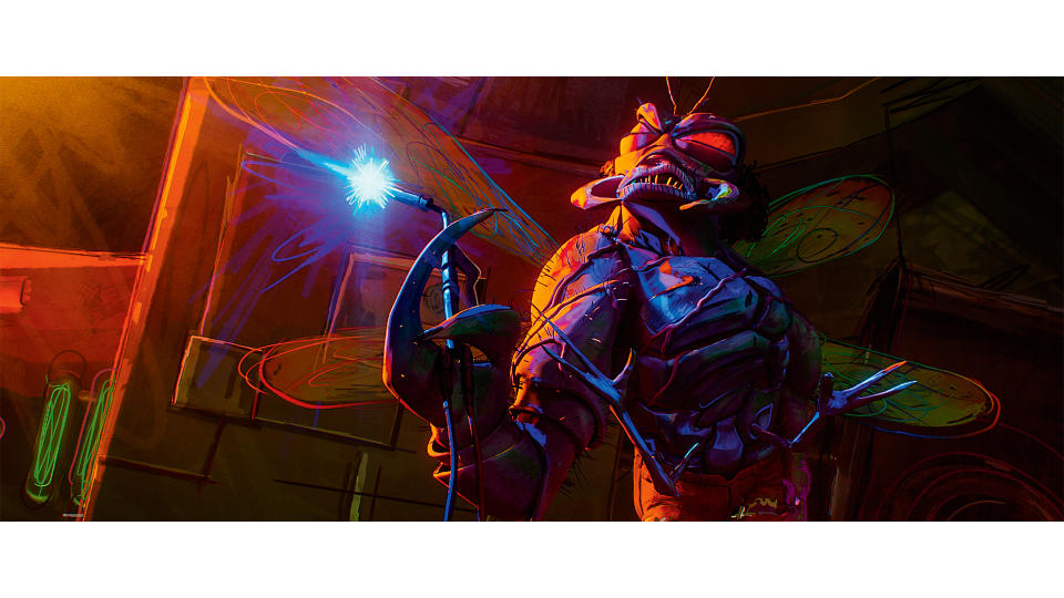
There is film grain, noise, lens flares and dust on the lens, and you also couldn’t pick any of the colours from a colour wheel. All mixed and smeared with usually grey and a rough brush feel on the transitions. Exactly what a modern renderer does not do, hence the challenge in all departments on the backend. In addition, we set up a 2D traditional FX department within the CS FX department and had a lot of hybrid looks, or just pure hand-drawn FX that we could leverage in the final shots.”
Cheung then adds: “On the technical side, it was dealing with strobing issues against moving cameras, because this is our first film on 2s and camera movements are on 1s, so we had to adapt and study films that have used NPR extensively to reference how it was done. Another challenge we had to overcome was working with characters that had a lot of accessories, we had to constantly manage belts, wristbands, straps, crashing through geometry, but we had an amazing shot finaling/tech animation team. So shout out to those guys!”
Bringing our conversation to a close, Cheung makes a key point about the visual distinction of the project, appropriately emphasising the energy that defines both the Turtles and, indeed, the animation aesthetic that characterises the new movie. “Mutant Mayhem has a style all its own inspired by a teenager’s sketchbook,” he says. “It was a design philosophy that production designer Yashar Kassai described to artists as ‘draw like you’re 15!’”
This content originally appeared in 3D World magazine. Subscribe to 3D World at Magazines Direct.