This Year's Best Renos Feature 13 of Our Fave Paint Colors for 2024
Painting a room in a fresh shade is an easy and cost-effective way to make a big change. What most people need help with, though, is choosing that paint color in the first place. There are endless shades and finishes to poke through, making it easy to fall into the trap of decision fatigue. But don’t give up just yet.
Apartment Therapy has published tons of amazing room makeovers this year, many of them featuring paint colors that editors are absolutely smitten with. Our very favorites — all 13 of them — are below, and include shades ranging from deep green to bold pink to calming blue. If you’ve been struggling with paint choices in your own home, might we recommend one of the following showstoppers? Read on to see them in action, used in real projects from real homes.
1. Farrow & Ball’s Dead Salmon
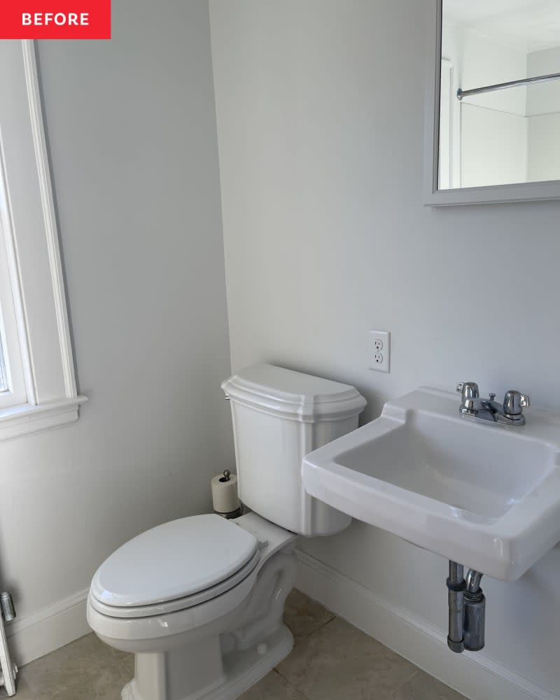
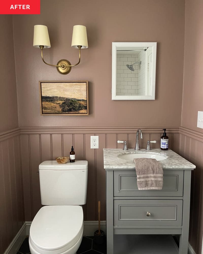
You may be tempted to stick to a “light and bright” palette if your bathroom is small, but take it from Leigha of @LittleMaineHouse — maybe this is a chance to go moody. When a pipe burst unexpectedly in her small bathroom, she used it as an opportunity to overhaul the all-white space. Seeing as it was only 6 feet by 7 feet, no one would blame her if she stuck to a neutral, airy shade in her redo. Instead, Leigha chose to paint the room in Farrow & Ball’s Dead Salmon and pair it with black hexagon tiles on the floor. Yes, it helps that the room gets natural light, but we think this shade would work well in any small space. “It’s exquisite,” Leigha says. “It’s purple-y with brown undertones and changes throughout the day.”
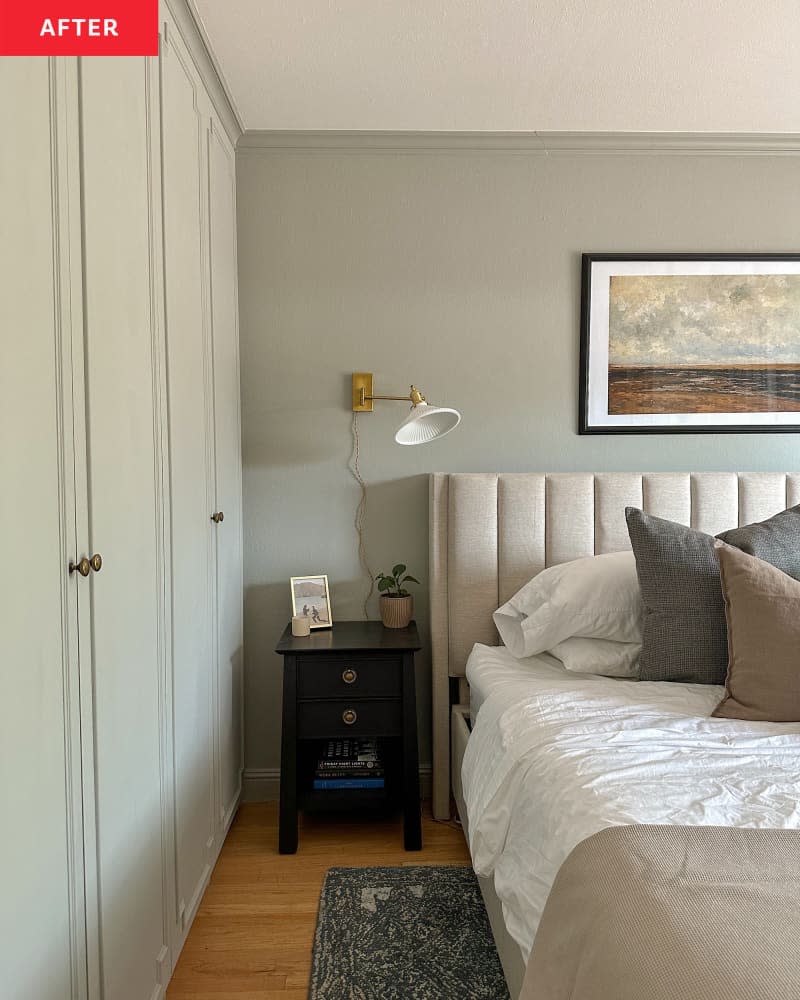
2. Benjamin Moore’s Sea Haze
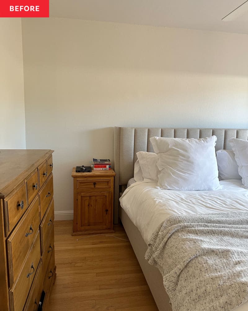
DIYer Rebecca Rajs (@rebs_home) took a year to decide what to do with her primary bedroom, knowing that she wanted to be intentional about how it looked and felt. It was a total “white box,” as she says, and she wanted the space to have character but still feel calming. Rebecca started the long-awaited process by building floor-to-ceiling PAX wardrobes from IKEA, and even added molding to them. She painted the wardrobes in Benjamin Moore’s Sea Haze, and liked the shade so much that it wraps around the entire room. It’s quite a lovely pick for calm-but-with-color vibes.
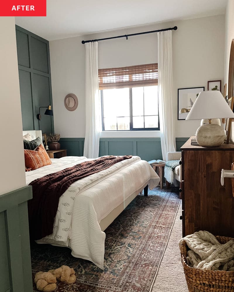
3. Sherwin-Williams’ Retreat
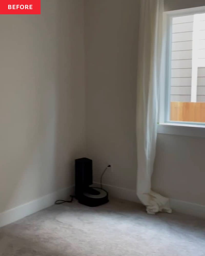
When Shweta Pathak (@houseofsuris) and her husband, Rajeev, first moved into their home, it was an exciting conundrum. On one hand, everything was new. But on the other hand, everything was boring. Their guest room had no embellishments or style, and they wanted anyone who visited to feel more warmth and coziness during their stay. So, by creating a six-project action plan, they got to work. One of the largest transformations is the custom accent wall behind the bed, which is painted a rich green (Sherwin-Williams’s Retreat). This is the shade to use if you want a space that leans classic and traditional.
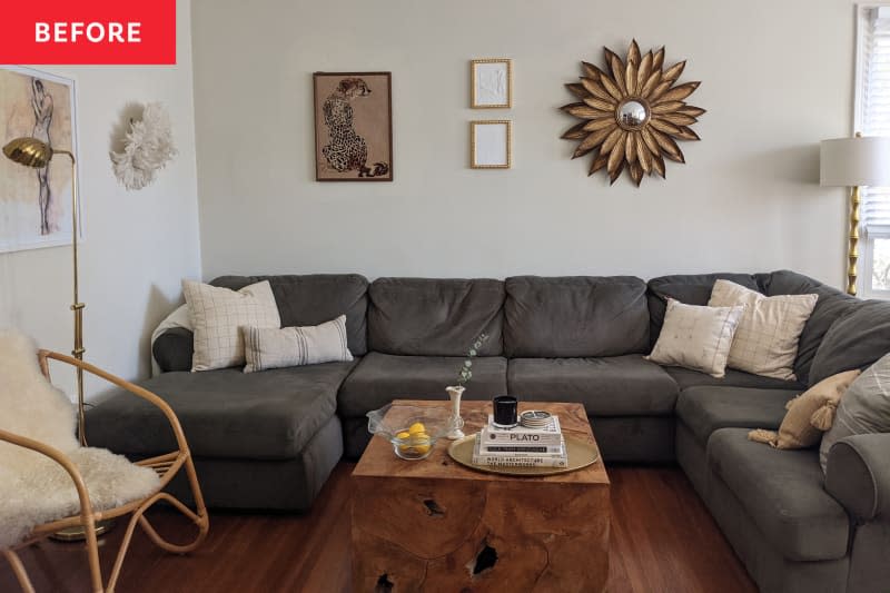
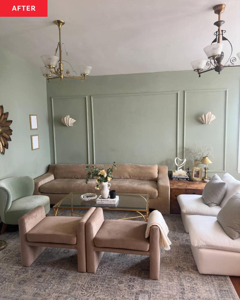
4. Farrow & Ball’s Vert de Terre
Ellie Baer shared her apartment with her fiancé, Tim, and they had been living with a problem in their living room for years: The couch, while comfortable, was just too big for the space. The same went for a lot of the items and materials in the room. Nothing was all that wrong, but everything could be improved. Ellie wanted the living room to feel cohesive and sophisticated, without being too stuffy a place for friends to hang. One of the biggest transformations is the wall color — Farrow & Ball’s Vert de Terre — which coordinates with the new velvet furnishings in an overall upscale feel. “The green is perfect during daylight and cozy at night,” she says.
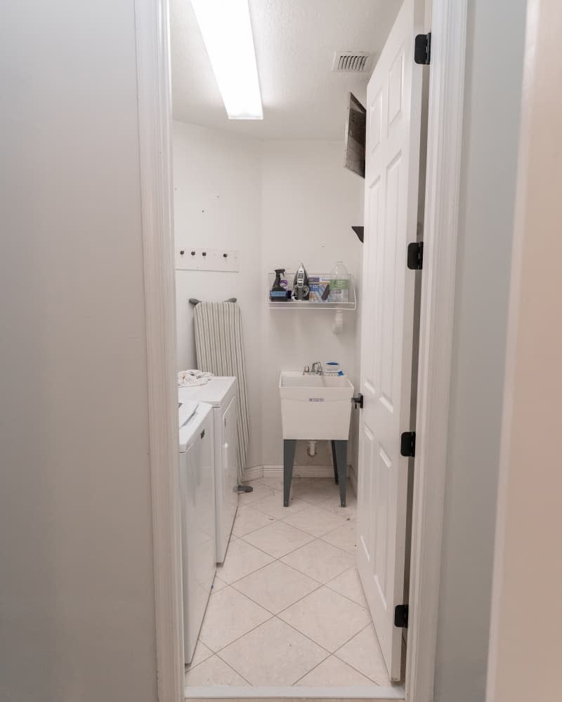
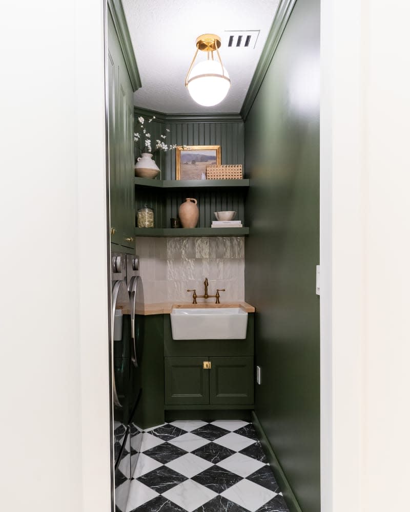
5. Behr’s Laurel Garland
Carol de Mauro (@caroldemaurohome) didn’t like her all-white, basic laundry room and called it the forgotten space in the property she shares with her husband, Alessandro. It had no big draws and little storage, and the pair wanted both in spades. So they took on the room in a big DIY project, and did something with Behr’s Laurel Garland that’s for the books: They painted the walls, cabinets, and shelves in this dark-green hue, perfectly contrasting it with black-and-white checkered floor tile and butcher-block countertop. The lesson? Even the most hard-working rooms deserve a wow factor.
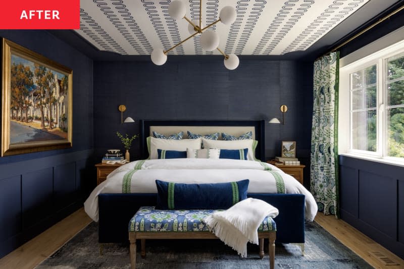
6. Sherwin-Williams’ Sea Mariner
Interior designer Tristan Gary’s (@tristangarydesigns) original bedroom was fine, as far as function goes. It had all the usual suspects and natural light, too, but the bedroom needed a glow-up. The transformation has a number of lessons for anyone who appreciates interiors, including wallpaper on the ceiling, but the paint color is an approachable hit of boldness, too. Tristan chose a deep navy shade called Sherwin-Williams’ Sea Mariner on new molding, and paired it with matching grasscloth on the upper portion of the wall. The results are straight out of a high-end hotel, which is exactly where everyone wishes they could sleep every night.
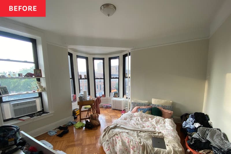
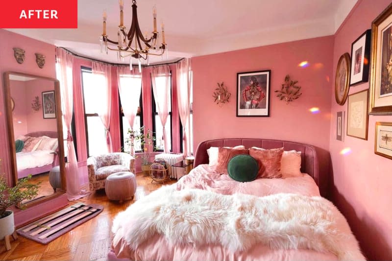
7. Benjamin Moore’s Palermo Rose
When Natalie Price moved into her Brooklyn apartment, it had all the quirks and charms of a 1920s building, but not a lot of color. She hired interior decorator Ally Doman of Doman Decors for help, and in the bedroom, they decided to go glam. “Natalie was an angel to work with: She trusted me wholeheartedly and totally embraced the monochromatic, pink-room concept,” Ally says. They picked Benjamin Moore’s Palermo Rose for the walls and Toasted Mauve for the trim, resulting in a bright pink room that has even more fun with gilded accents. Now the bedroom looks straight out of an old movie, in accordance with its setting, and is lots of fun for a woman living on her own.
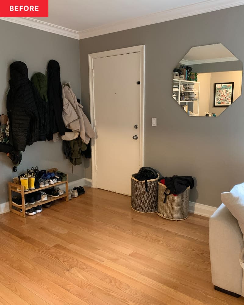
8. Farrow & Ball’s Sulking Room Pink
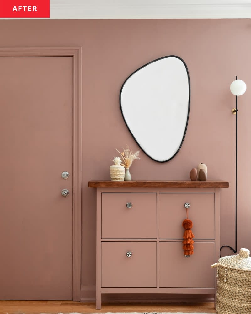
When YouTuber Alexandra Gater was asked to redo this entryway for owners Reyna and her husband, it had a lot of common problems. “The entryway was feeling cluttered and tight, even though there was a ton of open space that wasn’t being used,” Alexandra says. “The open floor plan also meant that the entryway felt like it was in the living room.” They wanted the entryway to look and feel more put-together, even with little kids running around. Alexandra accomplished that with a clever use of storage, but as far as style goes, she picked Farrow & Ball’s Sulking Room Pink for a delightful use of color. The shade covers the front door, wall, trim, and HEMNES shoe cabinet by the door, making it all look stylishly unified.
9. Benjamin Moore’s Mauve Mist
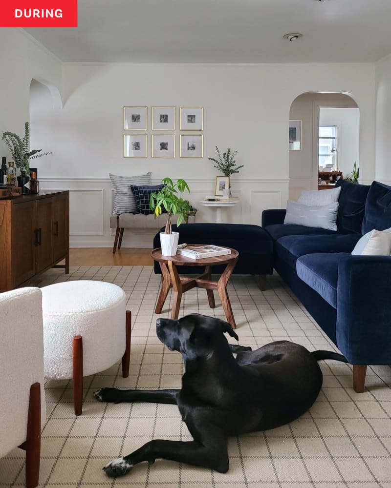
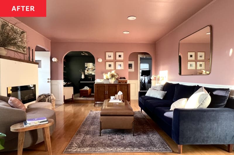
Savannah and Kaitlyn Stone (@ainslie_design_studio) are a design duo, so it’s no wonder that their “before” living room looked beautiful. But the white just wasn’t doing it for Savannah. “I was … inspired by designers who mixed color and pattern beautifully,” Savannah says. “I was feeling really inspired by mauve and loved how it looked with the blue velvet sofa.” The pair decided to paint their living room walls and ceiling Benjamin Moore’s Mauve Mist. The effect is enveloping yet not overwhelming, and succeeds in giving the room more depth.
10. Leyland Trade’s Forest Storm
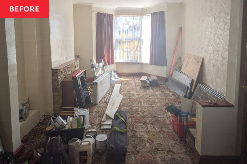
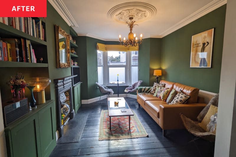
Jake Wilkinson and his partner, Megan, were fans of their living room’s bay window, but they didn’t exactly like how the space hadn’t been touched since the 1980s. Their home is a historic Victorian with flourishes on its exterior facade, and Jake felt it was important to bring those details inside. They decided to build bookcases for either side of the fireplace, and paint everything in Leyland Trade’s Forest Storm, a U.K.-brand paint (Americans can find a similar shade in Behr’s Down-to-Earth). Given that the fireplace and floors are black and the ceiling is white, this verdant shade really pops. “It was a big step for me to use much bolder colors, but I am very pleased with the results,” Jake says.

11. Valspar’s Sweet Lemon
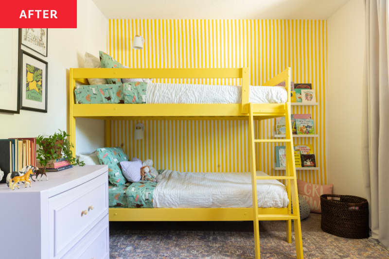
Paint can be very versatile if you have the patience, and Suzanne Kryton (@suzannekrytondesigns) proves that it can make for quite the striped wallpaper dupe in a kids’ room. “The previous room design had a color-block detail painted on the walls but once the bunk bed was in there it didn’t really look right,” Suzanne says. Aside from adding the upcycled bunk bed and creating a new ladder to the room, among other adjustments, Suzanne opted to paint it and its main wall vibrant yellow in Valspar’s Sweet Lemon. To create the stripes, Suzanne first painted the wall in white (Valspar’s Du Jour) with a large roller, and then spent less than an hour adhering painter’s tape to where the yellow would go. Now it’s a showstopper that would look great in any room, regardless of age.
12. Farrow & Ball’s Red Earth
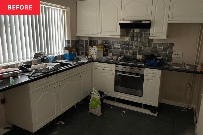
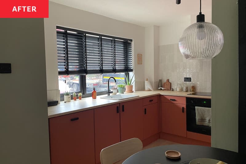
Sean Doherty’s kitchen needed a lot of work when he set out to do a renovation. The whole place hadn’t been touched much in two decades, and had the wear and tear to prove it. It had peeling paint and a cramped layout, which made it smell, and no character beyond a general dinginess. “It’s … my first house, so naturally I felt compelled to give it my all,” he says. With a lot of planning and some help from a friend and a couple of pros, Sean completely updated this kitchen into a modern space. But his paint choice of Farrow & Ball’s Red Earth for the cabinets is the real standouts here and make this familiar pairing of shades feel unexpected and entirely cool.
13. Dunn-Edwards’ Plum Perfect
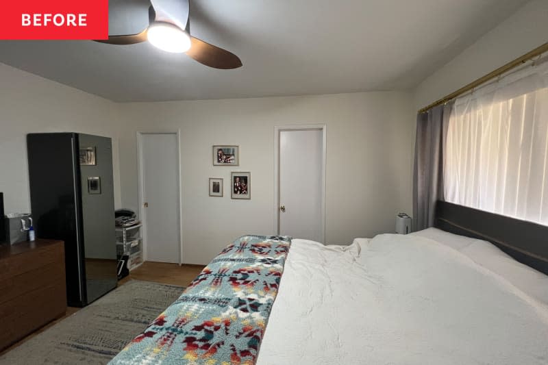
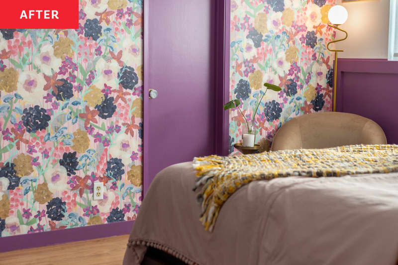
Amala Raj Swenson (@amalarajinteriors) used to have a pretty blah bedroom, but that’s because she and her partner, Ryan, basically moved their stuff in and left it all as is. “My partner [Ryan] and I both decided that if I was going to be spending almost all my time in the space, it needed to feel inspiring, calming, and peaceful,” she says. “The sterile walls it had were not going to do the trick!” They went for a bold look by hanging a floral wallpaper and painting the doors, half walls, and trim in Dunn-Edwards’ Plum Perfect. Now the space is very energetic and very ‘70s, and Amala loves how positive it makes her feel every morning.
