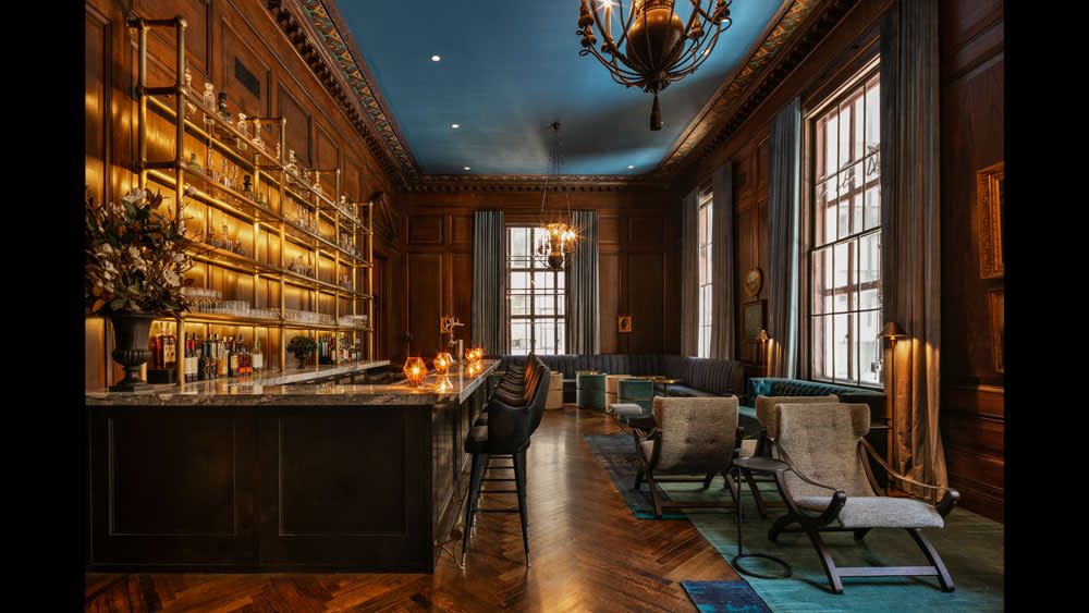
This New York City Residence Has Its Own Speakeasy

Real estate is part pragmatism and part instinct. As developers of major residential projects have begun collaborating with top-tier designers and architects, they are getting more than headline-making buzz. The result is often tempting, beautifully appointed residences that have a strong conceptfor buyers beyond “this can be yours.”
Amenities help too. The recently completely 63 Wall Streettower in New York’s Financial District has a selection of fine extras, but one in particular hits a strong design note: the private, residents-only speakeasy. Formerly used as the back-of-house leasing office, the space was revived with deft handling by designer Highlyann Krasnow, who took every opportunity to infuse it with sophisticated trappings and throwback allure without getting lost in a cliched vintage homage. “The design concept began with the spaces themselves,” says Krasnow, founder principal of boutique firm The Design High. “We wanted to honor the history and the original details in a modern way. Every element we designed kept the history, an example being our preservation of the original wood paneling and original chandeliers.”
The Rockpoint Group-owned property is itself part of a legendary city legacy. Known as the Wall & Handover building, the structure was built 1928 and designed by sought-after architects William Adams Delano and Chester Holmes Aldrich (among Aldrich’s clients was John D. Rockefeller). The building served as headquarters for Brown Brothers Harriman & Co.—one of the country’s oldest private banks. While the conversion to individual units resulted in a clean, modern style, Krasnow got cozy with the role of preservationist. She retained certain elements like the wood-framed door with a clock that led to the speakeasy, the paneling, and lighting. “We kept the materials traditional but used them in a modern way,” she says. “The furniture is all custom versions of classics. The art room in the great room was custom done to match the colors schemes of the rooms, while the art in the speakeasy was original Victorian oil paintings.”
In a style she calls, “modern traditional,” she and her team (which included collaborations with HTO Architect, Empire Core, and 2LS Consulting Engineering D.P.C) made careful edits. They spirited away the wall-to-wall carpeting, vinyl blinds, and negotiated the abundance of bookcases breaking up the space. Injecting modern comforts, she went to high-end makers for custom versions of those classics. Artistic Frame created the curvaceous, 84-inch green velvet banquette—a big statement that doesn’t shout; rather, it serves as a plush invitation. Ornate tile from Kelly Wearstler’s line with Ann Sacks provided a graphic counterpoint to the rich paneling.
Given that this is a residents-only amenity, it had to be impressive. Krasnow understood this instinctively; she has a background in real estate as an original founder of MNS Realty, and recognized that capturing the right ambiance was essential.
“We wanted the room to feel moody regardless of if it was day or night,” she says. “We wanted it to feel secretive and as if you are entering a different time and place.” The right seating was important to this effort. Krasnow was deliberate in the variety; she added banquets along with individual tables and chairs to accommodate groups or individuals. She placed seats throughout the space—near the fireplace, at the bar—and included foot rests and bag hooks for the post-work crowd.
The large custom bar, designed with Copperwood Specialties, features brass details and marble that kept the palette minimal but conveyed the right feeling. “In the day the light reflects off the brass and glass details while at night the lights sparkle to illuminate the marble, brass, and velvet,” she says.
For that reason, lighting was important. The team moved a 13-foot brass chandelier from one of the original lobbies to the center of the great room above a grand staircase. She turned to the coolest group on the block when selecting lighting, saying, “we looked for fixtures that were modern but unique.” She sourced from Apparatus, Juniper, Gabriel Scott, Bec Brittain, Michael Anastassiades, Jason Koharik, and Kelly Wearstler.
While Krasnow’s low-lit, superbly restrained look suits the speakeasy vibe, she wants the design to go one step further. “We want people to feel elevated in the space—how good design can have a positive impact on your life.”
Launch Gallery: In Pictures: The Chic Speakeasy at 63 Wall Street
Related stories
Sting and Trudie Styler Have Excellent Taste in Design
Two New Design Showrooms Worth a Visit (Not Just a Like on Instagram)
AnZa is the Crowd-Funded Espresso Machine We Want This Instant