The 6 key things Apple must fix in the next version of macOS
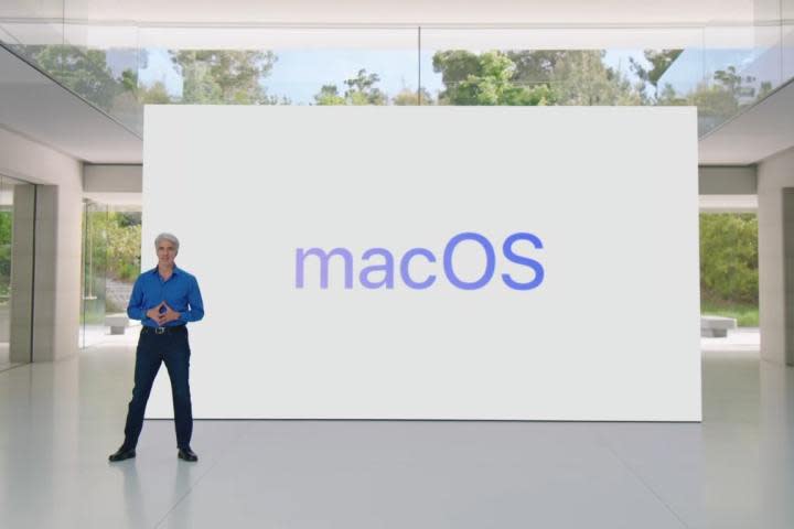
I use macOS every day, and there’s no doubt that I love it as an operating system. Yet, despite how full of genuinely brilliant features it is, there are still a handful of things I just wish it did better.
Luckily, Apple’s Worldwide Developers Conference (WWDC) is just a month away, which means there’s not long until we see what kind of software improvements Apple has in store for us. I’ve been thinking hard about what kind of changes I’d like to see happen, from Siri to Stage Manager and everything in-between. Here are the key areas I think Apple needs to fix in macOS 15.
Hey Siri, meet AI
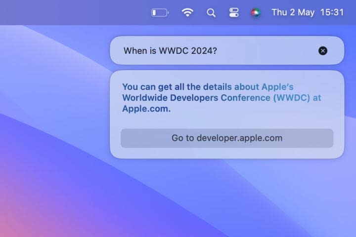
It’s no secret that Siri has fallen well behind its rivals. I’m sick of hearing it say, “OK, here’s what I found on the web,” instead of just giving me a concise answer, and I can probably count the number of times it’s actually helped me on one finger. It’s so unessential to my everyday Mac usage that I oftensimply forget it’s there.
With macOS 15, Apple has a chance to fix Siri for good. That’s because we know Apple is making a major artificial intelligence (AI) push in its software this year, and I expect that will affect macOS just as much as iOS. And Siri is absolutely crying out for an AI overhaul. Beyond that, all of Apple’s first-party Office and creative apps are also now lacking a lot of the AI functionality of the competition, whether that’s from Adobe or Microsoft.
Generative AI tools like ChatGPT are already miles ahead of Siri, even with their tendency to hallucinate. Now imagine something with ChatGPT-like capabilities that was integrated tightly into macOS — something that would be just as adept at finding an answer online as it would be performing system tasks. We already know that WWDC is going to be heavily focused on AI, and that means there’s an opportunity for Apple to unleash the best version of Siri we’ve ever seen.
Stage Manager’s unfulfilled potential
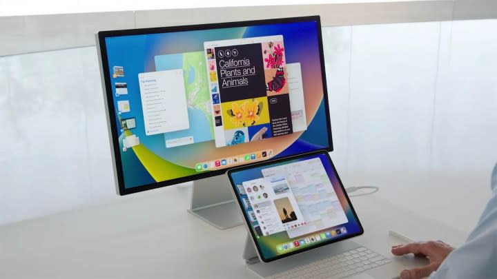
When Stage Manager first launched, I was intrigued. Here was something that could completely change how I used my Mac by giving me some clever options for grouping apps and separating tasks into different views. It seemed to be overflowing with potential.
Suffice it to say, that potential went unfulfilled. It’s now been almost two years since Stage Manager debuted, and it’s about time Apple turned its attention back to this unloved feature. Right now, it’s too rigid and fiddly to use, and you have to go out of your way to integrate it into your workflow. It doesn’t feel like a natural part of macOS, and since it’s disabled by default, most people probably don’t even know it exists.
Two years on from its introduction, Apple needs to give it a bit more love and remedy its long-standing issues. Otherwise, there’s a risk it will just become a forgotten element of macOS, an unwanted piece of bloatware that a vanishingly small number of people actually use. Considering its original promise, that would be a real shame.
Better desktop widgets

The latest version of the Mac operating system, macOS Sonoma, was a fairly modest upgrade. While it didn’t contain many earth-shattering features, it did come with an array of desktop widgets, some of which were borrowed from iOS. Yet, I’ve never been able to shake the feeling that they’re just simple iPhone ports that don’t quite feel at home on the Mac.
Despite the fact that I like their interactivity (meaning you can tick off reminders or launch shortcuts without having to open the widget’s app), they still feel underwhelming. In the vast majority of cases, I haven’t been tempted to use desktop widgets because they just feel like they take up more space than they’re worth. Many of them are buggy and don’t work properly (I’m looking at you, Photos widget), while there’s still no Smart Stack widget like the kind you get on iOS.
Here’s hoping Apple adds more features at WWDC. As I said of desktop widgets when I reviewed the macOS Sonoma public beta, “they’re a bit of a mixed bag, but they do show a lot of potential.” This summer, I want Apple to put things right once and for all.
The game porting toolkit
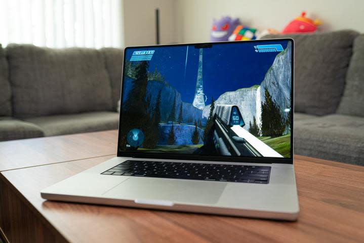
There’s no doubt that Mac gaming is enjoying a real moment in the sun right now, with superb hardware performance matched by a surge of top-class AAA games landing on macOS. If you’ve always dreamed of gaming more on your Mac, it’s an exciting time indeed.
One reason for optimism is Apple’s introduction of the game porting toolkit, which speeds up the process of bridging Windows games onto macOS for developers and end users. Yet, it’s also an area where some serious improvements could be made to help the Mac gaming ecosystem thrive even more.
Right now, using the game porting toolkit is a labyrinthine effort involving countless steps and a lot of entering code into the macOS Terminal. That’s a very user-hostile way to do things, and without the help of third-party apps like CrossOver or Whisky, it’s almost enough to make you want to give up.
Instead, I want to see Apple commit to making things simpler for developers and gamers alike, with a much better user interface and a less taxing process from start to finish. The game porting toolkit is a fantastic prospect for Mac gamers — now Apple needs to make it far more approachable.
Fix the notch
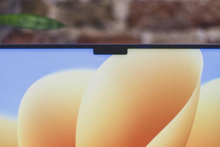
Most of the time, I don’t mind my MacBook’s notch — if it means I can have more screen real estate, I’m fine with it poking across the top of my display. What I do mind, though, is the way it interacts with the macOS menu bar, and that’s something Apple really needs to improve.
By default, I have quite a lot of app icons living in my Mac’s menu bar. So many, in fact, that if I end up with a few more than my usual contingent running across the top of the screen, some of the app icons actually get lost under the notch. Irritatingly, they don’t become visible again until I close some apps and banish their menu bar icons. You would have thought this is something Apple would have noticed in testing, but here we are.
I would love it if Apple implemented something like what BetterTouchTool does in this situation. This app is an absolute Mac game changer and includes a huge number of features and tweaks for macOS,. And one of them is the perfect fix for this notch nightmare. The app’s Floating Menu feature opens a menu whenever your mouse pointer moves over the notch. This means, for example, that you can drag an image file over the notch, drop it into the pop-out menu, then watch as it’s automatically converted into a different file format.
It’s an absolutely genius idea and something that feels like a very ‘Apple’ solution (albeit to a problem Apple itself has created). If Apple can add that kind of functionality to the notch, it will transform this element from a somewhat ugly blemish to a brilliant macOS addition.
But even if Apple doesn’t go that far, I just want it to keep menu bar items from disappearing behind the notch. Even if all we get is a situation where excess icons pop out the other side of the notch, that would still be an improvement over the status quo.
In Fitness and in Health

Despite the Fitness and Health apps being present in iOS for years, they’re still not available on the Mac. That feels strange, because for many people, the Mac is the perfect place for them.
My office doubles up as a workout space, and I’d love to have access to the Fitness app on my Mac when I’m exercising. Right now, I either have to use it on my iPhone’s small screen — not ideal when you’re working out and trying to follow instructions from afar — or send it to my Mac using AirPlay. But that’s a clunky way of doing things when a native Mac app would be so much simpler.
Having the Fitness app on my Mac would let me follow a workout on a large, spacious screen, making for a much better experience. I could then check my metrics in the Health app afterwards without needing to switch to a different device.
Apple has learned in recent years that its users love keeping fit — just look at the trajectory the Apple Watch has taken over its life span for proof. Adding the Fitness and Health apps to the Mac would help to cement that situation on every Apple device.
