Android 14 review: Steady refinement
Two years after the introduction of the Material You design language, Google is continuing to roll out refinements and tweak the overall aesthetic. That was a big part of Android 13, and Android 14 follows in a similar vein. That said, there's a bigger focus on customization this year, and Google has lavished attention in areas that have been neglected in recent Android releases. There are several changes to accessibility features, the Android share sheet is finally getting an overhaul that makes it more consistent across devices, and the predictive back gesture is a useful addition that changes how you navigate.
All in all, Android 14 is an incremental update, but that's not a bad thing. There are still a lot of tweaks that end up making a real difference in how you use your phone, and ultimately, that's what you're need in a new Android release. I used Android 14 for several months on a Pixel 7, starting out with the first public beta and installing the stable build as soon as it became available.
The stable Android 14 build is limited to select Pixels at the moment, but it will be rolling out to third-party manufacturers in the coming weeks. So let's take a look at everything that's new, and when you can start using Android 14 on your phone.
Android 14 takes customization to a new level
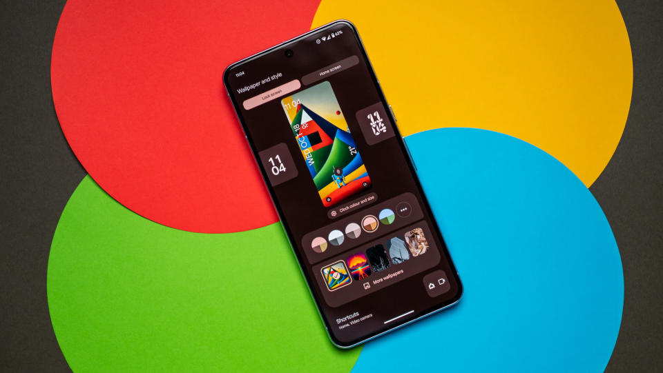
Google is lavishing a lot of attention to the lock screen in Android 14, and that includes much better customizability. You now get to choose between eight clock styles, and you can use the Material You color scheme here or go with custom colors — there's a choice of 10 available. I like the clock faces quite a bit; they go together really well with the Material You widgets, and you get plenty of quirky styles.
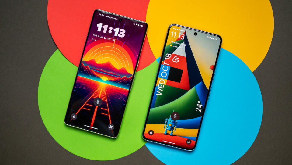
The clock changes size according to lock screen content, so if you have a lot of unread notifications, it shrinks in width so it doesn't dominate attention. The clock faces look good in always-on mode as well, and while Google isn't making any changes to how AOD works on its devices right now — that may come in Android 15 — there's a lot to like with lock screen customization. Oh, and you can customize the lock screen without having to go to the home screen; just long press while you're still on the lock screen, and you get a button at the bottom to customize the page.
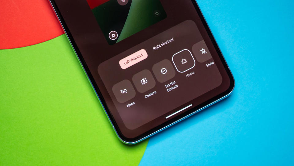
Another big change in this area is the addition of customizable shortcuts (finally!); you can add two shortcuts to the bottom of the lock screen, and these can be used to launch the camera, pull up the QR code reader, flashlight, enable DND, launch video mode, and so on. I'm still a little annoyed that there's no way to surface smart home controls with a long press of the power button — that was a feature I used extensively until Android 12 — but with a Home shortcut, there's the ability to control smart lights and so on without having to go to the home screen.
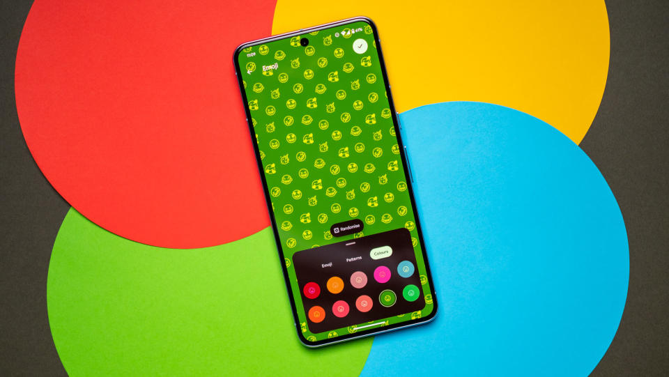
A particularly cool feature is the ability to create custom wallpapers. Emoji workshop — a feature that debuted earlier this year — lets you design fun emoji patterns and use those as your phone's background, and there's a lot of potential to create fun designs. What I like more is the AI wallpaper feature; it uses a set of text prompts to come up with differentiated backgrounds, and the effect is striking.
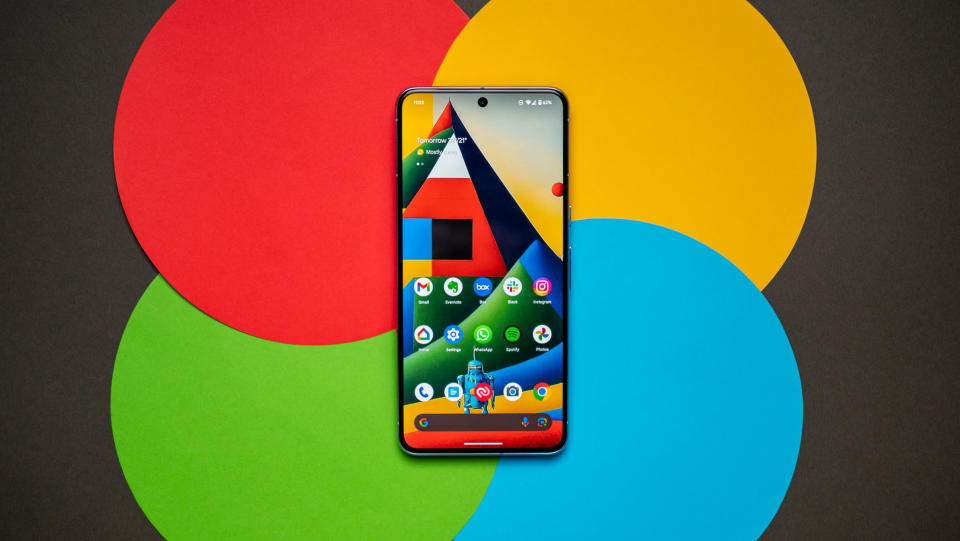
The feature uses text-to-image diffusion models and uses generative AI to create the backgrounds, and while you're limited to a set of preset prompts, there's enough variety to come up with plenty of unique designs. There's no shortage of AI-based text-to-image generators at the moment — I'm partial to Stable Diffusion — but having this feature easily accessible on your phone makes all the difference, and allows a wider audience to try it out.
Of course, it remains to be seen if other brands will utilize these changes in their own skins. Samsung has its own take on lock screen customization that was rolled out last year in One UI 5, and it doesn't look like ColorOS 14 will pick up either feature.
There are lots of smaller changes as well; the clipboard overlay that shows up when you copy text is now minimized by default, so it doesn't come in the way of using the keyboard. If you need to make any changes, you can just tap the overlay and pull up the text window. The back button has a new design where it's enclosed in a circle, and it uses the same Material You accent colors as the rest of the interface.
Android's share menu is getting a consistent design
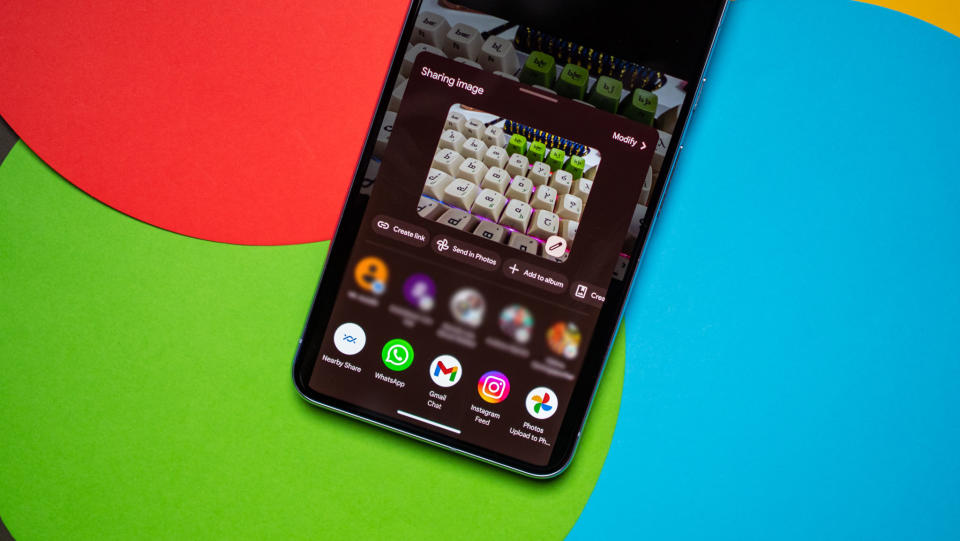
Google rolled out a lot of usability changes in Android 14, but the one that I'd like to talk about is the share sheet redesign. Android's share sheet — the menu you get when you hit the share button in a service — has had its share of issues over the years; it was slow and buggy in earlier versions of Android, and while Google overhauled it in Android 10, most manufacturers had their own implementation by that point.
That's why you don't find a consistent design when switching between different phones. For instance, Samsung tends to prefer a horizontally-scrolling app list (I don't know why the brand hates vertical scrolling), and it isn't as easy to use as the default Android standard. Similarly, ColorOS 13 doesn't show contacts when you try to share a photo or document, and MIUI has too many details in its share sheet, making it harder to use.
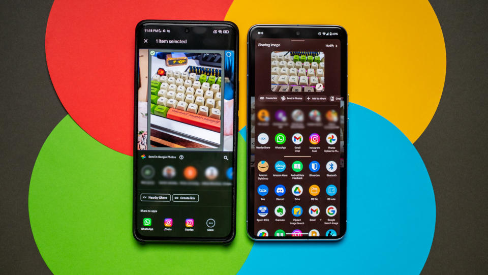
It goes beyond that; most individual apps use their own system when it comes to sharing links, so if you try to share a Facebook post, X post, or Instagram story, you'll get a different share menu each time. Google is also to blame, as none of its own apps use the same share sheet design either. Thankfully, some semblance of sanity is returning to the share sheet in Android 14; it has a unified style for starters, and if there's an app that has custom actions — like screenshots in Chrome — it can be added to the default share sheet directly.
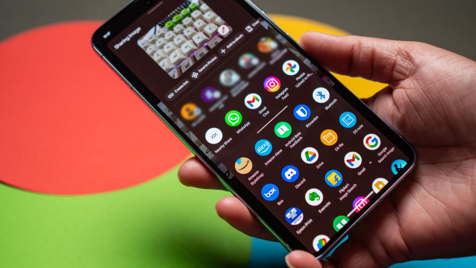
This makes a big difference in daily use, and honestly, Google should have done this two years ago. Nevertheless, I'm glad the share sheet is getting a consistent menu now, and I'm crossing my fingers that other brands start using the same design. What makes this update different is that Google is bundling the share sheet into Project Mainline, giving it the ability to roll out new features and make any changes without having to wait until the next Android release — it can be done straight from the Play Store.
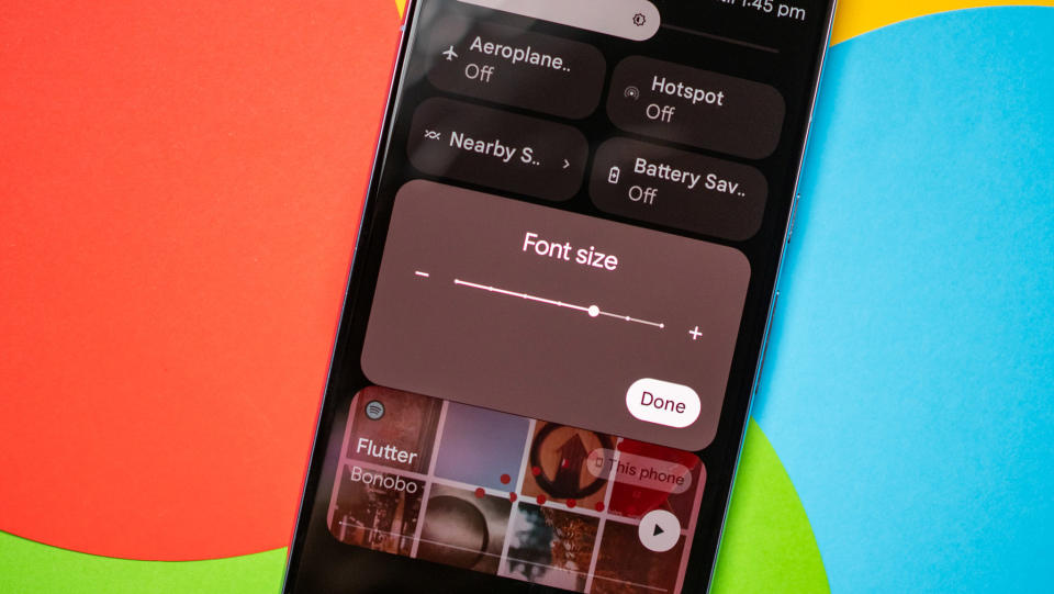
There's several usability tweaks in other areas. Non-linear font scaling gets an update, and you can now scale a font up to 200% — in Android 13, you could only go up to 130%. One of the best changes in Android 13 was per-app language settings, which offered the ability to change the language of an app without having to change the entire system language. In Android 14, you can set regional preferences, and this lets you change the numbering system, start of week, and weather units.
Although it took Google a long time to roll out this feature, Android 14 integrates lossless audio formats. So if you connect an IEM or wired headset to your phone, the Android system is able to natively handle lossless playback.
The predictive back gesture is usable (sort of)
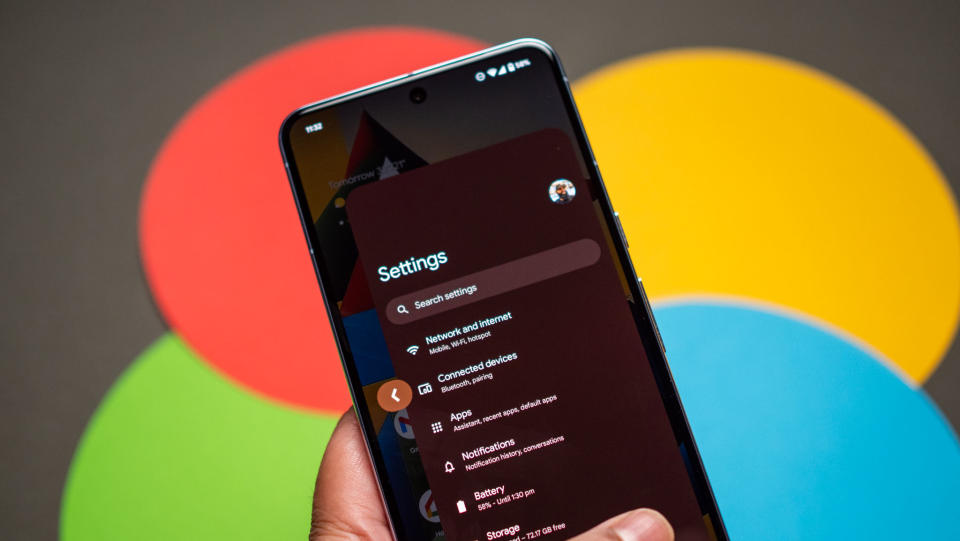
The predictive back gesture initially debuted in Android 13 beta, but it wasn't available in the stable release. And while it is available in Android 14, it's not enabled out of the box, and you have to go into developer options to toggle it on. And because Google doesn't mandate its own, you're essentially limited to Chrome and other Google services where you can actually use the feature.
That said, it's in Chrome where you're bound to need it the most, and it works as advertised. The feature shows a preview of the page you'll go back to when you start pressing the back gesture, so you can decide if you want to go back or stay on the current page. While the gesture is definitely handy and makes navigation a lot more seamless, it clearly has issues — there were several times where it wouldn't trigger — and there's the fact that you can't use it widely.
The most secure version of Android yet
Google rolls out a set of security features with every new Android release, and that's no different in Android 14. Let's start with permission management; Android 14 lets you give partial access to photos and videos, so if you're posting to Instagram or another social network, you don't need to give the app full access to all the photos and videos on your device. If this sounds familiar, it's because iOS has the same feature.
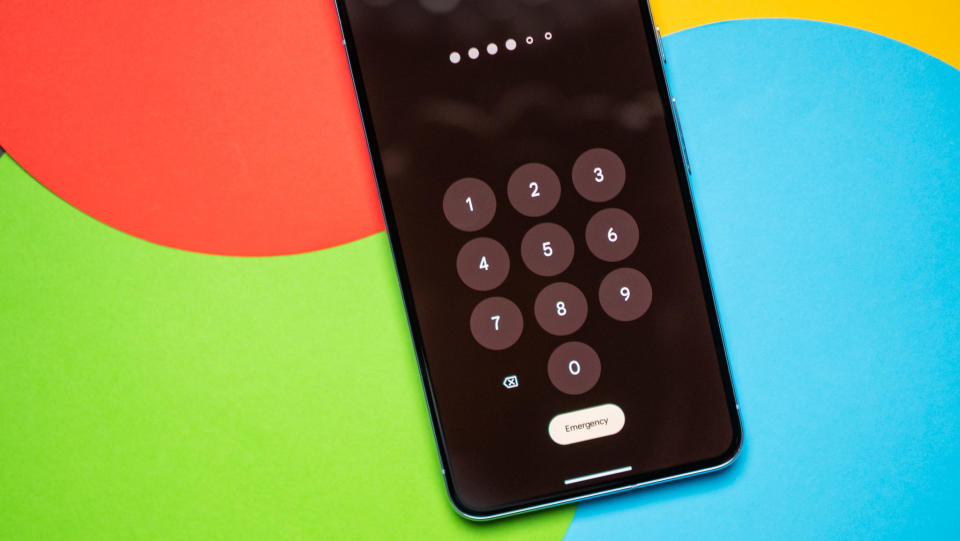
While most other manufacturers already let you use a 6-digit PIN, that's now being baked into Android — and you can now use it on your Pixel. What I like is that you don't have to hit enter after keying in the PIN; I know it's a small tweak, but it makes unlocking the phone with a PIN just that little easier. This is known as Auto-confirm unlock, and you'll need to use a 6-digit PIN for it to work; so if you're currently using a 4-digit PIN on your Pixel, you'll need to set up a new one.
Another change is how PIN entry works: when you're typing your PIN, you no longer get a preview of the digits you just entered; instead, you get animated symbols that show up on the screen. This makes it virtually impossible for anyone to guess your PIN if they're shoulder surfing.
Android 14 is also getting data sharing updates, so when you give an app permission to your location, you now get a notification when that app is sharing the details with any third parties. Given how many apps switch their policies around third-party sharing, this is a valuable addition.
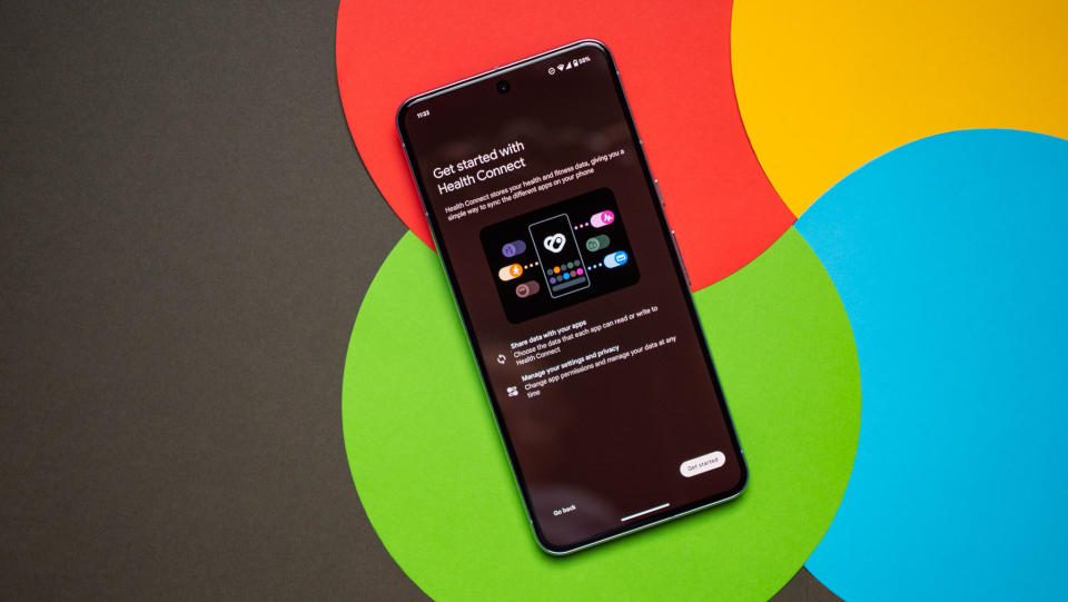
Health Connect debuted at the end of 2022, and with Android 14, Google is moving it into the settings page and integrating it natively. The feature lets you easily share fitness and health metrics with third-party apps, and all of the data is securely encrypted on the device and doesn't go to a cloud service. Like the share sheet, Health Connect is getting its own Project Mainline module, so Google can roll out timely changes and new features as needed via the Play Store.
Finally, Google is making changes to sideloading; you can still sideload apps without too much of a hassle, but Google now mandates an SDK level of at least 23, so anything built for Android 6.0 Marshmallow and below isn't eligible.
You can now use your phone as a webcam
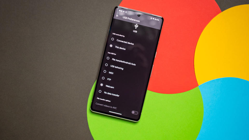
Android 14 brings a few changes to the camera, and a notable addition is the ability to use your Android phone as a webcam. Google is making it as straightforward as possible to do so; just connect your phone via a USB cable to a Windows machine, and in the USB menu, you now get a Webcam option. Choosing that launches a notification that lets you configure the options, and you can then use your phone in Windows — it shows up as Android Webcam.
Going this route lets you use your phone's front or rear cameras, and what's particularly great is that you can use the auxiliary lenses as well. The downside is that the feature isn't available widely; I don't see it on my Pixel 8 or 8 Pro just yet, but I have it on the Pixel 7 Pro that's running the QPR1 beta. That basically means the feature is yet to hit the Android 14 stable channel, but it is likely to be available in the coming weeks. If you need it right now, you can use the latest beta build.
A cool new feature in Android 14 is the introduction of Ultra HDR; it's a new format that Google is rolling out, and while it using the standard .jpg extension, it includes HDR metadata with the image. So when you view the image on an HDR screen, you automatically get richer colors with better vibrancy.
And while this isn't necessarily related to the camera, Android 14 includes automatic framing when you're making a video call. Samsung offered this feature on its Galaxy S and Galaxy Z this year, and it makes a noticeable difference. Thankfully, Google is now rolling it out as standard on its own devices.
Android 14 brings massive changes to accessibility
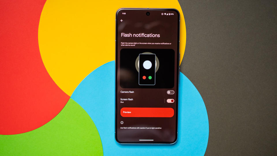
Phones these days don't have LED notification lights, so brands have resorted to using the screen as a notification LED of sorts. One UI, ColorOS, and MIUI let you configure edge lighting so that the edges of the screen light up for any incoming notifications, and Google is serving up its take on this feature in Android 14.
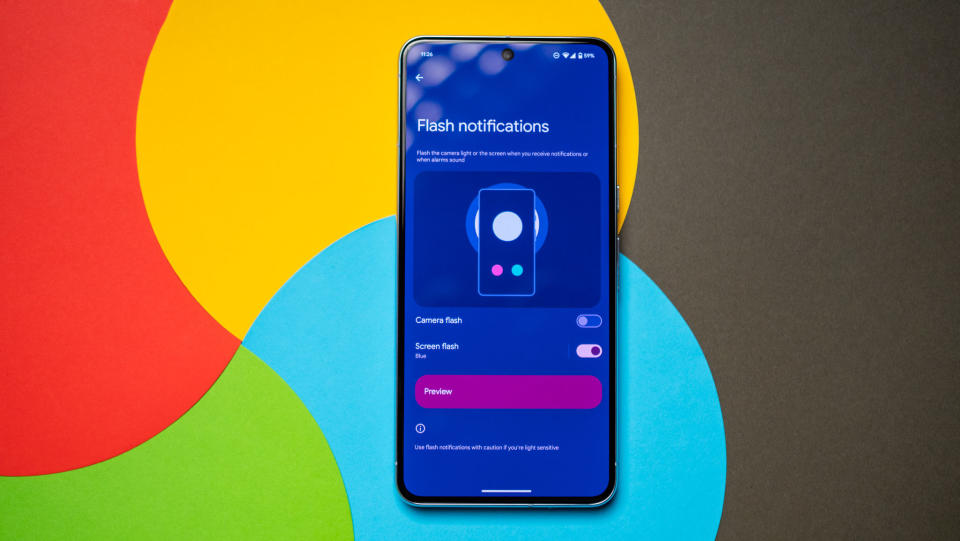
It's called Flash notifications, and you can enable either the camera flash to go off whenever you get a notification — handy if you place your phone face-down on a desk — or use the screen. Now, unlike other brands, the entire screen pulses with light when using this feature, and it's not subtle in the least. You get to choose between 12 colors, and there's a preview that shows what a flash notification would look like. Having used the feature for a few days, I definitely prefer what Samsung and other brands do with edge lighting.
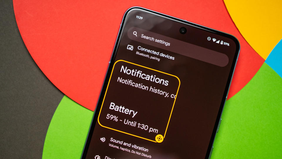
Magnifier in Android 14 is more intuitive, and you have the ability to easily adjust how much of the screen you'd like to magnify. And a key change is the ability to have the magnifier enabled when you switch between apps. There's a nifty shortcut as well; just use a two-finger swipe up gesture from the bottom of the screen to launch and close the built-in magnifier.
Android 14: When can you use it?
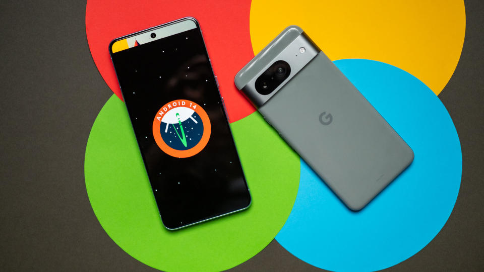
Android 14 is now on eligible Pixels (Pixel 4a and up), and it will start rolling out to other devices over the coming weeks. Thankfully, the wait shouldn't be as long as earlier versions of Android, and most brands do a decent job of rolling out the update to their latest phones within a few months — ideally, the best Android phones should get the update before the end of the year.
So if you're using a recent phone from Samsung, iQOO, Nothing, OnePlus, OPPO, Realme, Sharp, Sony, Tecno, Vivo, or Xiaomi, you won't have to wait too long to switch to the latest version of Android.
Samsung's One UI 6 beta program is already in full swing, as is OxygenOS 14. Xiaomi hasn't shared many details around MIUI 15, and similarly, it looks like ColorOS 14 will take a little while to get off the ground.
With Android 14, Google is building on the Material You foundation it introduced with Android 12. There aren't many changes to the visual aesthetic or notification pane, but with better customization options and rolling out Material You styling to all parts of the interface, Android 14 looks and feels cohesive.
Even if there aren't many exciting features this time around, Google is making much-needed fixes in areas that felt neglected in the past — like the share menu — and that ultimately is more useful on a day-to-day basis than a flashy new feature.
