There’s a big problem with iOS 18’s amazing customization features

“The home screen is truly your own.”
That’s the phrase used when Apple introduced iOS 18 during its Worldwide Developer Conference (WWDC 2024) keynote, and it heralded the end of the days when the design of iOS’ home screen was rigidly fixed.
It’s chaos from this point on and almost anything goes, just like on Android, and I couldn’t be more conflicted.
Making iOS more like Android
When rumors spread about more customization for the home screen in iOS, I wrote how I did not want it to lose any of its own personality at the same time. I think it’s important for the two primary mobile operating systems to look different and operate somewhat differently, too. But Apple’s rumored choices threatened to bring it far closer to Android than ever before.
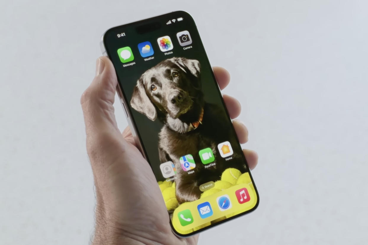
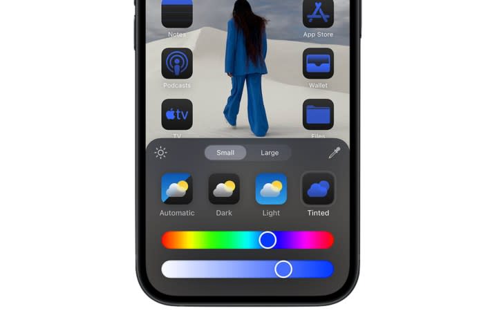
Now we’ve seen the breadth of Apple’s abandonment of the old ways. With the new software installed, you will be able to choose the number of app icons on the home screen, place them mostly where you want, and also alter the color and even the icon itself in Dark Mode. The lock screen hasn’t escaped either, as you can change out the two previously fixed icons for ones of your choosing. The Control Center has gained additional panels, more buttons, and the chance to swipe down through all the ones added, much like on the widget screen.
That’s a lot, and it’s very Android-like. And I haven’t finished yet. Icons can be resized on the home screen and in the Control Center, plus developers can create their own app controls for use in the Center, too. The Photos app has various new features that we’ve seen in Google Photos for a while, along with a Magic Eraser-like tool to edit images. Apple has also made an iPhone wireless mirroring tool for iOS 18, a common feature on Android phones. That’s about all we know for now, but as there are months to go before iOS 18’s release, more Android-like tools and features may come along.
With great power comes an ugly iPhone
So why am I conflicted when I previously said I hated the idea of such changes? Apple does a fantastic job of selling everything it does, and it certainly did make me want to try the new style on my iPhone. Shifting the apps I use around, exposing more of my wallpaper, and swapping the flashlight control on the home screen to another app really appeals to me.
I can also live with the new Control Center, but I generally dislike a host of buttons and controls to mess around with, and I always prefer a simpler, focused selection of controls to be close to hand. I understand I may be in the minority though, so I’m still pleased this is incoming. I also know that if I don’t want to switch the home screen around too much, it’s not a requirement. The freedom to make the home screen look the way you want is a good thing.
Except when it’s not. Apple took it a step too far with the option to change the color of the apps on the home screen to “match” or complement the wallpaper. This is the tipping point between not needing to be a designer or understanding how to implement color schemes, and the need to have some kind of creative talent. Why? When you use the color tool badly, the result can be hideous. It’s the one tool in Apple’s customization toolkit that made me cringe. It’s too powerful for us normals to use, and I already foresee so many visually unpleasant home screens created by using it without careful consideration.
Apple knows what I mean

During the presentation, Apple proudly showed off what’s possible with its new customization tools, and even in the few examples on-screen, the red, blue, and purple options are absolutely awful to look at. They show where creative restraint will be required to make good use of this dangerous tool, particularly in the purple one, which is genuinely terrible. It’s also emphasized in a way Apple would not really want it to be, as the “original” iOS home screen layout to the right looks far more legible, more professionally styled, and simply much easier on the eye than all of the others.
We’ve seen the results of Apple’s decision to give the masses access to such power before. Nothing, the technology brand from OnePlus co-founder Carl Pei, also embraces total customization, and Nothing OS can be given a monochrome look throughout, while Android as an OS lets you change the icon and button colors to ones inspired by the wallpaper. Usually though, the default options look best.
Don’t believe me? Imagine all the other home screens shown in Apple’s example image above with the classic, original color scheme. Each would be infinitely improved by ignoring the urge to mess around with the colors. Play around with the layout of apps and widgets on the iPhone’s home screen to your heart’s content — I admit I’m going to — but only wield the power of the color tool if you’re going to take care. Otherwise, you risk ruining the look of your iPhone’s home screen completely.


