I flipped, I folded: Choosing between the Galaxy Z Flip 5 and Motorola Razr Plus
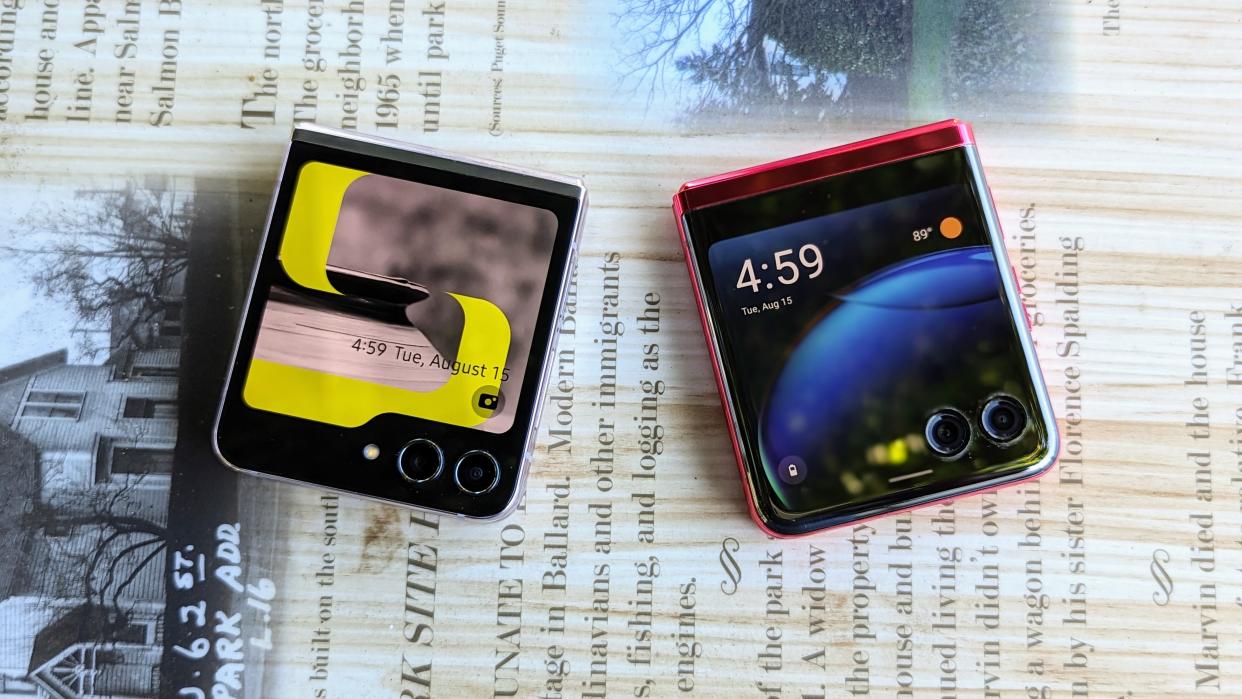
This year, I used my first foldable phones. After years of watching Samsung dominate the space with the Galaxy Z Fold and Z Flip, Motorola threw us all for a loop by launching the new Razr Plus. It's a surprisingly good phone, especially considering the company's previous efforts. It's so good, in fact, that I find myself loving it more than the objectively better Galaxy Z Flip 5.
Let me just say that while I knew I would be impressed with the Motorola Razr Plus, I fully intended on making the Galaxy Z Flip 5 my daily driver. That's because I've been using Galaxy smartphones for the past few years, and I actually really like One UI a lot more than the Pixel-like "stock" -ish UI that Motorola uses. There are a lot of things about it that I've become so accustomed to using, so switching to the Razr Plus was a little daunting to me.
However, even while I used the Z Flip 5, I found myself missing the Razr Plus, which honestly surprised me. And when my Z Flip 5 review was done, I immediately went back to using the Razr. Why, do you ask? Here are a few reasons why I prefer the Razr over the Flip.
The cover screen, duh
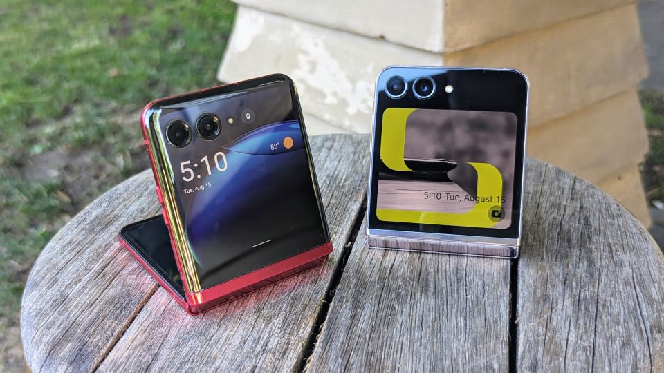
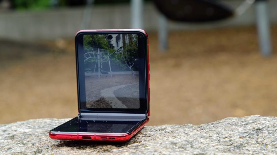
With the Motorola Razr Plus, using the cover screen feels almost as natural as using the main screen. Sure, apps are scrunched down as they are on the Flip 5, but the experience is enabled out of the box, and there are much fewer limitations than on the Flip. Notifications work as they should, I can switch between apps in the recent apps view, app continuity works when opening or closing the phone, and I can use Google Wallet. Motorola really wants you to use the cover screen, and it shows the sheer number of things you can accomplish without even opening the phone.
Unfortunately, that's not the case for the Galaxy Z Flip. I wrote about my experience using the cover screen on the Galaxy Z Flip 5 and how it feels like an afterthought to Samsung, with its software holding it back. Samsung clearly has its focus on widgets, which would be okay if the company offered more first and third-party options. And while the widgets are nicer than the ones on the Razr Plus, they still feel just as limited.
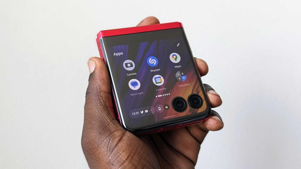
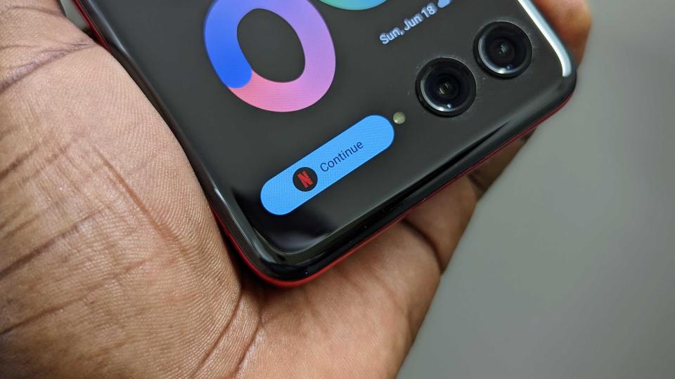
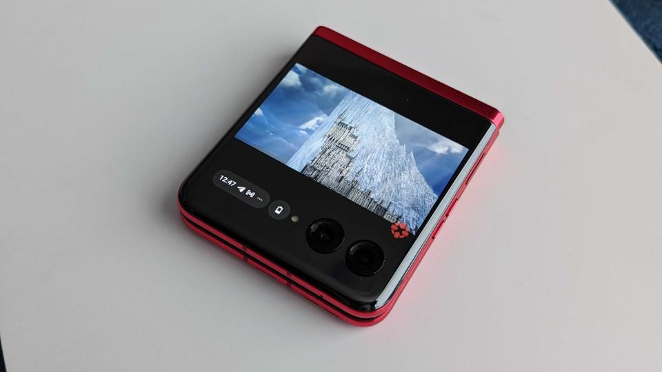
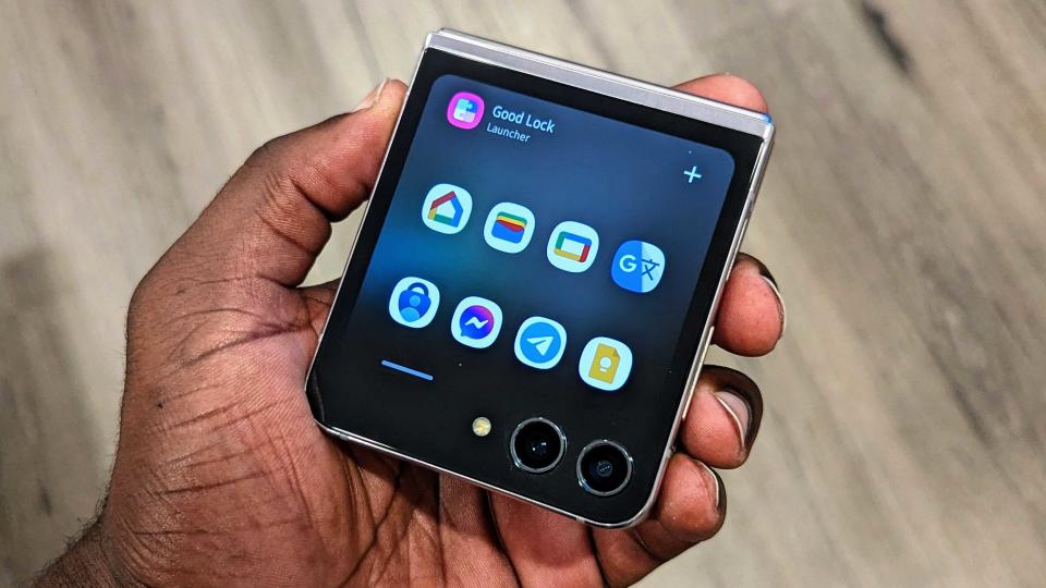
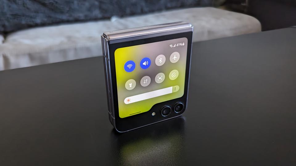
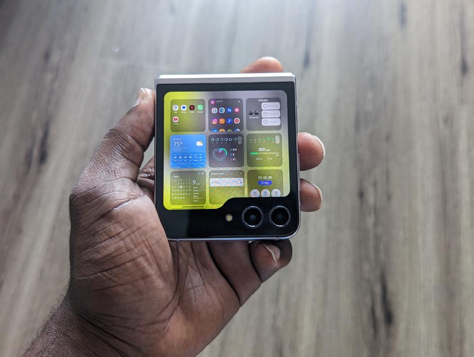
Full apps can run on the Z Flip's cover screen, but you have to jump through hoops to activate them. Once you get full apps to work, they function just fine, but the experience still feels half-baked. You can't even open the recent apps view to switch between open apps on the cover screen, which is just annoying. Also, interacting with notifications is inconsistent, even when full apps are activated on the cover screen. Some notifications will just open the app, some you can interact directly to reply to a message, and others will do nothing.
It's overall baffling how little effort Samsung put into the cover screen, given it's the main upgrade over its predecessor. Meanwhile, Motorola, who has had less success in the foldable space, has simply nailed this aspect of the Razr Plus.
Motorola's best features
While I enjoy One UI, there are some things about using a Motorola phone that are very easy to miss when you switch to something else. The biggest thing for me is the gestures. Sure, you'll find some fairly common ones, like the tap back to open an app, something available on Pixels and Galaxy phones. But Motorola phones often come with a set of gestures that I remember using back when I owned a Moto X Pure Edition, and the fact that they're still here helps set them apart from other phones.
Twist the phone twice in your hand, and you'll open the camera. Twist it again, and you'll switch to the front-facing camera. I love this because while you can always set to double-press the power button to open the camera, twisting your hand just feels a bit more natural.
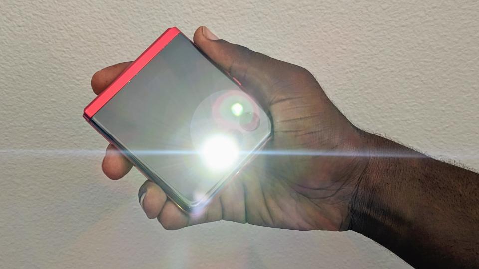
Make a double chopping motion, and you'll turn on the flashlight, a feature that I don't always use but comes in handy when I need it. I'm a little embarrassed to admit this, but I sometimes like to pretend I'm a wizard and say "Lumos" to light up my wand — or in this case, my phone — and then "Nox" when I turn it off.
Samsung has a few gestures on the Galaxy Z Flip 5, but most are pretty common, like Lift to wake and tapping the screen to turn it on and off. There’s also a back tap gesture on the Z Flip 5, but that’s unfortunately hidden behind Good Lock, just like all the better cover screen features, so happy digging.
As I said earlier, I enjoy One UI, but I can also recognize that there are some things that are annoying about it, and the main thing is bloatware. There are a ton of duplicate Samsung apps that I just don't ever want to see, like the ever-intrusive Samsung Wallet, which happens to work just fine on the cover screen even though Google Wallet doesn't. Many of these apps just feel superfluous because I end up defaulting to or downloading Google apps anyway. This makes setting up a Galaxy phone annoying because I have to get rid of all the Samsung things.
Meanwhile, Motorola generally leaves its bloatware for its mid-range phones like the Moto G 5G (2023), so you don't really have to worry about that on the Razr Plus. The only decision I was left making when setting up the phone was whether I wanted to use the Google Phone app or Motorola's, but it doesn't seem to matter which you choose.
Samsung's One UI 5 software is great... but only if you take the time to make it great.
Lastly, Motorola and Samsung both have their own desktop-like experience that they include with many of their devices. For Samsung, it's called DeX, while Motorola's is awkwardly named Ready For. Both offer ways to connect your phone to an external display to provide a desktop UI ideal for multitasking and getting work done. We love using DeX mode on our Samsung devices, but unfortunately, Samsung still omits the feature from the Flip, despite giving it an upgraded USB-C port.
Meanwhile, Motorola includes Ready For support on the Razr Plus, despite only being able to connect to a display wirelessly. So if you wanna get stuff done, you might be better off with the Razr Plus.
Design is key
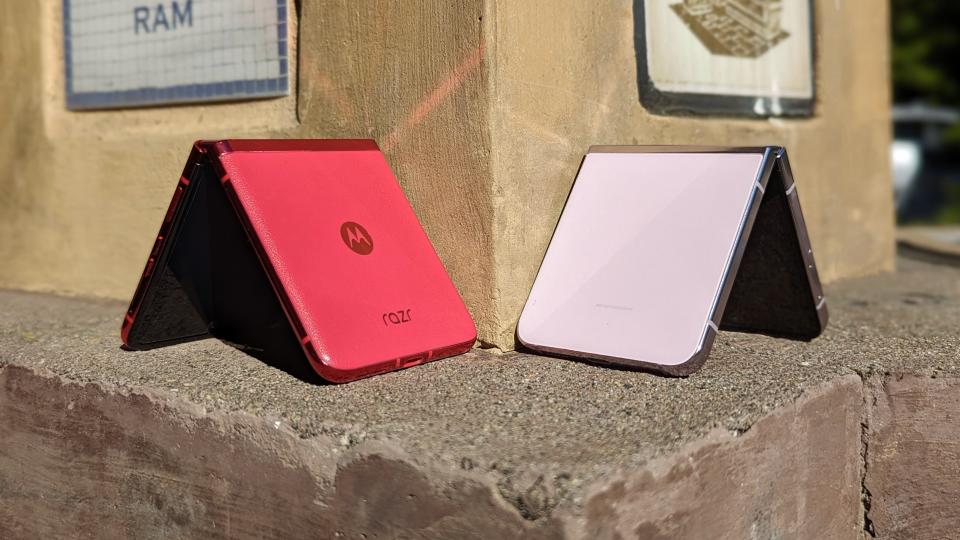
This one's a bit more subjective, but after using both phones, I feel as though the Razr Plus both looks and feels better. That's not to say the Z Flip 5 is ugly, but the boxy design isn't really doing it any favors. The Razr's cover panel nicely curves into the frame, which not only makes it look thinner (they're the same thickness when closed), but it feels better in the hand.
Unfortunately, you don't get as many color options as you do with the Flip, but the ones that Motorola gives you are very nice. The Obsidian Black is super classy, the Glacier Blue looks cool, and the Viva Magenta is an absolute looker. The first two colorways have a frosted glass back, which feels much better than the more glossy finish on the Flip. Then there's the vegan leather option, which just gives the Viva Magenta option such a distinct look and feel that you won't find on a Samsung phone.
There are other hardware and design choices that I find are just better on the Razr Plus. The side-mounted fingerprint sensor is raised so that it's easier to unlock the phone. On the Galaxy Z Flip 5, the sensor feels more flush with the body and is much stiffer, which makes it difficult to find and use and causes multiple misreads to the point that I have to use the PIN to unlock the device.
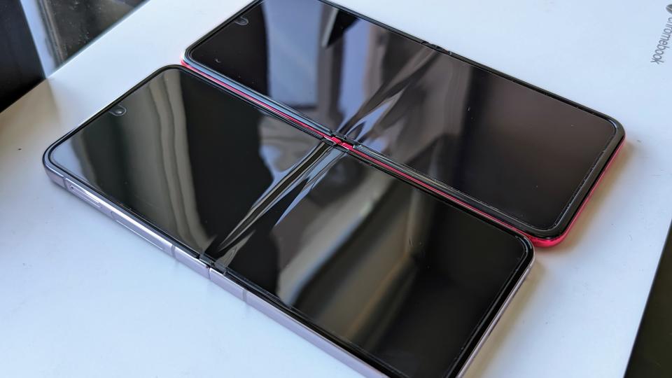
The internal folding display on the Razr Plus also has a smoother crease, which is much less noticeable than the deep crevasse that is the Galaxy Z Flip 5 crease. Lastly, the Razr Plus has a more reflective cover panel, and while that can accumulate fingerprints easily, it also makes for a great mirror because, yes, I'm vain.
Overall, I find the Motorola Razr Plus to be a much better-looking phone than the Z Flip 5, and it seems to do a better job at capturing the attention of curious eyes whenever I have it out and about.
The Galaxy Z Flip 5 is the better phone overall
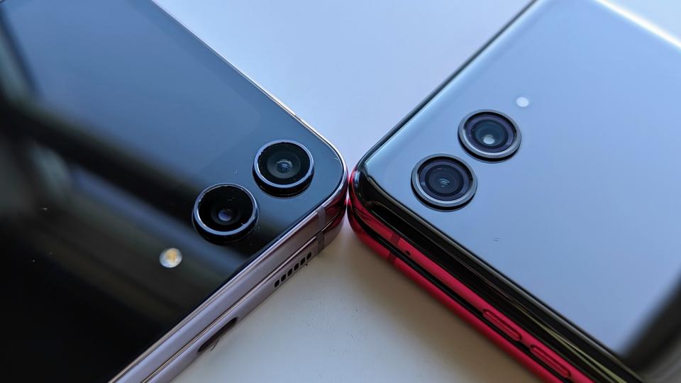
Despite my reasons for picking the Motorola Razr Plus over the Galaxy Z Flip 5, there's no denying that the Flip is really the better phone overall. After all, the Flip is more powerful, has a similarly large cover screen, more mature foldable software, and more consistent cameras. This is obvious when you compare the Galaxy Z Flip 5 and Motorola Razr Plus side-by-side.
When I first got my hands on the Galaxy Z Flip 5, I felt like I was back in familiar territory. The side panels, the quick panel, Good Lock, widget stacks, the Gallery app, and Samsung Music… I felt at home with the Flip 5. Not to mention I was coming off the high of using my first foldable, so I was fully expecting to love the Galaxy Z Flip 5 even more than the Razr Plus because it was a new and exciting form factor for me but combined with the software experience I was used to.
However, using the Flip 5 feels a bit like taking a step back after using the Razr Plus. The pieces are there, but somehow, Samsung just couldn't really get it all together, which is surprising for a company that absolutely dominates the Android and foldable space.
Overall, I choose the Razr Plus because it offers a better experience, even if the Galaxy Z Flip 5 offers better specs. That said, perhaps one day I'll change my mind and switch back to the Z Flip 5. It's just that right now, it doesn't excite me in the least, at least not until Samsung makes some changes.
But hey, don't just take my word for it. Check out this piece from Pranob Mehrotra of XDA-Developers explaining why they chose the Motorola Razr Plus over the Galaxy Z Flip 5.
