A Google Maps redesign is rolling out on Android phones

Google Maps on your Android phone might soon look a little different, with some users already reporting that their app now has a few visual changes.
Thankfully the redesign doesn’t drastically change Google Map’s functionality, if anything navigating the app should be a little simpler thanks to the layout alterations.
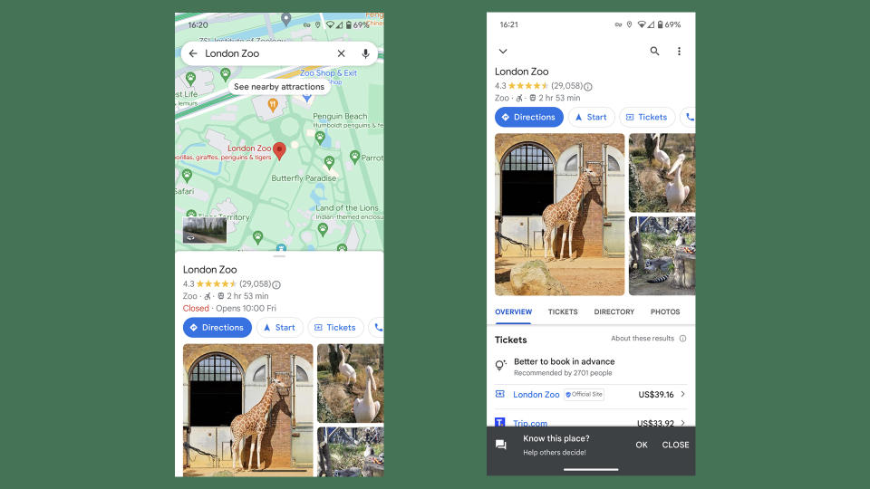
The biggest difference is that the menus for seeing more in-depth information about a location, or travel options for how to get between two points, now don’t fill the screen when you open them. Instead, a bit of the map is always still visible at the top of the screen.
The menu also now looks like it’s sitting over the map – rather than being a separate screen – with an obvious bar at the top of the menu indicating you can swipe down to minimize it and an X button you can tap to close it completely.
You could swipe down or tap the back arrow at the top of the old menu styles to return to the map, but this visual redesign makes this clearer and makes closing the menu completely a little simpler too.

The other slight change is that the Directions menu now lists the different transportation options at the bottom of the screen most of the time – they only move to the top of the screen when you open the menu fully.
Previously the options sat at the top of the screen. Bringing them down to the bottom should mean it’s easier to start navigation using just one hand.
These changes should soon appear in your Google Maps app if they haven’t already. As reported by 9to5Google some users are already seeing the changes in their app, though it might take a while for it to reach everyone – you can also check the Play Store to see if the update can be installed manually.
We expect this change may also arrive on the iOS version of Google Maps, but we’ll have to wait and see when it rolls out to a wider selection of users.
