iOS 18 could make my iPhone look like Android, and I hate it
If rumors are to be believed, iOS 18 will allow you to customize the home screen on your iPhone more substantially than ever before. This feature will be familiar to Android phone owners, but I don’t want my iPhone to look like an Android phone.
It’s a weird double-edged sword, as by giving you more freedom to make the home screen look unique, iOS may also lose what makes it unique compared to the less constrained world of Android.
iOS 18 and your iPhone home screen
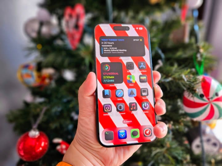
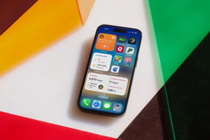
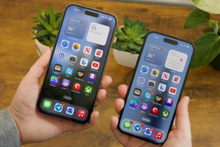
Apple’s rigid, grid-based app layout works. All your frequently used apps are right there, in familiar positions, when you want them. Those that aren’t so commonly used are popped into the App Library or into folders, which can be relegated to other home screens to keep the main screens free from clutter. Widgets can be slotted in to spice things up and make good use of areas you don’t want to fill with app icons.
In iOS 18, you’ll apparently be able to partially ignore the grid layout and place app icons more freely on the home screen, which will introduce blank space around apps. This is what you can do on Android, where you can have just one app placed anywhere on a home screen if you want. The blank space around your app serves no actual purpose, aside from the fact that you can now see more of the wallpaper.
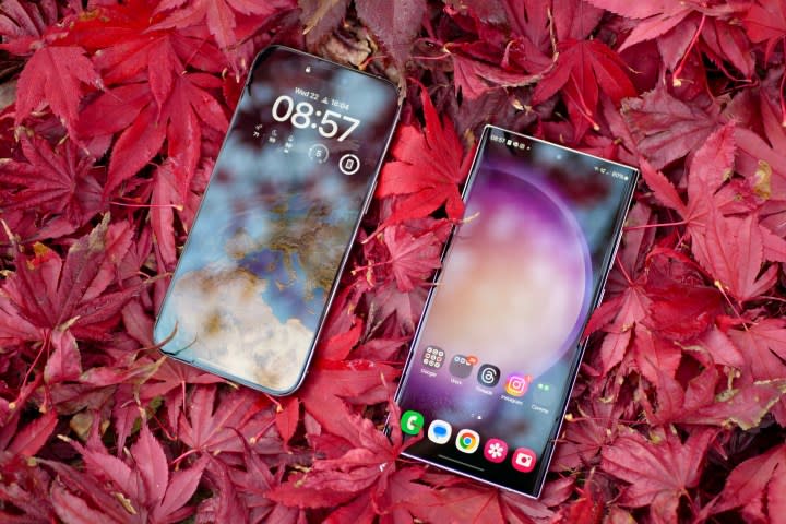
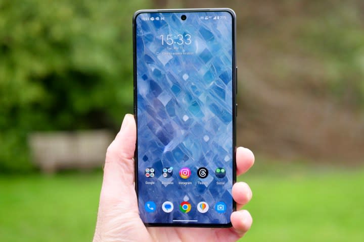
It sounds like I’m against it, right? I’m not. I like placing my commonly used apps in a row at the bottom of the home screen on Android. Just take a look at the photos of Android phones I review to see what I mean.
I stick to basically the same formula every time and appreciate the chance to enjoy whatever wallpaper I choose whenever I unlock my phone. It’s what makes Android, Android. But it’s not iOS, and I don’t really want the two to merge any more than they already have.
The Android-ification of iOS
In its efforts to keep iOS “fresh,” Apple has already taken more than enough design cues from Android over the past few years. Widgets — a longtime Android staple feature — first came to iOS on the Today screen and then to the home screen in iOS 14. In the same update, Apple introduced the App Library, which works in the same way as the App Drawer on an Android phone, where you can store infrequently used apps without deleting them entirely.
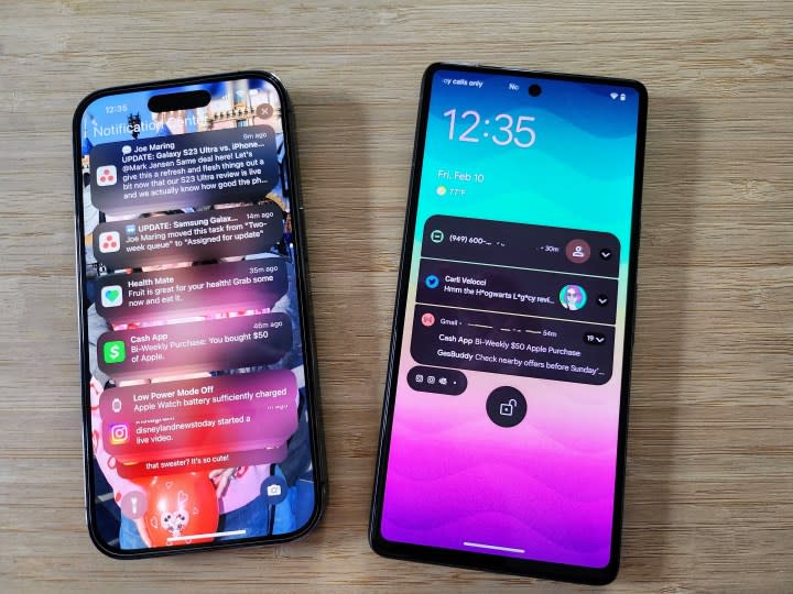
In iOS 16, the lock screen received some attention, including the ability to place widgets on it, change the font and style of the clock, and create different versions of the lock screen for different occasions. Through all this and other adjustments to the shape and style of iOS over the years, the iPhone’s software has become more personalized and individual, but it has never completely lost its iOS-ness — and I really like that.
The influence of home screen and operating system design has worked both ways. Android phones have taken on key aspects of what makes iOS what it is too. Most recently, manufacturers and developers have found ways to adapt Apple’s Dynamic Island into their own Android interfaces.
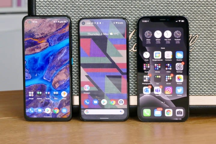
Before that, it was common on phones from Xiaomi, Oppo, and Huawei to set the software so apps spread over multiple home screens by default, iOS-style, rather than utilizing an app drawer. The two software platforms have similarities, but are still suitably different.
A step too far?
I fear the changes rumored for iOS 18 will be a step too far. While I understand you won’t be forced to space apps out or create open, blank areas on the home screen, the fact is that it’ll likely be possible to closely mirror the app layout and style of my Android phone on my iOS phone — and this is what I really don’t like about the prospect.
While it’s possible to replicate my iOS home screen on Android, I never do it. I want it to look different as it’s a different phone and software. It shouldn’t look like another device. It should be its own thing. I roll my eyes at Xiaomi and others for making its Android interface look like iOS because it’s lazy (and the same applies to smartwatches with watchOS-style interfaces). I do the same when manufacturers copy the iPhone’s camera module layout. If I wanted an iPhone and iOS, that’s what I’d buy.
It works the other way around, too. If I want an Android phone, I’ll buy one. The lines between the software are already blurred, but there’s enough differentiation between them that they’re still clearly unique, and one really can’t be mistaken for the other.
I’m cautious about the latest rumors because there’s a risk this could change. I’m all for making the software on my phone individual to me, but I also want it to have its own identity and not just be a tiny variation on a single theme I find on every phone, regardless of its manufacturer or platform. That’s not customization, that’s boring.
Until recently, complaints about smartphones all basically looking the same were valid, but this has definitely changed for the better. I don’t want to begin to think the same thing about the software on phones in the near future — especially after misguided efforts to introduce personalization accidentally eroded personality at the same time.
