The iPhone 15 Pro Max just short-circuited my move back to Android
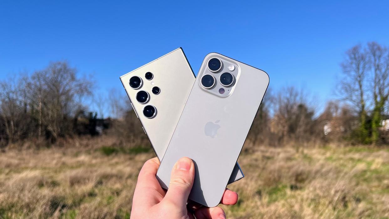
Ever since I made the switch from Android to iPhone towards the end of 2021, I had a feeling there would come a day I switched back, ditching Apple’s iterative phone for something more interesting from our best Android phones list.
That day almost came… but then it didn’t.
Before I tell you why, let me give you some context. I’ve never dogmatically been in the iOS camp or the Android Army. My first smartphone was the iPhone 4S, which I loved, but it gave way to the Samsung Galaxy S6 with its superior specs and then subsequent Android phones that came across my desk to test as I progressed my career as a consumer tech journalist.
For around seven years, my SIM card was slotted in various Android phones; I had iPads to get a taste of Apple’s mobile operating system. And I found Apple’s slow adoption of 120Hz displays a pain.
Android exodus
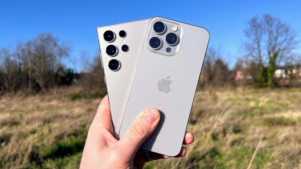
That changed with the iPhone 13 Pro, which not only brought in a 120Hz LTPO display, but also featured a second-gen take on Apple’s return to flat phone sides, and some great cameras. So when the opportunity came to try one, I jumped at it.
I was expecting to switch back within a few months but that never happened. I loved the size of the 13 Pro, its cameras produced great shots, and while Apple’s software can be a bit tedious compared to the intricacies and features of Android, it... well… it did ‘just work’.
So while I still carried various Android phones, notably some of the best foldable phones, an iPhone was my primary device.
But more than two years later I’d fully started to get bored of my iPhone 13 Pro, and I felt its battery wasn’t quite holding up as well as I wanted. Yet my colleagues had TechRadar’s allocation of iPhone 15 models, so I was gearing up to move to the likes of the Samsung Galaxy 24 Utra or Google Pixel 8 Pro.
Then an iPhone 15 Pro Max found its way into my hands and gave me cause to pause.
Well, I guess size does matter
I’ve never been convinced by previous Max iPhones. The notch design had me opt for the Pro over the iPhone 13 Pro Max, which I felt looked a bit dumb, as if the phone had been stretched rather than slickly scaled up.
The iPhone 14 Pro Max removed the notch problem by going with the Dynamic Island. But its stainless steel chassis felt a bit too heavy and unwieldy - conversely, I feel the heft of the normal iPhone 14 Pro is spot on.
So I didn’t think I’d like the iPhone 15 Pro Max. But I was wrong.
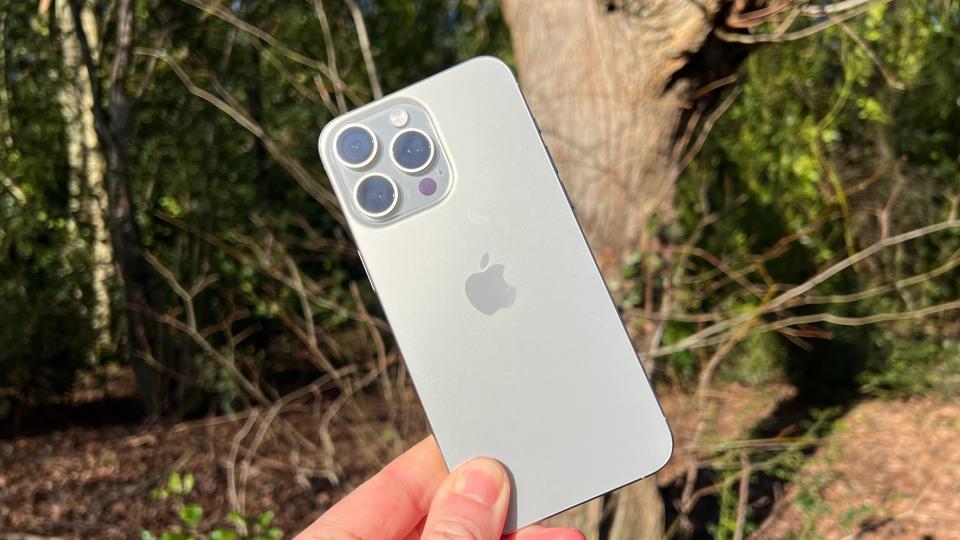
The titanium edges, which I had thought were more marketing and Apple bluster than a real design change, make the Max iPhone feel a lot smaller despite its larger screen size. It’s still a stretch to use one-handed (my hands aren’t small either) but it feels less likely to drop out of my hand when my thumb reaches for a top display corner.
It also feels great, with the matte back on the iPhone 15 Pro Max feeling softer to touch than my iPhone 13 Pro’s rear. And in 'Natural Titanium' I think it looks good too, with the sides and camera model merging better with the phone’s chassis.
Of course, design is one thing; it needs more to keep my attention from Android.
Core upgrades
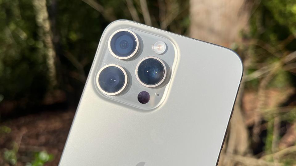
And it’s here that the new 5x telephoto camera comes into play. While nothing new in the phone world, this tetraprism periscope camera provides a zoom that feels more useful than 3x for my phone photography. Yet it's not as impractical as a lower resolution 10x optical zoom camera.
That new camera, combined with the already excellent camera performance of the main and ultra-wide lens and my enjoyment of Apple’s image processing and color balance, makes the iPhone 15 Pro Max’s camera suite almost unbeatable in my opinion; phone photography is very subjective of course. Add in how easy it is to get excellent video with ease from iPhone Pro models, and the camera suite is simply wonderful for point-and-shoot aficionados.
I hate myself for saying this, but Apple finally ditching the proprietary Lightning port for USB-C is mildly transformational for my iPhone experience. It’s dumb, but not having to carry an extra cable or go fishing in my backpack for a Lightning cable is a minor joy. I’m certainly not applauding Apple for adopting USB-C, but I can't deny it’s a definite upgrade to the latest iPhone series.
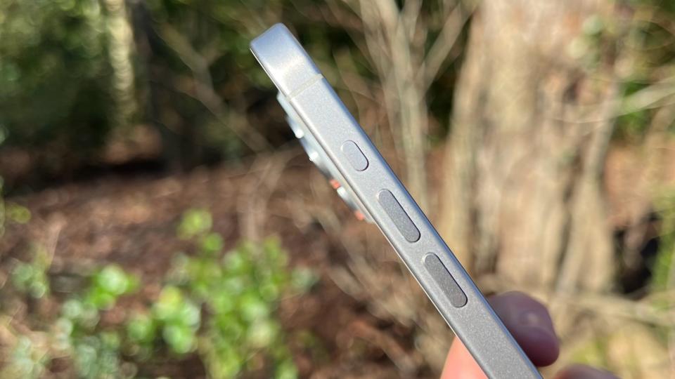
Oh, and the Action button is rather neat. I use it to turn on the flashlight feature without swiping at the screen, which is actually low-key marvelous.
All the above combined means there’s a little more road for my iPhone journey to keep traveling along.
I’m not mad about that, but I’m not stoked either; rather I’m starting to accept that the usability of iOS, its robust ecosystem, and how I rarely get frustrated at iPhones, even if I get a little bored of them, is a testament to Apple approach of taking its time with adopting new tech and iterating generation to generation to create a device that’s hard not to like. I didn’t think I’d be saying that in 2024.
