I tried the iPhone 16 and 16 Pro, and this one feature blew me away
Well, it happened. Apple just held its latest big hardware event, and as expected, we have new iPhones and Apple Watches. This is a tradition each September, and this year is no different. However, for the first time in my career writing about phones on the internet, I attended the iPhone launch in person and went hands-on with the new models much earlier than usual.
Trying to form fully-fledged, in-depth impressions about new phones is difficult when you’re shoulder-to-shoulder with hundreds of other press/media people. However, even in the brief time I got to use the new iPhone 16 and iPhone 16 Pro devices, there’s one thing that really stood out to me.
All of the new iPhone 16 models — including the iPhone 16, 16 Plus, 16 Pro, and 16 Pro Max — have a new hardware button. It’s called the Camera Control, and it’s on the right edge of the frame below the power/Siri button. Like other Android phones over the years, it allows you to snap a photo in the camera app like a dedicated shutter button. However, in the way that only Apple does, the Camera Control button is so much more than that.
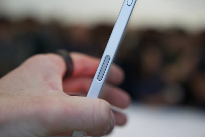
A single press of the Camera Control button opens the camera app. Pressing it again snaps a photo, while holding it down records a video. Simple enough, right? It is, but that’s just the start.
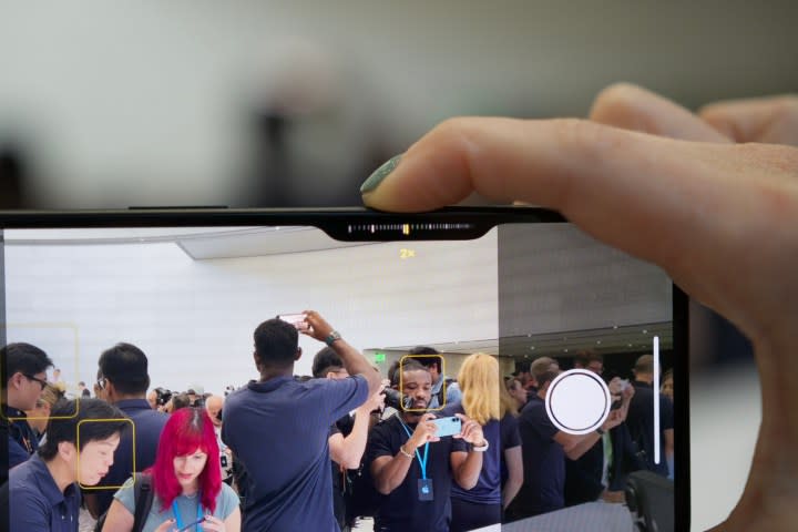
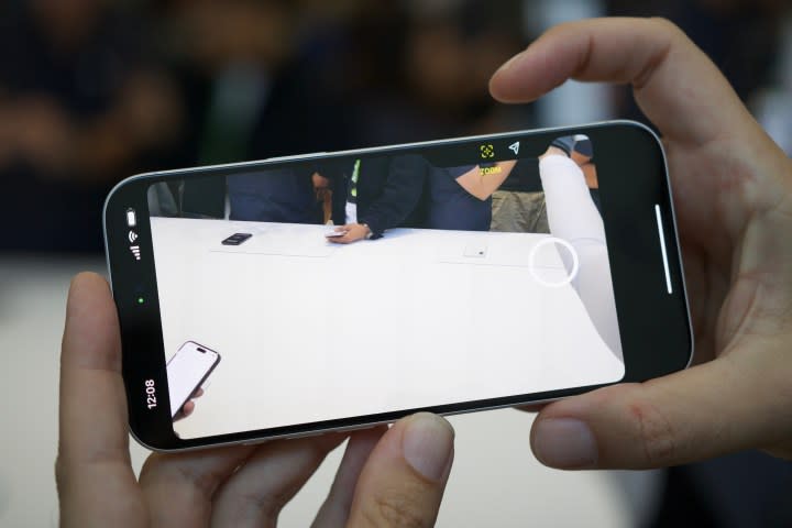
A capacitive sensor underneath the Camera Control button gauges how hard you’re pressing the button. A full press takes a picture, but a light press brings up a control interface right below the button — and you can swipe across it to zoom in and out. A double press from there brings up additional controls you can adjust with the button, including the depth of field, exposure, Photographic Styles, and more. Apple plans to add a two-stage shutter button option later this year, along with “visual intelligence” features that’ll allow you to use the Camera Control button to search the internet for things that your camera sees — not unlike Google Lens.
After trying the Camera Control button for myself, I’m 100% sold. It’s an unbelievably slick interface, and it worked incredibly well in the multiple demos I had with it. There’s also a Taptic Engine below the button that provides lovely haptic feedback when interacting with it. Paired with the Action button that’s also now on the iPhone 16 and 16 Plus (and returning to the iPhone 16 Pro and 16 Pro Max), Apple’s letting you do so much with buttons versus the touchscreen. I absolutely love it, and I really think it’s going to be difficult going back to my iPhone 15 Pro Max and its Camera Control-less design.
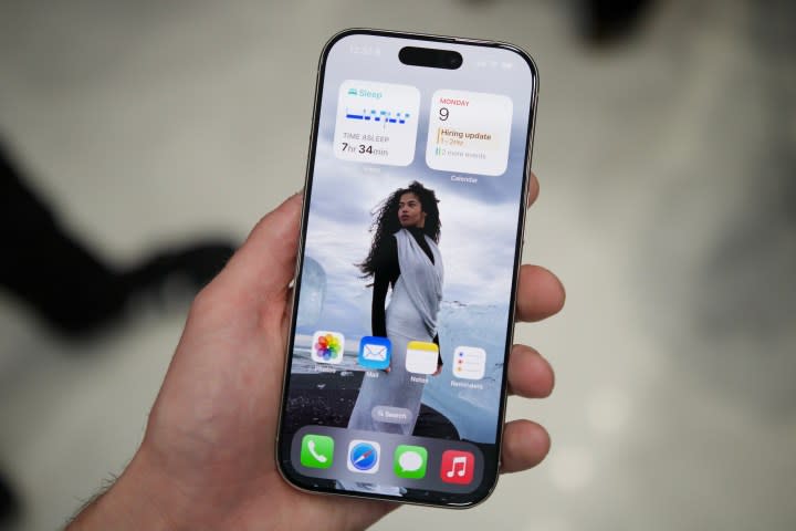
Beyond the Camera Control button, the slimmer bezels on the iPhone 16 Pro and iPhone 16 Pro Max are impressive — and suddenly make my iPhone 15 Pro Max look ancient by comparison. This year’s new screen sizes are an interesting change (6.3 inches for the 16 Pro and 6.9 inches for the 16 Pro Max). The iPhone 16 Pro didn’t feel immediately larger in my hand compared to the 15 Pro, though I’ll need more time to fully form my thoughts here.
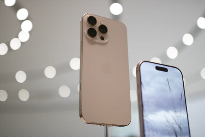
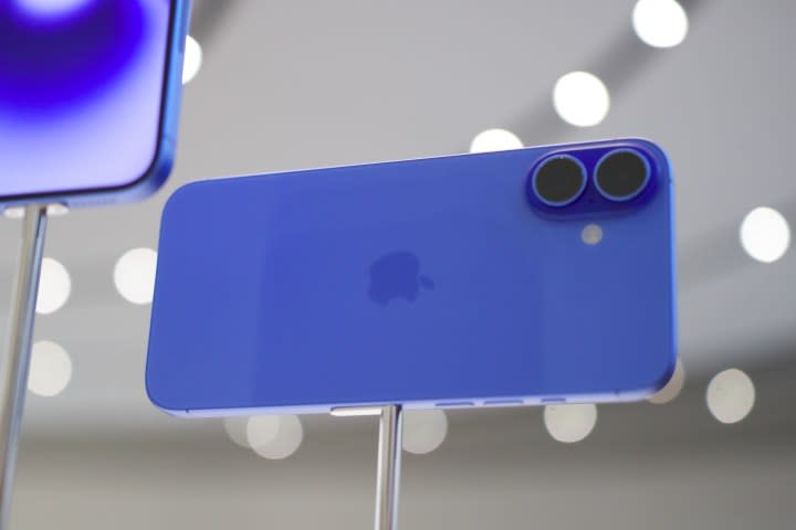
The new Desert Titanium color for the Pro models is fine and not nearly as awful-looking as early renders suggested it would be. The real color highlights are with the base iPhone 16 models; Ultramarine, Teal, and Pink are all stunning in person. To my eyes, they’re easily some of the best iPhone colors Apple has released in years.
You can preorder all of the new iPhone 16 models now, and regular sales are set to begin on September 20. We’ll have a lot more to say about the new iPhones very soon, so stay tuned for plenty more to come.
