Vitals is one of the best Apple Watch apps I’ve used in years
A little over two months ago, Apple held its WWDC 2024 conference and unveiled a lot of new software features. There was plenty to sink your teeth into, but my favorite announcement of the show was watchOS 11.
Why? Because watchOS 11 adds features I’ve been hoping to see on the Apple Watch for ages — such as the ability to pause activity rings and showing you more robust training/exercise data. It also adds the new Vitals app. I’ve been using Vitals on my Apple Watch Ultra 2 for a couple of weeks now, and it’s everything I had hoped the app would be.
What Vitals is and how it works

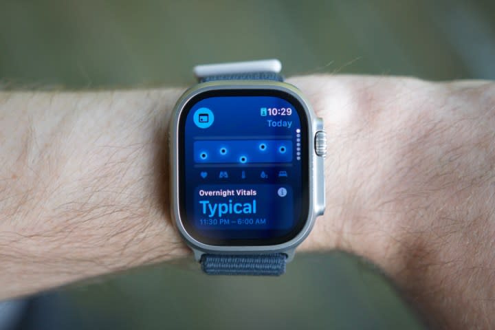
That’s some high praise right off the bat, but let’s take a step back really quickly: What is the Vitals app? It’s a new app you get on your Apple Watch after downloading watchOS 11. It has a pretty ambiguous icon, but once you see the app with three blue dots and one pink dot (pictured above), you’ll know you’ve found it.
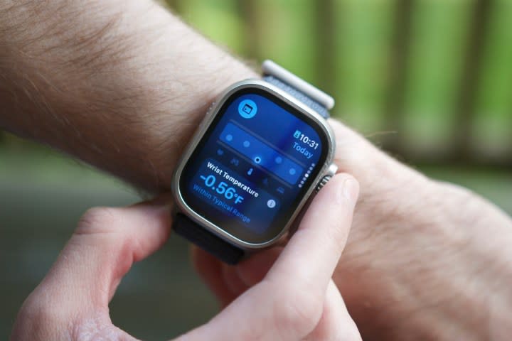
Vitals doesn’t necessarily give you any new health data. Instead, it takes information your Apple Watch is already recording while you sleep and presents it in a new light. The app looks for five metrics: heart rate, respiratory rate, wrist temperature, blood oxygen, and sleep duration. Wear your Apple Watch to bed, and when you wake up in the morning, the Vitals app shows you how it recorded all of those metrics overnight.
And that’s it! Open the Vitals app each morning, see where you’re at, and go about your day. There’s not much more to it, so why do I like it so much?
A simple, helpful app

As I’ve reviewed more smartwatches and smart rings over the past year, I’ve realized that information overload is a very real and annoying problem. Today’s wearables can track so much health data, but merely seeing that data isn’t necessarily helpful. I want my wearable to tell me why I should care about a certain health metric — not leave it up to me to figure out. This is what Vitals does so well.
Each of those five data points — heart rate, respiratory rate, wrist temperature, blood oxygen, and sleep duration — are presented in a large blue box. If they’re within that box, they’re within your body’s typical range and not something you should be concerned with.

However, if any of them go above or below your normal range, they appear as a pink dot and are marked as outliers. If your Apple Watch detects two or more outliers in a single night, you get a notification to give you a heads-up that something may be off.
Most days, I wake up, look at my Apple Watch, ensure my vitals are as expected, and go about my day. It takes just a couple of seconds, and it’s all I need to know that my body is doing what it should — except for one day when the app alerted me that my wrist temperature was higher than usual. I was already feeling pretty congested and groggy, and knowing my body temperature was up was a good push to take some cold/flu medicine before starting work that morning.
This is how health tracking on smartwatches should work, and it’s also a perfect antithesis to what we’ve seen from some competing watches this year. For example, the Vitals app is nowhere near as technically impressive as the AGEs Index on the Samsung Galaxy Watch Ultra, but I also have no idea what I’m supposed to get out of my AGEs numbers. I’m all for companies adding new and innovative health features to wearables, but they don’t mean anything if they’re too dense or complicated to understand. Sometimes, less is more, and that’s what the Vitals app does so well.
This is just what the Apple Watch needed

The Vitals app is precisely the kind of health feature I love. It doesn’t add yet another health metric to keep track of and try to interpret. Instead, it takes existing health data from my Apple Watch and does something useful with it.
Further, it’s not an app you need to spend much time in, nor does Apple want you to. You can see your vitals overview as a widget in the Smart Stack each morning, and if you tap on it, you can view specific numbers for each of the five metrics. You can also tap a calendar icon to compare today’s numbers to the past seven days, but that’s it. You’re not supposed to spend a lot of time sucked into it. You’re meant to view your metrics, ensure everything is in check, and go about your day.
I can’t wait for more people to use Vitals when watchOS 11 fully releases later this year, and I hope this is a sign of more things like this to come. The Apple Watch is an unbelievably powerful health/fitness tracker, but like so many other wearables, it doesn’t always present its health data in the most user-friendly way. The Vitals app is an excellent step toward fixing that, and after testing it myself, I think it’s brilliant.
