I was wrong about using Stage Manager on Mac

Stage Manager is one of those software features that has had a rather bumpy road since Apple launched it in 2022. The unique multitasking feature has landed itself in a heap of criticism over its short lifespan.
I, however, was not one of these critics. I was super excited by Stage Manager and the promise it contained. It was something new and shiny, here to shake up macOS in a fresh and different way. Even after using it myself, I foresaw it fundamentally changing the way I used my Mac.
But now that the feature is pushing two years old, it’s time to admit that Stage Manager hasn’t lived up to my hopes and dreams. After not using it for some time, I recently set it up again, arranged my windows, and started using my Mac as I regularly do. But the magic was gone. I’m sure there are plenty of people who still use Stage Manager, but for me, it’s a tale of unfulfilled potential.
A creature of habit

Stage Manager captured my interest when I first saw it demoed. I’m the kind of person who’s always open to tweaking my macOS habits and incorporating new features. I’ve augmented my Mac with all kinds of excellent third-party apps and useful software tweaks over the years, and I was excited to add Stage Manager to the mix.
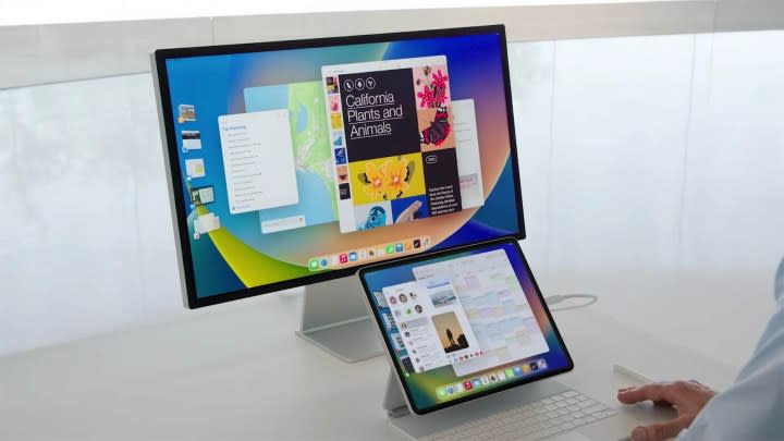
At its heart, Stage Manager is about keeping you focused on one task at a time, but without losing complete sight of other tasks and applications. The current app you’re using is centered on your screen, while recent apps are easily accessible as thumbnails along the left. You can have up to six along the side, even showing live views of those windows.
At first, I thought this might be a good alternative to using desktop spaces in macOS. I’ve always felt that using spaces required too much hassle, and remembering which window is stored in which space can be a bother. Ultimately, I’ve always preferred to just keep all my windows in one place where I can see them. Hence, my interest in Stage Manager.
Once the first flutters of interest faded away, however, it became apparent that Stage Manager just wasn’t compelling enough in everyday use. Trying to navigate around its various app arrangements is (and always has been) very fiddly and frustrating. As well as that, it’s a very rigid system with a specific use case in mind. It’s just not flexible enough to handle the various real-life scenarios that a day of work entails. On an iPad, that might suffice. Not so on a Mac.
The reason it didn’t take isn’t ultimately the point. I’m a creature of habit, and I’m guessing you are too. Something has to be pretty special to gain admittance into my everyday routine. It has to improve upon my current workflow, which is what makes the implementation of something like Stage Manager so difficult.
To make things worse, it was extremely buggy at launch, even long after it was out of beta. It seemed like you couldn’t go a day without finding some new problem afflicting it. Not a good look for your shiny new feature.
Unfulfilled potential

The failure of Stage Manager feels particularly strange given Apple’s pedigree in implementing new features. To see a new Mac feature done right, just look at another recent example: Universal Control.
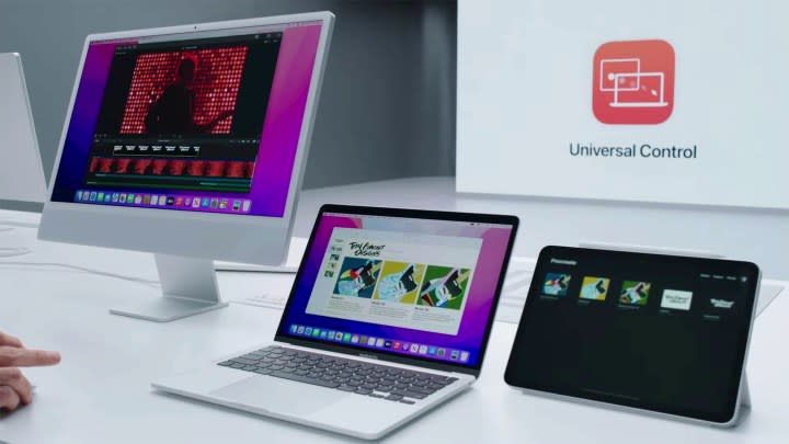
In case you missed it, Universal Control lets you place a mix of Macs and iPads next to each other and control them all with one mouse and keyboard. When you move the pointer to the edge of one screen, it appears on your other device, and you can drag and drop files between your devices and type on both using the same keyboard.
Unlike Stage Manager, I still absolutely love Universal Control. It fits into my life perfectly, and I use it every time I put my iPad next to my Mac. It’s a great example of a fascinating workspace management feature executed really well.
I use Universal Control all the time because it is such a natural macOS feature. In other words, I don’t have to put any effort into it — it’s a passive feature, not an active one.

Stage Manager, in contrast, is still clunky to enable and disable. Most of the time, you’ll have to go into Control Center or the Settings app to turn it on and off, and while you can set a keyboard shortcut for it, it’s not defined by default. And there’s still no trackpad gesture for it, either.
You also have to think about how you use Stage Manager, as I mentioned earlier. With Universal Control, you just move your mouse from one screen to the other as expected. Once it’s set up the first time, it enables itself whenever you place your devices next to each other. There’s no wondering whether it’s switched on or trying to remember how to use it. As Steve Jobs loved to say, it just works.
The ecosystem problem

More than that, Universal Control is a great example of allowing you to use the devices you have in tandem together without ever forcing one to act like the other. It’s a celebration of the Apple ecosystem, in other words. In contrast, Stage Manager is a feature that’s supposed to work on both iPad and Mac in the exact same way. It doesn’t account for the different ways you might want to use these products, forcing them to function in a similar way even when that feels clunky.
Let’s hope Apple finds a way to improve Stage Manager on Mac in the future and design more features that underline the strengths of each platform. Apple’s ecosystem needs more features like Universal Control — and fewer like Stage Manager.
